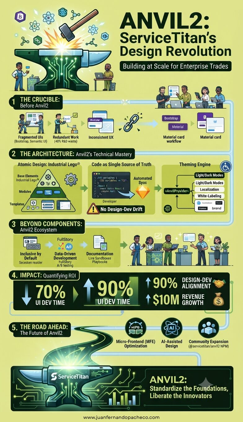
An infographic titled "Anvil2: ServiceTitan's Design Revolution" detailing the creation and impact of a unified design system. The graphic shows the transition from fragmented tools and redundant work to an atomic design architecture, a code-based single source of truth, and a robust theming engine. It highlights a 70% decrease in UI development time, 90% design-dev alignment, and $10M in revenue growth. The footer includes the URL www.juanfernandopacheco.com.

Anvil2: a design system engineered to unify 86,000+ professionals 10 and accelerate product innovation. More than a component library, it’s the bedrock of ServiceTitan’s mission to “build great products, faster” .
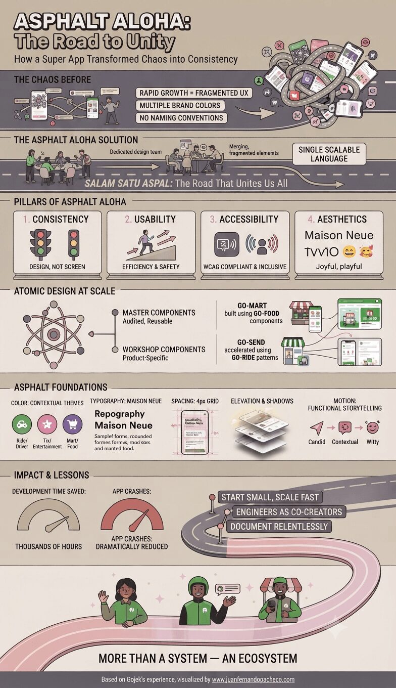
An infographic illustrating the transformation of Gojek's design system, "Asphalt Aloha," which unified fragmented app experiences into a single, scalable ecosystem across Southeast Asia. The graphic follows a "road" metaphor, starting with a tangle of screens labeled "The Chaos Before" and progressing to "The Asphalt Aloha Solution," detailing the system's pillars, atomic design methodology, and impact.

Asphalt Aloha is a love letter to Gojek’s users—a bridge between drivers in Jakarta and merchants in Singapore. It proves that design systems aren’t constraints; they’re enablers of creativity and accelerators of innovation.

As Gojek expands across Southeast Asia, Asphalt ensures that every pixel whispers the same promise: “We’re with you on this road.”
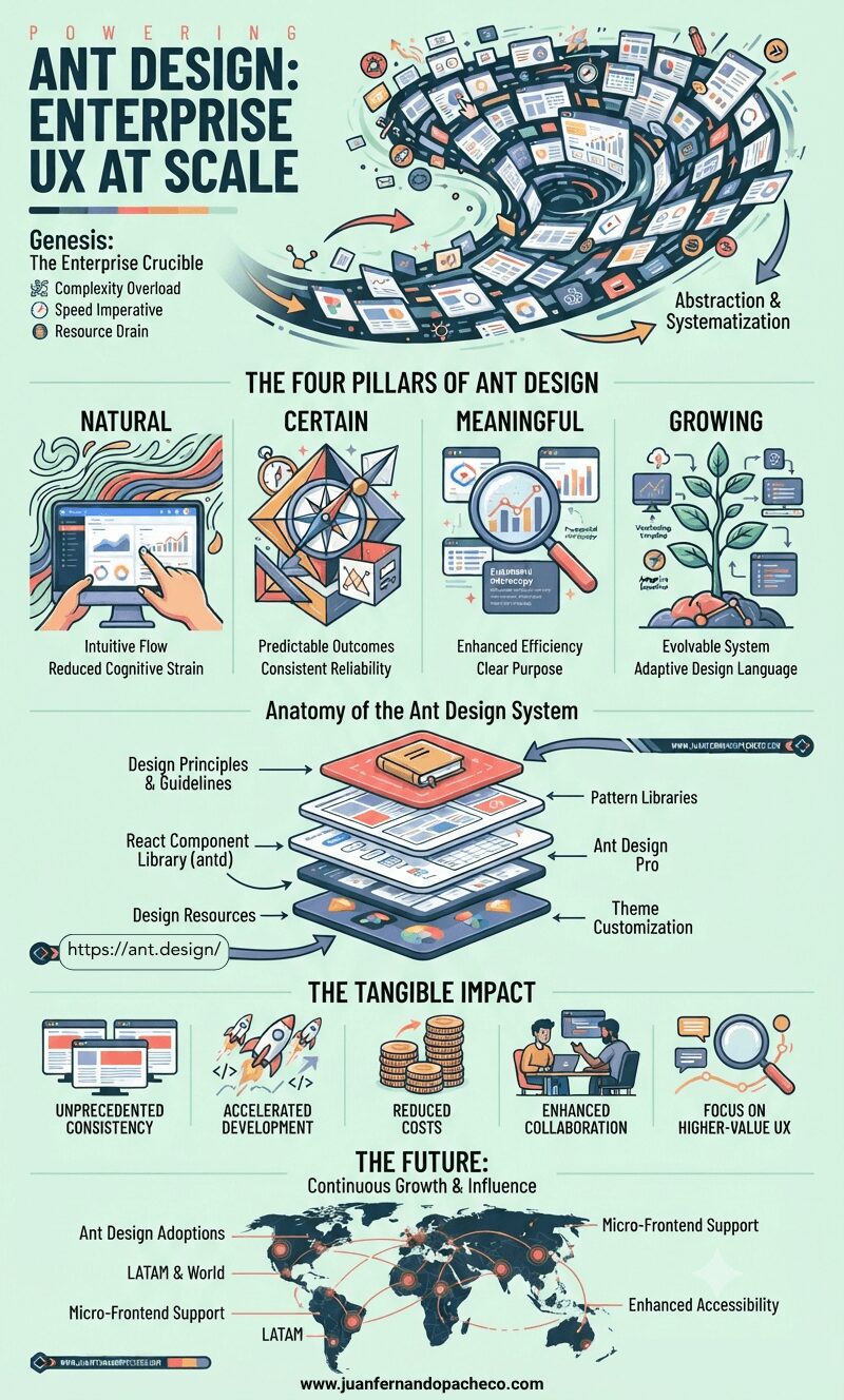
An infographic illustrating the Ant Design system, detailing its origins in the "enterprise crucible" of complexity, its four core values (Natural, Certain, Meaningful, Growing), the anatomy of its toolkit (React library, Ant Design Pro, design resources), tangible impacts like accelerated development and consistency, and its global future. The infographic includes references to www.juanfernandopacheco.com.

Ant Design is far more than a collection of React components. It represents a mature, battle-tested approach to taming the inherent complexity of enterprise software development.

By anchoring itself in strong design values – Natural, Certain, Meaningful, and Growing – it provides a holistic solution that boosts efficiency, enforces consistency, and elevates the user experience.
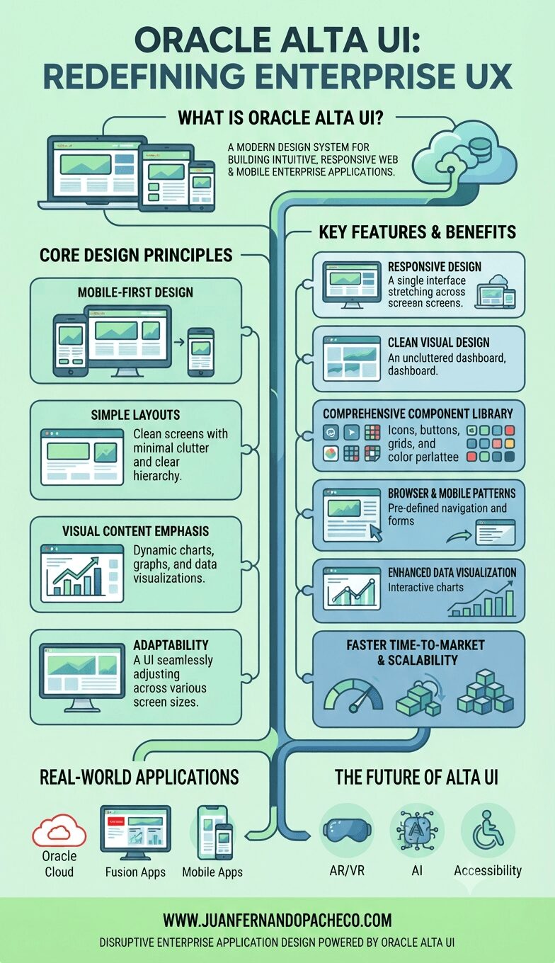
A comprehensive infographic titled "ORACLE ALTA UI: REDEFINING ENTERPRISE UX," set against a light mint green background, visually represents the design system. The central vertical flow connects sections detailing: "WHAT IS ORACLE ALTA UI?" with illustrations of desktop, tablet, and mobile screens; "CORE DESIGN PRINCIPLES" covering Mobile-First, Simple Layouts, Visual Content Emphasis, and Adaptability; and "KEY FEATURES & BENEFITS" including Responsive Design, Clean Visual Design, Component Library, Browser & Mobile Patterns, Enhanced Data Visualization, and Scalability. The infographic concludes with examples of "REAL-WORLD APPLICATIONS" (Oracle Cloud, Fusion Apps, Mobile Apps) and glimpses into "THE FUTURE OF ALTA UI" (AR/VR, AI, Accessibility). It features the URL WWW.JUANFERNANDOPACHECO.COM and the tagline "DISRUPTIVE ENTERPRISE APPLICATION DESIGN POWERED BY ORACLE ALTA UI."

Oracle Alta UI exemplifies how thoughtful design can transform enterprise software into intuitive tools that enhance productivity and user satisfaction. By prioritizing simplicity, responsiveness, and adaptability, it empowers developers to create applications that meet modern demands without sacrificing quality or efficiency.
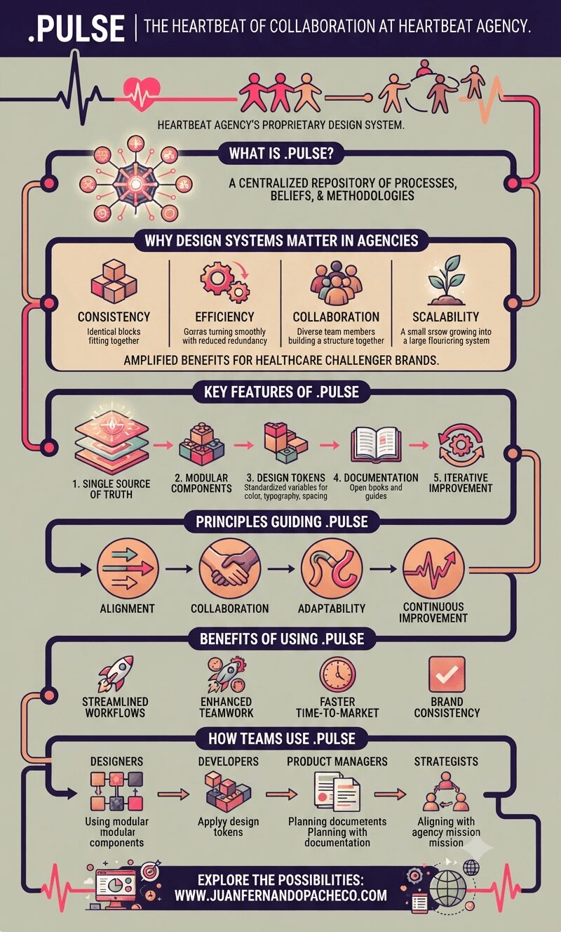
A vertical infographic titled ".PULSE | THE HEARTBEAT OF COLLABORATION AT HEARTBEAT AGENCY," using a color palette of purple, pink, peach, and terracotta on a light sage background. The infographic illustrates the design system's features, principles, and benefits across distinct sections, from a central "source of truth" to team workflows and real-world applications for healthcare brands.

.pulse exemplifies how a well-crafted design system can transform an organization’s workflows while fostering collaboration and innovation. For Heartbeat Agency—a pioneer in healthcare marketing—this centralized source of truth has become a cornerstone of its success.
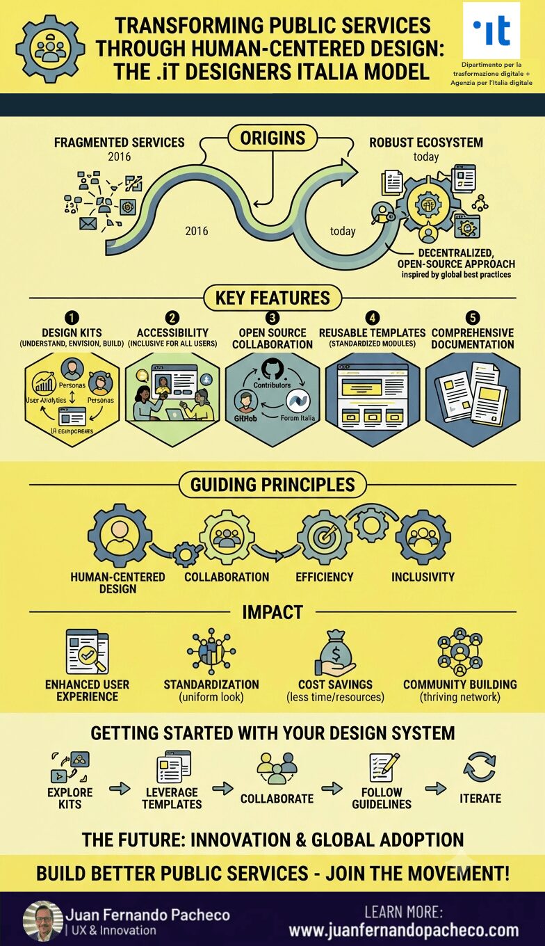
A comprehensive vertical infographic illustrating the .iT Designers Italia model for public administration. The graphic includes a timeline from 2016 (fragmented services) to today (robust ecosystem) with sections detailing Key Features, Guiding Principles, Impact, and a Getting Started guide, using a yellow, blue, and green color palette with icons and gear motifs.

Designers Italia exemplifies how thoughtful design can transform public administration into a more inclusive and efficient entity. By providing tools, guidelines, and a collaborative platform for designers and developers, it empowers agencies to deliver high-quality digital services that truly meet citizen needs.
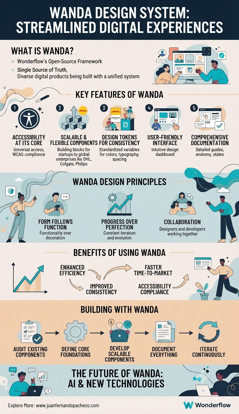
Infographic titled "Wanda Design System: Streamlined Digital Experiences," detailing its definition, key features (accessibility, scalability, tokens, user interface, documentation), guiding principles, benefits, step-by-step building process, and future outlook. It features illustrations of designers and developers collaborating and using digital tools across various sections.

The Wanda Design System is a game-changer for digital product development. By combining accessibility, scalability, and user-centric principles into one cohesive framework, it empowers organizations to create exceptional digital experiences efficiently and consistently.
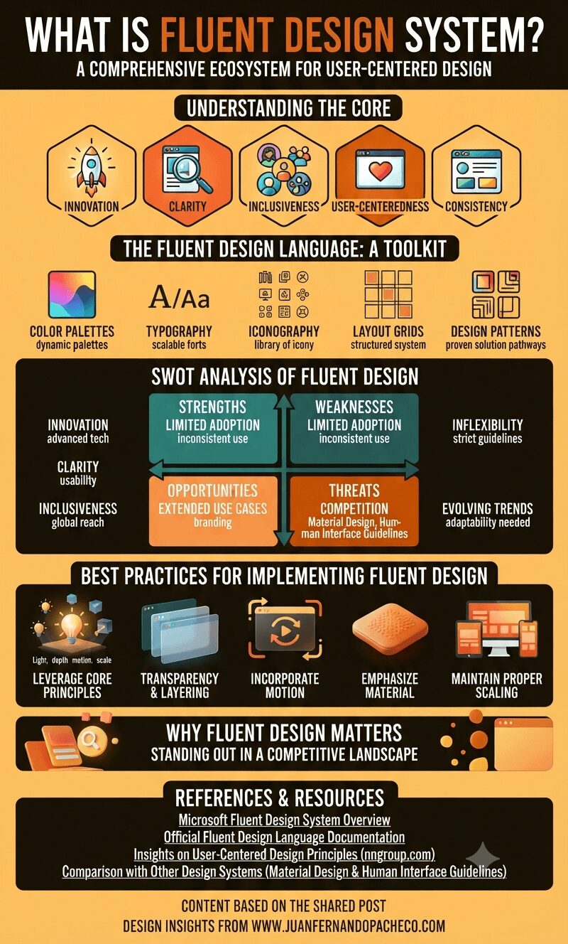
An infographic titled "What Is Fluent Design System?" featuring sections on its core principles, design toolkit, SWOT analysis, and best practices, all using a warm, orange-to-brown color palette.

Fluent Design is more than just a design system—it is a philosophy that prioritizes user satisfaction through innovation, inclusivity, and consistency. By creating interfaces that are both functional and aesthetically pleasing, Fluent Design helps Microsoft stand out in a competitive digital landscape.

An infographic titled "What is Ant Design?" presented in a warm, vintage-inspired color palette of creams and browns. The infographic uses a flow-chart and diagram style to explain the design system, starting with its origin from Ant Financial. It covers Key Principles, The Ant Design Language System, Best Practices, a SWOT Analysis with illustrated sections, Real-World Applications like Alipay and DingTalk, and concludes with links to learn more at juanfernandopacheco.com.

Ant Design, is a robust design system developed by Ant Financial, a subsidiary of the Alibaba Group. The design system has rapidly gained traction among designers and developers for its ability to simplify the design process while ensuring superior user experiences.

Infographic titled "WHAT IS IBM DESIGN LANGUAGE?" summarizing the design system's purpose, key components (system and principles), SWOT analysis, best practices, and conclusion.

IBM Design Language is more than just a design system; it’s a philosophy that embodies IBM’s commitment to user-centered, accessible, and inclusive design. By adhering to its principles, IBM delivers consistent and reliable experiences that resonate with its global audience. Whether you’re a designer, developer, or stakeholder, embracing IBM Design Language can transform the way you create and innovate.