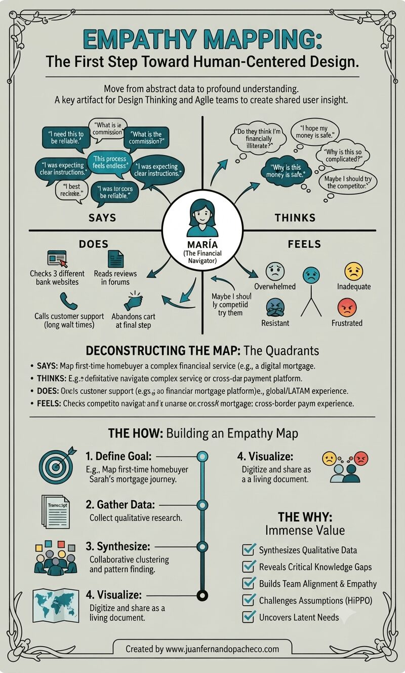
A vertically-oriented infographic titled "EMPATHY MAPPING: The First Step Toward Human-Centered Design," set against a light sage-green background with a decorative border. The center features a complete empathy map for a persona named "MARÍA (The Financial Navigator)," with radiating arrows connecting her icon to four detailed quadrants: "SAYS" (with quotes like "I need this to be reliable," "What is the commission?"), "THINKS" (internal thoughts like "Do they think I'm financially illiterate?"), "DOES" (actions like "Checks 3 different bank websites"), and "FEELS" (emotions with emojis like "Overwhelmed," "Inadequate"). Below the map, sections deconstruct the quadrants and outline "THE HOW: Building an Empathy Map" (Define, Gather, Synthesize, Visualize steps) and "THE WHY: Immense Value" (a checklist of benefits). The bottom includes the attribution: "Created by www.juanfernandopacheco.com."

An empathy map is more than just a diagram on a wall. It is a practice, a mindset, and a commitment to seeing the world through someone else’s eyes. It transforms the abstract “user” into a human with hopes, frustrations, and a complex inner world.

By systematically capturing what our users Say, Think, Do, and Feel, we move beyond building mere features.
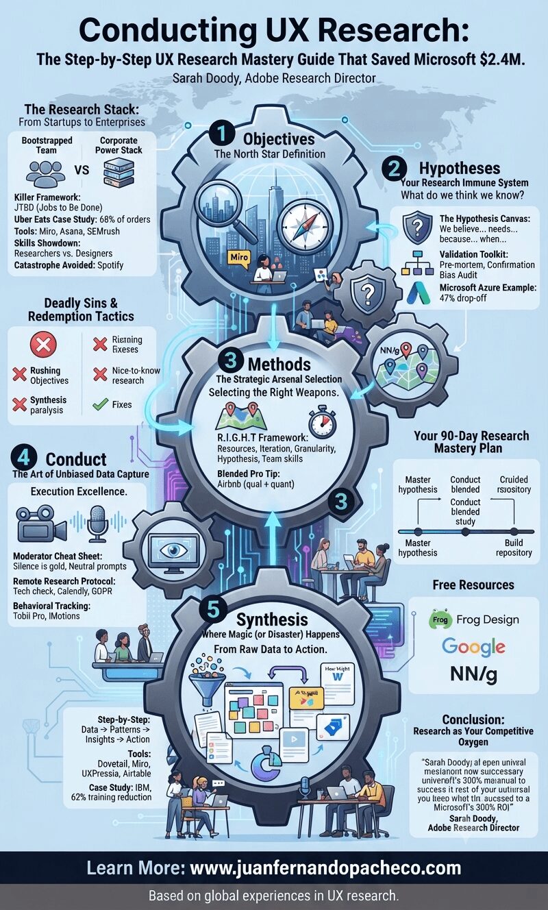
An intricate infographic with a blue and grey color scheme illustrating a five-step UX research process as a interconnected series of cogs. The title is "Conducting UX Research: The Step-by-Step UX Research Mastery Guide That Saved Microsoft $2.4M." Each cog represents a phase: 1. Objectives, 2. Hypotheses, 3. Methods, 4. Conduct, and 5. Synthesis. Detailed text within and around the cogs breaks down key frameworks (JTBD, R.I.G.H.T.), tools (Miro, Asana, Dovetail, etc.), case studies (Uber Eats, Spotify, Microsoft Azure, IBM), and skills. Additional sections include "The Research Stack," "Deadly Sins & Redemption Tactics," "Your 90-Day Research Mastery Plan," and "Free Resources." The footer displays "Learn More: www.juanfernandopacheco.com" and "Based on global experiences in UX research."

As a UX research lead, I’ve witnessed teams waste millions by skipping Step 2 (hypotheses). The Frog Design framework in your image isn’t academic theory—it’s a battle-tested survival blueprint. Let me walk you through each phase with real-world tactics you can implement tomorrow.

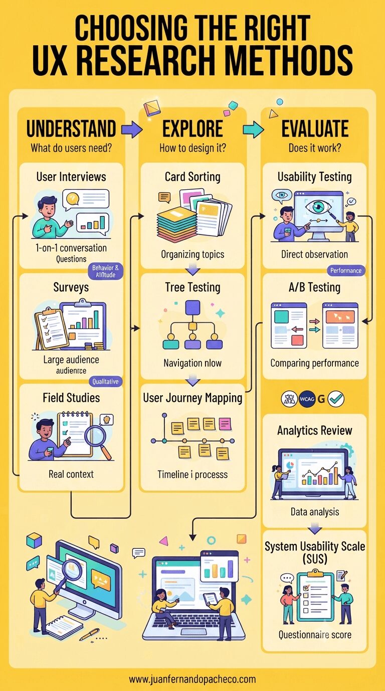
An infographic illustrating UX research methods, phases (Understand, Explore, Evaluate), and core dimensions, featuring a vibrant #ffca3a background and references to www.juanfernandopacheco.com.

I’ve learned this brutal truth: Choosing the wrong research methods costs companies $2.4M per project (IBM Research).

That landscape graphic you’re seeing? It’s not just a pretty chart—it’s your battle map for navigating the minefield of user insights. Let’s decode it together.

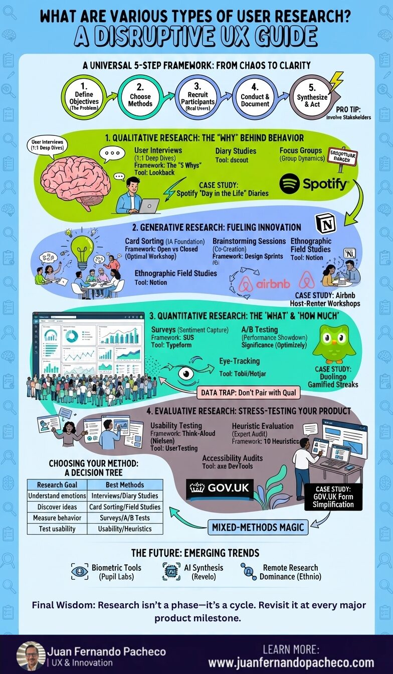
A comprehensive, vertical infographic titled "UX Research Methods" detailing qualitative and quantitative methods, categorized by behavioral ("what people do") and attitudinal ("what people say"). The design uses a green, blue, and yellow color palette and features a central matrix connected to detailed panels for each method, including Usability Testing, A/B Testing, Interviews, and Analytics, concluding with case studies from Spotify, Amazon, and Google, and a reference to juanfernandopacheco.com.

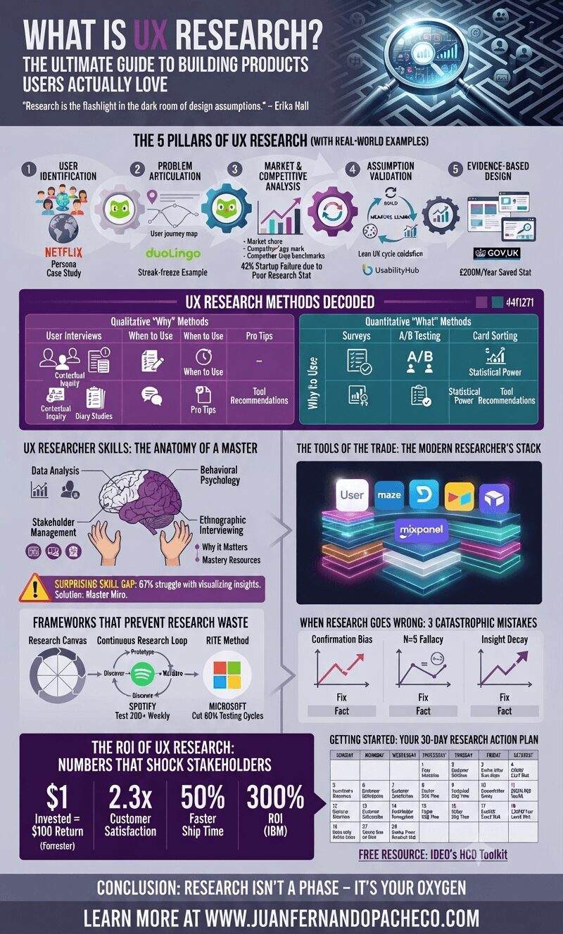
UX research is not a one-size-fits-all process. By blending behavioral and attitudinal methods, designers can create holistic, user-driven solutions. Start small—try a five-second test or a quick survey—and scale as you gain confidence. Remember, the best designs are rooted in empathy and evidence.