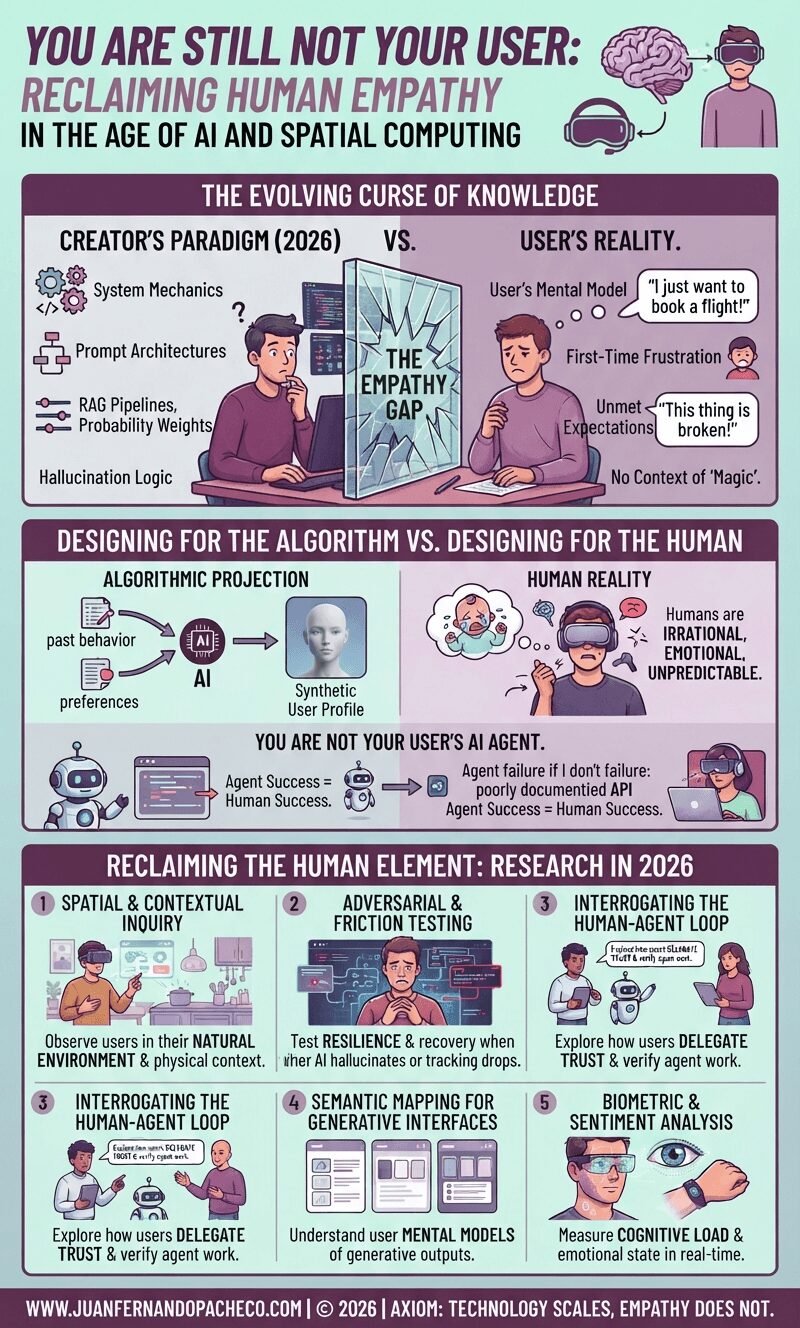
A vertical infographic titled "You Are Still Not Your User" against a light teal background, illustrating the growing gap between product creators and users in the age of AI and spatial computing. It is divided into sections showing the "Evolving Curse of Knowledge," the trap of "Synthetic Empathy," and a "2026 Research Toolkit" for reclaiming human understanding.

Fifteen years after the classic UX axiom was coined, the tools of our trade have evolved from static screens to generative interfaces and spatial computing. Yet, the fundamental rule remains: you are not your user. In 2026, as we navigate the complexities of AI agents and synthetic data, remembering this has never been more critical—or more challenging

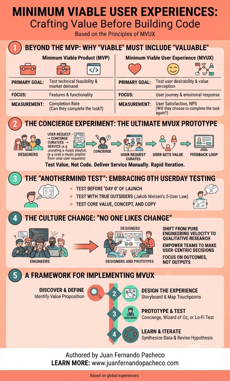
An infographic titled "MINIMUM VIABLE USER EXPERIENCES: Crafting Value Before Building Code," authored by Juan Fernando Pacheco. It presents a five-part framework for transitioning from MVP to MVUX. Section 1 compares MVP (focusing on features and technical feasibility) with MVUX (focusing on user journey and emotional response). Section 2 illustrates the "Concierge Experiment," showing a process of manual service delivery to test value before building code. Section 3 describes the "Anothermind Test" for 0th userday testing with outsiders. Section 4 explains the necessary "Culture Change," shifting from engineering velocity to user outcomes. Section 5 provides a four-step implementation framework: Discover, Design, Prototype, and Learn. The image uses a clean, professional design with icons and flowcharts.

After 20 years in this field, all you need to know is this:

The winning product is rarely the one with the most features.

It is almost always the one with the most thoughtful, frictionless, and valuable experience. The MVUX is your strategy to find that experience efficiently and effectively.

It’s a commitment to being human-centered from the very first sketch. It’s about being a concierge for your users, understanding their needs so deeply that the product you eventually build feels like it was made for them, and them alone. Because it was.
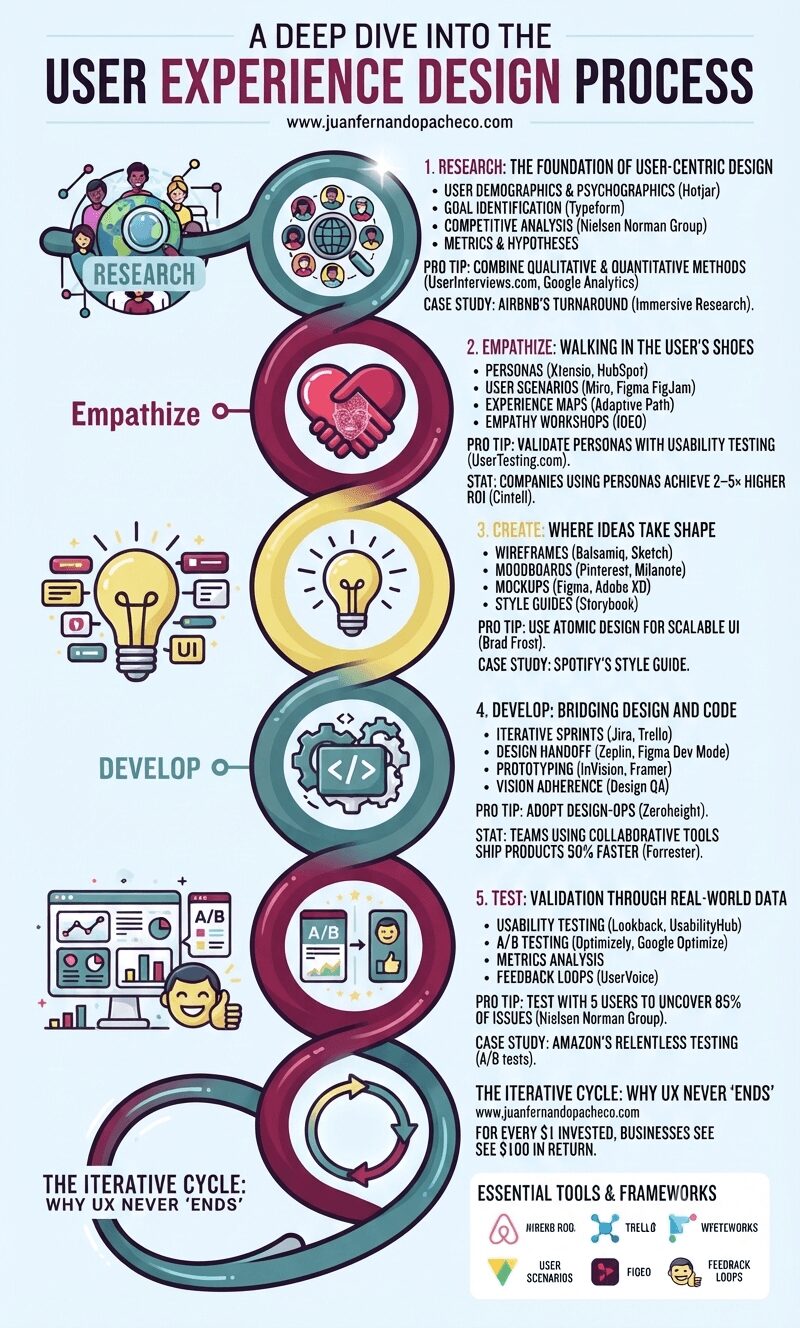
An infographic titled "A Deep Dive into the User Experience Design Process," presented as a stylized, continuous helix structure with five distinct, glowing nodes against a light blue background. From top to bottom, the nodes are: Research (#558c8c teal): Icons of users and a magnifying glass. Text includes "1. RESEARCH: THE FOUNDATION OF USER-CENTRIC DESIGN" and mentions Hotjar, Typeform, competitive analysis, and success metrics. Pro tip: "COMBINE QUALITATIVE & QUANTITATIVE METHODS (UserInterviews.com)." Empathize (#82204a magenta): Icons of two hands forming a heart with a wireframe face. Text includes "2. EMPATHIZE: WALKING IN THE USER’S SHOES" and mentions personas, user scenarios, experience maps (Adaptive Path), and empathy workshops (IDEO). Pro tip: "VALIDATE PERSONAS." Create (#e8db7d yellow): An icon of a glowing lightbulb with UI elements. Text includes "3. CREATE: WHERE IDEAS TAKE SHAPE" and mentions wireframes (Balsamiq), moodboards, mockups (Figma), and style guides (Storybook). Pro tip: "USE ATOMIC DESIGN (Brad Frost)." Develop (#558c8c teal): Icons of cogs and code brackets. Text includes "4. DEVELOP: BRIDGING DESIGN AND CODE" and mentions iterative sprints (Jira), design handoffs (Zeplin), prototyping, and design QA. Pro tip: "ADOPT DESIGN-OPS." Test (#82204a magenta): Icons of data charts, A/B testing, and a happy user. Text includes "5. TEST: VALIDATION THROUGH REAL-WORLD DATA" and mentions usability testing (Lookback), A/B testing (Optimizely), metrics analysis, and feedback loops. Pro tip: "TEST WITH 5 USERS (Nielsen Norman Group)." The helix loops back at the bottom to a final section: "THE ITERATIVE CYCLE: WHY UX NEVER ‘ENDS’" with an arrow circle, the ROI statistic (Forrester), and a list of "ESSENTIAL TOOLS & FRAMEWORKS" (Hotjar, SurveyMonkey, Google Analytics, Miro, UserTesting.com, Xtensio, Figma, Sketch, Adobe XD, Storybook, Zeplin, Jira, Framer, UsabilityHub, Optimizely, FullStory, HEART, Double Diamond, JTBD). The URL www.juanfernandopacheco.com is visible at the top and bottom.

Neglecting UX risks obsolescence. Brands like Apple and Tesla dominate by embedding user-centricity in their DNA. Start small: interview 5 users today. Map one customer journey. Test one button. The process compounds—each iteration deepens empathy, refines solutions, and ultimately, builds products humans love.
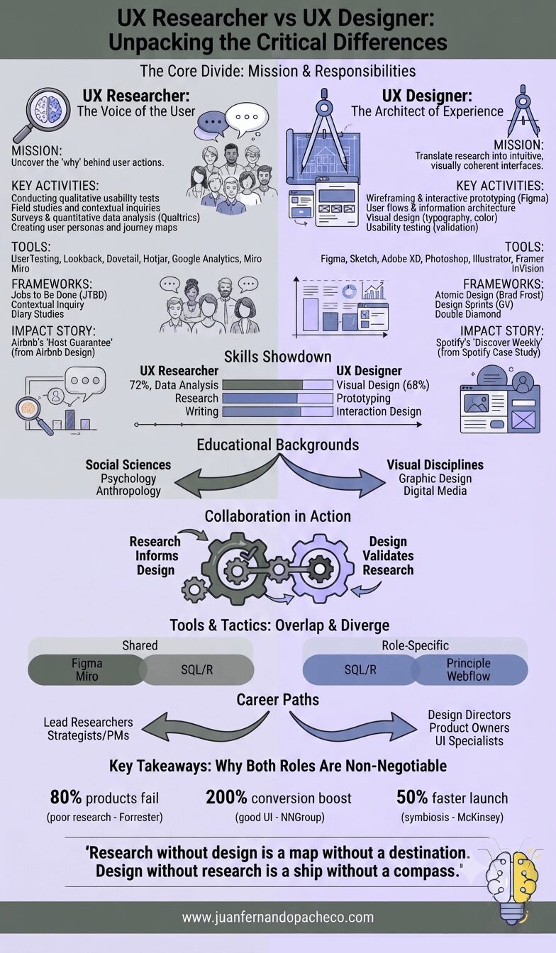
An infographic comparing UX Researchers and UX Designers, detailing their missions, key activities, tools, frameworks, skills showdown, educational backgrounds, collaboration, and career paths, styled in soft purple tones with references to www.juanfernandopacheco.com.

UX Researchers and Designers aren’t rivals—they’re co-pilots navigating the same destination: user delight. Researchers illuminate the path with data; designers pave it with ingenuity. In an era where user expectations skyrocket daily, investing in both isn’t optional—it’s existential.

“Research without design is a map without a destination. Design without research is a ship without a compass.”
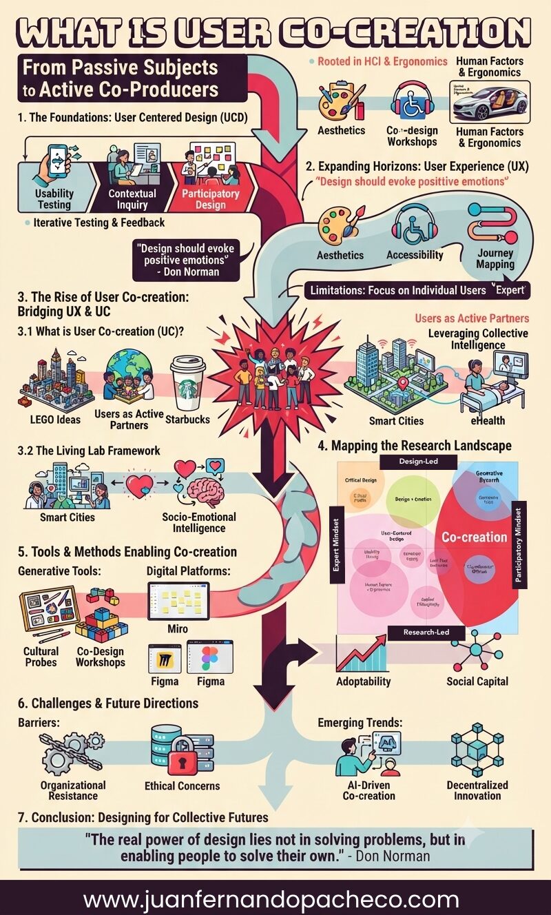
An intricate infographic titled "What is User Co-creation: From Passive Subjects to Active Co-Producers," illustrating the historical evolution of design methodologies from User Centered Design (UCD) to User Experience (UX) and finally to User Co-creation (UC). The graphic uses a vibrant color palette and segmented arrows to flow through seven key sections, detailing principles, tools (e.g., LEGO Ideas, Starbucks, Miro, Figma), frameworks (Living Labs, Sanders & Stappers' Research Map), metrics (Social Capital), challenges, and future trends (AI-Driven, Decentralized Innovation). It includes a concluding quote from Don Norman and branding for www.juanfernandopacheco.com.

The shift from User Centred Design (UCD) to User Co-creation (UC) marks a democratization of innovation. By embracing Living Labs and participatory frameworks, designers can harness the collective genius of users. As Don Norman aptly stated:

“The real power of design lies not in solving problems, but in enabling people to solve their own.”
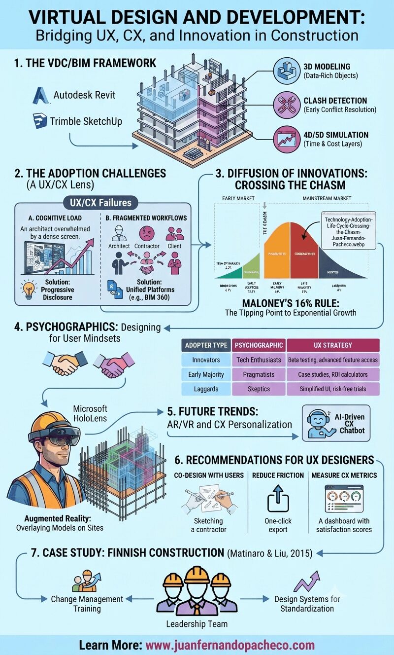
A comprehensive infographic titled 'VIRTUAL DESIGN AND DEVELOPMENT: Bridging UX, CX, and Innovation in Construction' that uses charts, diagrams, and illustrations to explain the role of User Experience (UX) and Customer Experience (CX) in the adoption of Virtual Design and Construction (VDC) and Building Information Modeling (BIM). The vertical graphic is structured in seven numbered sections: 1. The VDC/BIM Framework, 2. The Adoption Challenges (A UX/CX Lens), 3. Diffusion of Innovations: Crossing the Chasm, 4. Psychographics: Designing for User Mindsets, 5. Future Trends: AR/VR and CX Personalization, 6. Recommendations for UX Designers, and 7. Case Study: Finnish Construction (Matinaro & Liu, 2015). The infographic includes specific data from image_0.png, logos for software like Autodesk Revit and BIM 360, and concludes with a call to action to learn more at www.juanfernandopacheco.com.

VDC/BIM’s potential is undeniable, but its success hinges on human-centered design. By applying UX/CX principles—from progressive disclosure to psychographic segmentation—we can accelerate innovation diffusion and transform the construction industry.
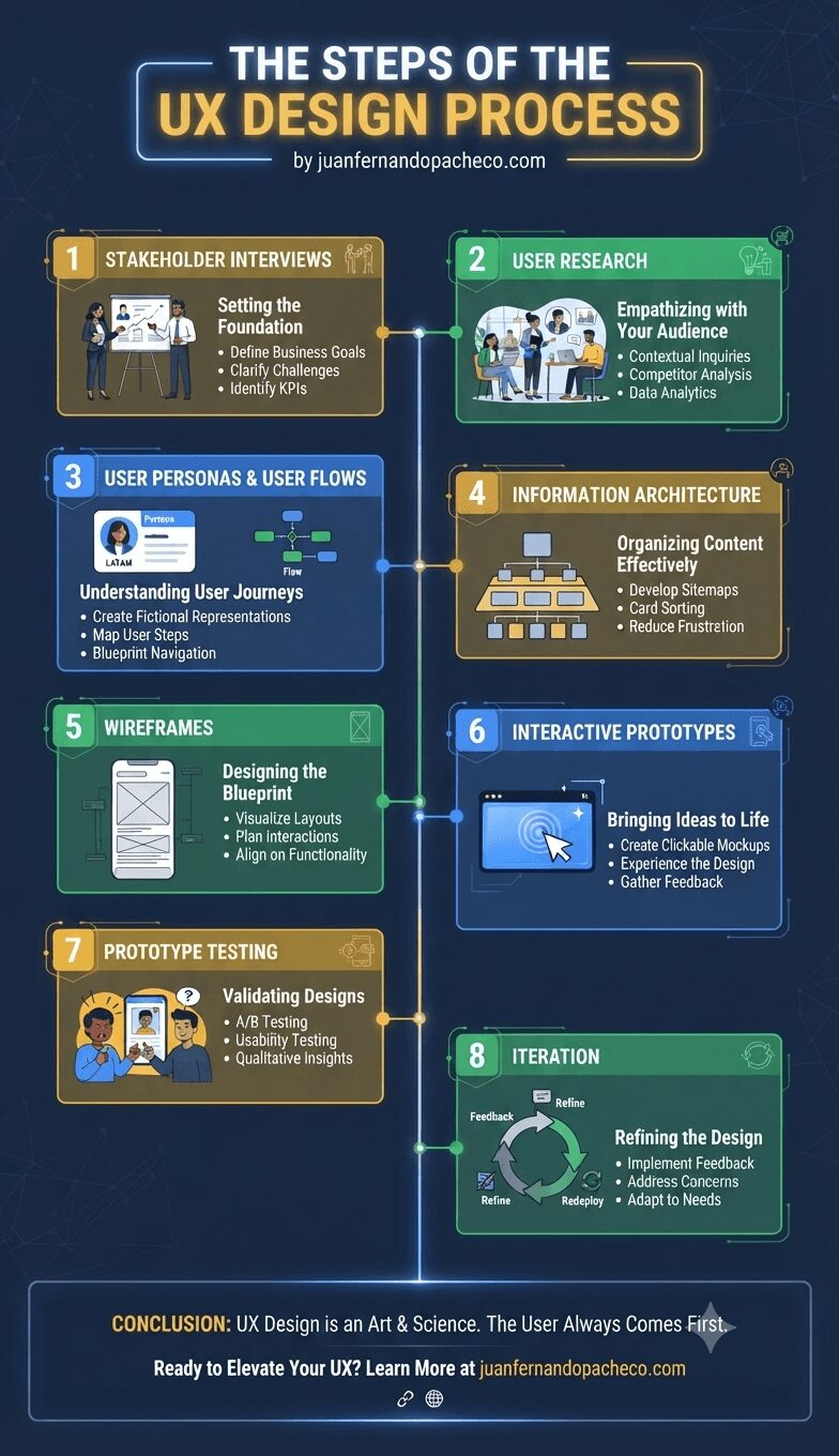
Infographic titled "The Steps of the UX Design Process by juanfernandopacheco.com" presented in a vertical, connected layout against a dark blue background. Eight numbered steps are detailed sequentially: 1. Stakeholder Interviews, 2. User Research, 3. User Personas & User Flows, 4. Information Architecture, 5. Wireframes, 6. Interactive Prototypes, 7. Prototype Testing, and 8. Iteration. Each step features a descriptive icon or illustration, a subtitle explaining the goal, and three specific bullet points outlining the activity. The infographic concludes with a summary banner emphasizing user-centered design and a call to action for the provided website.

The UX design process is both an art and a science. By following these steps, you’ll create products that resonate with users and achieve business goals. Whether you’re designing a simple app or a complex enterprise platform, remember: the user always comes first.
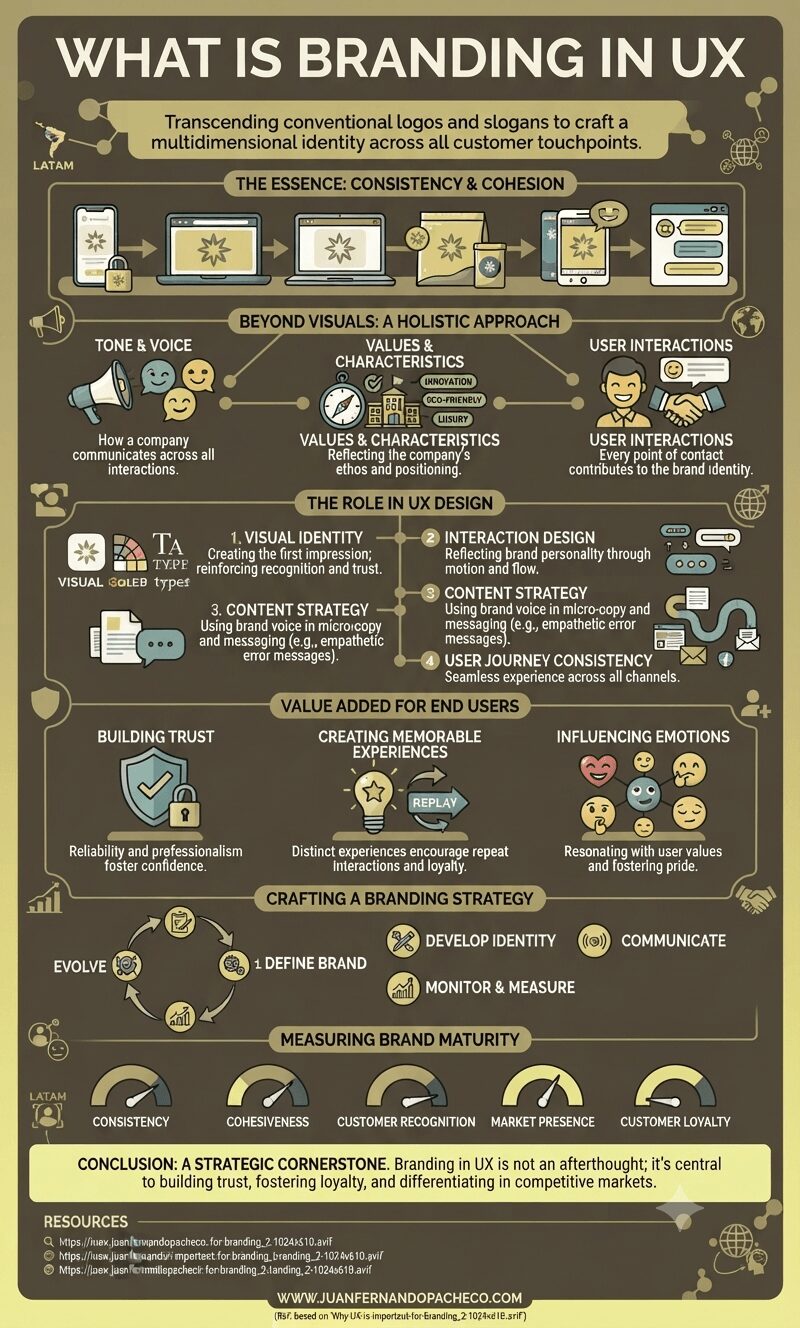
An expansive, dark-teal infographic titled "WHAT IS BRANDING IN UX" with a creative, illustrative layout. The design uses a color palette of olive, gold, and light yellow, featuring a central path and interconnected sections. Key areas include "THE ESSENCE: CONSISTENCY & COHESION" (with icons of devices and packaging), "BEYOND VISUALS: A HOLISTIC APPROACH" (tone, values, interactions), "THE ROLE IN UX DESIGN" (visuals, interaction, content, journey), "VALUE ADDED FOR END USERS" (trust, experiences, emotions), "CRAFTING A BRANDING STRATEGY" (a five-step circular flow), and "MEASURING BRAND MATURITY" (a series of gauges). The infographic includes the LATAM geo identifier, illustrative icons, and website reference: WWW.JUANFERNANDOPACHECO.COM.

Branding from a UX perspective is a strategic endeavor that goes beyond visuals. It’s about creating a consistent, cohesive, and memorable experience that resonates with users at every touchpoint. By integrating branding into UX design, companies can build trust, foster loyalty, and differentiate themselves in competitive markets.

An infographic titled "What is Information Architecture?" with illustrations of a digital cityscape and pathways. It details the definition, process, goals, principles, common mistakes, benefits, and importance of Information Architecture, ending with the URL www.juanfernandopacheco.com

Information Architecture is much more than a technical discipline; it’s a thoughtful approach to creating digital environments that serve both users and organizations. By adhering to its principles, avoiding common mistakes, and continually evolving, designers and businesses can craft experiences that truly resonate.