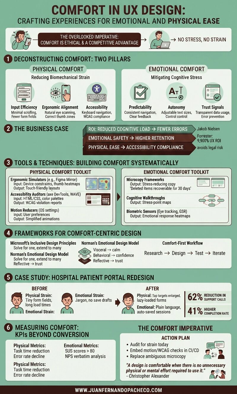
A detailed infographic titled "Comfort in UX Design" with a green background, broken into six main sections: Deconstructing Comfort, The Business Case, Tools & Techniques, Frameworks, a Case Study, and Measuring Comfort. It uses icons, charts, and text to explain how to design for physical and emotional ease, citing principles from Nielsen, Forrester, Microsoft, and Don Norman.

Comfort in UX design—defined as creating experiences with no stress, no strain—isn’t a luxury; it’s an ethical imperative and competitive advantage. Yet, it remains chronically undervalued.

As both a UX designer and solutions architect, I’ve seen how discomfort manifests: from RSI-inducing enterprise tools to anxiety-triggering checkout flows.