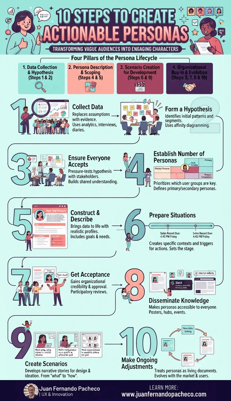
An infographic titled "10 Steps to Create Actionable Personas," laid out in a winding, numbered path from 1 to 10 against a light teal background. It illustrates the four pillars of the persona lifecycle: Data Collection & Hypothesis (1-2), Persona Description & Scoping (4-5), Scenario Creation for Development (6 & 9), and Organizational Buy-in & Evolution (3, 7, 8 & 10). Each step features icons, brief descriptions of goals and methods, and illustrations of diverse teams collaborating on research, workshops, and digital tools.

Creating engaging personas is not a one-week exercise to be filed away and forgotten. It is a strategic commitment to human-centered design. This 10-step process provides a robust framework, but its success hinges on a cultural shift within your organization—a shift from building for “the user” to designing for “Maria,” “John,” and “Akira.”

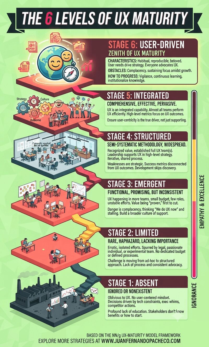
An infographic visualizes a six-stage staircase ascending from "Ignorance" to "Empathy & Excellence." Each level, from Stage 1: Absent to Stage 6: User-Driven, is detailed with an isometric illustration of an office environment, key characteristics, obstacles, and progress steps. The overall theme uses a bright, modern color palette of teals, yellows, and maroons against a lime-green background.

Understanding your organization’s UX maturity is not an exercise in vanity. It is a vital diagnostic tool that allows you to identify strengths to celebrate and weaknesses to address. It provides a realistic, shared language for improvement.

The path forward is incremental. You cannot leapfrog stages. The practices and cultural shifts of each stage create the necessary foundation for the next. Progressing even one stage can take years of dedicated effort. Don’t be discouraged. Start with an honest assessment, build a coalition of champions, celebrate small victories, and always, always tie your work back to both user value and business impact.
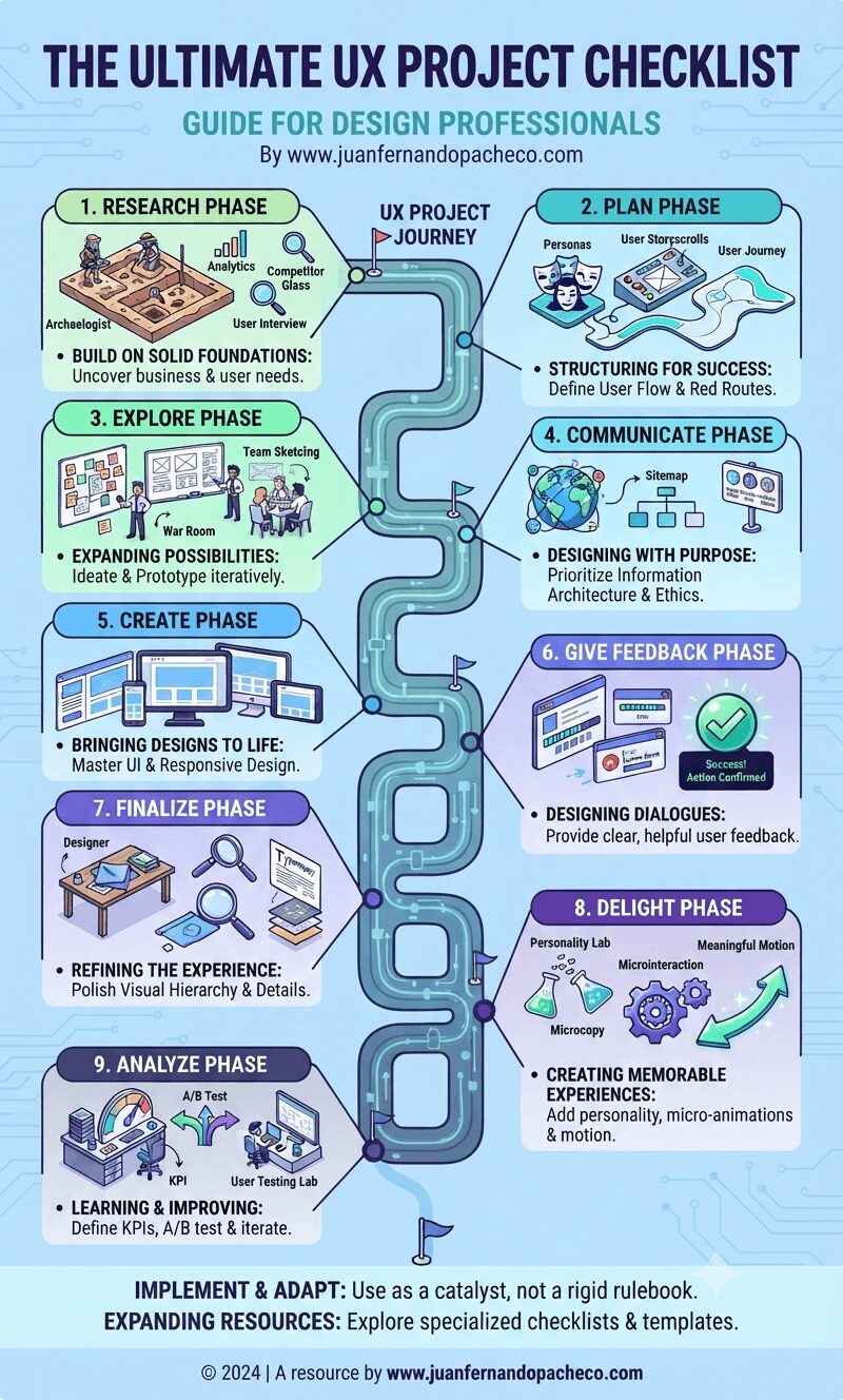
An infographic titled "The Ultimate UX Project Checklist" featuring a winding central milestone path connecting nine distinct UX phases—Research, Plan, Explore, Communicate, Create, Give Feedback, Finalize, Delight, and Analyze—against a light blue background, with brand reference www.juanfernandopacheco.com.

The UX Project Checklist represents more than just a list of tasks—it embodies a comprehensive approach to designing exceptional user experiences. As the field continues to evolve with new technologies, interaction patterns, and user expectations, this checklist should serve as a foundation rather than a final word.
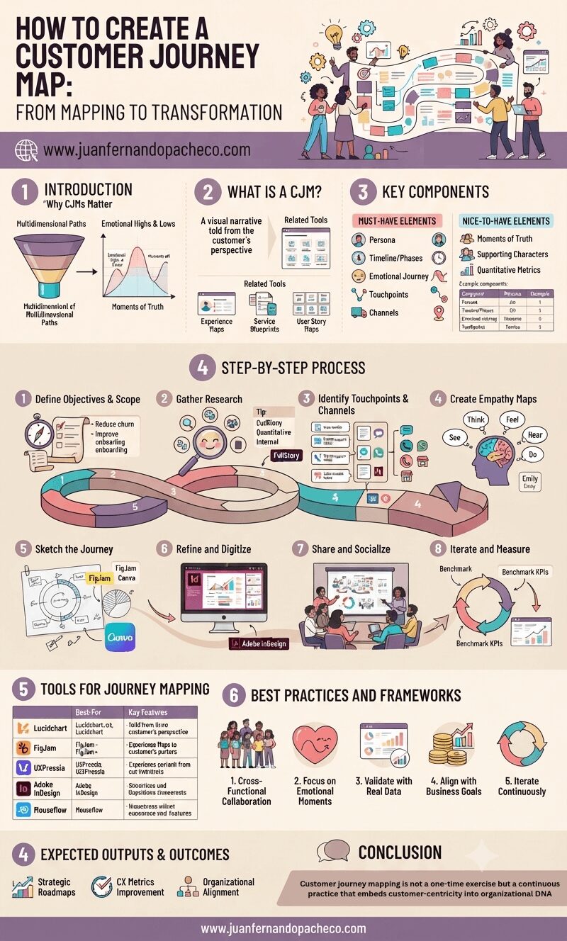
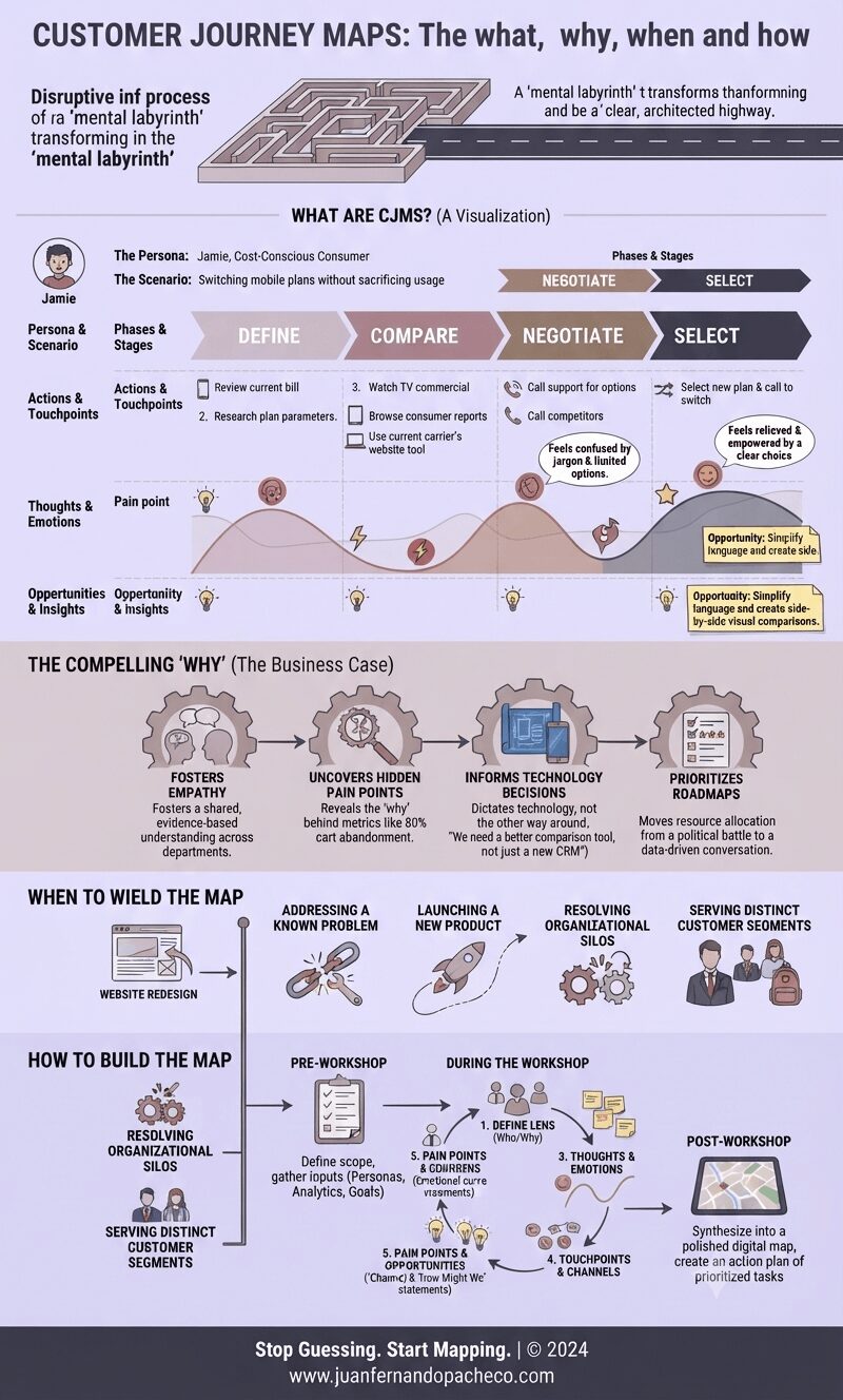
An intricate, vertically-oriented infographic detailing the eight-step process of creating a Customer Journey Map (CJM). The image includes sections on "Why CJMs Matter," "What Is a CJM," "Key Components," "Tools for Journey Mapping," and "Best Practices," using a color palette of lavenders, rose, and beige. It features illustrations of diverse CX teams, charts, a helical journey timeline, and the website www.juanfernandopacheco.com.

Customer journey mapping is not a one-time exercise but a continuous practice that embeds customer-centricity into organizational DNA.

By visualizing the intersection of human emotions and business processes, UX professionals can drive transformative change—turning fragmented interactions into cohesive, respectful experiences that build long-term loyalty.

As CX expectations escalate, the brands that thrive will be those who listen, adapt, and design journeys that resonate deeply with the people they serve.
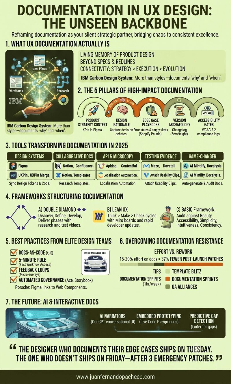
An infographic titled "Documentation in UX Design: The Unseen Backbone" is presented in a vertical format against a light-yellow background. It is structured into seven numbered sections that detail the components, pillars, tools, frameworks, best practices, overcoming resistance, and future of UX documentation, using a color palette of greens, orange, and white.

Treating documentation as a “task” misses its power. It’s the continuous act of design reasoning made visible. As Apple’s Human Interface Guidelines reveal, legendary products emerge when principles are documented, not memorized.

“The designer who documents their edge cases ships on Tuesday. The one who doesn’t ships on Friday—after 3 emergency patches.”

Start small: Document one decision today. Link a research insight to a button component. Your future self—and team—will thank you.
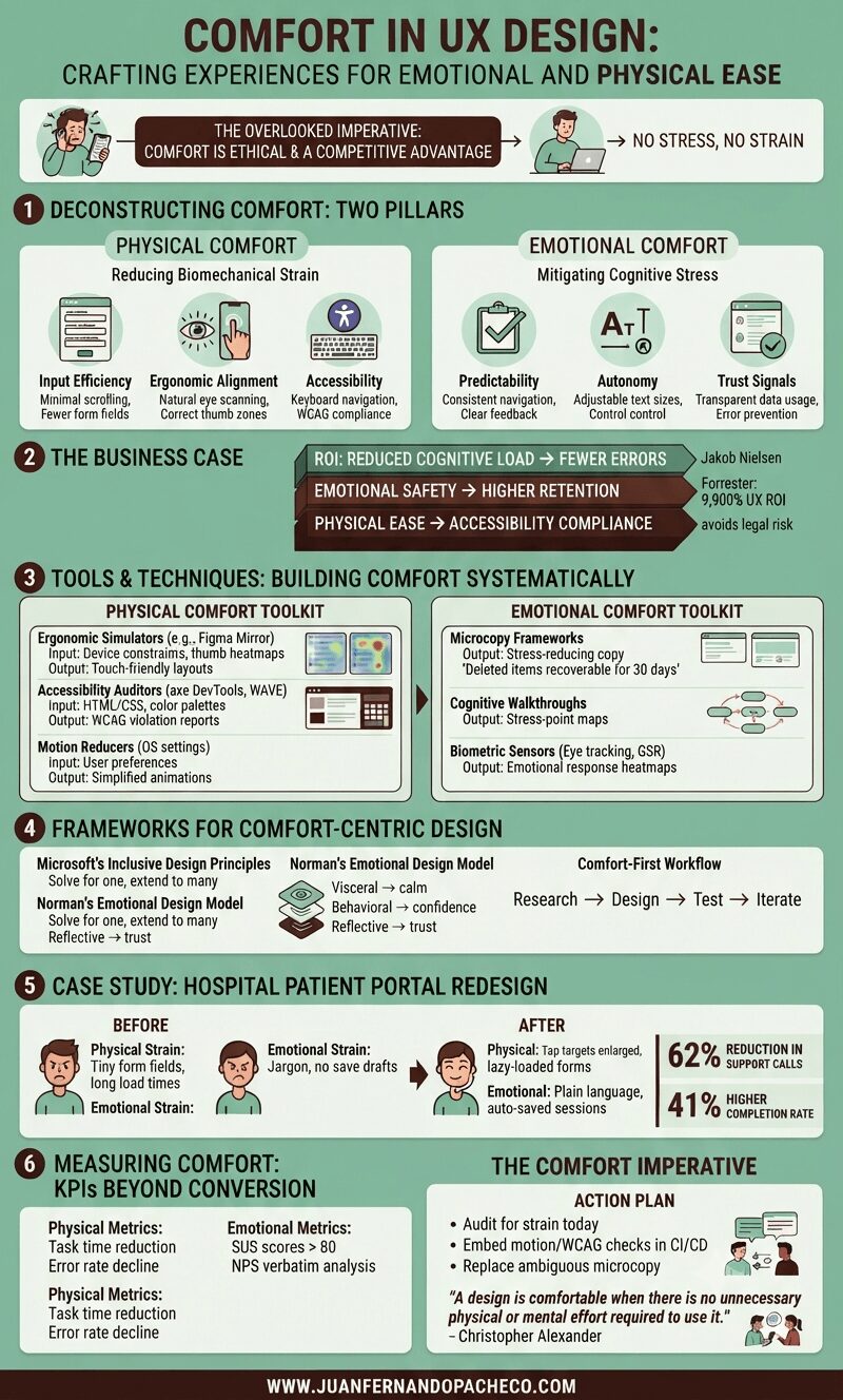
A detailed infographic titled "Comfort in UX Design" with a green background, broken into six main sections: Deconstructing Comfort, The Business Case, Tools & Techniques, Frameworks, a Case Study, and Measuring Comfort. It uses icons, charts, and text to explain how to design for physical and emotional ease, citing principles from Nielsen, Forrester, Microsoft, and Don Norman.

Comfort in UX design—defined as creating experiences with no stress, no strain—isn’t a luxury; it’s an ethical imperative and competitive advantage. Yet, it remains chronically undervalued.

As both a UX designer and solutions architect, I’ve seen how discomfort manifests: from RSI-inducing enterprise tools to anxiety-triggering checkout flows.
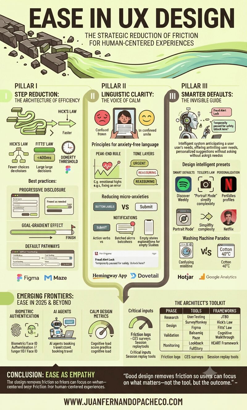
An infographic titled "EASE IN UX DESIGN" with the subtitle "THE STRATEGIC REDUCTION OF FRICTION FOR HUMAN-CENTERED EXPERIENCES." The visual is split into three main columns representing pillars: I. Step Reduction, II. Linguistic Clarity, and III. Smarter Defaults, with a final section on "Emerging Frontiers." It features charts, illustrations of digital interfaces, and icons explaining UX laws (Hick's, Fitts', Doherty), best practices (Progressive Disclosure, Goal-Gradient), and tools (Figma, Maze, Hemingway App). The overall aesthetic uses greens, browns, and yellows, incorporating illustrative elements like a broken path becoming a smooth river. The footer prominently displays "WWW.JUANFERNANDOPACHECO.COM".

Ease isn’t about oversimplification—it’s about precision.

It’s the art of removing cognitive weight, interaction barriers, and emotional friction so users achieve goals with clarity and confidence. As Jakob Nielsen aptly noted,

“Users spend most of their time on other sites”

Meaning they bring expectations shaped by seamless experiences elsewhere. Fail to match that fluency, and abandonment follows.
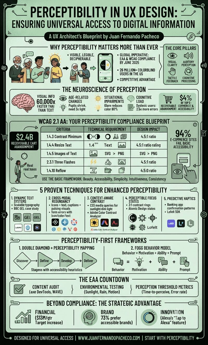
A comprehensive infographic titled "Perceptibility in UX Design: Ensuring Universal Access to Digital Information" presented in a vertical, segmented layout using a sage green and dark teal color palette. It covers sections on why perceptibility matters, neuroscience, WCAG 2.1 AA compliance, five design techniques, frameworks, the EAA countdown, and strategic advantages, ending with the URL www.juanfernandopacheco.com.

Perceptibility ensures critical information is visible, legible, and decipherable regardless of users’ sensory abilities, temporary limitations, or environmental contexts.

With the European Accessibility Act (EAA) mandating WCAG 2.1 AA compliance by June 2025, and 26 million+ colorblind Americans struggling with poorly designed interfaces, mastering perceptibility is now both a legal imperative and competitive advantage.
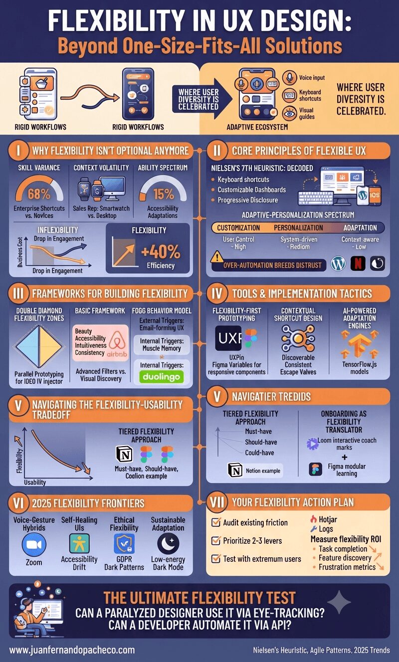
An infographic titled "FLEXIBILITY IN UX DESIGN: Beyond One-Size-Fits-All Solutions" structured into seven sections detailing the necessity, principles, frameworks, tools, and frontiers of adaptive user experience design.

Imagine two culinary apps: one forces rigid workflows with fixed ingredient entry paths; the other adapts—voice input for hurried cooks, keyboard shortcuts for pros, and visual guides for novices.

The latter exemplifies strategic flexibility, where user diversity isn’t accommodated—it’s celebrated. As interfaces evolve beyond screens into voice, gesture, and AI-driven ecosystems, flexibility transitions from “nice-to-have” to core resilience strategy.

A comprehensive vertical infographic titled "Equity in UX Design," with a background in a light cream color (#f7f9f9) and accented with teal, beige, terra cotta, and dark brown. The graphic is structured into six main sections detailing the shift from equality to equity, core principles, a three-stage framework, best practices, pitfalls, and future trends. It includes comparative tables, illustrative diagrams, and specific examples like the Detroit Water Project and Xbox Adaptive Controller. The footer includes the URL www.juanfernandopacheco.com.

For decades, UX design focused primarily on usability and accessibility—creating products that functioned efficiently for the “average” user. Today, we recognize that this approach perpetuates exclusion.

Equity in UX design demands that we create experiences that actively address systemic barriers, ensuring all users—especially those from historically marginalized groups—can thrive in digital spaces.

As a veteran UX designer and architect, I’ve witnessed how equity transforms not only products but societal narratives.

An infographic titled "Tolerance in UX Design" is organized into six sections detailing the inevitability of user error, business and ethical costs, error taxonomy, the prevention-recovery-resilience framework, relevant tool ecosystems, and future technologies. It features illustrations of common user mistakes, statistical graphs, comparison tables, and actionable takeaways, all set against a color palette of dark purples, magentas, and soft peaches, referencing www.juanfernandopacheco.com.

In 2025, digital experiences aren’t judged by their peak performance—but by their failure resilience. The most advanced AI, the sleekest animations, the most elegant workflows mean nothing if they collapse at the first human stumble.