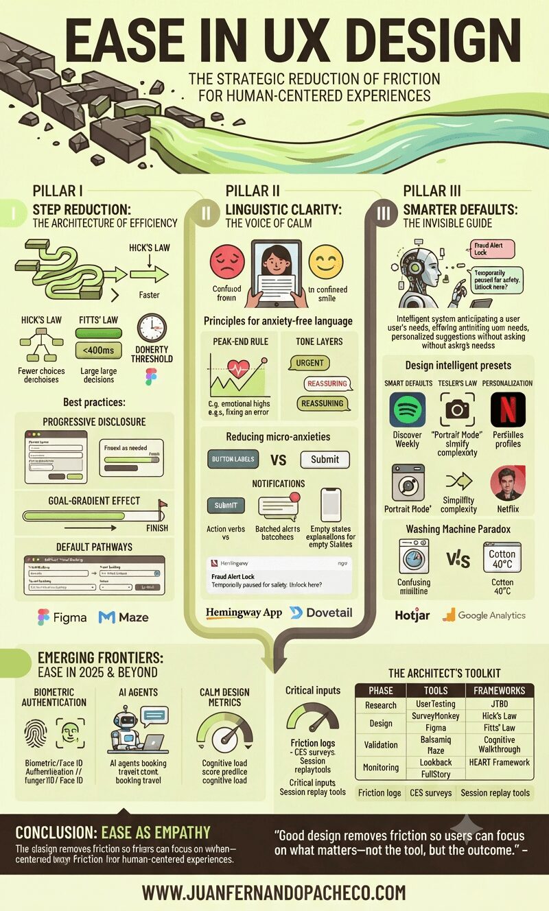
An infographic titled "EASE IN UX DESIGN" with the subtitle "THE STRATEGIC REDUCTION OF FRICTION FOR HUMAN-CENTERED EXPERIENCES." The visual is split into three main columns representing pillars: I. Step Reduction, II. Linguistic Clarity, and III. Smarter Defaults, with a final section on "Emerging Frontiers." It features charts, illustrations of digital interfaces, and icons explaining UX laws (Hick's, Fitts', Doherty), best practices (Progressive Disclosure, Goal-Gradient), and tools (Figma, Maze, Hemingway App). The overall aesthetic uses greens, browns, and yellows, incorporating illustrative elements like a broken path becoming a smooth river. The footer prominently displays "WWW.JUANFERNANDOPACHECO.COM".

Ease isn’t about oversimplification—it’s about precision.

It’s the art of removing cognitive weight, interaction barriers, and emotional friction so users achieve goals with clarity and confidence. As Jakob Nielsen aptly noted,

“Users spend most of their time on other sites”

Meaning they bring expectations shaped by seamless experiences elsewhere. Fail to match that fluency, and abandonment follows.