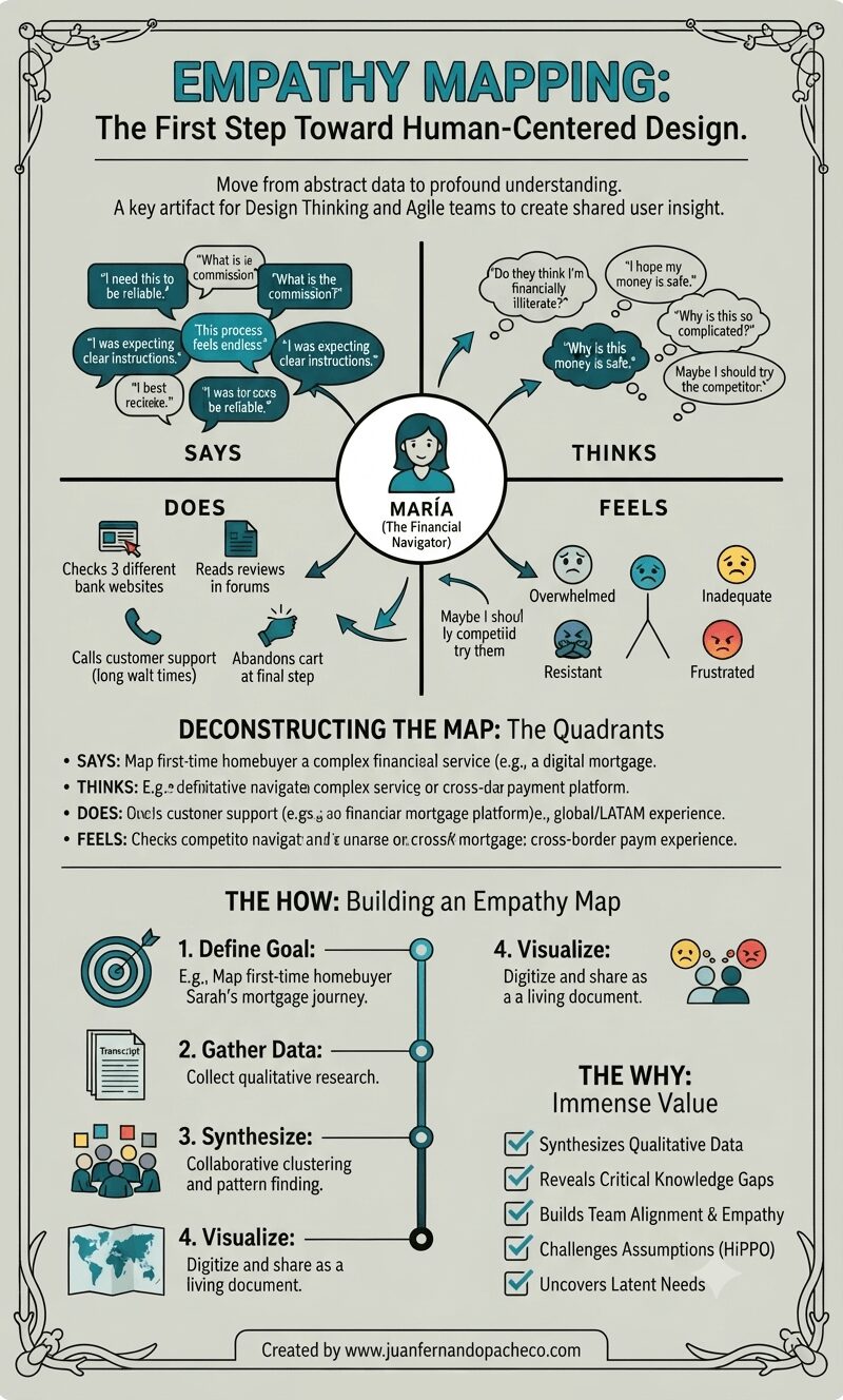
A vertically-oriented infographic titled "EMPATHY MAPPING: The First Step Toward Human-Centered Design," set against a light sage-green background with a decorative border. The center features a complete empathy map for a persona named "MARÍA (The Financial Navigator)," with radiating arrows connecting her icon to four detailed quadrants: "SAYS" (with quotes like "I need this to be reliable," "What is the commission?"), "THINKS" (internal thoughts like "Do they think I'm financially illiterate?"), "DOES" (actions like "Checks 3 different bank websites"), and "FEELS" (emotions with emojis like "Overwhelmed," "Inadequate"). Below the map, sections deconstruct the quadrants and outline "THE HOW: Building an Empathy Map" (Define, Gather, Synthesize, Visualize steps) and "THE WHY: Immense Value" (a checklist of benefits). The bottom includes the attribution: "Created by www.juanfernandopacheco.com."

An empathy map is more than just a diagram on a wall. It is a practice, a mindset, and a commitment to seeing the world through someone else’s eyes. It transforms the abstract “user” into a human with hopes, frustrations, and a complex inner world.

By systematically capturing what our users Say, Think, Do, and Feel, we move beyond building mere features.
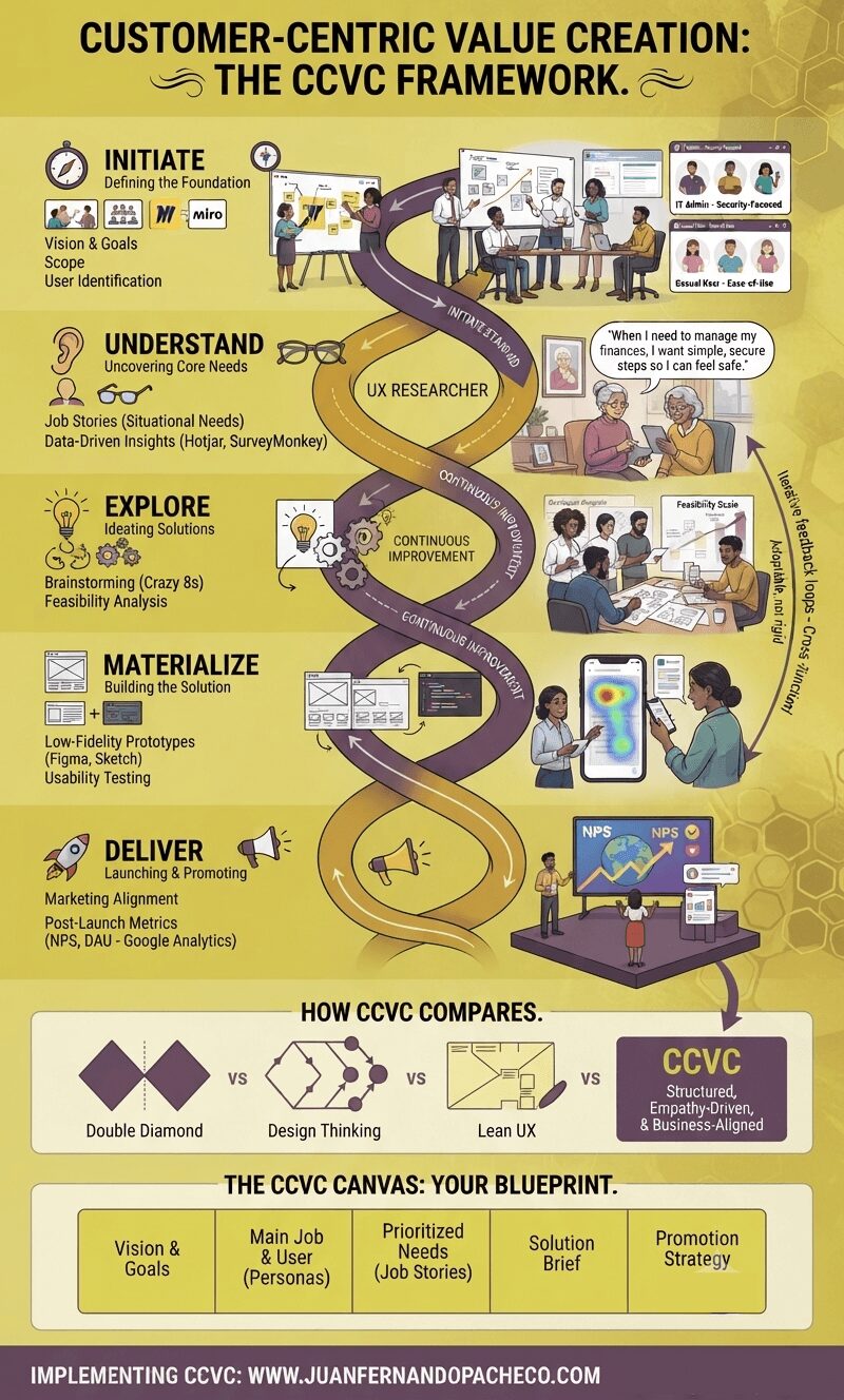
An infographic titled 'Customer-Centric Value Creation: The CCVC Framework' in a vertical format. The central visual is a DNA helix-like structure colored in the requested gold and purple palette, winding through five distinct phases: Initiate, Understand, Explore, Materialize, and Deliver. Each phase is detailed with icons, text, and illustrative scenes of diverse teams and users. The infographic also includes a comparison section with Double Diamond, Design Thinking, and Lean UX frameworks, a breakdown of 'The CCVC Canvas: Your Blueprint,' and a footer with the URL 'WWW.JUANFERNANDOPACHECO.COM'.

The CCVC Framework isn’t a silver bullet—it’s a mindset. By prioritizing empathy, agility, and measurable outcomes, UX designers can craft solutions that truly resonate. As Nagel prepares to delve deeper into the CCVC Canvas in future work, stay tuned for actionable insights.

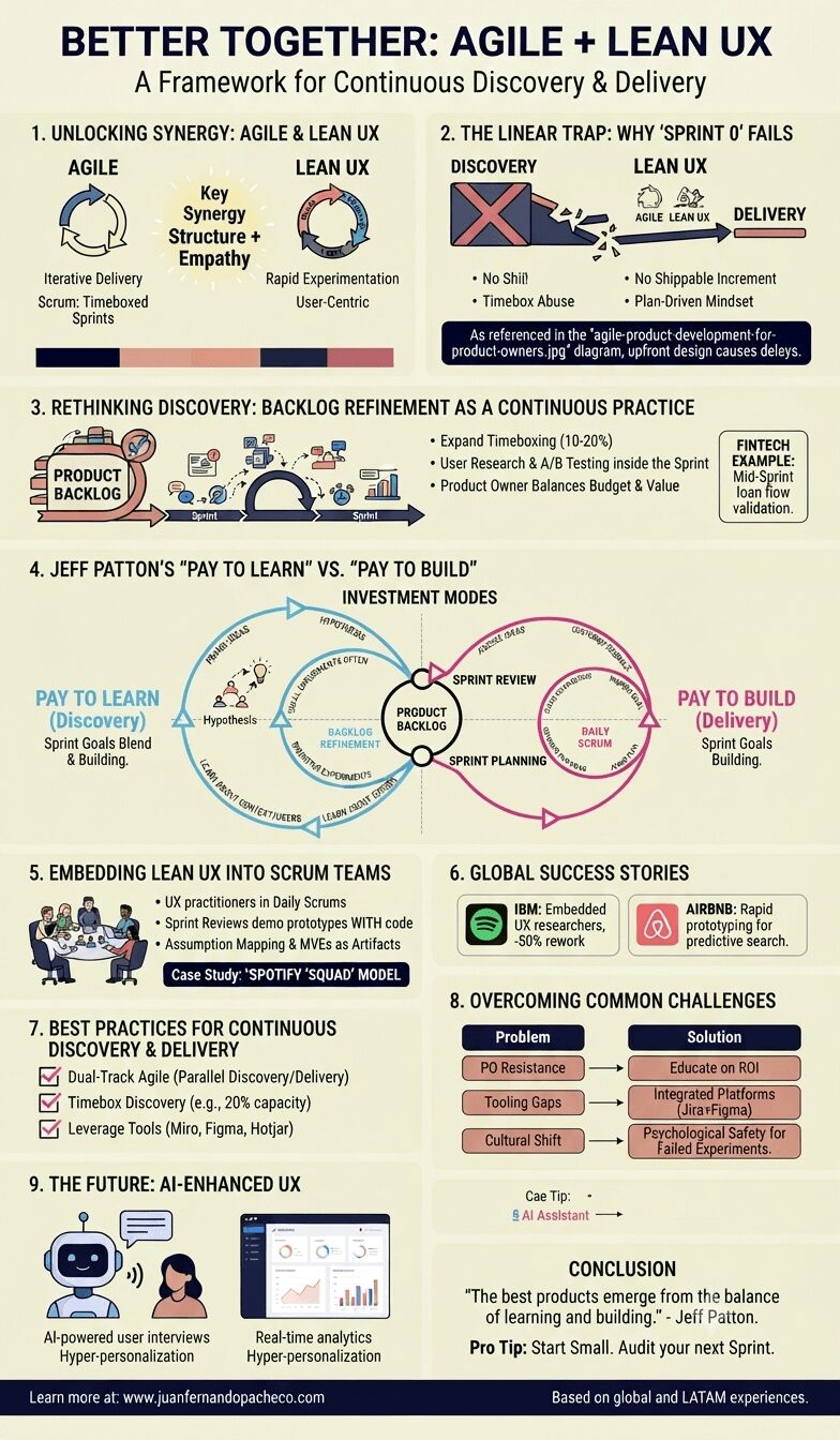
A detailed vertical infographic titled "Better Together: Agile + Lean UX: A Framework for Continuous Discovery & Delivery." The image is organized into nine numbered sections with illustrations, icons, and text, utilizing a color palette of cream, navy, pink, peach, and dark blue. It details how to integrate Lean UX principles like continuous discovery and "Pay to Learn" into Agile Scrum rituals, and includes case studies from Spotify, IBM, and Airbnb, as well as future trends like AI. The central diagram visually merges "Pay to Learn" and "Pay to Build" cycles.

Agile + Lean UX are not competing frameworks—they’re complementary forces. By embedding continuous discovery into Sprints, teams can deliver value faster while staying user-centric. As Jeff Patton says, “The best products emerge from the balance of learning and building.”