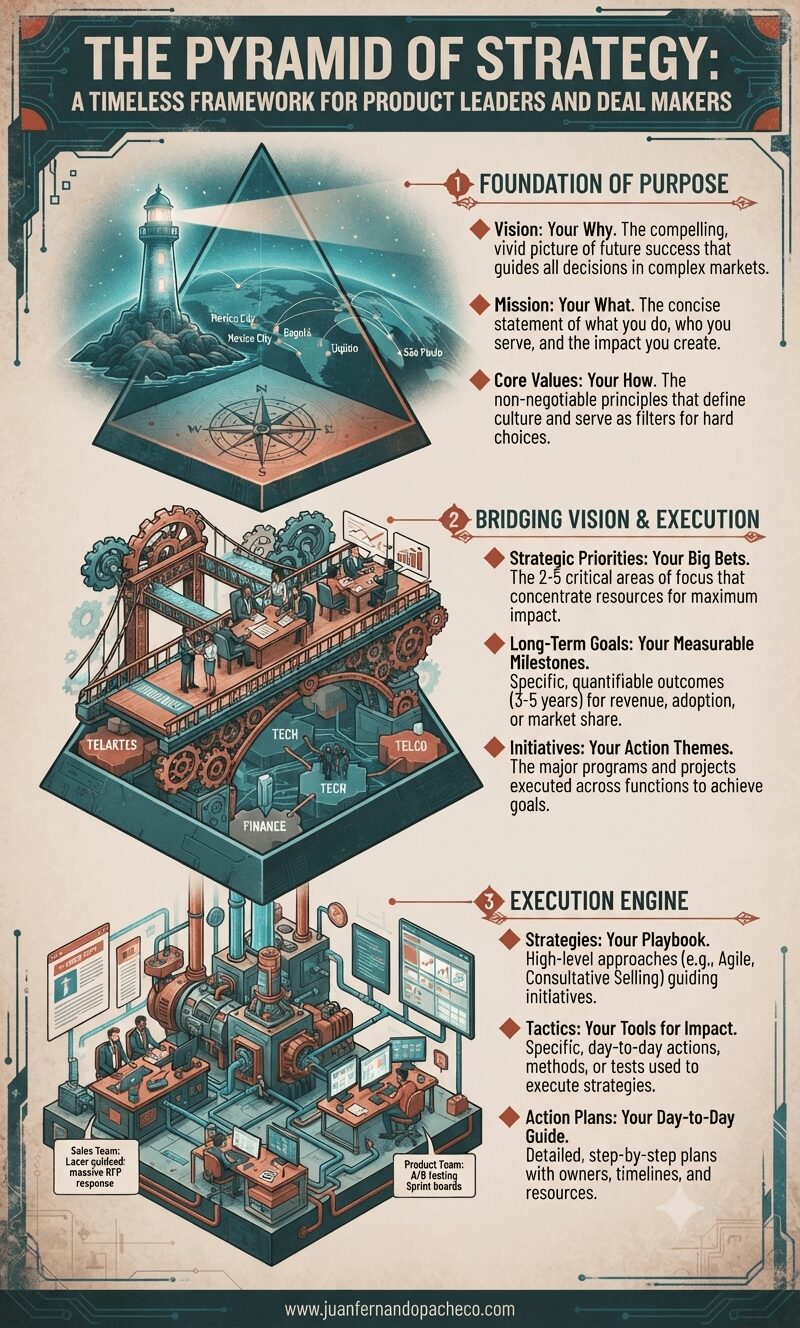
Master the pyramid of strategy framework to transform your vision into executable action. Learn how product leaders and business developers can align vision, priorities, and tactics to drive sustainable growth and close complex deals.
Tag: strategy
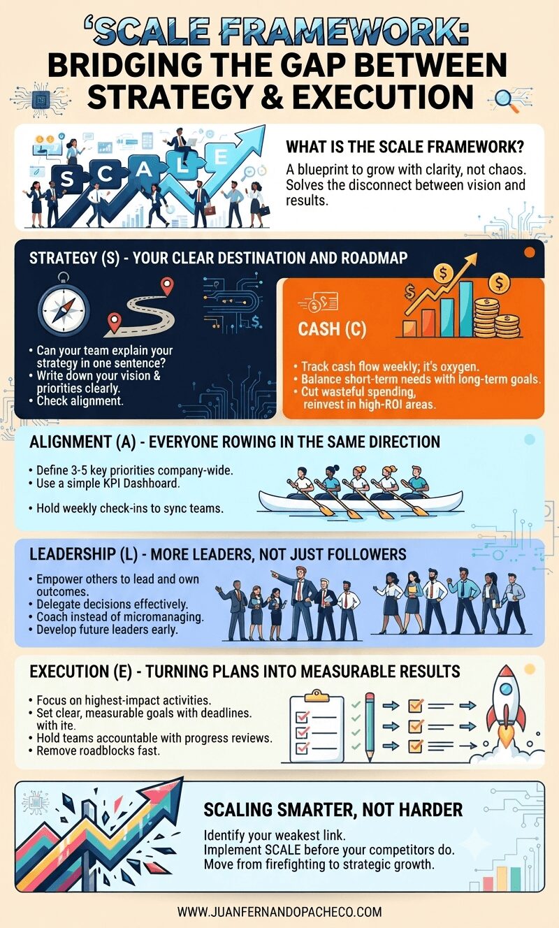
Bridging the Gap Between Strategy and Execution in Technology Business Growth After many years of
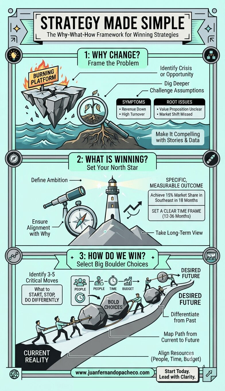
Strategy doesn’t have to be complicated. Start with why. Define what winning looks like. Make bold choices about how you’ll get there. Communicate with clarity. Execute with discipline.
That’s it. That’s the formula.
The question isn’t whether this framework works—it does. The question is whether you’ll have the courage to use it. To make the hard choices. To say no to the good so you can say yes to the great. To lead your organization from where it is to where it needs to be.
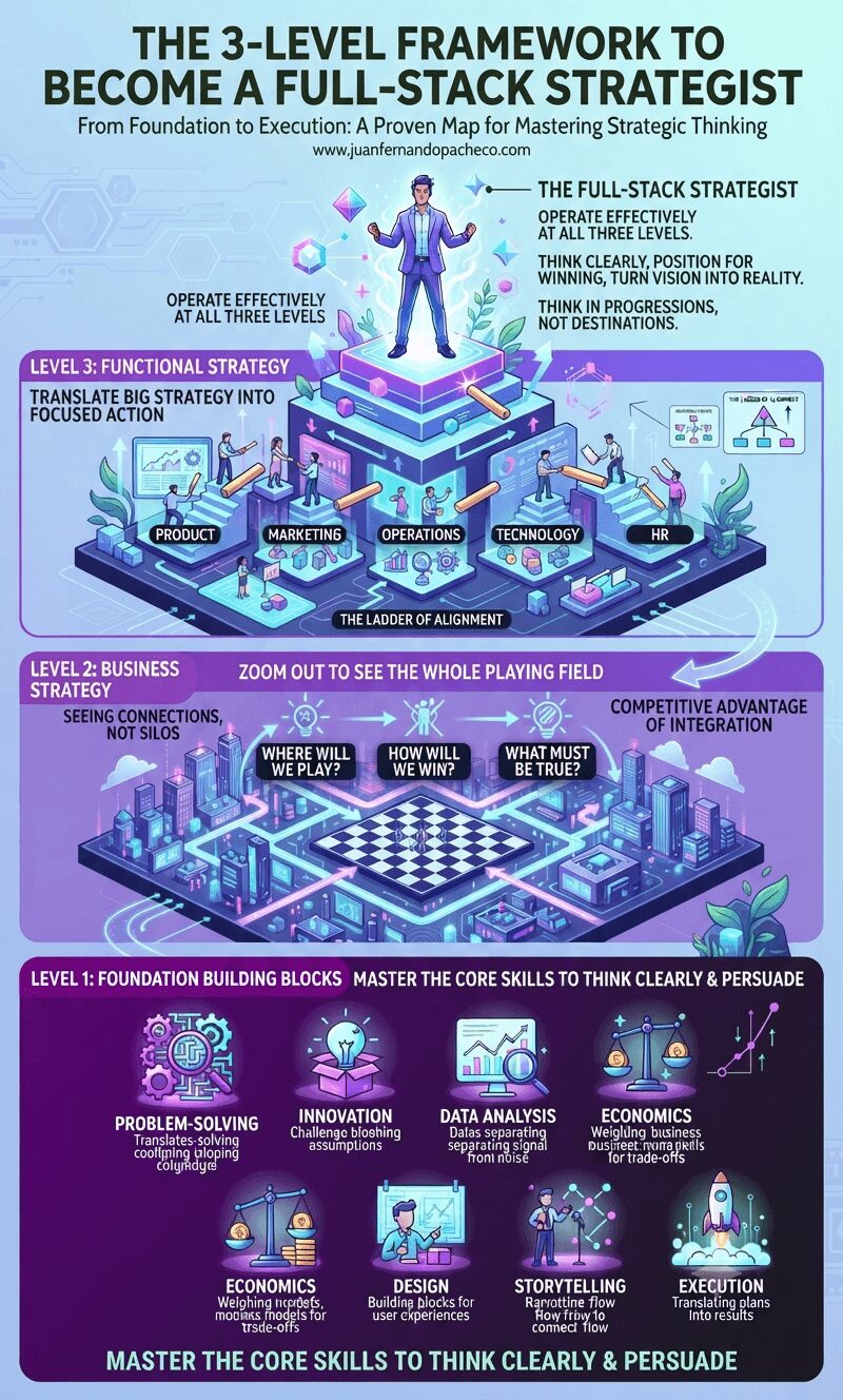
Strategy doesn’t have to be a mystery. Discover the proven 3-level framework that breaks down strategic thinking into foundation building blocks, business strategy, and functional strategy—transforming you into a full-stack strategist who can think clearly, position for winning, and translate vision into action.
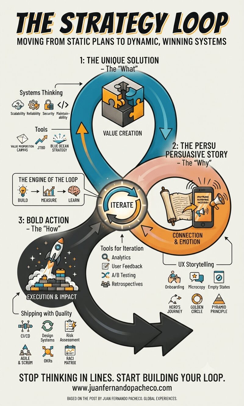
The Strategy Loop transforms strategy from a static document owned by a few executives into a dynamic, living system that empowers the entire organization. It aligns the logical rigor of the solutions architect with the empathetic, human-centered focus of the UX designer.
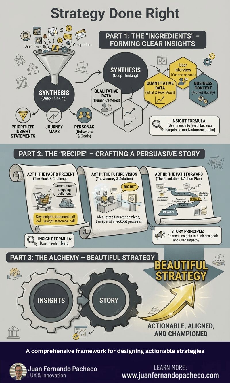
Strategy is the compelling story that explains why those steps are necessary and how they lead to victory. It is the bridge between the current reality and a desired future.
The framework in this post encapsulates this perfectly:
Beautiful Strategy emerges from the alchemy of Clear Insights and a Persuasive Story.
Think of insights as your raw “ingredients” and the story as your “strategy recipe.”
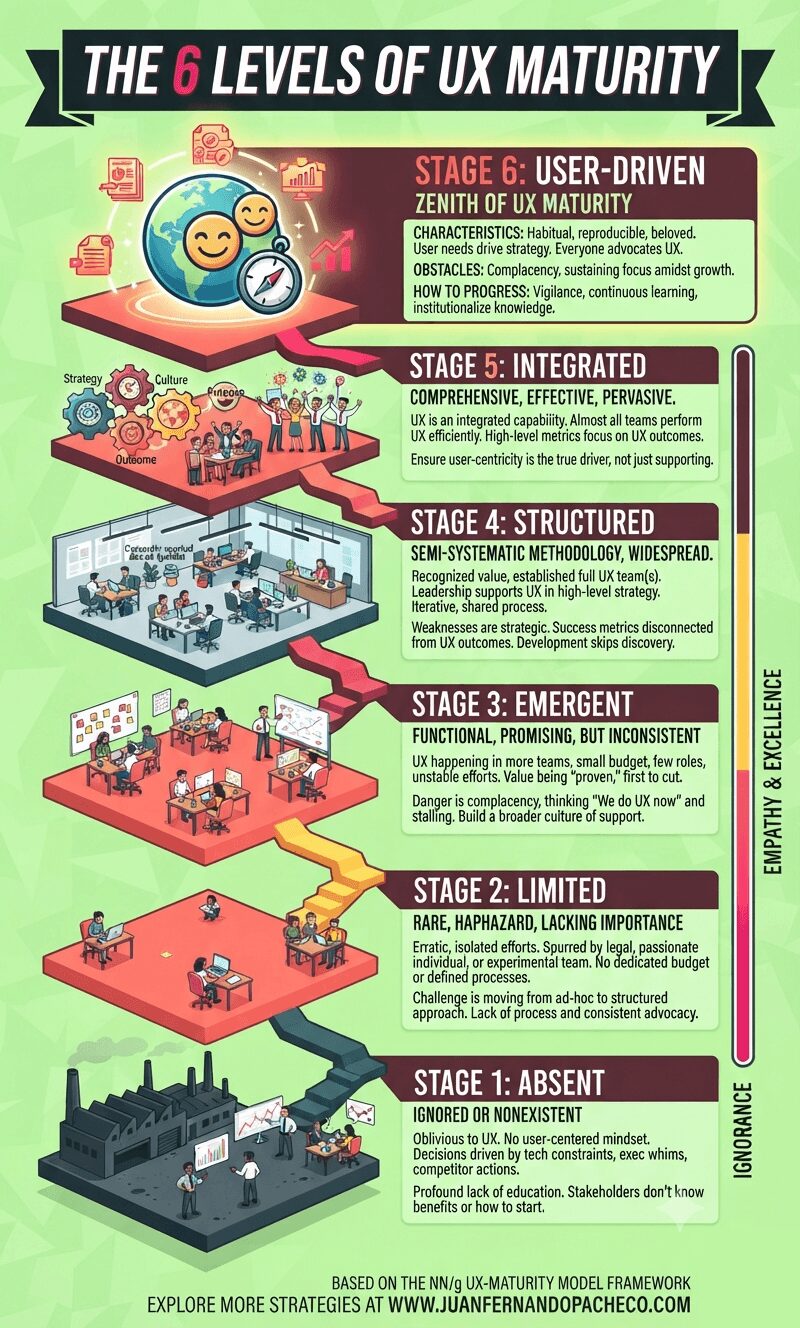
Understanding your organization’s UX maturity is not an exercise in vanity. It is a vital diagnostic tool that allows you to identify strengths to celebrate and weaknesses to address. It provides a realistic, shared language for improvement.
The path forward is incremental. You cannot leapfrog stages. The practices and cultural shifts of each stage create the necessary foundation for the next. Progressing even one stage can take years of dedicated effort. Don’t be discouraged. Start with an honest assessment, build a coalition of champions, celebrate small victories, and always, always tie your work back to both user value and business impact.
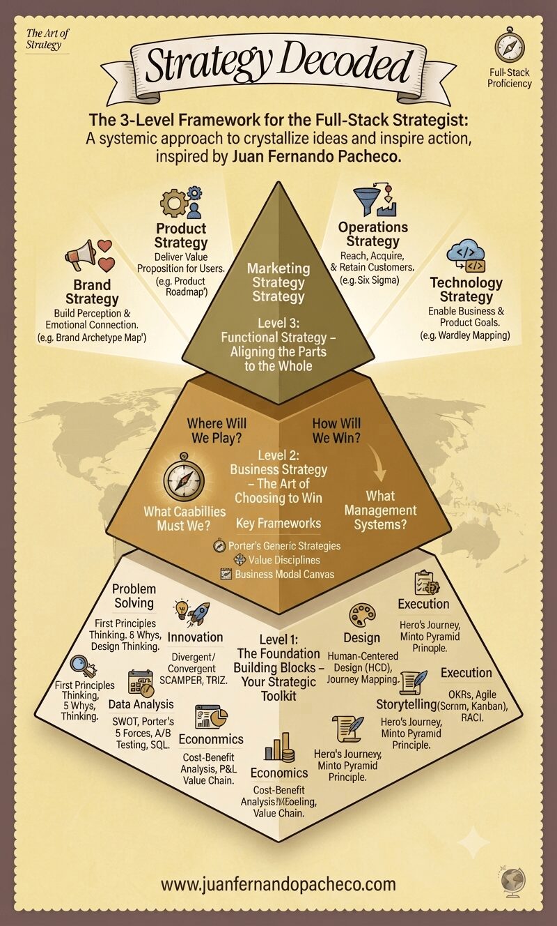
Becoming a full-stack strategist is a journey.
Start by auditing your proficiency in the seven building blocks. Where are you strong? Where do you need improvement?
Then, practice articulating the business strategy for your team or company—even if it’s not your official job.
Finally, constantly scrutinize your functional work (whether in design, tech, product, or marketing) and ask: “Does this truly ladder up to how we’ve chosen to win?”
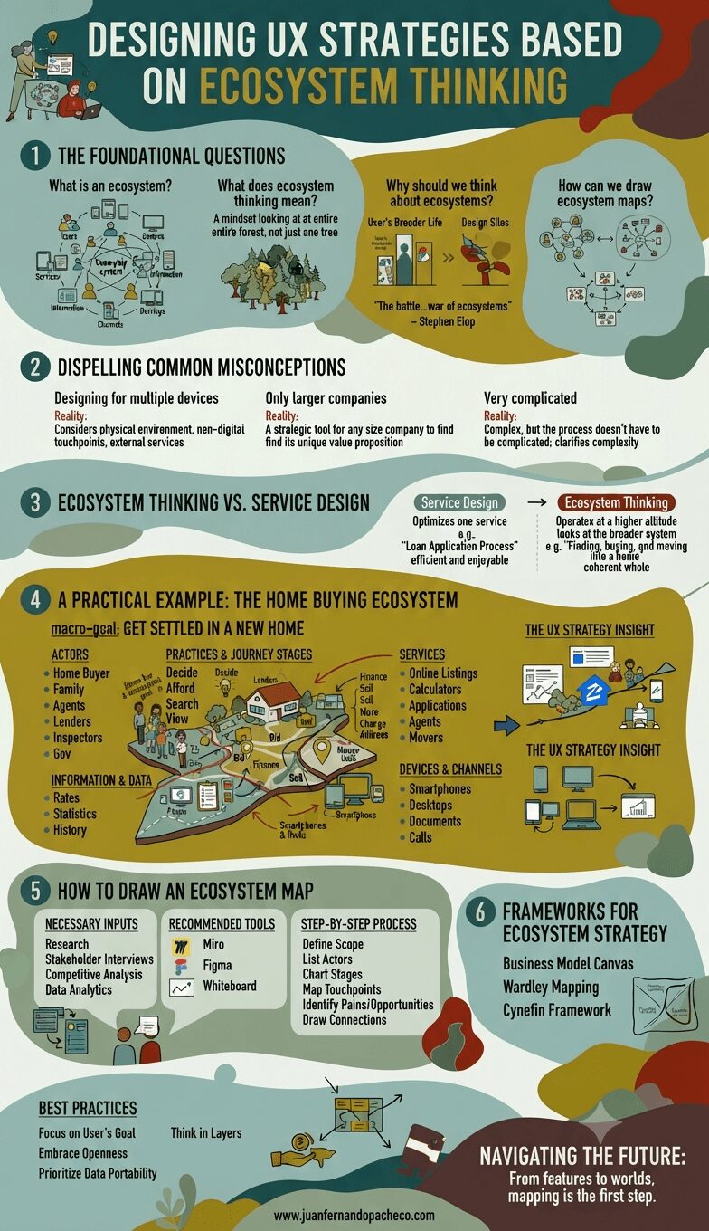
The future of UX design is not in crafting perfect, isolated interactions. It is in designing intelligent, adaptive, and respectful nodes within a vast and complex human ecosystem. It requires us to be not just designers, but strategists, systems thinkers, and diplomats who can navigate the relationships between services, businesses, and most importantly, people.
By adopting ecosystem thinking, we move from creating products that people use to crafting environments that people live in. We stop building features and start building worlds. The map is the first step. It’s time to start charting.
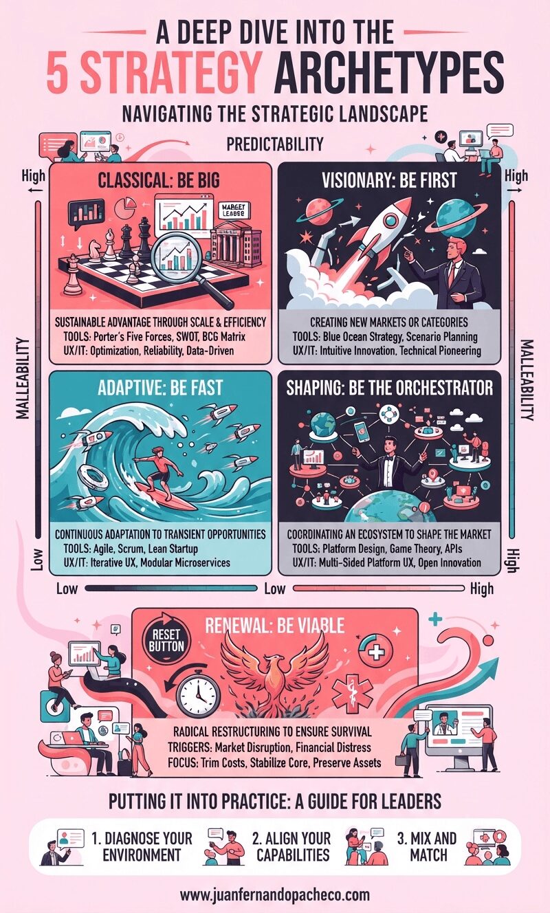
The greatest risk in strategy is complacency—the unconscious application of a default approach. The framework of the five archetypes empowers us to move from a reactive stance to a proactive one. It provides a language to debate not just what we are doing, but why we are doing it and how it matches the world we operate in.