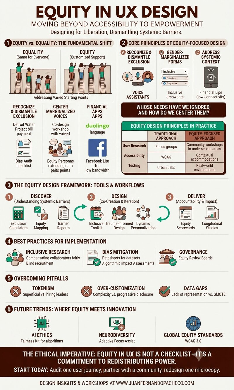
A comprehensive vertical infographic titled "Equity in UX Design," with a background in a light cream color (#f7f9f9) and accented with teal, beige, terra cotta, and dark brown. The graphic is structured into six main sections detailing the shift from equality to equity, core principles, a three-stage framework, best practices, pitfalls, and future trends. It includes comparative tables, illustrative diagrams, and specific examples like the Detroit Water Project and Xbox Adaptive Controller. The footer includes the URL www.juanfernandopacheco.com.

For decades, UX design focused primarily on usability and accessibility—creating products that functioned efficiently for the “average” user. Today, we recognize that this approach perpetuates exclusion.

Equity in UX design demands that we create experiences that actively address systemic barriers, ensuring all users—especially those from historically marginalized groups—can thrive in digital spaces.

As a veteran UX designer and architect, I’ve witnessed how equity transforms not only products but societal narratives.