The Strategist’s Guide to Finding Meaning in Data
As a UX designer, you stare at a wall of user interview quotes. And as a solutions architect, you confront a sprawling architecture diagram and reams of performance metrics. On the other hand, as a leader, you’re presented with a quarterly report full of charts and KPIs.
The question in every case is the same: What does it all mean?
The difference between busywork and breakthrough, between a good outcome and a great one, often hinges on a single, powerful asset: a clear insight.
An insight is not just a fact or a observation. It’s a penetrating understanding of the underlying truth of a situation. It reveals the unspoken needs, the hidden patterns, and the root causes of a problem. It is the catalyst that transforms data into strategy, and strategy into action.
For over two decades in UX and IT architecture, I’ve seen projects thrive or fail based on this crucial skill. The good news? Crafting powerful insights isn’t a mystical art reserved for geniuses. It’s a disciplined process.
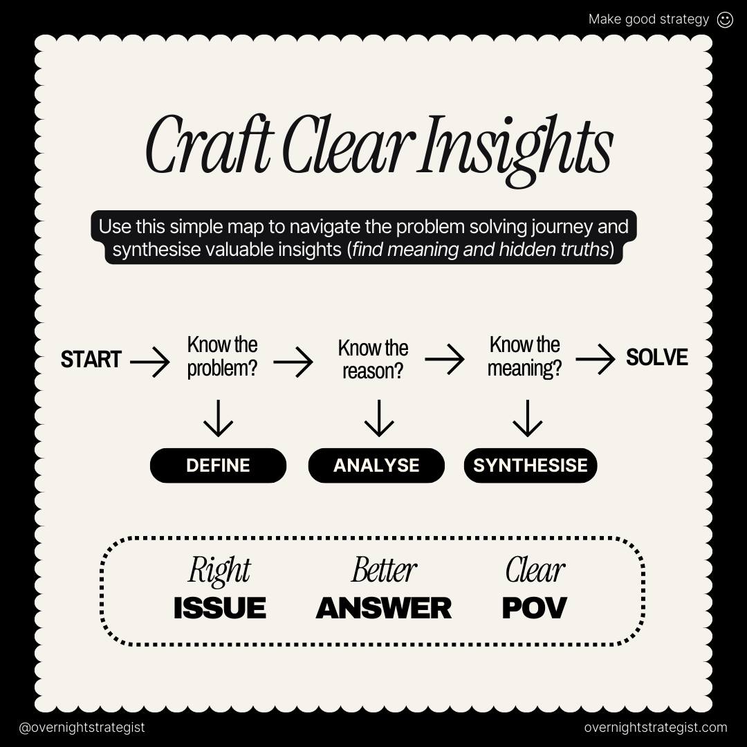
Today, we’ll unpack a simple but profoundly effective model for navigating the problem-solving journey and synthesizing valuable insights. It’s a map I’ve returned to countless times, and it’s perfectly captured in the above image.
This model provides the scaffolding for everything we’ll discuss. Let’s walk through each stage, moving from a fuzzy situation to a crystalline, actionable point of view.
Stage 1: Define – Getting to the “Right ISSUE”
The journey begins with a critical, often overlooked, step: defining the right problem.
The Question: “Know the problem?”
If No: DEFINE
Output: A Right ISSUE – a specific, well-framed, and actionable problem statement.
You cannot find a clear insight if you are solving the wrong problem. Yet, teams constantly jump into solution mode based on assumptions, surface-level symptoms, or the loudest voice in the room. The Define stage is your first and most important defense against wasted effort.
Inputs & Tools for the Define Stage
Inputs: Initial complaints, stakeholder hypotheses, anecdotal evidence, high-level business goals, project briefs (which are often wrong and need challenging).
Tools & Techniques:
The “Five Whys”: A foundational root-cause analysis technique from Toyota’s production system. By asking “Why?” iteratively (around five times), you peel back the layers of symptoms to reach a underlying cause. [1]
Problem Framing Workshops: Facilitate sessions with cross-functional stakeholders to map out the perceived problem from different angles. Techniques like “How Might We…” (HMW) statements from IDEO can reframe challenges into opportunities. [2]
Stakeholder Interviews: Conduct one-on-one conversations to understand different perspectives on what the problem is and why it matters.
Expected Output: A crisp Problem Statement. A good problem statement is human-centered, specific, and broad enough to allow for creative freedom but narrow enough to be actionable. A template I often use is: “[A user/persona] needs a way to [user’s need] because [surprising insight].”
Best Practice: Separate the Problem from the Solution
A client might say, “The problem is we need a chatbot on the homepage.” That’s a solution masquerading as a problem. Your job is to dig deeper. Why do they think they need a chatbot? Is it to reduce support tickets? To qualify leads faster? To provide 24/7 service? By defining the core problem (e.g., “High-value leads are dropping off during the inquiry process because they can’t get immediate answers to simple questions”), you open the door to multiple, potentially better solutions than a chatbot.
Stage 2: Analyse – Uncovering the “Better ANSWER”
Once you have a well-defined problem, it’s time to investigate its drivers. This is the stage of divergence, of gathering and breaking down.
The Question: “Know the reason?”
If No: ANALYSE
Output: A Better ANSWER – a data-rich, multi-faceted understanding of the factors contributing to the problem.
Analysis is about moving from the “what” to the “why.” It’s a systematic investigation into all the factors, forces, and variables that create or influence the problem you’ve defined.
Inputs & Tools for the Analyse Stage
Inputs: Your defined problem statement.
Data Sources:
Quantitative Data (The ‘What’): Analytics data (Google Analytics, Mixpanel, Amplitude), performance metrics (API response times, server load), survey results (NPS, CSAT), A/B test results.
Qualitative Data (The ‘Why’): User interviews, contextual inquiry, usability testing recordings, support ticket logs, sales call transcripts, social media sentiment.
Tools & Techniques:
Analytics Platforms: Google Analytics [3], Pendo [4], and Amplitude [5] for quantitative behavioral analysis.
Research Platforms: Dovetail [6] or EnjoyHQ for synthesizing qualitative data.
Journey Mapping: Visualizing the user’s end-to-end experience to identify specific pain points, bottlenecks, and emotional highs and lows. [7]
Heuristic Evaluation: Using established usability principles (like Nielsen’s 10 heuristics) to systematically evaluate a digital product. [8]
Data Analysis: Using Python (Pandas, NumPy) [9] or R for statistical analysis, or SQL to query databases for specific patterns.
Expected Output: A comprehensive collection of evidence—facts, patterns, pain points, quotes, and metrics—that explain the mechanics of the problem. This is not yet an insight; it’s the raw material from which insights are forged.
Best Practice: Triangulate Your Data
Never rely on a single data source. A analytics dashboard might show where users are dropping off (e.g., 70% exit on the pricing page), but it won’t tell you why. You must triangulate that quantitative data with qualitative research. Watch five usability test participants struggle to understand the pricing tiers, or analyze support tickets that say, “I’m confused about the difference between Plan A and Plan B.” The convergence of different data types is where true understanding begins.
Stage 3: Synthesise – Forging the “Clear POV”
This is the moment of convergence. You have a mountain of data from the Analyse stage. Now, you must find the signal in the noise. This is where meaning is made.
The Question: “Know the meaning behind the data?”
If No: SYNTHESISE
Output: A Clear POV (Point of View) – a sharp, actionable, and impactful insight.
Synthesis is the creative and analytical process of connecting the dots to reveal relationships, patterns, and underlying truths. It’s about moving from description to interpretation.
Inputs & Tools for the Synthesise Stage
Inputs: All the raw data, notes, and evidence gathered during the Analyse stage.
Tools & Techniques:
Affinity Diagramming: A classic UX technique where researchers group individual observations and data points on sticky notes (physical or digital) into emergent themes and patterns. This is the foundational act of synthesis. [10]
Digital Whiteboards: Miro [11] and Mural [12] are indispensable for remote and collocated teams to synthesize data together.
Insight Statements: Formally writing out the insight. A strong structure is: “We observed that [user/behavior/trend] but [contradiction/surprise/unmet need]. This matters because [impact/consequence]. This suggests an opportunity to [potential direction].”
The “So What?” Test: For every potential pattern, relentlessly ask “So what?” to push the interpretation to a deeper, more strategic level.
Expected Output: The primary output is the Core Insight itself. Secondary outputs might include updated personas, journey maps with key insights annotated, or a succinct presentation of findings.
Best Practice: Look for Tensions and Surprises
The most powerful insights often lie in a contradiction or a surprise. For example:
Tension: “Users say they want more features (as seen in survey data), but our analytics show that the most successful users master a few core features and ignore the rest.”
Surprise: “Even though we built the onboarding process for tech-savvy millennials, our most engaged user segment is actually retirees who appreciate the product’s simplicity for staying connected with grandchildren.”
These moments of cognitive dissonance are goldmines. They challenge assumptions and point to a deeper, more human truth.
From Insight to Impact: The “SOLVE” Stage
The framework ends at “SOLVE.” A clear insight, by its very nature, should point toward potential solutions. It frames the problem in a new way that makes the path forward clearer.
A Right ISSUE ensures you’re building the right thing.
A Better ANSWER ensures you’re building it based on evidence.
A Clear POV ensures you’re building it in a way that is innovative and meaningful.
Your insight becomes the North Star for ideation, design, and development. It inspires features, informs architectural decisions (e.g., prioritizing a robust search API because the insight revealed users’ primary mode of discovery was search, not browsing), and aligns cross-functional teams around a shared, profound understanding of the user and the problem.
Recommended Frameworks to Augment This Model
This simple three-step model is powerful on its own, but it can be integrated into larger, more formal frameworks:
Design Thinking: [13] This model maps almost perfectly to the Double Diamond model of design. “Define” and “Analyse” cover the first diamond (Discover and Define), while “Synthesise” and “SOLVE” lead into the second (Develop and Deliver).
Jobs to Be Done (JTBD): [14] The JTBD framework is a superb tool for the Synthesise stage. It pushes you beyond demographics to understand the fundamental “job” a customer is “hiring” your product to do. A core JTBD statement is a form of powerful insight.
Root Cause Analysis (RCA): [15] Techniques like the “Five Whys” or Fishbone (Ishikawa) diagrams are formalized methods for the Define and Analyse stages, ensuring you get to the true source of a problem, especially for complex technical issues.
Conclusion: The Power of a Clear Insight
In a world saturated with data, the ability to craft clear insights is a superpower. It is the bridge between raw information and human understanding, between execution and strategy. It is what separates a feature factory from a truly impactful product team.
The next time you face a complex challenge, don’t just dive into solutions. Pause. Navigate the journey.
Ask yourself: Do I truly know the problem? If not, Define.
Do I understand the reasons behind it? If not, Analyze.
Do I see the deeper meaning? If not, Synthesize.
This disciplined approach will transform your work, ensuring that every line of code you write, every pixel you design, and every strategy you craft is built on a foundation of profound, undeniable truth.
References:
10 Usability Heuristics for UI Design – Nielsen Norman Group
Know Your Customers’ “Jobs to Be Done” – Harvard Business Review
Image credits: OverNightStrategist