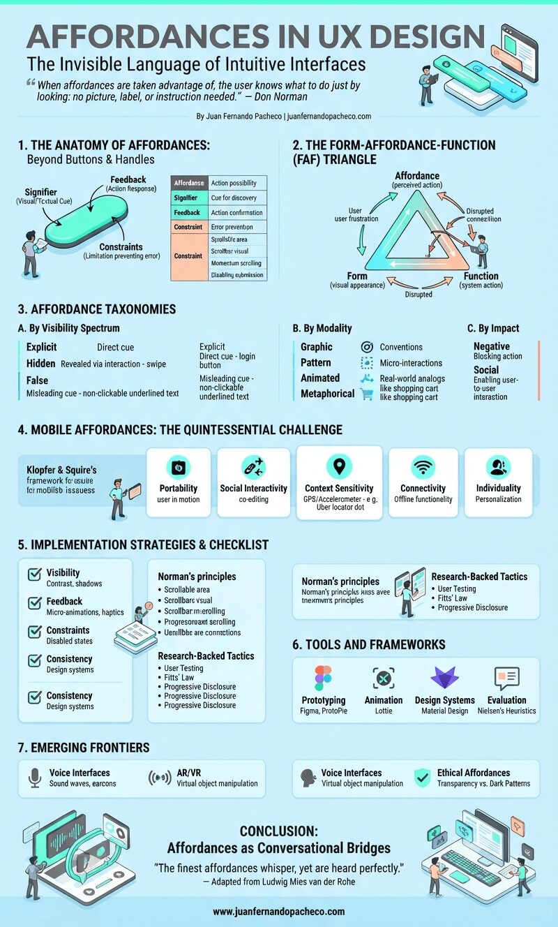
A long vertical infographic titled "Affordances in UX Design" detailing the principles, anatomy, and taxonomies of user interface elements. It features a light blue background with seven sections covering topics like the Form-Affordance-Function triangle, mobile affordances, implementation strategies, and emerging frontiers like AI and spatial computing. The infographic includes diagrams, tables, and icons referencing various design frameworks and the website juanfernandopacheco.com.

Affordances originate from James Gibson’s ecological psychology theory (1977), defining them as action possibilities latent in environments relative to an actor.

Don Norman later adapted this for design, emphasizing perceived affordances—not what an object can do, but what users believe it can do.

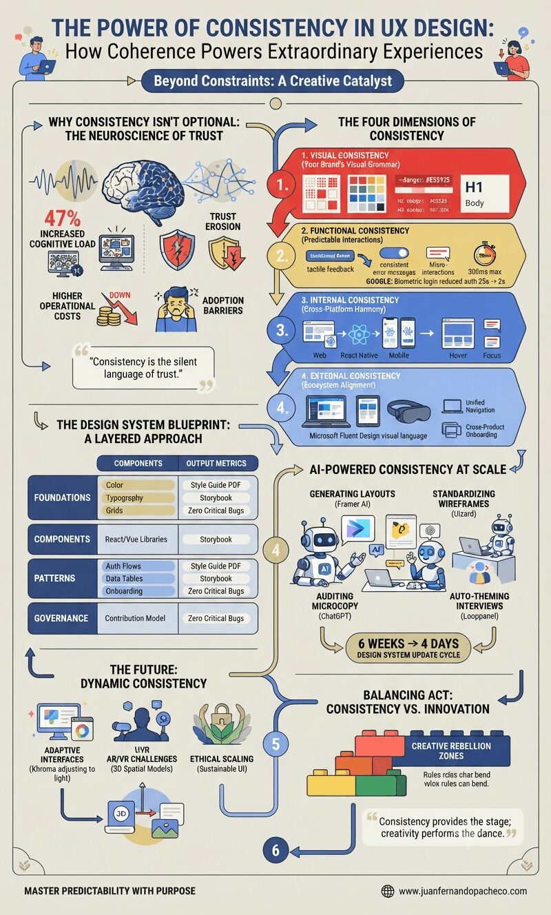
A detailed vertical infographic titled "The Power of Consistency in UX Design" on a light beige background, broken into sections with charts, icons, and text illustrating why consistency matters. Key sections include neuroscience of trust, four dimensions of consistency (visual, functional, internal, external), design system layers, AI tools, future trends like AR/VR, and a final section on balancing consistency with innovation, featuring a LEGO metaphor and a URL for www.juanfernandopacheco.com at the bottom.

Why Consistency Isn’t Optional: The Neuroscience of Trust

Our brains are prediction engines. Every micro-interaction—a button hover effect, navigation placement, error message tone—trains users’ mental models. Research shows inconsistent interfaces increase cognitive load by 47%, directly impacting task completion rates. Consider these tangible impacts:

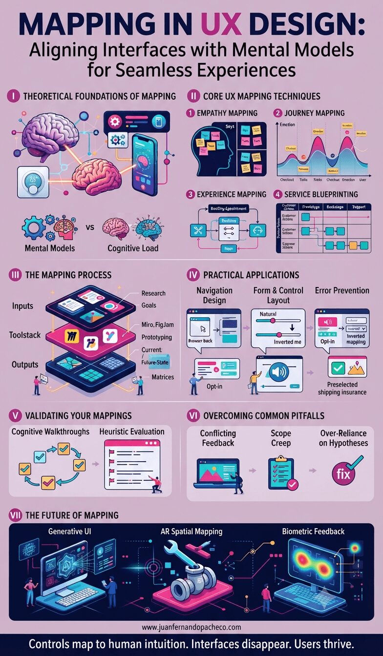
A comprehensive infographic titled 'Mapping in UX Design: Aligning Interfaces with Mental Models for Seamless Experiences' is divided into seven sections. Section I covers Theoretical Foundations (Mental Models, Cognitive Load). Section II details Core Techniques (Empathy, Journey, Experience Mapping, Service Blueprinting). Section III outlines the Process (Inputs, Toolstack, Outputs). Section IV shows Practical Applications (Navigation, Forms, Error Prevention). Section V explains Validation (Walkthroughs, Heuristics). Section VI addresses Pitfalls, and Section VII explores the Future (Generative UI, AR, Biometrics). The footer includes www.juanfernandopacheco.com and the tagline 'Controls map to human intuition. Interfaces disappear. Users thrive.'

Mapping transcends diagramming—it’s the art of translating cognition into interface.

By anchoring designs in mental models, we reduce cognitive friction, build trust, and accelerate task completion.

Start small: pick one critical user journey, blueprint its current state, then redesign one touchpoint using empathy-driven insights.

A detailed infographic titled 'Constraints in UX Design' against a light gray background. It details six types of UX constraints (physical, cultural, semantic, logical, temporal, economic) with examples and icons, followed by sections on their benefits (error prevention, cognitive load reduction, accessibility), a case study of a successful checkout flow, common pitfalls, and the future of AI-driven adaptive constraints.

The most effective, intuitive, and empowering user experiences are born not from infinite possibilities, but from intelligently applied constraints.

Let’s dismantle the misconception and explore how constraints—when wielded strategically—become your most powerful design tool.

An infographic titled "Feedback in UX Design: From Theory to Action" that illustrates key concepts, frameworks, best practices, and tools for implementing effective user feedback. It covers topics from Jakob Nielsen's Visibility Principle to the future of AI-driven adaptive systems.

Feedback is the oxygen of user experience design.

Every click, swipe, or interaction creates a conversation between users and digital products. As a UX Designer with over two decades in the field, I’ve seen how strategically crafted feedback transforms frustrating experiences into delightful ones—and how poor feedback mechanisms sabotage even the most beautifully designed interfaces.

A comprehensive vertical infographic titled "Discoverability in UX Design" with a vibrant yellow background, featuring sections defining the concept, its importance, techniques, testing methods, challenges, future trends, and tools, alongside a portrait of Don Norman and the URL www.juanfernandopacheco.com.

Discoverability isn’t a UI embellishment—it’s the backbone of inclusive, efficient digital experiences. As interfaces grow more complex, the designer’s role evolves into a bridge builder between capability and usability.

By combining progressive disclosure, AI-enhanced personalization, and rigorous accessibility testing, we can create products that don’t just function but reveal their genius intuitively.

An infographic titled "Aligning OKRs to Business Strategy: The Architect’s Blueprint for Execution Excellence" in a vertical format, featuring a light green background and organized into six main sections. Section I contrasts "Why Alignment Fails" (siloed priorities, vagueness, static planning) with "How OKRs Fix It." Section II shows an "OKR Pyramid" cascading from vision to team KRs, and "North Star OKRs" for Pinterest. Section III is a "Tactical Playbook" with three phases: Clarify Strategy, Craft Aligned OKRs (INSPIRE framework, lead/lag indicators), and Cascade with 60/40 Bottom-Up input. Section IV lists "Critical Pitfalls: Why 70% Fail" (Tool Misuse, BAU Infiltration, Siloed Creation). Section V recommends a "Toolstack" of software including Quantive, Asana, and Lattice. Section VI details a "Case Study" of Ariadne Labs. The bottom features a quote by Dan Montgomery and the URL www.juanfernandopacheco.com.

In dynamic markets, OKRs are your compass. They translate vision into measurable bets, empowering teams to innovate within strategic boundaries.

As Andy Grove proved at Intel: Alignment isn’t about everyone doing the same thing—it’s about everyone contributing to the same outcome.

A vertical infographic titled "How OKRs and Agile Development Create Strategic Synergy" on a dark background. It details the fusion of Agile execution power and OKR strategic compass through a closed-loop cycle, leading to a fintech transformation. It presents four integration models: Agile OKRs, OKR-Infused Sprints, Operational Alignment (SAFe), and Role Mapping. It also covers why the fusion drives digital transformation, a toolkit for implementation (crafting rules, cadence, tool stacks), and the future of AI-enhanced integration.

Agile is the engine that propels your product forward; OKRs are the GPS ensuring you’re heading toward value. By embedding objectives into sprint rhythms, teams shift from “Did we ship?” to “Did it matter?” As John Doerr reminds us: “Measures matter more when they’re counterintuitive.”

Start your integration with one pilot team—measure their KR impact versus control groups. In 2025’s AI-driven chaos, this fusion isn’t just optimal; it’s existential.

An infographic titled "Tracking Success with OKRs: The Architect’s Blueprint for Strategic Execution" by Juan Fernando Pacheco. The image presents a comprehensive guide to OKRs, covering the importance of tracking, scoring methodologies (including the 0.7 sweet spot), practical math examples, a best practices toolkit for cadence and tools, user experience considerations for adoption, a diagnostic flowchart for failures, and the future of AI-powered forecasting. It uses illustrations, comparison tables, and clear data visualizations against a sage-green background with a bridge metaphor at the top.

The chasm between ambition and execution isn’t due to lack of effort—it’s a systems design problem. Objectives and Key Results (OKRs) bridge this gap, but only when tracked with surgical precision.

Let’s deconstruct how elite teams instrument their goal-tracking systems.

A comprehensive vertical infographic on a green background titled "Defining OKRs: The Strategic Art of Outcome-Focused Goal Setting." The image is structured as a central timeline breaking down OKRs into six sections: Anatomy, KPIs vs. OKRs, Engineering Effective KRs, Execution Architecture, Tool Ecosystem, and UX, concluding with a summary and reference.

Defining OKRs is less about filling templates and more about cultivating an outcome mindset.

When Syracuse, New York, implemented OKRs like “Achieve fiscal sustainability” with KRs such as “Reduce budget variance from 11% to 5%”, they didn’t just set goals—they installed a new operating system for decision-making.