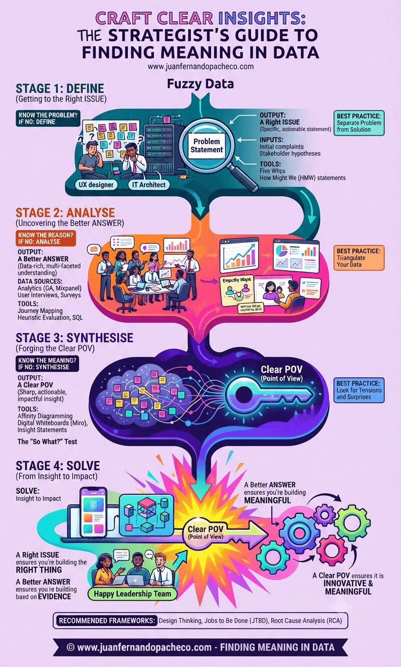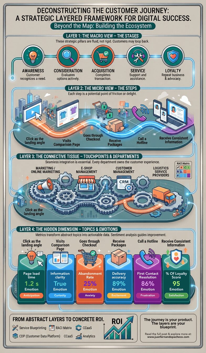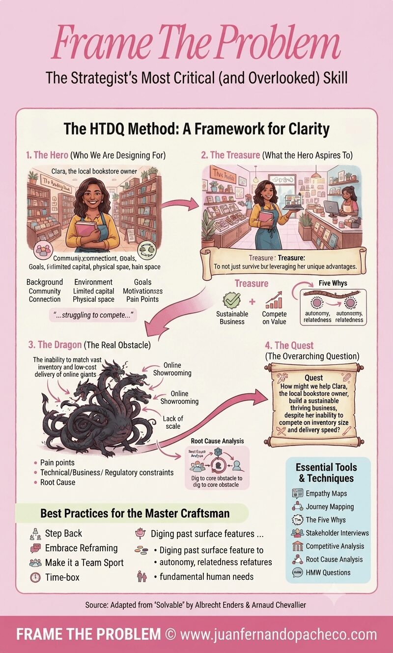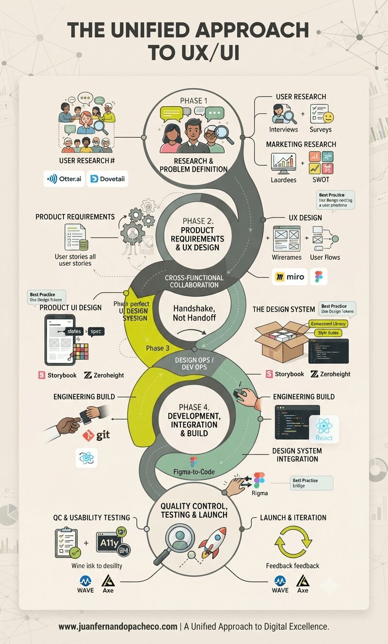
A detailed vertical infographic titled "THE UNIFIED APPROACH TO UX/UI" displaying a five-phase product development lifecycle pipeline. It shows interconnected stages from Research & Definition to Launch & Iteration, highlighting key activities, deliverables, team roles, and tools (such as Figma, React, Otter.ai, and WAVE) against a cream (#f2e9dc) background. A central winding path emphasizes collaboration and the concept of "Handshake, Not Handoff." The footer includes the URL "www.juanfernandopacheco.com".

The “Experience Design Framework” illustrates that consistency is not a superficial concern.

It is the tangible result of a deeply integrated, user-centric, and collaborative process. It is the quality that allows users to build a confident mental model of your product, leading to reduced cognitive load, increased efficiency, and greater trust.
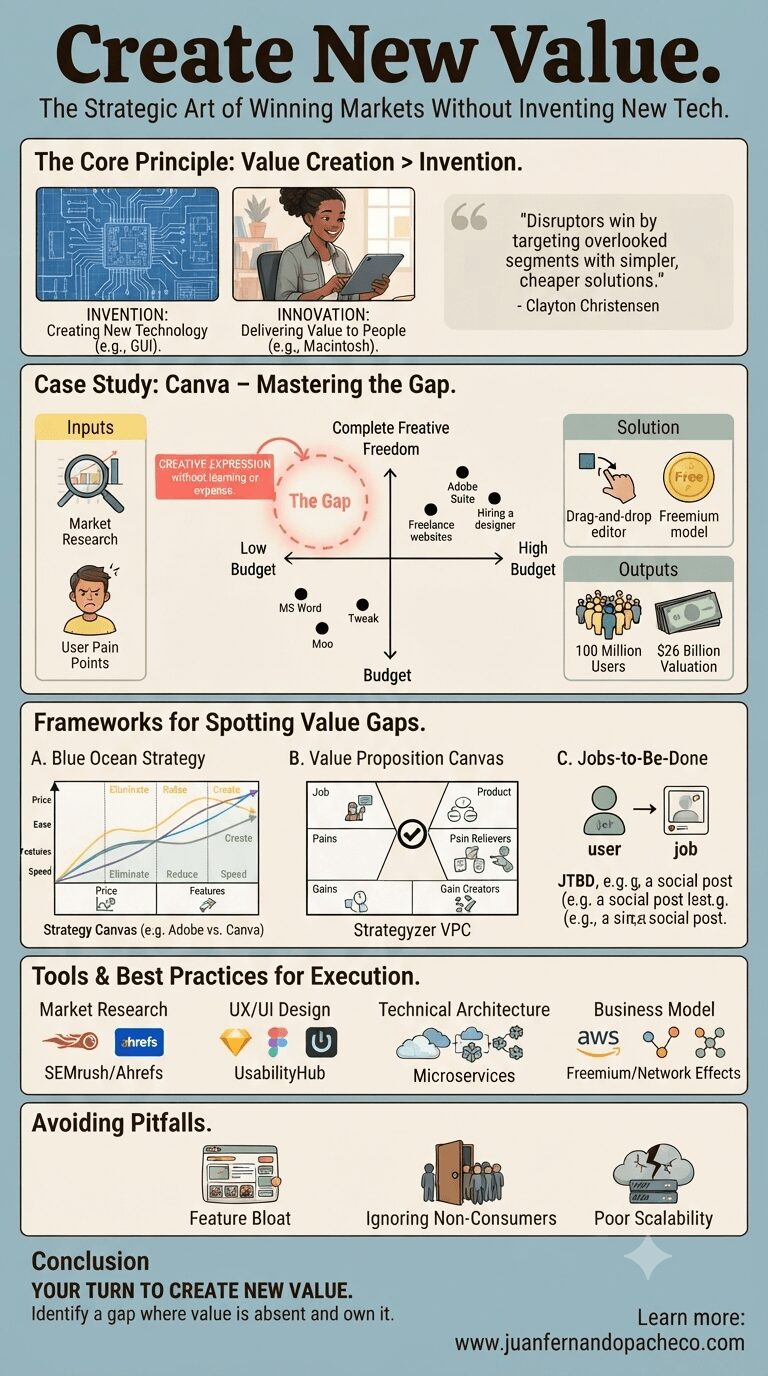
A comprehensive business infographic titled "Create New Value. The Strategic Art of Winning Markets Without Inventing New Tech." The image is divided into stacked sections: "The Core Principle: Value Creation > Invention," a detailed "Case Study: Canva – Mastering the Gap" (including a 2x2 positioning map, inputs, outputs, and UX insights), "Frameworks for Spotting Value Gaps" (Blue Ocean Strategy, Value Proposition Canvas, Jobs-to-Be-Done), "Tools & Best Practices for Execution" (Market Research, UX/UI Design, Technical Architecture, Business Model), and "Avoiding Pitfalls" (Feature Bloat, Ignoring Non-Consumers, Poor Scalability). The infographic uses diagrams, charts, and icons, concluding with a call to action and the URL "www.juanfernandopacheco.com."

Visionaries spot gaps in the market—unmet needs others overlook—and craft solutions so elegantly aligned with those gaps that they carve out entirely new categories.

Let’s dissect this with surgical precision, using real-world examples, battle-tested frameworks, and actionable tools. By the end, you’ll see how to identify and own your “white space” in any market.
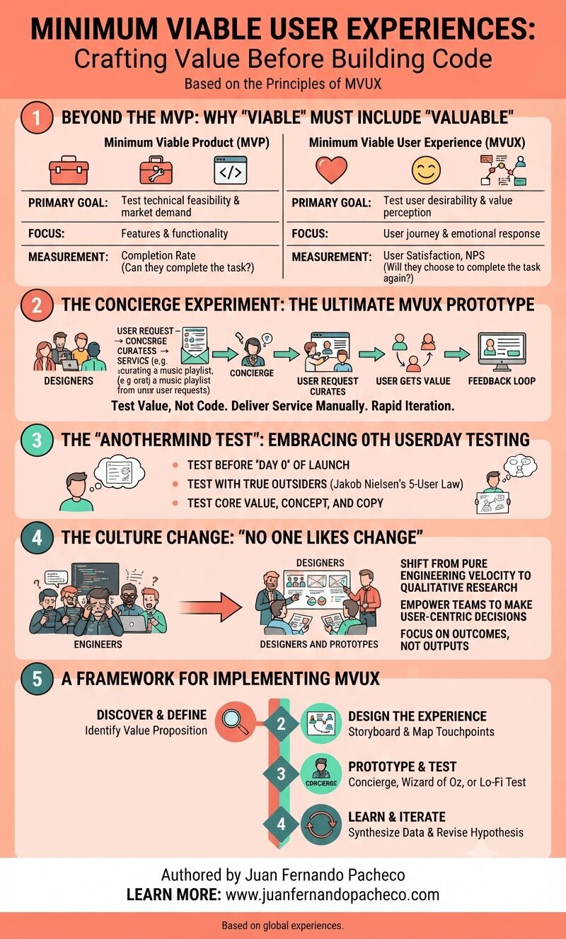
An infographic titled "MINIMUM VIABLE USER EXPERIENCES: Crafting Value Before Building Code," authored by Juan Fernando Pacheco. It presents a five-part framework for transitioning from MVP to MVUX. Section 1 compares MVP (focusing on features and technical feasibility) with MVUX (focusing on user journey and emotional response). Section 2 illustrates the "Concierge Experiment," showing a process of manual service delivery to test value before building code. Section 3 describes the "Anothermind Test" for 0th userday testing with outsiders. Section 4 explains the necessary "Culture Change," shifting from engineering velocity to user outcomes. Section 5 provides a four-step implementation framework: Discover, Design, Prototype, and Learn. The image uses a clean, professional design with icons and flowcharts.

After 20 years in this field, all you need to know is this:

The winning product is rarely the one with the most features.

It is almost always the one with the most thoughtful, frictionless, and valuable experience. The MVUX is your strategy to find that experience efficiently and effectively.

It’s a commitment to being human-centered from the very first sketch. It’s about being a concierge for your users, understanding their needs so deeply that the product you eventually build feels like it was made for them, and them alone. Because it was.
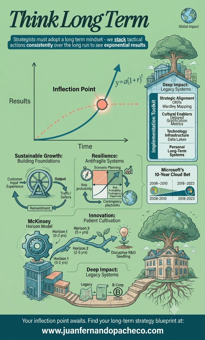
An intricate infographic titled 'Think Long Term,' illustrating a strategic blueprint for exponential growth based on the provided post. The central element is a graph showing an exponential teal curve labeled 'Long Term' overtaking a plateauing coral dotted line ('Short Term') at a glowing 'Inflection Point' (y=a(1+r)t). Below the graph, the strategy is broken into four detailed pillars: Sustainable Growth: Building Foundations, with a flywheel model (Customer Input → Output → Reinvestment). Resilience: Antifragile Systems, featuring a scenario planning matrix and contingency playbooks. Innovation: Patient Cultivation, depicted as a branching path (Horizon Model) leading to a 'Disruptive R&D Seedling.' Deep Impact: Legacy Systems, shown as a pathway from an initial structure to a mature B-Corp house with deep roots. A sidebar lists an 'Implementation Toolkit' (OKRs, Wardley Mapping, Data Lakes). A case study highlights 'Microsoft's 10-Year Cloud Bet.' The infographic ends with the footer text: 'Your inflection point awaits. Find your long-term strategy blueprint at: www.juanfernandopacheco.com.' The overall color scheme is a blend of soft green (#9ece9a), teal, and warm coral.

In the 1980s, IBM dominated mainframe computers while Microsoft focused on the embryonic PC market—a classic long-term gamble. Bill Gates famously said, 

“We always overestimate the change that will occur in two years and underestimate the change that will occur in ten.” 

This encapsulates the power of long-term thinking: the deliberate prioritization of future exponential gains over immediate rewards.
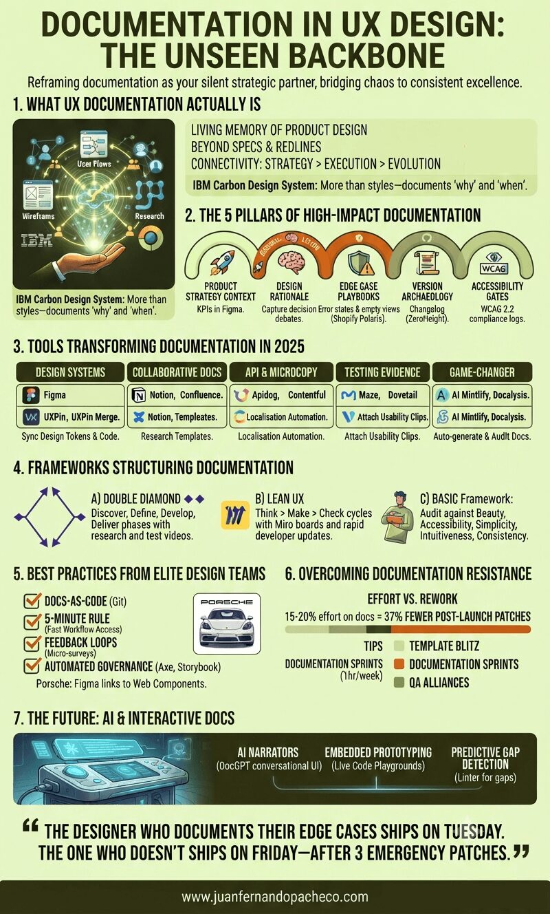
An infographic titled "Documentation in UX Design: The Unseen Backbone" is presented in a vertical format against a light-yellow background. It is structured into seven numbered sections that detail the components, pillars, tools, frameworks, best practices, overcoming resistance, and future of UX documentation, using a color palette of greens, orange, and white.

Treating documentation as a “task” misses its power. It’s the continuous act of design reasoning made visible. As Apple’s Human Interface Guidelines reveal, legendary products emerge when principles are documented, not memorized.

“The designer who documents their edge cases ships on Tuesday. The one who doesn’t ships on Friday—after 3 emergency patches.”

Start small: Document one decision today. Link a research insight to a button component. Your future self—and team—will thank you.
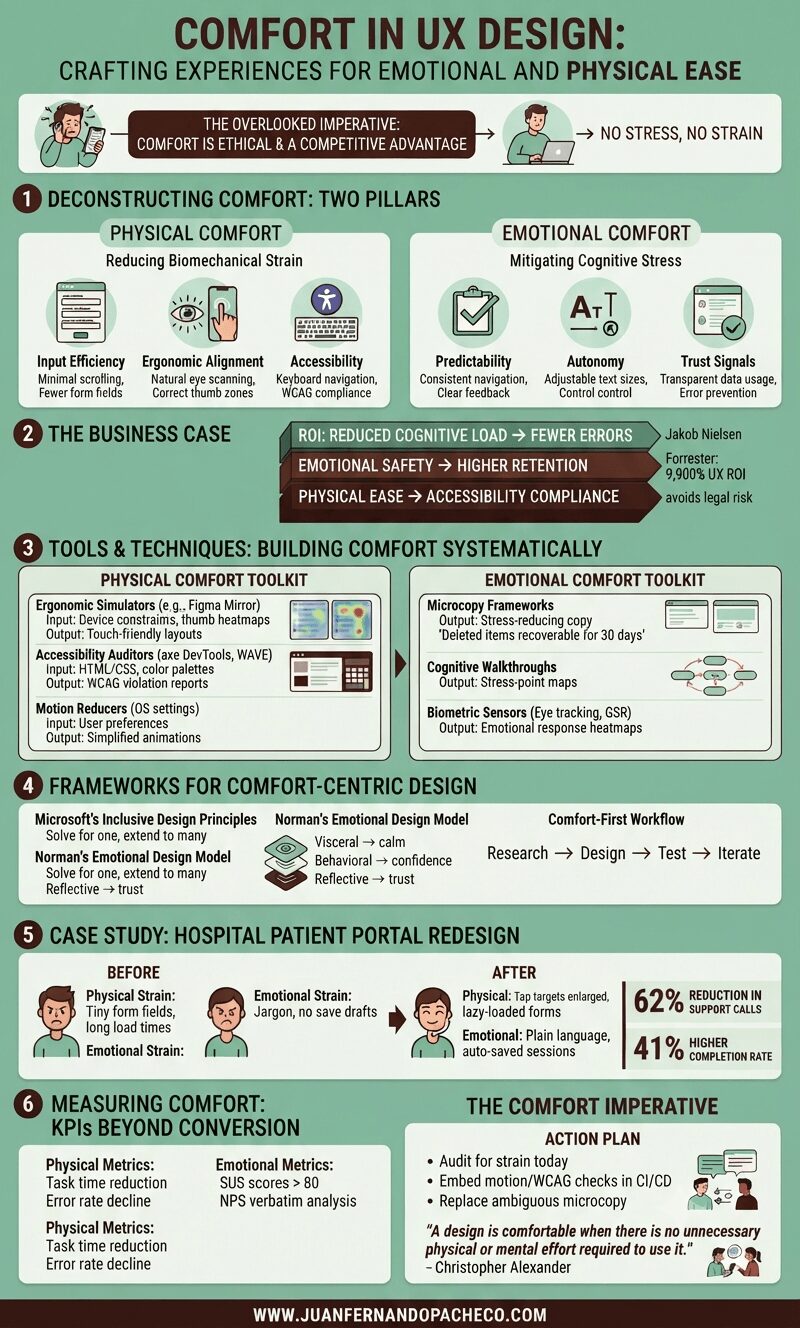
A detailed infographic titled "Comfort in UX Design" with a green background, broken into six main sections: Deconstructing Comfort, The Business Case, Tools & Techniques, Frameworks, a Case Study, and Measuring Comfort. It uses icons, charts, and text to explain how to design for physical and emotional ease, citing principles from Nielsen, Forrester, Microsoft, and Don Norman.

Comfort in UX design—defined as creating experiences with no stress, no strain—isn’t a luxury; it’s an ethical imperative and competitive advantage. Yet, it remains chronically undervalued.

As both a UX designer and solutions architect, I’ve seen how discomfort manifests: from RSI-inducing enterprise tools to anxiety-triggering checkout flows.

An infographic titled "EASE IN UX DESIGN" with the subtitle "THE STRATEGIC REDUCTION OF FRICTION FOR HUMAN-CENTERED EXPERIENCES." The visual is split into three main columns representing pillars: I. Step Reduction, II. Linguistic Clarity, and III. Smarter Defaults, with a final section on "Emerging Frontiers." It features charts, illustrations of digital interfaces, and icons explaining UX laws (Hick's, Fitts', Doherty), best practices (Progressive Disclosure, Goal-Gradient), and tools (Figma, Maze, Hemingway App). The overall aesthetic uses greens, browns, and yellows, incorporating illustrative elements like a broken path becoming a smooth river. The footer prominently displays "WWW.JUANFERNANDOPACHECO.COM".

Ease isn’t about oversimplification—it’s about precision.

It’s the art of removing cognitive weight, interaction barriers, and emotional friction so users achieve goals with clarity and confidence. As Jakob Nielsen aptly noted,

“Users spend most of their time on other sites”

Meaning they bring expectations shaped by seamless experiences elsewhere. Fail to match that fluency, and abandonment follows.

A comprehensive infographic titled "Perceptibility in UX Design: Ensuring Universal Access to Digital Information" presented in a vertical, segmented layout using a sage green and dark teal color palette. It covers sections on why perceptibility matters, neuroscience, WCAG 2.1 AA compliance, five design techniques, frameworks, the EAA countdown, and strategic advantages, ending with the URL www.juanfernandopacheco.com.

Perceptibility ensures critical information is visible, legible, and decipherable regardless of users’ sensory abilities, temporary limitations, or environmental contexts.

With the European Accessibility Act (EAA) mandating WCAG 2.1 AA compliance by June 2025, and 26 million+ colorblind Americans struggling with poorly designed interfaces, mastering perceptibility is now both a legal imperative and competitive advantage.

An infographic titled "FLEXIBILITY IN UX DESIGN: Beyond One-Size-Fits-All Solutions" structured into seven sections detailing the necessity, principles, frameworks, tools, and frontiers of adaptive user experience design.

Imagine two culinary apps: one forces rigid workflows with fixed ingredient entry paths; the other adapts—voice input for hurried cooks, keyboard shortcuts for pros, and visual guides for novices.

The latter exemplifies strategic flexibility, where user diversity isn’t accommodated—it’s celebrated. As interfaces evolve beyond screens into voice, gesture, and AI-driven ecosystems, flexibility transitions from “nice-to-have” to core resilience strategy.

A comprehensive vertical infographic titled "Equity in UX Design," with a background in a light cream color (#f7f9f9) and accented with teal, beige, terra cotta, and dark brown. The graphic is structured into six main sections detailing the shift from equality to equity, core principles, a three-stage framework, best practices, pitfalls, and future trends. It includes comparative tables, illustrative diagrams, and specific examples like the Detroit Water Project and Xbox Adaptive Controller. The footer includes the URL www.juanfernandopacheco.com.

For decades, UX design focused primarily on usability and accessibility—creating products that functioned efficiently for the “average” user. Today, we recognize that this approach perpetuates exclusion.

Equity in UX design demands that we create experiences that actively address systemic barriers, ensuring all users—especially those from historically marginalized groups—can thrive in digital spaces.

As a veteran UX designer and architect, I’ve witnessed how equity transforms not only products but societal narratives.

An infographic titled "Tolerance in UX Design" is organized into six sections detailing the inevitability of user error, business and ethical costs, error taxonomy, the prevention-recovery-resilience framework, relevant tool ecosystems, and future technologies. It features illustrations of common user mistakes, statistical graphs, comparison tables, and actionable takeaways, all set against a color palette of dark purples, magentas, and soft peaches, referencing www.juanfernandopacheco.com.

In 2025, digital experiences aren’t judged by their peak performance—but by their failure resilience. The most advanced AI, the sleekest animations, the most elegant workflows mean nothing if they collapse at the first human stumble.

An infographic titled "Simplicity in UX Design" illustrating a five-pillar framework, toolstack, pitfalls, and future trends for creating minimalist user experiences, referencing juanfernandopacheco.com.

Simplicity isn’t just aesthetic—it’s strategic.

Consider Google’s search interface—a white canvas, a single input field, and near-instant results. This intentional minimalism handles over 8.5 billion daily queries because it eliminates everything that doesn’t serve the core task: finding information.

But simplicity is often misunderstood. It’s not about stripping features or creating sterile interfaces. As articulated in the Minimalism in UX Design research: