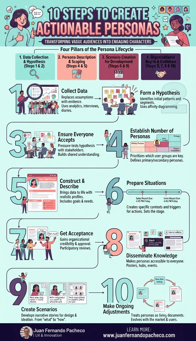
Creating engaging personas is not a one-week exercise to be filed away and forgotten. It is a strategic commitment to human-centered design. This 10-step process provides a robust framework, but its success hinges on a cultural shift within your organization—a shift from building for “the user” to designing for “Maria,” “John,” and “Akira.”
Author: Juan Fernando Pacheco
I am Juan Fernando Pacheco, a Business Development Manager, Senior Product Designer, and UX Designer with 20+ years of experience working on user-centered experiences, developing products and services driven by research and design.
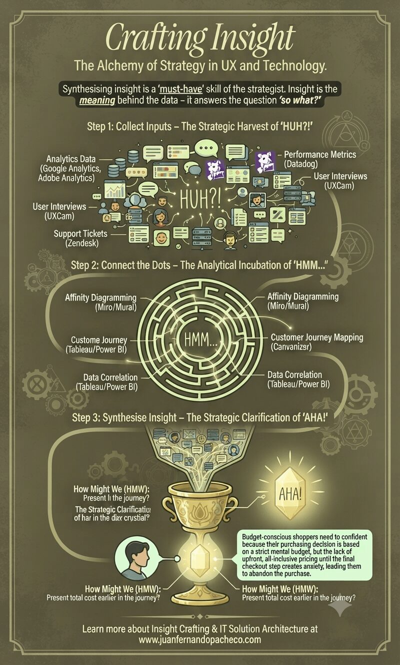
Crafting insight is not a linear, one-time event. It’s a continuous, iterative cycle. As you build and test solutions based on your insights, you generate new data, leading to new “HUH?!” moments, and the cycle begins anew.
Remember: quality insights will lead to quality strategy.
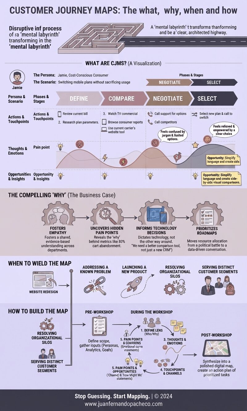
A Customer Journey Map is more than a diagram; it’s a strategic compass. It aligns your organization’s internal machinery with the external reality of your customer’s experience. It transforms abstract data into human stories, and those stories into a clear, actionable blueprint for improvement.
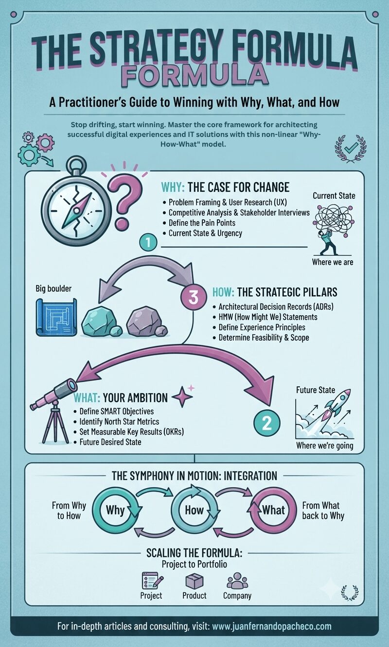
In a world of infinite distractions and limited resources, clarity is your most significant competitive advantage. The Strategy Formula—Why, How, What—is the ultimate tool for achieving that clarity. It forces rigor, fosters alignment, and grounds your ambition in reality.
It prevents the all-too-common pitfalls: the solution in search of a problem, the activity mistaken for progress, and the vague goal that inspires no one.
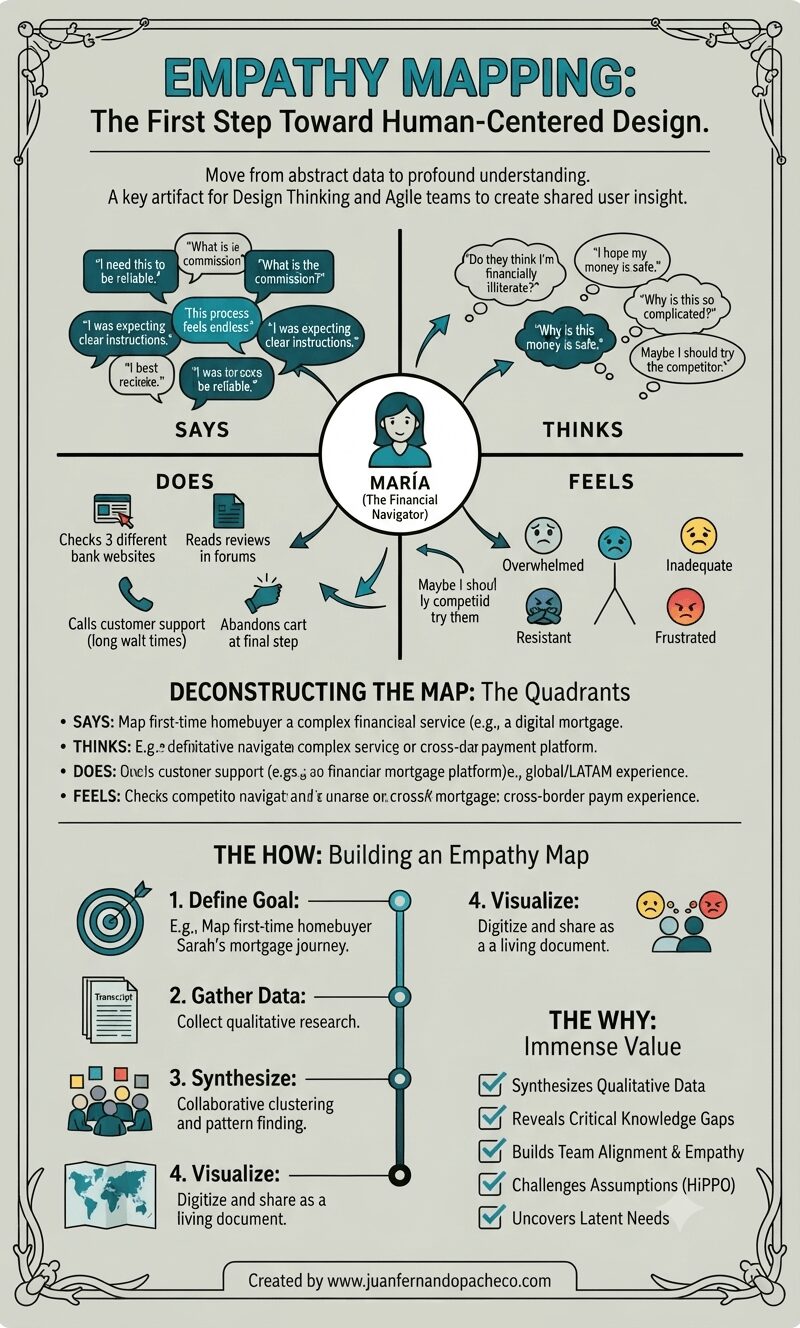
An empathy map is more than just a diagram on a wall. It is a practice, a mindset, and a commitment to seeing the world through someone else’s eyes. It transforms the abstract “user” into a human with hopes, frustrations, and a complex inner world.
By systematically capturing what our users Say, Think, Do, and Feel, we move beyond building mere features.
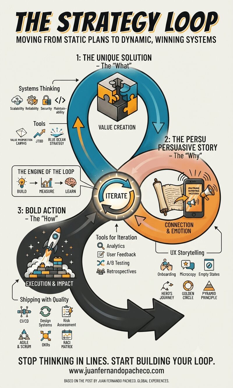
The Strategy Loop transforms strategy from a static document owned by a few executives into a dynamic, living system that empowers the entire organization. It aligns the logical rigor of the solutions architect with the empathetic, human-centered focus of the UX designer.
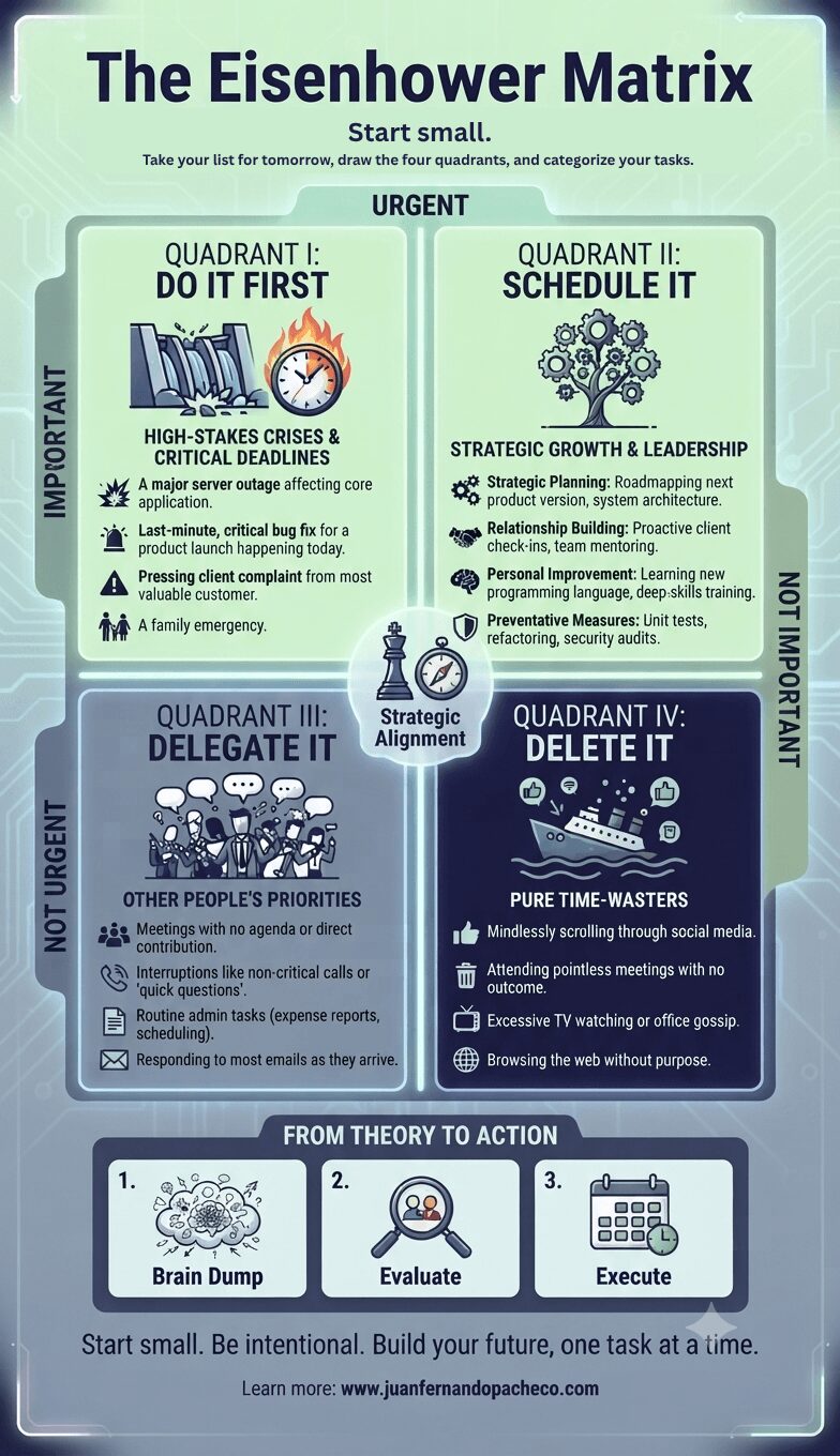
The Eisenhower Matrix is more than a productivity hack; it is a philosophy of intentional living. It teaches us to be the architects of our time rather than the tenants of other people’s urgency. By consistently asking, “Is this important?” we align our daily actions with our long-term vision.
The goal is not to achieve a perfect, static state where no emergencies exist. The goal is to cultivate the habit of discernment—to spend more of our precious time in Quadrant II, building a meaningful future, one scheduled, important task at a time.
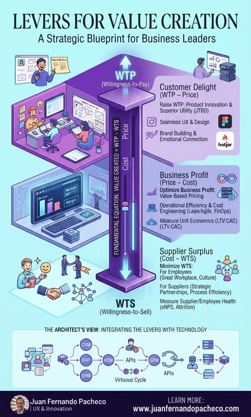
The Value Stick is more than a diagram; it is a mindset. It forces a holistic view of your business ecosystem. You cannot win by delighting customers while exploiting employees. You cannot sustain profit by cutting costs without regard for the value you destroy.
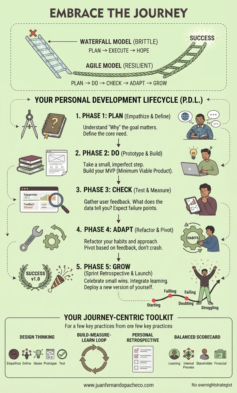
In technology, a product is never truly “finished.” It is continuously improved upon in a live environment based on user interaction and changing conditions. Your life and goals are the same.
The wall decal that inspired this article isn’t a picture of failure; it’s an accurate map of the Agile development cycle for a human being. Starting, Learning, Practicing, Doubting, Failing, Feeling Lost, Struggling—these are not signs that you are off course. They are the necessary phases of a well-architected, resilient, and meaningful life.
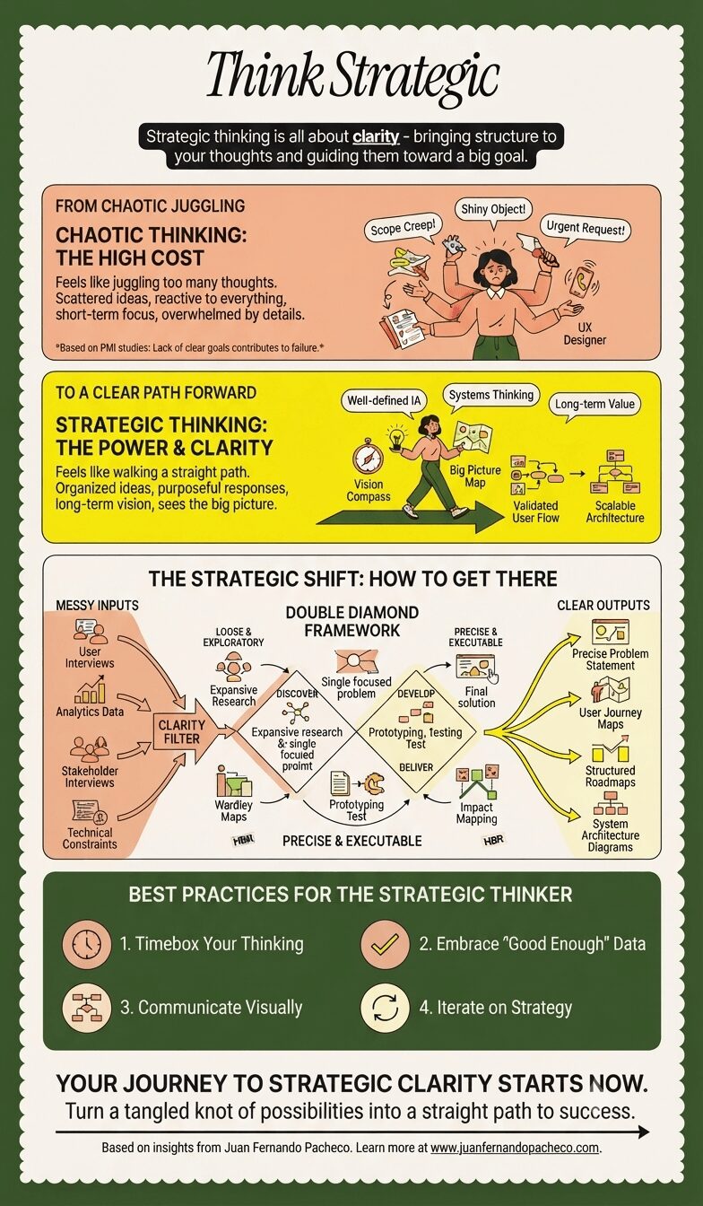
The journey from messy to clear thinking is a discipline. It’s a commitment to moving beyond the comfortable chaos of reaction and into the disciplined clarity of purpose. It’s the difference between juggling blindly and walking purposefully toward a known destination.