A Comprehensive Guide
In today’s fast-paced digital world, creating consistent and user-friendly interfaces is essential for delivering outstanding user experiences.
The Lightning Design System (LDS) offers designers and developers a powerful framework to achieve this goal, specifically for applications built on the Salesforce platform.
This post delves into the details of the Lightning Design System, its key principles, strengths, weaknesses, opportunities, threats, and best practices for implementation.
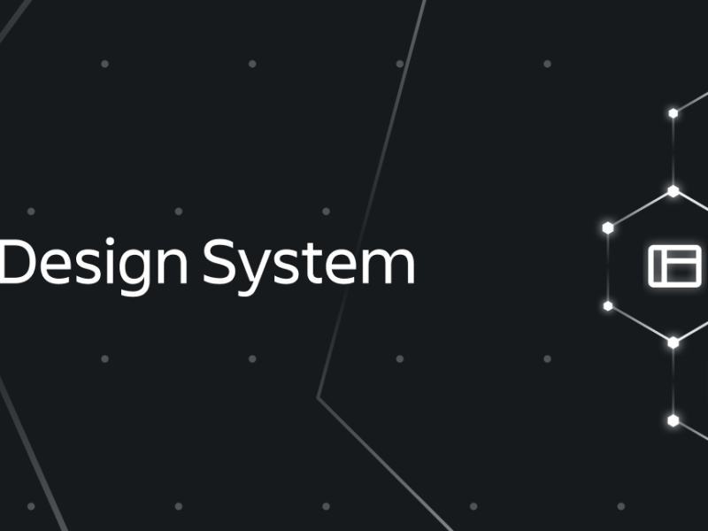
What is the Lightning Design System?
The Lightning Design System (LDS) is a robust collection of design guidelines, principles, and reusable components designed to ensure consistency within the Salesforce Lightning Experience. By using LDS, designers and developers can create user interfaces (UIs) that are visually cohesive, accessible, and easy to customize.
LDS draws inspiration from Material Design, leveraging:
- Grid-based layouts for organizing content.
- Responsive animations and transitions to improve interactivity.
- Padding and depth effects, like lighting and shadows, to establish a clear hierarchy and context.
Moreover, LDS includes design tokens for customizable styles, such as:
- Colors
- Fonts
- Spacing
This flexibility allows teams to tailor the system while maintaining consistency with Salesforce’s visual identity.
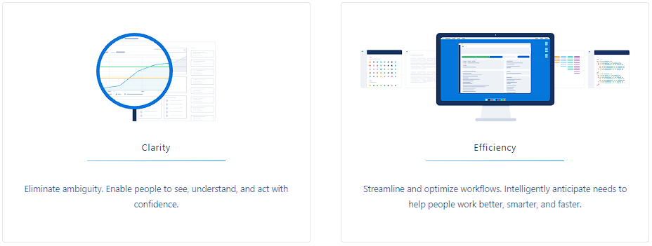
Accessibility, Internationalization, and Performance
LDS goes beyond aesthetics. It includes comprehensive guidelines for:
- Accessibility: Ensuring inclusivity for users with disabilities.
- Internationalization: Facilitating easy translation and cultural adaptation.
- Performance: Optimizing interfaces for speed and efficiency.
By adhering to these principles, LDS helps teams deliver interfaces that are:
- Visually appealing.
- Intuitive.
- Functional across various devices and platforms.
Key Principles of the Lightning Design System
1. User-Centered Design
At its core, LDS prioritizes users by creating interfaces that are:
- Intuitive
- Easy to navigate
- Accessible to all users, regardless of their abilities.
2. Consistency and Predictability
LDS aligns interfaces with the Salesforce Lightning Experience, fostering familiarity and reducing the learning curve for users.
3. Flexibility and Customization
With reusable components and design tokens, LDS supports custom designs tailored to diverse project requirements.
4. Accessibility
LDS incorporates accessibility standards (e.g., WCAG) to ensure usability for people with disabilities.
5. Internationalization
LDS provides resources for translating UIs into multiple languages, making them adaptable for global audiences.
By following these principles, LDS ensures a seamless and inclusive user experience.
SWOT Analysis of the Lightning Design System
Strengths
- Comprehensive tools for creating Salesforce-consistent UIs.
- Built on Material Design principles for hierarchy and context.
- Includes design tokens for easy customization.
- Focused on accessibility, internationalization, and performance.
Weaknesses
- Exclusive to the Salesforce Lightning Experience.
- Perceived rigidity may limit creative freedom.
- Dependency on Salesforce’s commitment to maintaining LDS.
Opportunities
- Establish itself as the go-to design system for Salesforce UIs.
- Expand influence in the enterprise software market.
- Continuously evolve to include emerging design trends.
Threats
- Competition from other design systems, such as Apple’s Human Interface Guidelines.
- Potential decline in Salesforce Lightning Experience’s popularity.
Best Practices for Using the Lightning Design System
To maximize the benefits of LDS, follow these best practices:
1. Follow the Guidelines
LDS offers detailed documentation covering:
- Design principles
- Components
- UI patterns
Sticking to these ensures consistency and adherence to Salesforce’s standards.
2. Use a Grid-Based Layout
Grids help organize content, creating a clear visual hierarchy. This makes interfaces:
- Structured
- Easy to navigate
3. Leverage Responsive Animations
Animations and transitions enhance usability by:
- Highlighting relationships between elements.
- Providing visual feedback during interactions.
4. Customize with Design Tokens
Adapt the visual style using tokens for:
- Colors
- Fonts
- Spacing
This flexibility enables brand-specific designs without sacrificing consistency.
5. Prioritize Accessibility
Incorporate accessibility best practices, such as:
- Proper color contrast.
- Keyboard navigation support.
- Screen reader compatibility.
6. Address Internationalization
Plan for global audiences by:
- Using translatable strings.
- Designing layouts that accommodate text expansion.
- Considering cultural differences in design.
7. Optimize Performance
Ensure fast load times and smooth interactions by:
- Reducing heavy scripts.
- Using optimized assets.
Why Choose the Lightning Design System?
The Lightning Design System provides an unparalleled framework for building Salesforce applications. Its combination of user-centric principles, robust tools, and comprehensive guidelines ensures that developers and designers can craft interfaces that are:
- Consistent with Salesforce’s aesthetic.
- Accessible to a wide range of users.
- Flexible enough to meet specific project needs.
Whether you’re creating internal tools or customer-facing applications, LDS simplifies the process of delivering high-quality, scalable designs.
Web References for Further Reading
- Salesforce Lightning Design System Official Documentation
- Material Design Principles by Google
- Accessibility Standards (WCAG)
- Salesforce Developers Blog
- Internationalization Techniques for Web Development
By implementing the Lightning Design System effectively, teams can ensure their Salesforce applications are both functional and user-friendly.
Whether you’re a seasoned developer or a designer new to the platform, LDS is your roadmap to creating seamless, scalable, and accessible UIs.