Material Design An In-Depth Exploration
Material Design is a design language developed by Google and introduced in 2014. Since its inception, it has transformed the way designers and developers create user interfaces by offering a comprehensive set of guidelines and principles.
Its primary aim is to create a unified user experience across devices and platforms by delivering consistent design elements, interactions, and visual cues. This post dives into the design system —what it is, its core principles, strengths, challenges, and best practices—to provide you with a thorough understanding of its impact and utility.
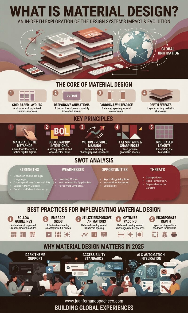
The Core of Material Design
The design System aims to create visually appealing and intuitive user interfaces that adapt seamlessly to various platforms and devices. At its heart, it uses:
- Grid-based layouts: Content is organized systematically, promoting hierarchy and making navigation intuitive.
- Responsive animations and transitions: These elements create smooth interactions and help users understand relationships between UI components.
- Padding and whitespace: These features emphasize key content while maintaining a clean aesthetic.
- Depth effects: Shadows and lighting effects add hierarchy and a sense of realism to the UI.
These foundational aspects ensure that Material Design delivers a cohesive and engaging user experience.
Key Principles
Material Design is built on a set of guiding principles that define its aesthetic and functional aspects:
1. Material is the Metaphor
The design System mimics the physical world. By incorporating textures, patterns, and lighting effects, it creates interfaces that feel tangible and relatable, enhancing the user’s connection with the digital environment.
2. Bold, Graphic, Intentional
The use of vibrant colors, bold typography, and clear visual hierarchy directs users’ attention to essential elements. This approach ensures clarity and usability across various applications.
3. Motion Provides Meaning
Animations and transitions are integral to Material Design. These elements guide users, highlight relationships between UI components, and make interactions more intuitive.
4. Flat Surfaces and Sharp Edges
A clean, modern aesthetic is achieved through flat designs and sharp edges, creating a professional and uncluttered interface.
5. Grid-based Layouts
The content organization relies on a robust grid system, promoting consistency and enhancing the user’s ability to navigate through interfaces effortlessly.
SWOT Analysis of Material Design
To better understand the significance and challenges of Material Design, let’s break it down using a SWOT analysis:
Strengths
- Comprehensive Design Language: Provides clear guidelines and components for consistent, visually appealing interfaces.
- Cross-platform Compatibility: Ensures a seamless experience across devices and platforms.
- Support from Google: Backed by a tech giant, guaranteeing ongoing improvements and widespread adoption.
- Depth and Visual Hierarchy: Incorporates shadows, lighting, and whitespace to create intuitive interfaces.
Weaknesses
- Learning Curve: Designers and developers new to Material Design may need time to master its nuances.
- Not Universally Applicable: May not fit every application or interface, particularly those requiring distinct branding or unconventional layouts.
- Perceived Similarity: Critics argue it borrows heavily from other design systems, reducing its differentiation.
Opportunities
- Expanding Adoption: Increasingly popular in various industries, from e-commerce to education.
- Innovation Potential: With updates and refinements, it can continue to lead in UI/UX design standards.
- Scalability: Works well for both small-scale projects and enterprise-level applications.
Threats
- Competition: Faces rivalry from Apple’s Human Interface Guidelines and other design systems.
- Rigid Perception: Overly prescriptive guidelines may limit creative freedom.
- Dependence on Google: Its longevity and relevance hinge on Google’s continued support.
Best Practices for Implementing Material Design
1. Follow the Guidelines
Google’s official Material Design documentation offers comprehensive guidelines for designers and developers. Adhering to these ensures consistency and aligns with the intended aesthetic.
2. Embrace Grid-based Layouts
Grids help organize content systematically, making interfaces cleaner and easier to navigate. Ensure alignment and spacing adhere to Material Design’s recommendations for a polished result.
3. Utilize Responsive Animations and Transitions
Implement smooth animations that guide users and enhance interactivity. Examples include button presses or transitions between pages that use Material Design’s motion principles.
4. Optimize Padding and Whitespace
Whitespace directs attention to key content and avoids clutter. Use it strategically to enhance readability and focus.
5. Incorporate Depth Effects
Shadows and lighting create a three-dimensional feel, making interfaces more engaging. Follow depth guidelines to avoid overuse or underuse.
Why Material Design Matters in 2025
As of 2025, Material Design continues to dominate the UI/UX landscape due to its adaptability, consistency, and focus on user-centric design. With ongoing updates from Google, it addresses modern challenges like dark mode compatibility, accessibility, and seamless integration with AI-driven platforms.
- Dark Theme Support: Material Design’s dark mode guidelines ensure readability and aesthetic appeal in low-light environments.
- Accessibility Standards: Its principles emphasize inclusivity, catering to users with diverse abilities.
- AI and Automation Integration: Material Design evolves to complement AI-driven tools, making interfaces smarter and more intuitive.
Conclusion
Material Design’s comprehensive approach revolutionized digital interfaces. Its guiding principles of realism, bold design, intuitive motion, and structured layouts provide a robust framework for creating user-friendly and visually stunning applications. Whether you’re a seasoned designer or a developer exploring UI/UX design, understanding and implementing Material Design principles can elevate your projects.
For more resources, explore:
- Material Design Official Documentation
- Google’s Material Design Blog
- Material Design Github Repository
By embracing Material Design, you’re not just creating interfaces—you’re building experiences that resonate with users across the globe.