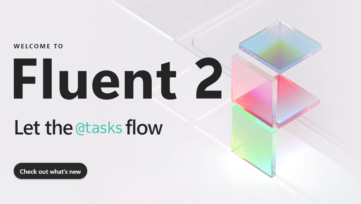
The Fluent Design System, developed by Microsoft, represents a groundbreaking framework for creating user-centered designs across the company’s diverse portfolio of products and services.
As a comprehensive design ecosystem, Fluent Design equips designers and developers with principles, guidelines, and best practices to ensure a cohesive and consistent user experience (UX) across platforms.
Let’s explore what makes the Fluent Design System a cornerstone of modern digital design.
Understanding the Core of Fluent Design
At its heart, the Fluent Design System revolves around five foundational principles: innovation, clarity, inclusiveness, user-centeredness, and consistency. These principles shape its mission to craft future-ready, accessible, and intuitive designs for a diverse user base.
Key Principles of Fluent Design
- Innovation:
- Fluent Design emphasizes staying ahead of design trends and incorporating cutting-edge technologies to meet users’ evolving needs. It fosters a future-forward approach that pushes the boundaries of creativity.
- Clarity:
- Interfaces built with Fluent Design are intuitive and easy to navigate. By prioritizing clear labels, intuitive layouts, and well-defined feedback mechanisms, the system ensures a smooth user experience.
- Inclusiveness:
- A cornerstone of Fluent Design is inclusivity. The system reflects Microsoft’s commitment to creating designs that cater to various demographics, cultural backgrounds, and abilities. From accessibility standards to responsive layouts, inclusiveness is deeply embedded in its framework.
- User-Centeredness:
- Fluent Design prioritizes the preferences, goals, and needs of its users. Rigorous user research and feedback loops enable designers to create interfaces that truly resonate with the target audience.
- Consistency:
- Consistency across products is crucial for reinforcing brand identity and ensuring familiarity. Fluent Design employs a unified visual language, patterns, and components to achieve this.
The Fluent Design Language: A Comprehensive Toolkit
A pivotal component of the Fluent Design System is the Fluent Design Language, a robust toolkit that empowers designers and developers. This toolkit includes:
- Color Palettes: Rich and dynamic colors help create visually engaging interfaces.
- Typography: Scalable, legible, and expressive fonts ensure clarity in communication.
- Iconography: A vast library of icons promotes consistency while addressing various design needs.
- Layout Grids: Structured grids facilitate alignment and organization, enhancing visual harmony.
- Design Patterns: Proven solutions to common design challenges enable a seamless user journey.
These resources provide a foundation for crafting experiences that are not only user-centered but also aligned with Microsoft’s design ethos.
SWOT Analysis of Fluent Design System
To better understand the strengths, weaknesses, opportunities, and threats of the Fluent Design System, here’s a detailed SWOT analysis:
Strengths:
- Innovation: The focus on advanced technologies positions Microsoft as a leader in design innovation.
- Clarity: Emphasizing usability ensures high user satisfaction and engagement.
- Inclusiveness: By addressing diverse user needs, Fluent Design enhances its appeal to a global audience.
Weaknesses:
- Limited Adoption: Inconsistent adoption across Microsoft products may dilute the user experience.
- Limited Scope: The system’s primary focus on UI/UX excludes broader design disciplines, such as branding.
- Inflexibility: Strict guidelines can hinder creativity and limit unconventional design approaches.
Opportunities:
- Improved User Experience: Broader adoption could lead to a more cohesive and user-friendly design ecosystem.
- Extended Use Cases: Expanding the system to cover branding and communication design can open new possibilities.
Threats:
- Competition: Rival design systems, like Google’s Material Design and Apple’s Human Interface Guidelines, pose significant competition.
- Evolving Trends: As design trends shift, Fluent Design must continually adapt to maintain relevance.
Best Practices for Implementing Fluent Design
To maximize the benefits of Fluent Design, adhere to these best practices:
- Leverage Core Principles:
- Use elements like light, depth, motion, material, and scale to establish a clear visual hierarchy and guide user interactions.
- Transparency and Layering:
- Incorporate transparent layers to create depth and complexity, enriching the visual experience.
- Incorporate Motion:
- Use animation and motion thoughtfully to provide feedback, guide users, and enhance interactivity.
- Emphasize Material:
- Employ material-based elements to add physicality and focus, directing attention to key areas.
- Maintain Proper Scaling:
- Ensure scalable layouts that adapt seamlessly to different devices, maintaining usability and readability.
Why Fluent Design Matters
Fluent Design is more than just a design system—it is a philosophy that prioritizes user satisfaction through innovation, inclusivity, and consistency. By creating interfaces that are both functional and aesthetically pleasing, Fluent Design helps Microsoft stand out in a competitive digital landscape.
References
For more insights into Fluent Design and its principles, explore the following resources:
- Microsoft Fluent Design System Overview: https://developer.microsoft.com/en-us/fluentui
- Official Fluent Design Language Documentation: https://learn.microsoft.com/en-us/windows/apps/design
- Insights on User-Centered Design Principles: https://www.nngroup.com
- Comparison with Other Design Systems: https://material.io/design (Google Material Design) https://developer.apple.com/design/human-interface-guidelines (Apple’s Human Interface Guidelines)
By adopting Fluent Design System’s guidelines, designers and developers can deliver exceptional user experiences that are innovative, inclusive, and tailored to the modern user.
This comprehensive understanding of Fluent Design System highlights its potential to shape the future of digital experiences, emphasizing why it remains a vital asset in the UX design landscape.


