A Designer’s Guide to Utilizing Nature-Inspired Color Palettes
The visual landscape surrounding us offers an inexhaustible wellspring of inspiration, particularly in the realm of color. For UI and graphic designers, the ability to effectively harness color is fundamental to crafting impactful and user-centric designs.
Natural Harmony, with its inherent balance and aesthetically pleasing combinations, presents a readily available and profoundly influential source for color palettes. By observing and thoughtfully extracting hues from natural scenes, designers can infuse their work with a sense of authenticity, visual coherence, and emotional resonance that deeply connects with audiences.
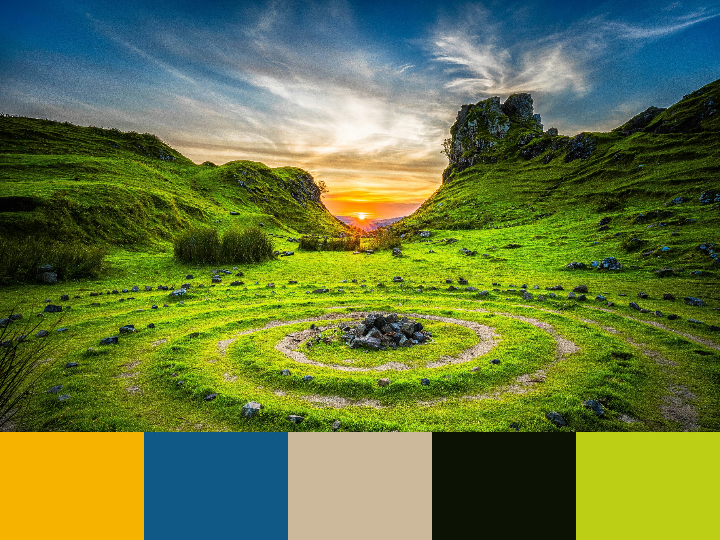
Consider a breathtaking panorama where rolling, verdant terrain meets a dynamic sky painted with the warm hues of either sunrise or sunset.
The interplay of light and shadow across the landscape creates a rich tapestry of colors, each contributing to the overall mood and atmosphere. Analyzing such a scene through a design lens can yield a wealth of color combinations that can be directly translated into diverse design applications.
The provided image captures precisely this type of evocative natural harmony. Lush, green slopes undulate beneath a sky transitioning from a deep, clear blue to the vibrant oranges and yellows of the sun near the horizon.
Distinct rock formations punctuate the landscape, adding visual interest and textural contrast. A unique circular pattern on the ground introduces an element of visual intrigue. This visual richness is further distilled into a curated color palette at the bottom of the image, providing a practical starting point for design exploration.
Deconstructing the Natural Harmony:
The accompanying palette comprises five distinct colors, each reflecting a key element within the depicted landscape:
#F6B400 (Vibrant Yellow-Orange): This bright, energetic hue captures the intense warmth and luminosity of the sun near the horizon. It evokes feelings of optimism, energy, and vibrancy. In design, this color can be effectively used for primary calls to action, highlighting key information, or adding a touch of visual excitement. Its high visibility makes it suitable for drawing attention to important elements in a user interface or graphic layout. However, it should be used judiciously to avoid overwhelming the user.
#105987 (Deep Teal-Blue): This rich, cool tone reflects the deeper parts of the sky, particularly away from the immediate vicinity of the sun. It conveys a sense of calmness, stability, and professionalism. In design, this color can be used for backgrounds, navigation elements, or as a contrasting color to warmer hues. Its association with trust and reliability makes it a strong contender for interfaces related to finance, technology, or corporate branding.
#CCB99B (Warm Beige): This neutral, earthy tone reflects the subtle highlights on the grassy terrain or the lighter tones of the rock formations. It offers a sense of warmth, naturalism, and understated elegance. In design, this color serves as an excellent background, providing a calm and unobtrusive canvas for other elements. It can also be used for subtle textures, secondary text, or as a neutral contrast to both warm and cool colors in the palette. Its versatility makes it suitable for a wide range of applications.
#0D1304 (Deep Charcoal Green): This near-black, organic tone represents the deepest shadows within the landscape, the dense patches of vegetation, or the dark crevices of the rock formations. It conveys a sense of depth, grounding, and sophistication. In design, this color is invaluable for creating strong visual anchors, defining text for optimal readability, or adding a touch of drama and elegance as an accent. It should be used thoughtfully for large areas to avoid appearing too heavy, but it provides excellent contrast and legibility for typography and key UI elements.
#BDCF15 (Bright Lime Green): This vibrant, fresh hue captures the most sunlit areas of the lush vegetation, conveying a sense of vitality, growth, and energy. It evokes feelings of freshness and natural abundance. In design, this color can be used as a striking accent, for calls to action related to positive outcomes, or to highlight interactive elements. Its association with nature and growth makes it particularly relevant for designs related to health, sustainability, or innovative technologies.
Practical Applications in UI and Graphic Design:
The inherent natural harmony within this nature-inspired palette makes it adaptable for a wide range of design applications:
User Interface Design:
Creating Invigorating and Balanced Experiences: For applications focused on outdoor activities, travel, or creative pursuits, this palette can evoke a sense of energy and inspiration. The vibrant yellow-orange (#F6B400) can highlight key features or calls to action, while the deep teal-blue (#105987) provides a calming and reliable backdrop for navigation. The warm beige (#CCB99B) can serve as a neutral content area, and the bright lime green (#BDCF15) can draw attention to interactive elements or positive feedback. The deep charcoal green (#0D1304) can ensure text readability and provide strong visual anchors.
Building Trust and Professionalism: For platforms related to finance, education, or professional services, the deep teal-blue (#105987) can establish a sense of trust and stability. The warm beige (#CCB99B) can provide a neutral and accessible background, while the deep charcoal green (#0D1304) ensures clear typography. The vibrant yellow-orange (#F6B400) can be used sparingly for important notifications or key actions, and the bright lime green (#BDCF15) can represent growth or positive progress.
Enhancing Visual Hierarchy and User Guidance: The contrasting nature of the colors in this palette allows for clear visual hierarchy. The vibrant yellow-orange (#F6B400) and bright lime green (#BDCF15) can be used to draw the user’s eye to important elements, while the deeper tones (#105987 and #0D1304) can provide structure and grounding. The warm beige (#CCB99B) offers a neutral space for content, ensuring that key elements stand out effectively.
Ensuring Accessibility: When utilizing this palette, designers must prioritize accessibility by ensuring sufficient color contrast between text and background elements. For instance, light text on the deep charcoal green (#0D1304) or deep teal-blue (#105987) will offer good readability. Conversely, dark text on the warm beige (#CCB99B) or brighter hues, used strategically, should also meet accessibility guidelines. Careful consideration of color pairings and contrast ratios is crucial for inclusive design.
Graphic Design:
Developing Dynamic Brand Identities: A brand seeking to convey energy, innovation, or a connection to nature could find a compelling visual identity within this palette. The vibrant yellow-orange (#F6B400) and bright lime green (#BDCF15) can represent energy and growth, while the deep teal-blue (#105987) provides a sense of stability and the warm beige (#CCB99B) offers a grounding neutrality. The deep charcoal green (#0D1304) can add a touch of sophistication and contrast.
Creating Impactful Marketing Materials: Brochures, websites, and social media graphics can leverage the visual interest and emotional resonance of this palette. Imagery of natural landscapes similar to the inspiration image, combined with text and design elements utilizing these colors, can create a captivating and memorable experience for the audience. The vibrant hues can be used strategically to draw attention to key messages or calls to action.
Designing Engaging Print Collateral: For print materials such as posters, flyers, or brochures, this palette offers a range of possibilities for creating visually striking designs. The warm beige (#CCB99B) can serve as a versatile background, allowing the brighter colors (#F6B400 and #BDCF15) to pop and draw the viewer’s attention. The deeper tones (#105987 and #0D1304) can provide structure and ensure readability of textual content.
Developing Thematic Visuals: For projects related to environmental awareness, sustainable practices, or outdoor adventures, this palette offers a natural and relevant aesthetic. The greens (#BDCF15 and implied within #0D1304), the blue (#105987), and the earthy beige (#CCB99B) directly evoke natural landscapes, while the vibrant yellow-orange (#F6B400) can represent the sun and energy.
The Enduring Value of Nature-Inspired Color:
The effectiveness of drawing color inspiration from nature lies in the inherent harmony and emotional associations these palettes possess. These colors are deeply ingrained in our collective experience and often evoke positive feelings of tranquility, energy, or connection. By thoughtfully integrating these hues into their designs, UI and graphic designers can tap into these subconscious associations, creating visuals that feel both natural and compelling.
Furthermore, natural harmony provides an endless source of unique and nuanced color combinations, each with its own distinct character and emotional undertones. By cultivating the ability to observe and analyze the colors present in diverse natural environments, designers can continuously expand their creative toolkit and develop a more sophisticated understanding of color theory in practice.
The provided palette, derived from a vibrant landscape, serves as a powerful illustration of the visual harmony found in the natural world.
By understanding the individual characteristics of each color and exploring their potential combinations, UI and graphic designers can create impactful and resonant designs that effectively communicate their intended message and connect with their target audience on a deeper level.
Embracing nature’s palette is not merely an aesthetic choice; it is a strategic approach to creating visually engaging and emotionally meaningful experiences.