A Practical Guide for UI and Graphic Designers
The visual world around us offers an inexhaustible source of inspiration, particularly in the realm of color. For UI and graphic designers, understanding and effectively utilizing color is paramount to creating impactful and user-friendly designs. Nature, in its boundless complexity and inherent harmony, presents a rich and readily available palette for this purpose. By observing and extracting color schemes from natural landscapes and phenomena, designers can imbue their work with a sense of authenticity, balance, and visual appeal that resonates deeply with audiences.
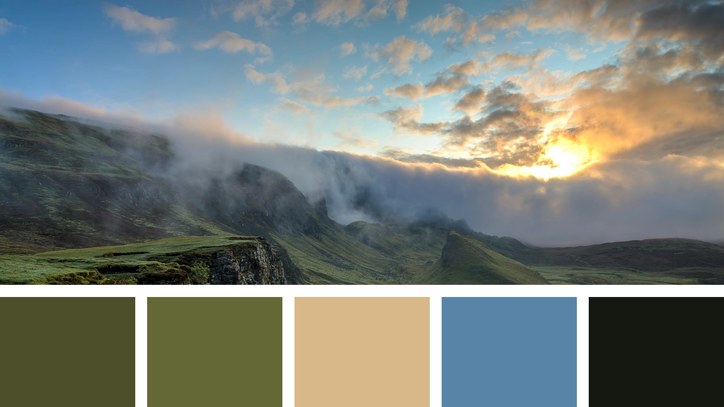
Consider a sprawling vista of undulating terrain, bathed in the soft glow of either dawn or dusk. The interplay of light and shadow across the landscape creates a nuanced spectrum of hues, each contributing to the overall mood and atmosphere. Analyzing such a scene can yield a wealth of color combinations that can be directly translated into design applications.
The provided image captures precisely this kind of evocative landscape. Rolling hills, cloaked in varying shades of verdant vegetation, stretch towards a horizon where the sky transitions from a soft, misty blue to the warm, golden tones of the sun. The rugged texture of a prominent cliff face adds depth and contrast, while a winding path subtly guides the eye through the scene. This visual richness is further distilled into a curated color palette at the bottom of the image, offering a tangible starting point for design exploration.
Deconstructing nature’s palette:
The accompanying nature’s palette comprises five distinct colors, each reflecting a key element within the landscape:
#4D4E2A (Dark Olive Green): This deep, earthy tone evokes the shadows and denser foliage found within the landscape. It speaks of stability, grounding, and a connection to the natural world. In design, this color can be effectively used for backgrounds, text, or accent elements where a sense of weight and authority is desired. Its low saturation makes it easy on the eyes and suitable for extended viewing, making it a strong contender for body text in digital interfaces.
#646837 (Olive Green): A lighter, more vibrant shade of green, this color represents the sunlit vegetation and the overall vitality of the landscape. It conveys a sense of growth, freshness, and natural harmony. Designers can utilize this hue for primary or secondary accents, calls to action, or visual elements intended to draw attention. Its natural association with life and well-being can be particularly beneficial in designs related to health, environment, or organic products.
#D8B888 (Tan/Sand): This warm, neutral tone reflects the exposed earth, the subtle highlights on the terrain, or even the sandy hues that might be present in a broader natural context. It offers a sense of warmth, neutrality, and understated elegance. In design, this color serves as an excellent background, providing a calm and unobtrusive canvas for other elements. It can also be used for subtle highlights or as a secondary accent to create a sense of balance and visual hierarchy. Its versatility makes it suitable for a wide range of applications, from minimalist interfaces to more complex graphic layouts.
#5885A7 (Dusty Blue): This muted blue captures the atmospheric perspective of the distant sky or the hazy quality of the light. It evokes feelings of calmness, serenity, and openness. In UI design, this color can be used for navigation elements, subtle backgrounds, or as an accent color to create a sense of spaciousness and clarity. Its association with tranquility can be particularly useful in applications aimed at reducing stress or promoting focus. In graphic design, it can add a touch of sophistication and visual interest without being overly dominant.
#151811 (Dark Charcoal): This deep, almost black hue represents the darkest shadows, the rugged textures of rock formations, or the intensity of a twilight sky. It conveys a sense of strength, contrast, and sophistication. In design, this color is invaluable for creating strong visual anchors, defining text readability, or adding a touch of drama and elegance. It should be used judiciously, particularly for large areas, to avoid overwhelming the user. However, as an accent or for typography, it provides excellent contrast and legibility.
Applying Nature’s Palette in Design:
The beauty of drawing inspiration from nature’s palette lies in the inherent harmony of its color combinations. These nature’s palettes are not arbitrary; they are the result of millennia of visual evolution, pleasing to the human eye and evoking a sense of natural order. UI and graphic designers can leverage this inherent harmony in numerous ways:
User Interface Design:
Creating Calm and Focused Environments: A UI for a meditation app, for instance, could effectively utilize the dusty blue (#5885A7) and the lighter olive green (#646837) for backgrounds and subtle accents, fostering a sense of tranquility and natural peace. The tan (#D8B888) could serve as a neutral backdrop for text and interactive elements, ensuring readability and minimizing distraction.
Building Trust and Reliability: For a financial institution’s website or application, the dark olive green (#4D4E2A) could be used for primary navigation and key informational blocks, conveying a sense of stability and trustworthiness. The tan (#D8B888) could provide a neutral and professional background, while the dusty blue (#5885A7) could be used for secondary actions or informational cues.
Enhancing User Engagement: An application focused on outdoor activities or environmental awareness could embrace the full spectrum of the palette. The vibrant olive green (#646837) could highlight calls to action and key features, while the darker olive (#4D4E2A) and charcoal (#151811) could provide grounding and contrast. The dusty blue (#5885A7) could evoke the open sky and natural landscapes, enhancing the overall thematic experience.
Improving Accessibility: When using natural palettes, designers must still adhere to accessibility guidelines. The contrast between text and background colors is crucial for readability. For example, white or light text on the dark olive green (#4D4E2A) or charcoal (#151811) would provide sufficient contrast. Similarly, dark text on the tan (#D8B888) or lighter olive (#646837) would ensure legibility. Careful consideration of color pairings and contrast ratios is essential to create inclusive designs.
Graphic Design:
Developing Brand Identities: A brand focused on sustainable practices or natural products could find a strong visual identity in this palette. The olive greens (#4D4E2A and #646837) directly communicate a connection to nature, while the tan (#D8B888) adds a touch of organic warmth. The dusty blue (#5885A7) could represent a commitment to environmental responsibility, and the charcoal (#151811) could provide a sophisticated and grounding element.
Creating Marketing Materials: Brochures or websites for eco-tourism could utilize the landscape-inspired palette to evoke the beauty and tranquility of natural destinations. Large images showcasing similar landscapes, paired with text using the dark olive green (#4D4E2A) and accented with the lighter olive (#646837), could create a compelling and immersive experience for potential travelers.
Designing Print Collateral: For print materials, the earthy tones of the palette can translate beautifully, offering a sense of natural elegance and sophistication. Business cards or stationery using the tan (#D8B888) as a base, with accents of the dark olive green (#4D4E2A) and charcoal (#151811), can convey a sense of professionalism and understated style.
Illustrative Work: Artists and illustrators can draw directly from this palette to create visually harmonious and evocative depictions of natural scenes or abstract concepts inspired by nature. The subtle variations within the green and blue tones allow for depth and nuance, while the tan and charcoal provide essential contrast and grounding.
The Enduring Appeal of Nature’s Palette:
The effectiveness of nature’s palette stems from its inherent familiarity and the positive associations they evoke. These colors are deeply ingrained in our collective consciousness, representing life, growth, stability, and tranquility. By thoughtfully incorporating these hues into their designs, UI and graphic designers can tap into these subconscious connections, creating visuals that feel both natural and appealing.
Furthermore, nature offers an endless array of color combinations, each with its own unique character and emotional resonance. By learning to observe and analyze the colors present in different natural settings – from forests and mountains to oceans and deserts – designers can expand their creative toolkit and develop a more nuanced understanding of color theory in practice.
The provided palette, derived from a serene landscape, serves as a powerful reminder of the visual harmony found in the natural world. By understanding the individual characteristics of each color and exploring their potential combinations, UI and graphic designers can create impactful and resonant designs that connect with users on a deeper level. Embracing nature’s palette is not merely an aesthetic choice; it is a strategic approach to creating visually compelling and emotionally engaging experiences. The key lies in thoughtful application, ensuring accessibility and aligning the color choices with the overall message and purpose of the design.