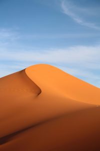
Desert’s Embrace
Color, a cornerstone of effective UI and graphic design, holds immense power to influence perception, guide user interaction, and forge strong emotional connections. While the boundless array of synthetic color choices offers creative freedom, a particularly impactful and resonant approach lies in drawing directly from the raw, elemental beauty of natural desert landscapes.
By meticulously observing and extracting the subtle nuances and compelling harmonies found in diverse natural environments, designers can infuse their work with authenticity, visual depth, and an inherent appeal that resonates deeply with human psychology.
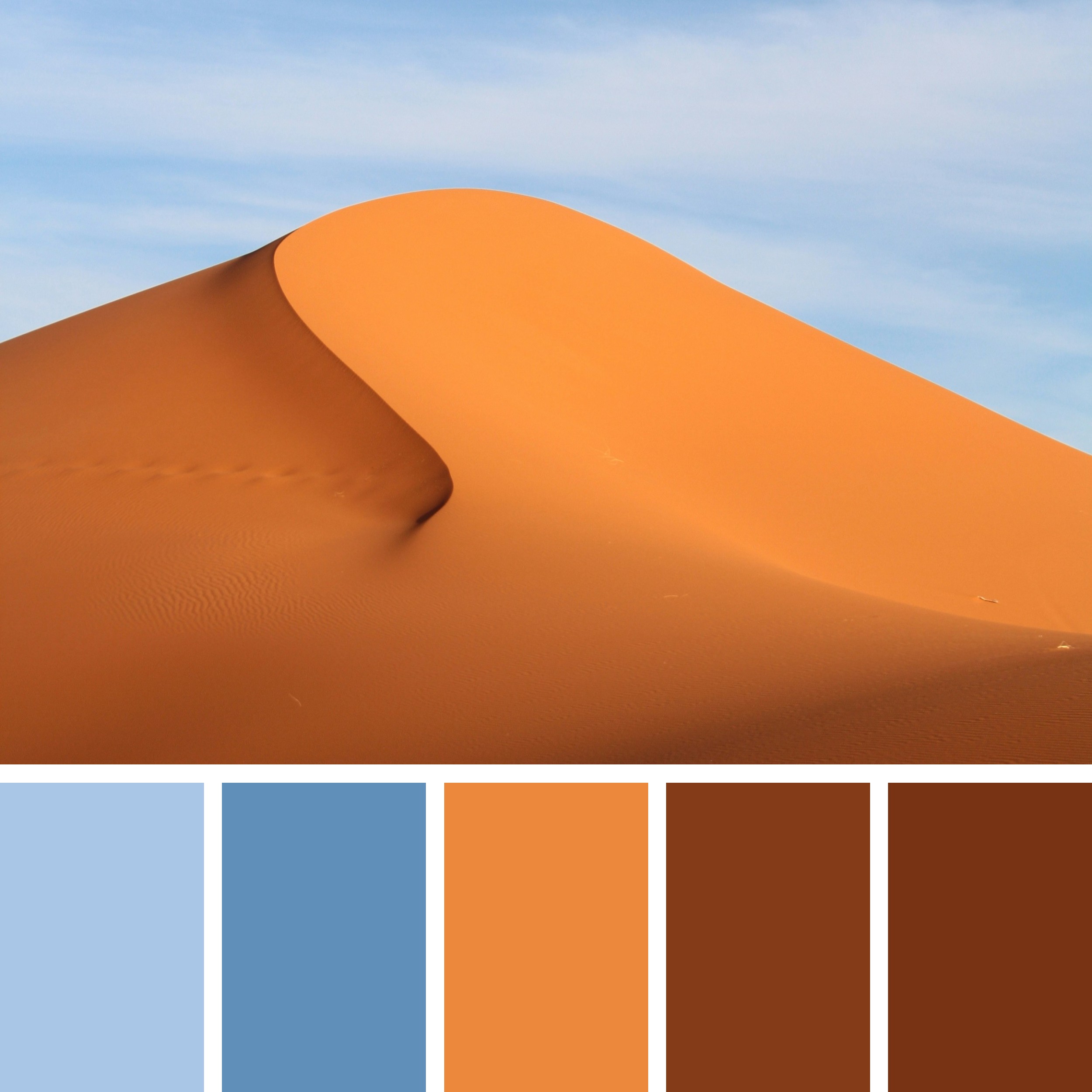
Consider the stark yet captivating beauty of a desert landscape, where monumental sand dunes meet a vast, open sky. The interplay of sunlight on the sculpted sand, the subtle color shifts across the dune’s surface, and the expansive blue of the sky create a scene of profound simplicity and striking contrast.
This kind of minimalist natural observation, when approached with a designer’s discerning eye, can yield a robust and versatile color palette perfectly suited for applications demanding clarity, warmth, and a sense of enduring strength.
The desert’s image captures precisely this kind of serene and powerful natural setting. A grand sand dune, with its elegantly curved crest, dominates the foreground, displaying a range of warm orange and brown tones.
Above, a clear, pale blue sky stretches, offering a cool counterpoint to the warm earth below. The soft light illuminates the texture of the sand, highlighting subtle shifts in color and form. This visual richness is meticulously distilled into a curated color palette at the bottom of the image, offering a tangible starting point for practical design exploration.
Deconstructing the Desert Palette’s Significance:
The accompanying palette comprises five distinct colors, each reflecting a key aspect within the depicted desert landscape:
#A9C6E6 (Pale Sky Blue): This light, ethereal blue evokes the vast, clear expanse of the desert sky, particularly near the horizon or in softer light conditions. It conveys a sense of openness, tranquility, and lightness. In design, this color can be highly effective as a primary background for web interfaces, creating a feeling of spaciousness and calm. It can also be used for subtle navigation elements, light borders, or as a secondary accent to introduce a refreshing contrast to warmer tones. Its muted quality ensures it doesn’t overpower other elements, promoting a sense of serene focus.
#608FB9 (Mid-Tone Sky Blue): This deeper, more saturated blue reflects the richer tones of the desert sky, perhaps higher up or under more direct sunlight. It offers a sense of depth, stability, and a touch of grounded coolness. Designers can effectively utilize this color for primary navigation, headers, or as a more prominent background section where a sense of authority and serene professionalism is desired. It provides a strong, reliable foundation and a sophisticated contrast to the warm sand tones within the palette.
#EC883C (Vibrant Desert Orange): This bright, energetic orange captures the intense, sun-drenched vibrancy of the sand dunes themselves, especially where they catch the most direct light. It evokes feelings of warmth, energy, enthusiasm, and natural adventure. In design, this color is highly effective for primary calls to action, important highlights, or as a dominant brand accent when a sense of dynamism, warmth, or inviting energy is desired. Its striking visibility makes it excellent for drawing immediate attention in user interfaces and marketing materials, but its intensity suggests thoughtful placement to maximize impact without visual fatigue.
#843B18 (Deep Earthy Brown): This rich, dark brown reflects the deeper, more shadowed areas of the sand dune, or the subtle presence of rock or darker earth within the desert landscape. It conveys a sense of grounding, stability, and profound earthiness. In design, this color is invaluable for strong, authoritative typography, creating clear visual dividers, or as a background for sections that require a high degree of contrast with lighter elements. Its depth provides excellent readability for light-colored text and adds a sophisticated, weighty feel, connecting the design to natural, stable elements.
#783314 (Warm Terracotta Brown): This slightly lighter, warmer brown carries the depth of the previous hue but with a subtle reddish undertone, mimicking the sun-baked, oxidized appearance of desert soil or weathered rock. It offers a sense of rustic warmth, natural texture, and enduring strength. Designers can use this color for secondary accents, subtle background textures, or to add a touch of organic richness to graphical elements. It provides a natural bridge between the vibrant oranges and the deeper browns, enhancing the palette’s overall coherence and warmth.
Practical Applications of the Desert Palette in Design:
The inherent harmony and striking contrasts within this desert-inspired palette make it exceptionally versatile for a wide range of design applications where warmth, clarity, and enduring appeal are desired:
User Interface Design:
Creating Open and Engaging Experiences: For applications related to travel, outdoor adventure, environmental exploration, or educational platforms, this palette can evoke a sense of vastness, calm, and adventure. The pale sky blue (#A9C6E6) can serve as a primary background, offering a feeling of openness. The vibrant desert orange (#EC883C) can highlight key features, calls to action, or interactive elements, inviting exploration. The mid-tone sky blue (#608FB9) can provide sophisticated navigation elements, while the deep earthy brown (#843B18) ensures clear, readable text for content.
Building Trust and Authenticity for Sustainable Brands: For brands emphasizing natural resources, sustainable tourism, or earthy products, this palette visually communicates core values of groundedness and connection to nature. The deep earthy brown (#843B18) and warm terracotta brown (#783314) convey stability and authenticity, while the blues (#A9C6E6, #608FB9) add a refreshing and expansive feel. The vibrant desert orange (#EC883C) can be used for calls to action related to ethical consumption or environmental initiatives, fostering a sense of positive impact.
Enhancing Visual Hierarchy and User Guidance: The clear contrast between the warm desert tones and the cool sky blues allows for effective visual hierarchy. Important content or interactive elements can stand out prominently when designed with the vibrant orange (#EC883C) against a blue background, or dark text in #843B18 against a lighter blue. This strategic use of contrast helps guide the user’s eye and ensures critical information is easily discernible, leading to a more intuitive user experience.
Ensuring Accessibility and Readability: When implementing this palette, designers must consistently check color contrast ratios to meet accessibility guidelines. For example, light text on the deep earthy brown (#843B18) or warm terracotta brown (#783314) will provide excellent readability. Conversely, dark text on the pale sky blue (#A9C6E6) or mid-tone sky blue (#608FB9) should also ensure sufficient contrast. Careful consideration of color pairings and contrast ratios is crucial for creating inclusive and user-friendly interfaces for all.
Graphic Design:
Crafting Evocative Brand Identities: A brand in the outdoor adventure sector, natural wellness, or high-end leisure travel could find a compelling and memorable identity using this palette. The vibrant desert orange (#EC883C) provides an energetic and appealing primary color, representing adventure and warmth. The mid-tone sky blue (#608FB9) and pale sky blue (#A9C6E6) can create a sophisticated and expansive secondary palette. The deep earthy brown (#843B18) and warm terracotta brown (#783314) offer elegant anchors for logos and typography, conveying authenticity and enduring quality.
Developing Immersive Marketing Collateral: Brochures, websites, and digital advertisements can leverage the visual appeal and emotional resonance of this palette to transport the audience to the serene desert setting. Imagery of desert landscapes, combined with text and graphic elements using these harmonious colors, can create a captivating and immersive experience. The warm orange tones evoke feelings of adventure and escape, while the blues offer a refreshing balance.
Designing Visually Rich Print Materials: For high-end print collateral such as travel guides, coffee table books, or luxury product packaging, this palette offers a sophisticated and inviting aesthetic. The warm desert orange (#EC883C) can be used for engaging imagery or key highlights, while the blues provide calming backgrounds. The deep browns (#843B18, #783314) offer a strong foundation for elegant typography and sophisticated layouts, contributing to a premium, tactile feel.
Creating Thematic Illustrations and Infographics: Artists and illustrators can draw directly from these hues to create visually rich and harmonious depictions of natural environments, ecological processes, or travel destinations. The contrast between the warm earth tones and the cool sky blues allows for dynamic compositions and atmospheric depth. This palette can also be effectively used in infographics to represent data related to climate, geology, or resource management, making complex information visually engaging and easily digestible within a relevant aesthetic.
A final word
The timeless appeal of natural color palettes, particularly those inspired by the desert, lies in their ability to evoke a sense of vastness, warmth, and enduring beauty.
By understanding and thoughtfully integrating these elemental hues into their designs, UI and graphic designers can craft visual experiences that are not only aesthetically captivating but also deeply meaningful and effective in achieving their communication goals.
The continuous exploration of nature’s boundless spectrum provides an endless source of inspiration, allowing designers to continually refine their craft and produce work that truly resonates with users on an emotional and intuitive level, fostering a sense of connection to the natural world.
Photo by Fernando Paredes Murillo on Unsplash