A Color Strategy for Designers
Color is a fundamental element in both UI and graphic design, possessing the profound ability to evoke emotions, direct attention, and establish a powerful connection with an audience. While a vast array of synthetic color options exists, drawing inspiration directly from nature’s inherent palettes offers a unique advantage.
Nature and natural color schemes are inherently harmonious and resonate deeply with human perception, creating designs that feel authentic, balanced, and visually compelling. By observing and extracting hues from natural phenomena, designers can imbue their work with an organic richness and psychological depth that is difficult to achieve otherwise.
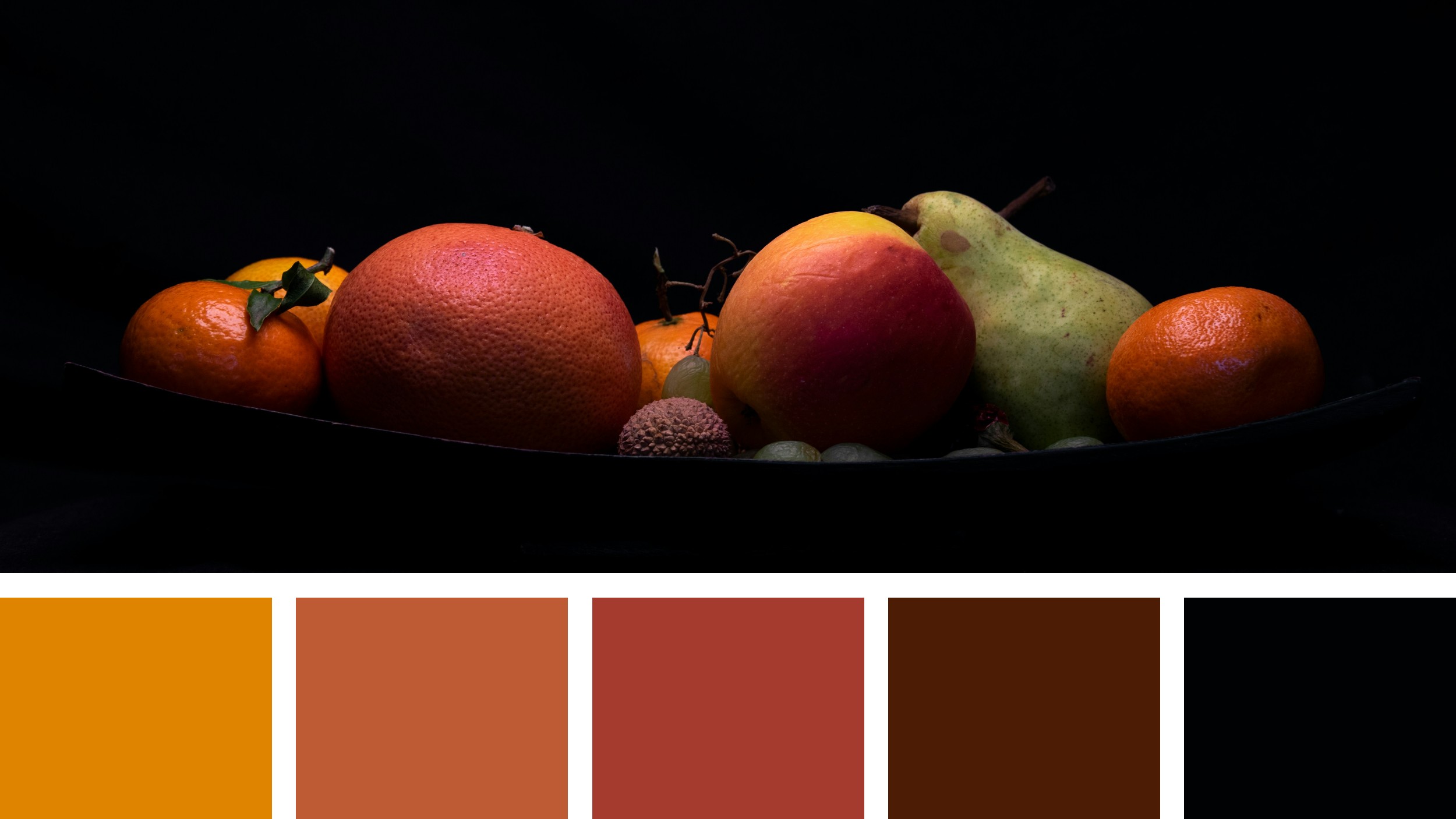
Consider a still life arrangement of fruits, dramatically illuminated against a deep, contrasting background. The interplay of light and shadow on their varied textures and vibrant skins creates a dynamic spectrum of warm, inviting tones. This kind of intimate natural observation, when approached with a designer’s eye, can yield a rich and versatile color palette perfectly suited for a multitude of design applications.
The provided image presents just such a compelling still life. A collection of diverse fruits—oranges, a grapefruit, an apple, and a pear—are artfully arranged in a dark dish, set against an almost absolute black backdrop. The fruits themselves display a stunning range of warm colors, from vibrant oranges to subtle reds and earthy greens, each catching the light and casting soft shadows. This visual richness is meticulously distilled into a curated color palette at the bottom of the image, offering a tangible starting point for practical design exploration.
Decoding the Significance of the Nature Palette:
The accompanying palette comprises five distinct colors, each reflecting a key aspect within the depicted still life:
#DF8400 (Vibrant Orange): This bright, energetic hue captures the intense, sun-kissed vibrancy of a ripe orange or grapefruit. It evokes feelings of warmth, enthusiasm, energy, and cheerfulness. In design, this color is highly effective for primary calls to action, prominent headlines, or as a dominant brand color when a sense of warmth, activity, or inviting energy is desired. Its high visibility makes it excellent for drawing immediate attention in user interfaces and marketing materials, but its intensity suggests thoughtful placement to avoid visual fatigue.
#BE5B34 (Burnt Orange/Terracotta): This richer, deeper orange carries the warmth of the first hue but with an added sense of earthiness and maturity, reflecting the deeper tones found on the skin of certain fruits or the subtle shadows they cast. It conveys feelings of comfort, groundedness, and natural richness. Designers can use this color for secondary accents, textured backgrounds, or for larger blocks of color where a warm, inviting, yet less intense feel is needed. It works well to create a sense of organic authenticity and can provide a strong, warm base for layouts.
#A53B2E (Deep Reddish-Brown): This profound, muted red-brown hue reflects the darkest, most saturated tones of the apple or the deeper, richer parts of the grapefruit’s skin, especially where light is less direct. It evokes feelings of richness, sophistication, and a subtle intensity. In design, this color can be used for important subheadings, sophisticated backgrounds, or to provide a deeper, more luxurious accent in a palette. It can add a touch of elegance and warmth without being overtly bright, providing a strong visual anchor.
#4C1C05 (Dark Chocolate Brown): This very deep, almost black-brown tone represents the profound shadows within the arrangement, the darkest parts of the dish, or the subtle nuances of decay or ripeness on the fruit’s surface. It conveys a sense of grounding, stability, and understated luxury. In design, this color is invaluable for strong, authoritative typography, creating clear visual dividers, or as a background for sections that require a high degree of contrast with lighter elements. Its depth provides excellent readability for light-colored text and adds a sophisticated, weighty feel.
#010204 (Near Black): This extreme dark tone represents the absolute deepest shadow or the backdrop against which the fruits are set, allowing their colors to truly pop. It conveys stark contrast, formality, and serves as a powerful grounding element. In design, this color is best used for primary backgrounds to create dramatic contrast, for critical text elements that require absolute clarity, or as a sophisticated frame for other vibrant colors. Its minimalist nature allows other colors to shine with maximum impact, establishing clear focal points.
Practical Applications of Nature’s Warm Palette in Design:
The inherent harmony and rich contrasts within this fruit-inspired palette make it exceptionally versatile for various design applications:
User Interface Design:
Creating Engaging and Inviting User Experiences: For applications related to food, cooking, wellness, or e-commerce for natural products, this palette can immediately establish a warm, approachable, and trustworthy atmosphere. The vibrant orange (#DF8400) can be used for primary calls to action or “add to cart” buttons, drawing immediate attention. The burnt orange (#BE5B34) can serve as a background for product listings, while the deep reddish-brown (#A53B2E) can highlight category headers. The dark chocolate brown (#4C1C05) ensures clear, readable text, and the near black (#010204) provides a sophisticated backdrop, allowing the product imagery to stand out vividly.
Building Trust and Authenticity: For brands emphasizing natural ingredients, artisanal craftsmanship, or healthy living, this palette visually communicates core values. The warm, earthy tones (#BE5B34, #A53B2E, #4C1C05) convey authenticity and groundedness, while the vibrant orange (#DF8400) adds a touch of fresh, natural energy. This combination can foster a sense of reliability and genuine connection with the user.
Enhancing Visual Hierarchy and Readability: The strong contrast between the darker hues (#4C1C05, #010204) and the lighter, more vibrant tones (#DF8400, #BE5B34) is excellent for establishing clear visual hierarchy. Crucial information or interactive elements can pop against a darker background, while body text can be highly legible against the warm, mid-range oranges. This ensures an intuitive and accessible user flow.
Ensuring Accessibility Standards: When implementing this palette, designers must consistently check color contrast ratios to meet accessibility guidelines. For example, light text on the dark chocolate brown (#4C1C05) or near black (#010204) will provide excellent readability. Conversely, dark text on the vibrant orange (#DF8400) or burnt orange (#BE5B34) should be carefully tested to ensure sufficient contrast, particularly for longer blocks of text.
Graphic Design:
Developing Rich and Appealing Brand Identities: A brand in the food and beverage industry, natural cosmetics, or home goods could find a compelling and memorable identity using this palette. The vibrant orange (#DF8400) provides an energetic and appealing primary color. The burnt orange (#BE5B34) and deep reddish-brown (#A53B2E) can create a sophisticated and warm secondary palette. The dark chocolate brown (#4C1C05) and near black (#010204) offer elegant anchors for logos and typography, conveying quality and depth.
Creating Impactful Marketing and Packaging Designs: For product packaging, advertisements, or promotional materials, this palette can evoke feelings of deliciousness, freshness, and natural goodness. Imagine a juice brand using the vibrant orange (#DF8400) as its dominant color, complemented by the darker browns (#4C1C05, #010204) for text and subtle imagery of fruit textures. This creates a powerful visual narrative that connects directly to the product’s natural origins.
Designing Thematic Illustrations and Infographics: Artists and illustrators can draw directly from these hues to create visually rich and harmonious depictions of food, agricultural themes, or natural cycles. The warmth of the oranges and reds, grounded by the deep browns and black, allows for the creation of evocative scenes that feel organic and inviting. This palette can also be used effectively in infographics to represent data related to harvest, consumption, or natural resources, making information visually appealing and easily digestible.
Crafting Sophisticated Print Collateral: For high-end print materials such as menus, brochures, or lookbooks, this palette offers a luxurious and inviting aesthetic. The warm orange tones can be used for inviting imagery or key highlights, while the deep browns and black provide a strong foundation for elegant typography and sophisticated layouts. This combination lends itself well to tactile experiences that convey quality and warmth.
The effectiveness of drawing color inspiration from nature and natural elements, such as the fruits in this still life, lies in their inherent harmony and psychological resonance. These colors are deeply ingrained in our collective experience, often evoking primal associations with nourishment, warmth, and vitality. By thoughtfully integrating these natural hues into their designs, UI and graphic designers can craft visual experiences that are not only aesthetically captivating but also deeply meaningful and effective in achieving their communication goals. The continuous exploration of nature’s vast color spectrum provides an endless source of inspiration, allowing designers to continually refine their craft and produce work that truly resonates with users on an emotional and intuitive level.
Photo by Thimo Pedersen on Unsplash