Igniting Natural Design
In the dynamic and ever-evolving landscape of UI and graphic design, color stands as an undeniable force, capable of captivating attention, orchestrating user journeys, and forging profound emotional connections. While the vast spectrum of manufactured colors offers endless possibilities, a uniquely powerful and authentic approach lies in drawing inspiration directly from the raw, untamed palettes of nature.
By meticulously observing and extracting the intense, elemental hues present in natural phenomena, designers can infuse their work with a sense of dynamism, urgency, and visceral impact that profoundly resonates with human perception.
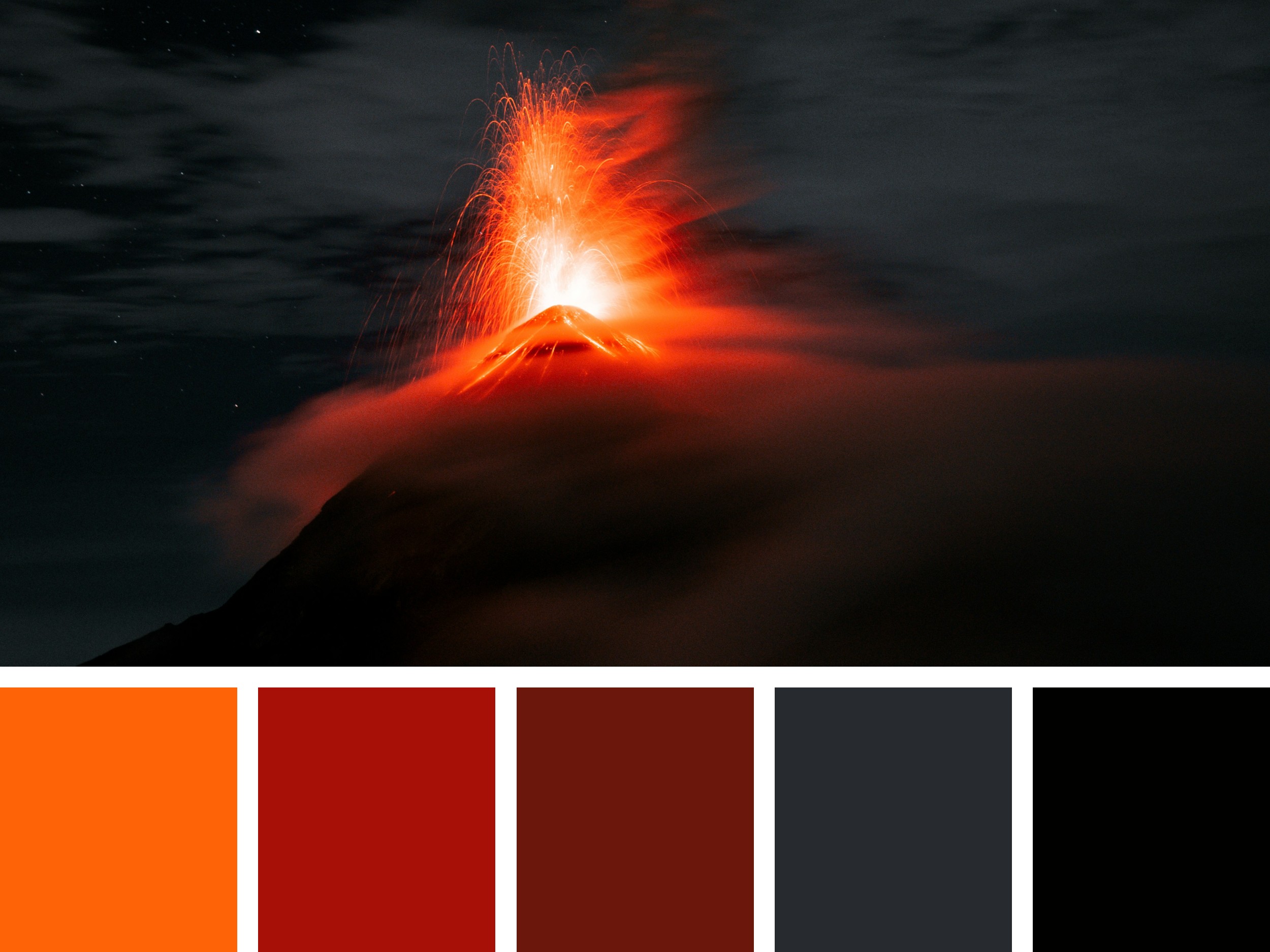
Consider a dramatic nocturnal scene dominated by the awe-inspiring eruption of a volcano. The incandescent glow of molten rock, the fiery expulsion of ash and gas, and the stark contrast against the dark sky create a spectacle of raw power and intense coloration.
The interplay of extreme light and profound shadow, along with the swirling plumes, offers a masterclass in visual tension and vibrant energy. This kind of intense natural observation, when approached with a designer’s discerning eye, can yield a rich and potent color palette perfectly suited for applications demanding immediate attention, energy, and a sense of powerful transformation.
The provided image captures precisely this kind of powerful natural event. A volcano erupts against a dark, cloudy sky, spewing brilliant orange and red lava and ash.
The fiery glow illuminates the surrounding clouds and the slopes of the volcano itself, creating a striking contrast between the intense light and the deep shadows.
This visual intensity is meticulously distilled into a curated color palette at the bottom of the image, offering a tangible starting point for practical design exploration.
Dissecting the Volcanic Palette’s Impact:
The accompanying palette comprises five distinct colors, each reflecting a key aspect within the depicted volcanic eruption:
#FE6307 (Vibrant Fiery Orange): This bright, intensely saturated hue embodies the incandescent glow of fresh lava and the fiery expulsion from the volcano’s crater. It evokes feelings of extreme energy, urgency, excitement, and danger. In design, this color is highly effective for primary calls to action that demand immediate attention, warning indicators, or as a dominant brand color for products or services that aim to convey dynamism, speed, or high impact. Its strong visibility makes it excellent for drawing the eye to critical UI elements or commanding attention in graphic layouts, but its intensity requires careful and strategic application to avoid overwhelming the user.
#A71007 (Deep Fiery Red): This rich, saturated red represents the molten core of the eruption, the glowing fissures, or the deeper, hotter parts of the volcanic material. It conveys feelings of power, passion, intensity, and immediate importance. Designers can use this color for strong accents, alerts, or as a secondary brand color that supports the energy of the vibrant orange while adding depth and gravitas. It can be used for error messages in UI, or for impactful headlines in graphic design, signifying strong emphasis or critical information.
#6B170C (Dark Crimson/Volcanic Brown): This deeper, more subdued red-brown hue reflects the cooling lava flows, the ash plumes illuminated by the intense light, or the subtle, oxidized tones on the volcano’s flanks. It evokes feelings of raw earthiness, grounded power, and underlying intensity. In design, this color can be used for backgrounds that need to convey strength without being overly bright, for sophisticated accents, or for textual elements that require a powerful yet less aggressive presence than pure red. It can add an organic, rugged feel to designs related to geology, extreme sports, or powerful industrial themes.
#272A2F (Dark Slate Gray/Ash Gray): This cool, desaturated dark gray represents the dark clouds of ash, the unlit portions of the volcano’s slopes, or the overall somber atmosphere of the nocturnal sky. It conveys feelings of solidity, stoicism, and a dramatic contrast to the fiery elements. In design, this color is invaluable for stable backgrounds, clear navigation elements, or as a sophisticated color for body text. It provides a strong, neutral ground against which the fiery colors can truly ignite, enhancing readability and providing visual balance. Its subtle coolness can offset the intense warmth of the reds and oranges.
#010100 (Near Black): This extreme dark tone represents the absolute blackness of the night sky, the deepest shadows around the volcano, or the impenetrable core of the ash cloud. It conveys ultimate depth, contrast, and serves as a powerful grounding element. In design, this color is best used for primary backgrounds to create dramatic impact, for critical text elements that demand absolute clarity (especially with light-colored text), or as a sophisticated frame for other vibrant colors. Its minimalist nature allows the fiery colors to shine with maximum intensity, establishing clear focal points and a sense of raw power.
Strategic Applications of Natural Intense Palette in Design:
The inherent dynamism and rich contrasts within this volcanic-inspired palette make it exceptionally compelling and versatile for various design applications where impact and energy are key:
User Interface Design:
Creating High-Impact and Urgent Interfaces: For applications requiring immediate attention, such as emergency alerts, financial trading platforms, or high-octane gaming interfaces, this palette can immediately establish a sense of urgency and excitement. The vibrant fiery orange (#FE6307) or deep fiery red (#A71007) can be used for critical alerts, “buy now” buttons, or progress indicators. The dark slate gray (#272A2F) or near black (#010100) provides a stable, unobtrusive background that allows these high-energy elements to pop dramatically, ensuring critical information is seen and acted upon.
Building Brand Identities with Energy and Authority: For brands in technology, cybersecurity, extreme sports, or industries conveying innovation and disruption, this palette visually communicates power and cutting-edge presence. The deep fiery red (#A71007) or vibrant fiery orange (#FE6307) can serve as core brand colors, representing energy and forward momentum. The dark slate gray (#272A2F) and near black (#010100) provide a sophisticated, authoritative foundation for typography and structural elements, balancing the intensity.
Enhancing Visual Hierarchy and User Flow in Complex Systems: The stark contrast offered by this palette is excellent for defining clear visual hierarchy in data-rich or complex interfaces. Key metrics, status indicators, or interactive elements can be highlighted using the bright orange or red, ensuring they stand out. The dark grays and near black can be used for background layers, inactive states, or detailed information, guiding the user’s eye to the most critical components without cognitive overload.
Ensuring Accessibility in High-Contrast Designs: When implementing such a high-contrast palette, designers must rigorously test for accessibility. Using vibrant colors like #FE6307 and #A71007 on dark backgrounds like #272A2F or #010100 will typically provide excellent contrast for text and interactive elements. Conversely, very dark text would struggle on the red/orange hues, so careful pairing of light text on dark backgrounds is crucial to ensure readability for all users, including those with visual impairments.
Graphic Design:
Crafting Dramatic and Memorable Marketing Materials: For posters, advertisements, or digital campaigns promoting events, action films, or high-performance products, this palette can create an undeniable natural visual impact. Imagery that resonates with the raw power of the volcano, combined with text and graphic elements using these intense colors, can generate immediate excitement and draw significant attention. The vibrant orange and red are ideal for headlines and calls to action that demand engagement.
Developing Thematic Visuals for Editorial or Educational Content: In editorial design for science journals, documentaries, or educational materials about geology or natural disasters, this palette provides an authentic and visually compelling foundation. The fiery colors can highlight specific data points or dramatic visuals, while the dark grays and near black offer a sophisticated and serious backdrop for factual information, creating a sense of gravity and importance.
Designing Striking Print Collateral: For print materials such as album covers, book jackets, or specialty product packaging, this palette offers a unique opportunity for high-impact design. The deep, rich reds and oranges can be used for powerful imagery or brand elements, complemented by the strong blacks and grays for typography and structural integrity. This combination can result in highly tactile and visually arresting designs that convey strength and dynamism.
Creating Engaging Infographics and Data Visualizations: When presenting impactful data, such as energy consumption trends, market volatility, or critical risk assessments, this palette can visually underscore the urgency and significance. The fiery colors can be used to represent peaks, warnings, or areas of high activity, while the dark grays and black provide a clear, neutral ground for charts, graphs, and labels, making complex information immediately impactful and understandable.
A final word
The inherent power and raw beauty of natural phenomena like a volcanic eruption provide a boundless source of inspiration for designers. By understanding the emotional and visual impact of these intense hues and contrasts, UI and graphic designers can create compelling, high-impact designs that cut through visual clutter and effectively communicate their intended message.
The strategic application of this fiery palette, grounded by sophisticated dark tones, enables designers to craft experiences that are not only visually striking but also deeply resonant, driving engagement and leaving a lasting impression.
Photo by Jeferson Argueta on Unsplash