A Designer’s Approach to Color Harmony
In the dynamic world of UI and graphic design, color serves as a fundamental pillar, capable of shaping perceptions, guiding interactions, and forging emotional connections with users. Beyond fleeting trends, the enduring appeal of natural color palettes offers a powerful and sophisticated avenue for designers seeking to create impactful and resonant work.
By closely observing and extracting the subtle nuances and harmonious relationships found in the natural world, designers can infuse their creations with a sense of authenticity, visual tranquility, and an innate appeal that deeply resonates with human psychology.
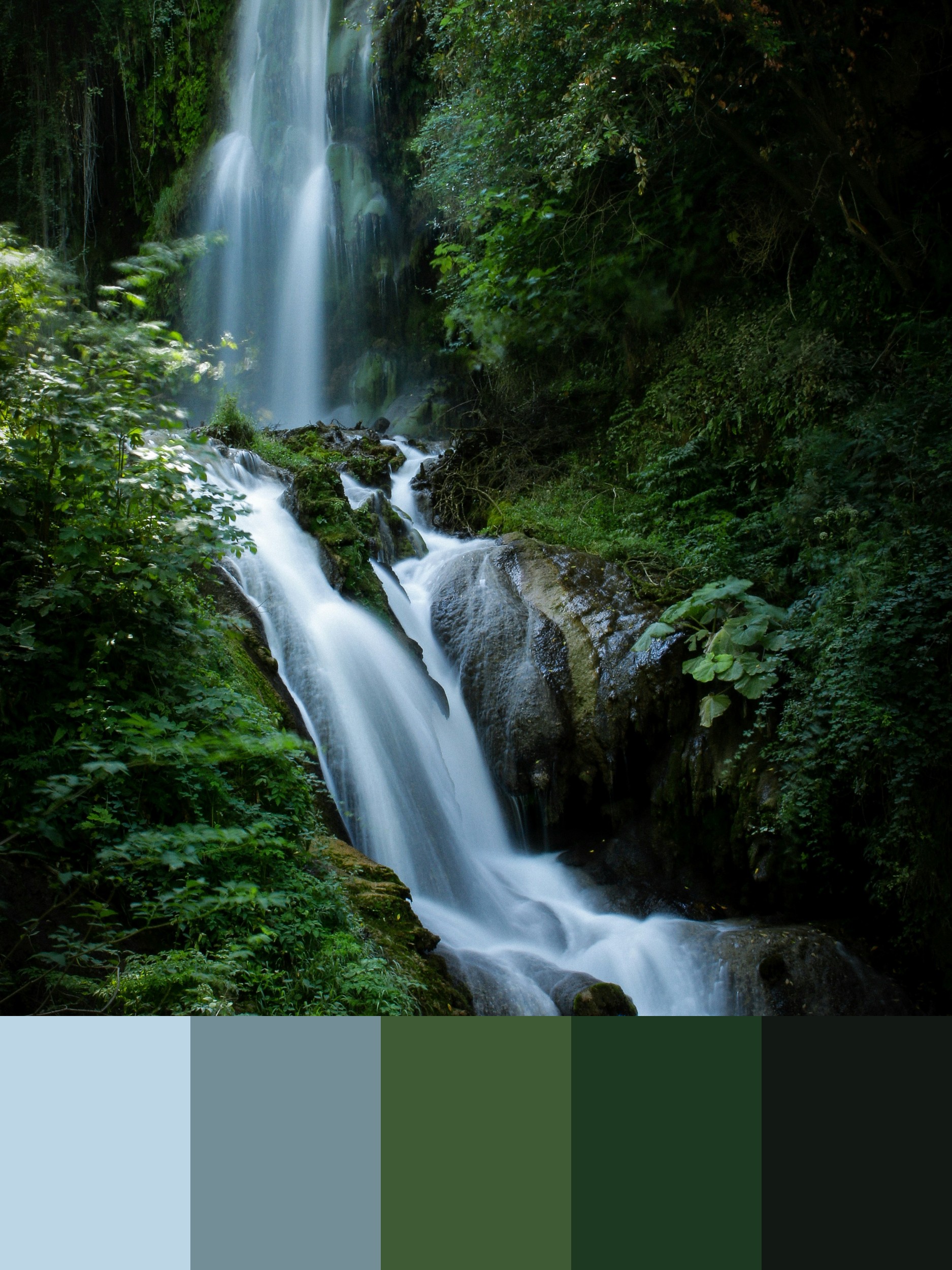
Consider a serene scene dominated by the gentle cascade of a waterfall, enveloped by lush, verdant foliage. The play of light on the flowing water, the myriad shades of green in the surrounding plant life, and the subtle textures of damp rock create a complex yet utterly balanced visual experience. This kind of natural spectacle, when analyzed through a designer’s discerning eye, yields a rich tapestry of color combinations that can be directly translated into a diverse array of design applications.
The image captures precisely this tranquil and invigorating natural setting. A multi-tiered waterfall gracefully descends amidst a dense array of green foliage, with sunlight subtly illuminating parts of the scene, creating areas of brightness and deep shadow. The movement of the water, rendered with a beautiful softness, contrasts with the static, vibrant greenery, inviting a sense of calm and natural energy. This visual richness is meticulously distilled into a curated color palette at the bottom of the image, offering a tangible starting point for comprehensive design exploration.
Unpacking the Natural Palette’s Significance:
The accompanying palette comprises five distinct colors, each reflecting a key element within the depicted natural environment:
#BCD6E5 (Light Sky Blue/Muted Cyan): This soft, airy hue evokes the cool, refreshing tones of the sky reflected in the water, or the misty quality of the air around the waterfall. It conveys a sense of lightness, tranquility, and clarity. In design, this color can be highly effective as a background for clean interfaces, creating a feeling of spaciousness and calm. It can also be used for subtle navigation elements, borders, or as a secondary accent to introduce a touch of serenity without being overwhelming. Its lightness makes it excellent for conveying freshness and openness.
#738E97 (Slate Blue-Gray): This deeper, more grounded blue-gray tone reflects the shaded areas of the water, the damp rocks, or the cooler, deeper parts of the sky. It offers a sense of stability, depth, and understated elegance. Designers can effectively utilize this color for primary navigation, footers, or as a more prominent background where a sense of reliability and gravitas is desired. It provides a strong foundation and a sophisticated contrast to lighter hues within the palette.
#3F5B35 (Deep Forest Green): This rich, dark green captures the intense saturation of the lush foliage in areas receiving more direct light, embodying the vibrant life within the forest. It evokes feelings of growth, vitality, and connection to nature. In design, this color can be used for primary branding elements, prominent sections of a layout, or as a strong background color that conveys depth and natural abundance. Its inherent link to nature makes it ideal for themes of sustainability, organic living, or environmental initiatives.
#1D3922 (Very Dark Green/Near Black): This profoundly deep green, almost bordering on black, represents the darkest shadows beneath the canopy, the deepest recesses of the rock formations, and the saturated depths of the foliage. It conveys a sense of mystery, profound depth, and strong grounding. In design, this color is invaluable for typography, providing excellent contrast and legibility, especially for headings and important body text. It can also be used for strong visual anchors, dividing lines, or as a sophisticated backdrop for elements that need to stand out with crisp clarity. Its minimal light reflection ensures focus on brighter elements.
#121814 (Charcoal Black): This deep, rich black represents the absolute darkest points in the scene—perhaps the deepest pool at the base of the falls, or areas completely devoid of direct light. It conveys ultimate contrast, formality, and a sense of conclusion or emphasis. In design, this color is best used sparingly for critical text, strong separators, or as a powerful accent to create dramatic visual impact. It grounds the palette and provides the highest level of contrast, essential for readability and visual clarity in strategic areas.
Translating Nature’s Harmony into Design Practice:
The effectiveness of drawing color inspiration from nature lies in the inherent harmony and emotional resonance of its combinations. These palettes are not arbitrary; they are the result of countless natural interactions, creating visually pleasing relationships that are instinctively understood and appreciated by the human eye. UI and graphic designers can leverage this intrinsic harmony in countless ways:
User Interface Design:
Cultivating Serene and Intuitive Experiences: For applications focusing on wellness, mindfulness, or nature exploration, this palette can create an incredibly calming and immersive user experience. The light sky blue (#BCD6E5) can serve as a primary background, offering a feeling of openness, while the deep forest green (#3F5B35) can be used for key sections or interactive elements, connecting users to natural themes. The slate blue-gray (#738E97) can provide sophisticated navigation, and the very dark green (#1D3922) or charcoal black (#121814) can ensure optimal text readability for information and functional elements.
Building Trust and Reliability: For corporate or financial applications, the palette can establish a sense of professionalism and steadfastness. The slate blue-gray (#738E97) can anchor primary navigation and crucial information blocks, conveying stability. The light sky blue (#BCD6E5) can introduce a sense of clarity and cleanliness in content areas, while the deep forest green (#3F5B35) can be used for positive indicators or calls to action. The very dark green (#1D3922) and charcoal black (#121814) ensure critical information is presented with high contrast and legibility.
Guiding User Flow and Enhancing Engagement: The strategic contrast within this palette allows designers to effectively guide the user’s eye and highlight key interactions. Lighter backgrounds, such as #BCD6E5, provide a clean stage for content, while darker elements like #3F5B35 or #1D3922 can draw attention to buttons or important data. The subtle shifts from the light blue to the deep greens create a visual journey reminiscent of exploring a natural landscape, subtly encouraging user interaction and exploration.
Prioritizing Accessibility and Readability: When implementing natural palettes, adherence to accessibility guidelines remains paramount. The contrast between text and background colors is critical for all users. For example, light text on the deep forest green (#3F5B35), very dark green (#1D3922), or charcoal black (#121814) will provide excellent contrast. Similarly, darker text on the light sky blue (#BCD6E5) or appropriately shaded elements of the slate blue-gray (#738E97) will ensure legibility. Designers must consistently check contrast ratios to create inclusive interfaces.
Graphic Design:
Crafting Authentic Brand Identities: A brand focused on eco-tourism, sustainable products, or nature-inspired services could find a profoundly resonant visual identity in this palette. The deep forest green (#3F5B35) immediately communicates a connection to nature, while the light sky blue (#BCD6E5) adds a refreshing and expansive feel. The slate blue-gray (#738E97) provides a sophisticated grounding, and the very dark green (#1D3922) or charcoal black (#121814) adds a sense of premium quality and timelessness to logos and branding materials.
Developing Immersive Marketing Collateral: Brochures, websites, and digital advertisements can leverage this palette to transport the audience to the serene natural setting depicted. Large format imagery of natural landscapes, paired with text and graphic elements utilizing these harmonious colors, can create a compelling and immersive experience. The cool tones can evoke tranquility, while the deep greens emphasize the natural theme.
Designing Elegant Print Materials: For print collateral, the subtle sophistication of this palette translates beautifully. Business cards or stationery using the light sky blue (#BCD6E5) or slate blue-gray (#738E97) as a base, with accents of the deep forest green (#3F5B35) and deep charcoal green (#1D3922) for typography, can convey professionalism and an understated connection to natural elegance. The depth of the greens provides a rich, tactile feel in print.
Creating Thematic Illustrations and Infographics: Artists and illustrators can draw directly from this palette to create visually harmonious and evocative depictions of natural scenes, environmental concepts, or abstract ideas inspired by growth and tranquility. The range of green and blue tones allows for significant depth, nuance, and atmospheric perspective, while the very dark green and charcoal black provide essential contrast and grounding.
The power of natural hues lies in their ability to tap into universal human experiences and emotions. They evoke feelings of calm, energy, growth, and stability—qualities that are inherently pleasing and reassuring.
By thoughtfully integrating these natural hues into their designs, UI and graphic designers can create visual experiences that are not only aesthetically captivating but also deeply meaningful and impactful.
The continuous exploration of nature’s vast color spectrum provides an endless source of inspiration, allowing designers to continually refine their craft and produce work that truly resonates with users.
Photo by John Rodenn Castillo on Unsplash