Crafting Experiences for Emotional and Physical Ease
Introduction: The Overlooked Imperative
Imagine tapping frantically on a misbehaving app while your flight boards, or squinting at a medical portal displaying critical information in 8px gray text. These moments of digital friction aren’t just inconveniences—they’re physical and emotional violations. Comfort in UX design—defined as creating experiences with no stress, no strain—isn’t a luxury; it’s an ethical imperative and competitive advantage. Yet, it remains chronically undervalued.
As both a UX designer and solutions architect, I’ve seen how discomfort manifests: from RSI-inducing enterprise tools to anxiety-triggering checkout flows. This post dissects how to engineer comfort through intentional design choices, tools, and frameworks.
1. Deconstructing Comfort: Two Pillars
Physical Comfort
Reducing biomechanical strain:
Input Efficiency: Minimize repetitive actions (e.g., excessive scrolling/form fields).
Ergonomic Alignment: Design for natural eye movement (F-pattern scanning) and thumb zones on mobile.
Accessibility: WCAG 2.2 compliance for reduced physical effort (e.g., keyboard navigation).
Example: Gmail’s keyboard shortcuts (Shift + I to archive) prevent mouse-dependent strain.
Emotional Comfort
Mitigating cognitive stress:
Predictability: Consistent navigation, undo actions, clear feedback loops.
Autonomy: User control (e.g., adjustable text sizes, opt-out options).
Trust Signals: Transparent data usage policies and error prevention.
Example: Duolingo’s “streak freeze” feature reduces anxiety about missing daily practice.
2. The Business Case for Comfort
Reduced Cognitive Load → Fewer errors (Jakob Nielsen: Error Prevention)
Emotional Safety → Higher retention (Forrester: UX ROI can reach 9,900%)
Physical Ease → Accessibility compliance avoids legal risk (ADA, EU Accessibility Act)
3. Tools & Techniques: Building Comfort Systematically
Physical Comfort Toolkit
| Tool | Input | Output | Best Practices |
|---|---|---|---|
| Ergonomic Simulators (e.g., Figma Mirror) | Device constraints, thumb heatmaps | Touch-friendly layouts | Prioritize key actions in green zones (Smashing Magazine Guide) |
| Accessibility Auditors (axe DevTools, WAVE) | HTML/CSS, color palettes | WCAG violation reports | Fix contrast issues (4.5:1 minimum), semantic HTML (WebAIM Checklist) |
| Motion Reducers (OS settings, prefers-reduced-motion) | User system preferences | Simplified animations | @media (prefers-reduced-motion: reduce) in CSS |
Emotional Comfort Toolkit
| Tool | Input | Output | Best Practices |
|---|---|---|---|
| Microcopy Frameworks (Voice & Tone guides) | User scenarios, brand lexicon | Stress-reducing copy (e.g., “Deleted items recoverable for 30 days”) | Use positive framing; avoid blame in errors (Mailchimp Voice Guide) |
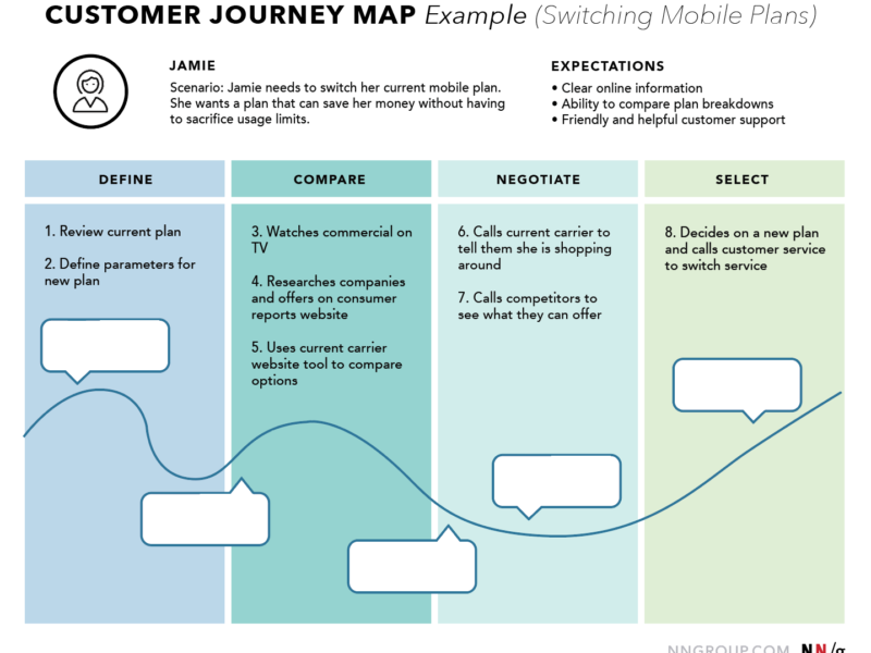
| Cognitive Walkthroughs | Task flows, heuristics | Stress-point maps | Identify “what if?” panic points (e.g., irreversible deletions) |
| Biometric Sensors (iMotions, Affectiva) | Eye tracking, GSR data | Emotional response heatmaps | Test stress triggers during critical tasks (e.g., payment) |
4. Frameworks for Comfort-Centric Design
Microsoft’s Inclusive Design Principles
Inclusive Design Toolkit: “Solve for one, extend to many.” Design for edge cases (e.g., single-hand use) to benefit all.Norman’s Emotional Design Model
Three layers:Visceral (aesthetics → calm)
Behavioral (performance → confidence)
Reflective (meaning → trust)
Resource: Emotional Design by Don Norman
The Comfort-First Workflow:
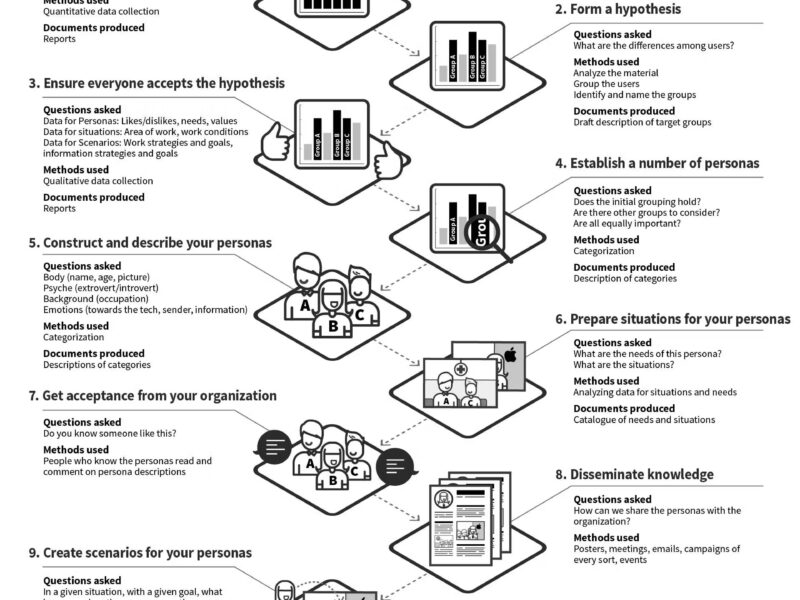
Research → [Empathy maps + Biomechanical analysis] →
Design → [Prototyping w/ comfort constraints] →
Test → [Biometrics + Accessibility audits] →
Iterate → [Comfort metrics tracking]
5. Case Study: Comfort in Action
Project: Redesigning a hospital patient portal
Physical Strain: Tiny form fields caused mis-taps; long load times induced frantic re-taps.
Emotional Strain: Medical jargon increased anxiety; no save drafts for forms.
Solutions:
Physical: Tap targets enlarged to 48x48px; lazy-loaded forms.
Emotional: Plain-language labels (“Next steps” vs. “Prognosis”); auto-saved sessions.
Outcome: 62% reduction in support calls about form errors; 41% higher completion rate.
6. Measuring Comfort: KPIs Beyond Conversion
Physical Metrics:
Task time reduction (especially for motor-impaired users)
Error rate decline (misclicks, form re-entries)
Emotional Metrics:
System Usability Scale (SUS) scores > 80
Net Promoter Score (NPS) verbatim analysis for “stress” mentions
Abandonment rates at high-friction points
Tool: Hotjar’s frustration heatmaps (rage clicks, u-turns).
Conclusion: The Comfort Imperative
Comfort isn’t about coddling users—it’s about respecting human limitations. Physical ease prevents injury; emotional ease builds trust. In an age of digital saturation, comfort is the ultimate differentiator.
Your Action Plan:
Audit one key user journey for physical/emotional strain today.
Embed prefers-reduced-motion and WCAG 2.2 AA checks into your CI/CD pipeline.
Replace three instances of ambiguous copy with comfort-driven microcopy.
As architect Christopher Alexander noted: “A design is comfortable when there is no unnecessary physical or mental effort required to use it.” Strive for that zero-friction ideal—your users’ bodies and minds will thank you.
Further Reading:
Tools Catalog:
Accessibility: axe DevTools, Stark
Emotion Testing: Lookback.io, UserTesting.com
Ergonomics: Fitts’ Law Calculator, Touch Heatmaps
Design like you’re saving someone from a panic attack or a wrist injury—because sometimes, you are.


