Designing Consistency
In the two decades I’ve spent navigating the turbulent waters of product development—from nascent startups to global enterprises—one truth has emerged with crystalline clarity: the most successful digital products are not merely collections of features. They are cohesive, predictable, and intuitive experiences. They feel whole. This sensation of seamlessness, often mistaken for simple aesthetic appeal, is the hard-won result of a disciplined, unified approach to User Experience (UX) and User Interface (UI) design. It is the antithesis of the fragmented, siloed processes that still plague our industry.
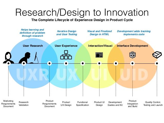
The above image is not just a diagram; it is a manifesto. It elegantly captures the complete, integrated lifecycle necessary to move from ambiguity to innovation. It argues that consistency isn’t a final layer of polish but a fundamental quality that must be engineered into a product from its very first breath.
This post will deconstruct this framework, exploring how a unified UX/UI process, deeply embedded within the entire product cycle, is the most reliable engine for creating products that users not only use but love.
The Peril of Silos: Why We Need a Unified Framework
Before we delve into the solution, we must understand the problem. Traditional product development often operates in sequential, isolated phases.
The “Waterfall” Trap: Marketing defines requirements in a vacuum. Engineering implements them literally, often making interface decisions based on technical convenience. Design is brought in late to “make it pretty,” working with constraints that make a good experience impossible. Quality Assurance tests for bugs against a specification, not for usability against human needs.
The Consequences: This fragmentation yields inconsistent interfaces, jarring user flows, and products that feel like a patchwork of ideas. Buttons behave differently on various screens, terminology is inconsistent, and the user is left feeling confused and frustrated. This inconsistency erodes trust and adoption.
The Pacheco framework presents a powerful antidote: a holistic, interconnected model where each discipline informs and is informed by the others throughout the entire product lifecycle.
Deconstructing the Framework: A Phase-by-Phase Analysis
Let’s walk through each stage of the framework, detailing the inputs, outputs, tools, and best practices that bring this unified approach to life.
Phase 1: Research & Problem Definition
This is the bedrock of everything. Without a deep, empathetic understanding of the user and the problem space, any design effort is built on sand.
Inputs: Market analysis, business goals, stakeholder hypotheses, initial user complaints or requests.
Activities: This phase involves a dual-track research effort, as indicated by the “User Research” and “Marketing Research” bubbles feeding into the “Helps learning and definition of problem through research” node.
User Research: This is qualitative and quantitative inquiry into the user’s world.
Methods: User interviews, contextual inquiries, surveys, diary studies, and ethnographic field research.
Tools: Otter.ai for transcription, Dovetail or EnjoyHQ for synthesizing insights, SurveyMonkey or Typeform for surveys.
Marketing Research: This focuses on the business landscape.
Methods: Competitive analysis, SWOT analysis, market sizing, review of existing analytics data.
Outputs: A single, shared source of truth that aligns the entire team. This includes:
User Personas: Archetypes representing key user segments. (Guide from Nielsen Norman Group)
Journey Maps: Visual narratives of the user’s end-to-end experience, highlighting pain points and moments of delight. (Guide from Nielsen Norman Group)
Problem Statements: Clearly framed, human-centered definitions of the core problems to be solved.
Best Practice: Synthesis. Research is useless if it stays in notebooks. Hold collaborative workshops with cross-functional partners (design, engineering, product, marketing) to synthesize findings into actionable insights. This shared understanding is the first step toward unity.
Phase 2: Product Requirements & UX Design
Here, the insights from research are translated into tangible definitions and structural designs. Notice how “Product Requirements” and “UX Design” are distinct yet connected nodes. This is critical.
Inputs: The validated insights from Phase 1.
Activities:
Product Requirements Definition: Product managers lead the creation of the Product Requirements Document (PRD). In a unified model, this is not a dictate but a hypothesis-driven collaborative document. It defines the “what” and the “why.”
UX Design: Designers architect the experience. This is the “how.”
Outputs:
Product Requirements Document (PRD): A living document outlining goals, user stories, acceptance criteria, and success metrics.
User Flows & Wireframes: Blueprints of the user’s path through the product and the skeletal structure of each interface. (Guide on Wireframing)
Low-Fidelity Prototypes: Clickable models used to validate flow and structure quickly and cheaply before visual design or code begins.
Best Practice: Cross-Functional Critique. The PRD should be reviewed by design and engineering. The wireframes should be reviewed by product and engineering. This ensures feasibility, uncovers edge cases early, and ensures everyone is building the same vision.
Phase 3: Product UI Design & Specification
This is where the visual language, interactivity, and final design consistency are codified. The framework shows “Product UI Design” feeding into the “Quotes and Kit Integration” and “Specification Document.” This is the heart of designing for consistency.
Inputs: Validated wireframes and user flows from Phase 2.
Activities: Applying the visual design (typography, color, spacing, imagery) and defining the micro-interactions (animations, transitions, states) to the wireframes.
Outputs:
High-Fidelity Interactive Prototypes: Pixel-perfect models that simulate the final product.
The Almighty Design System: This is the most critical output for consistency. A design system is a collection of reusable components, guided by clear standards, that can be assembled together to build any number of applications. It includes:
Component Library: Reusable UI elements (buttons, modals, form fields) with all their states (default, hover, active, disabled).
Style Guide: Definitions for color palettes, typography scales, grid systems, iconography, and elevation/shadow.
Documentation: Usage guidelines, design tokens, and code snippets for developers.
Specification Document (“Spec”): Detailed documentation for engineers, outlining spacing, animations, behaviors, and redlines. Modern tools like Figma have largely automated this.
Tools: Figma (the industry leader for its collaborative and developer-handoff features), Sketch with Abstract, Adobe XD. For design system management: Storybook (for developers), Zeroheight for documentation.
Best Practice: Design Tokens. These are the foundational, technology-agnostic values (e.g.,
--color-primary: #0066ff;,--spacing-unit: 8px;) that define the visual design. They are the single source of truth for color, spacing, and typography that can be used across web, iOS, Android, and other platforms, guaranteeing visual consistency everywhere. (Introduction to Design Tokens)
Phase 4: Development, Integration, and Build
The unified approach shines here. The goal is a seamless handoff from design to code, where the design system becomes the common language.
Inputs: The Design System, High-Fidelity Prototypes, and Specification Document.
Activities: Engineers translate the design into functional code. The “Quotes and Kit Integration” node suggests the process of integrating pre-defined, approved UI components (the “Kit”) into the codebase.
Tools: Version control (Git), front-end frameworks (React, Vue, Angular), and their corresponding component-driven architecture. The Figma-to-Dev workflow, where developers can inspect designs, copy code, and export assets directly from the prototype, is indispensable.
Outputs: A functional build of the product that is visually and behaviorally consistent with the designed prototypes.
Best Practice: Component-Driven Development. Engineers should build by assembling components from the library defined in the design system. This ensures that what is built is exactly what was designed, and it dramatically improves development efficiency and reduces bugs. The role of the designer evolves to auditing the built product for fidelity to the system.
Phase 5: Quality Control, Testing, and Launch
Testing cannot be only functional (“does the button click?”). It must be experiential (“is the experience consistent and intuitive?”).
Inputs: The functional build from Phase 4.
Activities:
Quality Control (QC): Traditional testing for bugs, performance, and cross-browser/device compatibility.
Validation Testing: This is crucial. Does the built product solve the user problems identified in Phase 1? This involves:
Usability Testing: Observing real users interact with the built product to identify any areas of confusion or friction. (Guide from Nielsen Norman Group)
Accessibility (A11y) Auditing: Ensuring the product is usable by people with disabilities. This is a non-negotiable part of consistency—a consistent experience is an accessible experience. Tools: WAVE, axe, manual testing with screen readers.
Outputs: Bug reports, usability findings, validation that the product meets its goals, and ultimately, a green light for launch.
Best Practice: Continuous Feedback Loops. Findings from validation testing must be fed directly back to the design and product teams. This isn’t a final gate; it’s a feedback mechanism for the next iteration, closing the loop on the lifecycle and fueling continuous improvement.
The Glue That Holds It All Together: Communication & Collaboration
A framework is just lines and boxes without a culture to support it. The unified approach requires a fundamental shift in mindset:
Shift from “Handoff” to “Handshake”: The goal is not to throw designs over a wall to engineering. It’s to collaborate continuously. Include engineers in design critiques and include designers in sprint planning.
Embrace DesignOps and DevOps: These disciplines aim to streamline and scale design and development processes. They create the workflows and tools that make this unified lifecycle efficient and repeatable. (What is DesignOps?)
The Designer’s Role Evolves: The modern UX/UI designer is not a pixel-pusher in a dark room. They are a systems thinker, a facilitator, a researcher, and an advocate for the user across the entire product cycle.
Conclusion: Consistency as a Strategic Advantage
The “Experience Design Framework” illustrates that consistency is not a superficial concern. It is the tangible result of a deeply integrated, user-centric, and collaborative process. It is the quality that allows users to build a confident mental model of your product, leading to reduced cognitive load, increased efficiency, and greater trust.
Investing in this unified approach—from foundational research to a living design system and continuous validation—is not an expense; it is a strategic advantage. It builds products that are not only beautiful and usable but also scalable, maintainable, and ultimately, successful. In a world saturated with digital noise, a consistent, thoughtful experience is the clearest voice in the room. It is the experience users will remember, return to, and recommend.
Image belongs to: Neuro Spark Works