The Ultimate Guide for Design Professionals
As a UX designer and IT solutions architect with over two decades of experience, I’ve witnessed the evolution of user experience design from a niche afterthought to a critical business discipline. Throughout my career, I’ve found that the most successful projects—those that deliver exceptional user experiences while meeting business objectives—share one common element: meticulous planning and execution through comprehensive checklists.
Today, I’m breaking down the renowned UX Project Checklist—a resource that has become invaluable to designers worldwide—to help you understand how to leverage it for your projects. This guide will explore each section in depth, providing practical insights, recommended tools, and professional frameworks to elevate your UX process.
The Power of Checklists in UX Design
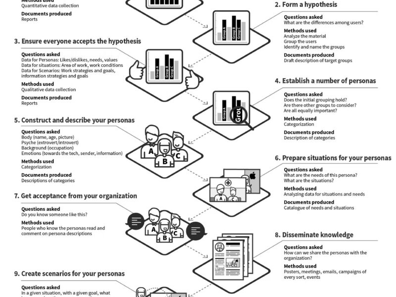
Checklists might seem mundane, but in complex fields like UX design and architecture, they serve as critical safety nets against human error and oversight. The original creator of the UX Project Checklist, Andrea, developed it while working at Moonpig to address the need for process transparency and project tracking . What began as an internal tool quickly gained international recognition, even finding its way into educational institutions like Harvard.
The fundamental value of this checklist lies in its ability to:
Ensure comprehensive coverage of all UX aspects
Provide visual guidance on project progress
Serve as a conversation starter for team alignment
Act as an educational resource for junior designers
Help teams prioritize activities based on project needs
Deep Dive into the UX Project Checklist
1. Research Phase: Building on Solid Foundations
Inputs: Business requirements, existing analytics, stakeholder interviews, market data
Activities:
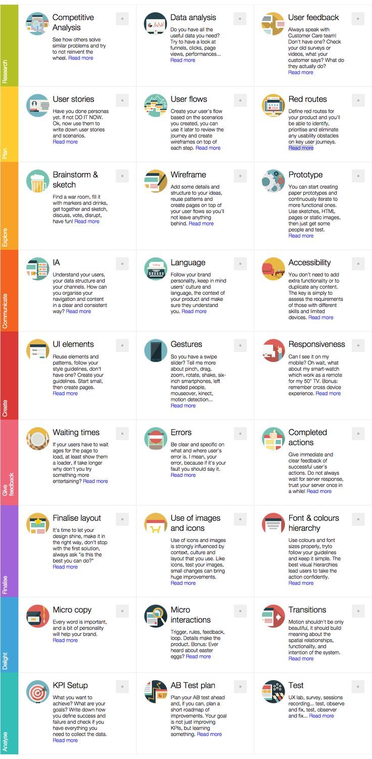
Competitive Analysis: Understanding how others solve similar problems helps you avoid reinventing the wheel while identifying opportunities for differentiation. The checklist recommends analyzing competitors’ solutions to identify industry standards and gaps.
Data Analytics Review: Examine existing funnels, clicks, page views, and performance metrics to understand current user behaviors and pain points. As the checklist suggests, this data is invaluable in guiding your design decisions.
User Research: Engage with customer support teams and review existing surveys, user videos, or testimonials. As emphasized in the checklist, understanding what users say and do reveals crucial gaps in your understanding.
Outputs: Research report, user insights, competitive analysis, analytics findings
Tools: Google Analytics, Hotjar, Lookback, UserTesting.com, SurveyMonkey
Best Practice: Don’t limit yourself to digital research. As Matt Hryhorsky demonstrates with his chocolate bar exercise, sometimes the most powerful research insights come from simple analog activities that reveal user preferences without technical bias .
2. Plan Phase: Structuring for Success
Inputs: Research findings, business objectives, technical constraints
Activities:
Persona Development: If you haven’t created personas yet, the checklist emphatically states, “DO IT NOW.” These fictional representations of your key user groups should be based on actual research data rather than assumptions.
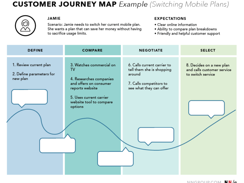
User Stories & Scenarios: Use your personas to craft detailed narratives that capture user goals, motivations, and contexts. These stories become the foundation for your design decisions.
User Flows: Visualize the pathways users will take through your product, identifying each step and decision point. The checklist recommends creating flows based on your scenarios to ensure seamless experiences .
Red Route Identification: Originally developed for London bus routes, this concept applies to identifying and prioritizing the most critical user journeys. Focusing on these essential pathways ensures you eliminate usability obstacles where it matters most.
Outputs: Personas, user stories, journey maps, red route analysis, project plan
Frameworks: Jobs-to-be-Done, User Journey Mapping, Kano Model
Best Practice: When creating user flows, maintain consistency with established patterns where appropriate but don’t be afraid to innovate when user needs demand it. As the Laws of UX resource recommends, understanding established principles helps you make informed decisions about when to follow conventions and when to break them.
3. Explore Phase: Expanding Possibilities
Inputs: User flows, red routes, design principles
Activities:
Collaborative Ideation: The checklist recommends finding a war room, filling it with markers and drinks, and gathering your team to sketch, discuss, vote, and disrupt conventional thinking . This collaborative approach generates diverse ideas while building team buy-in.
Wireframing: Add structure and detail to your ideas by creating wireframes that reuse established patterns and align with your user flows. This intermediate step between sketches and prototypes helps you validate structural decisions before investing in visual design.
Prototyping: Start with low-fidelity prototypes (paper or digital) and iteratively increase fidelity as you validate concepts. The checklist emphasizes the importance of continuous iteration toward more functional prototypes.
Outputs: Sketches, wireframes, low-fidelity prototypes, ideation artifacts
Tools: Figma, Sketch, Adobe XD, UXPin, Balsamiq
Best Practice: When prototyping, focus on what interactions you need to showcase. As UXPin highlights, each interaction includes a trigger (what initiates the action) and an action (what actually happens) . Clearly defining these elements ensures your prototypes test the right things.
4. Communicate Phase: Designing with Purpose
Inputs: Content inventory, brand guidelines, accessibility standards
Activities:
Information Architecture: Organize your content and navigation to align with user mental models and business objectives. The checklist emphasizes creating clear and consistent structures that help users find what they need .
Accessibility Planning: Design inclusively by accommodating diverse abilities and devices without duplicating content. As the checklist notes, accessibility fosters universal usability.
Ethical Considerations: Prioritize security, privacy, and honesty in your designs. The checklist prompts designers to consider whether their products are secure, private, and honest.
Inclusive Design: Recognize that everything you design is influenced by your own perspective and background. The checklist encourages opening your design process to diverse viewpoints to counteract personal biases.
Outputs: Sitemaps, content matrices, accessibility reports, ethical guidelines
Frameworks: WCAG guidelines, Microsoft Inclusive Design Principles
Best Practice: When addressing accessibility, go beyond compliance to embrace genuine inclusivity. As the GOV.UK accessibility guidelines referenced in the checklist emphasize, the key isn’t adding extra functionality but rather assessing requirements of those with different skills and limited devices.
5. Create Phase: Bringing Designs to Life
Inputs: Wireframes, style guides, component libraries
Activities:
UI Design: Follow your style guidelines and reuse established patterns to create visually consistent interfaces. If you lack guidelines, the checklist recommends starting small and expanding as needed .
Interaction Design: Consider all possible interaction methods beyond simple clicks—including gestures like swiping, pinching, rotating, and shaking. The checklist prompts designers to think beyond traditional input methods.
Responsive Design: Ensure your design adapts seamlessly across devices, from smartphones to smart TVs. The checklist emphasizes remembering cross-device experiences.
Outputs: High-fidelity designs, design systems, component libraries, responsive layouts
Tools: Figma, Sketch, Adobe XD, Framer, Webflow
Best Practice: When designing for multiple devices, use tools that facilitate responsive design thinking. As UXPin demonstrates, using responsive breakpoints in your design tool can help simulate behavior across different screen resolutions .
6. Give Feedback Phase: Designing Dialogues
Inputs: User actions, system status, error conditions
Activities:
Loading States: Minimize perceived waiting times by using engaging loaders or animations. The checklist suggests that if users must wait, at least show them a loader, and if it takes longer, try something more entertaining .
Error Handling: Provide clear, specific messages that take responsibility for system issues. The checklist emphasizes being clear about what went wrong and where the error occurred.
Success Communication: Acknowledge successful user actions instantly, even before server confirmation. The checklist recommends giving immediate and clear feedback for successful actions .
Outputs: Microcopy, loading animations, error states, success messages
Frameworks: Nielsen’s 10 Usability Heuristics
Best Practice: When crafting error messages, follow the guidance of Nielsen’s usability heuristics, which emphasize the importance of keeping users informed about what is happening through appropriate feedback .
7. Finalize Phase: Refining the Experience
Inputs: Design mockups, brand guidelines, usability findings
Activities:
Visual Refinement: Polish your design to ensure it is visually appealing and functionally optimal. The checklist encourages designers to continually ask, “is this the best you can do?”.
Icon & Imagery Evaluation: Test your icons and images to ensure they resonate with your audience and work across cultural contexts. The checklist notes that small changes can bring huge improvements .
Visual Hierarchy: Use typography, color, and spacing to guide users effectively. The checklist emphasizes that proper visual hierarchies lead users to take action confidently.
Outputs: Final designs, optimized assets, style guides, design documentation
Tools: Figma, Sketch, Adobe Creative Suite, Zeroheight
Best Practice: When refining visual hierarchy, use tools like A Visual Type Scale to create harmonious typographic systems. This resource, inspired by Tim Brown’s Modular Scale, helps take the math out of finding harmony between varying font sizes .
8. Delight Phase: Creating Memorable Experiences
Inputs: Brand personality, user context, motion principles
Activities:
Microcopy: Infuse personality into your product through concise, engaging text. The checklist emphasizes that every word is important, and a bit of personality will help your brand.
Microinteractions: Design small, functional animations that provide feedback and enhance engagement. The checklist references Dan Saffer’s concept of microinteractions having four parts: trigger, rules, feedback, and loop.
Meaningful Motion: Use transitions that build meaning about spatial relationships, functionality, and system intention. The checklist recommends that motion shouldn’t be only beautiful but should enhance understanding .
Outputs: Animated components, microcopy library, transition specifications
Frameworks: Material Design motion principles
Best Practice: When adding delightful elements, ensure they enhance rather than detract from the core experience. Avoid deceptive patterns that might trick users—as the Deceptive Patterns resource (formerly darkpatterns.org) highlights, just because popular companies use certain patterns doesn’t mean they’re ethical .
9. Analyze Phase: Learning and Improving
Inputs: Usage data, business metrics, research findings
Activities:
KPI Definition: Establish clear success metrics that align with business goals and user needs. The checklist emphasizes writing down how you define success and failure.
A/B Testing Planning: Plan experiments that will improve KPIs while generating valuable learning. The checklist recommends planning a short roadmap of improvements alongside your tests .
User Testing: Employ various methods—from UX labs to session recordings—to observe behavior and identify improvement opportunities. The checklist promotes a cycle of testing, observing, and fixing .
Outputs: Measurement plan, test results, insights reports, recommendation documents
Tools: Optimizely, Google Optimize, Hotjar, FullStory, Mixpanel
Best Practice: When analyzing results, adopt an atomic research approach that breaks down findings into experiments, facts, insights, and conclusions. This method, referenced in the MarvelApp article, helps organizations build a reusable knowledge base.
Implementing the Checklist in Your Organization
As a seasoned architect, I’ve learned that the value of any checklist comes from its integration into team workflows rather than its mere existence. Here’s how to successfully implement the UX Project Checklist:
Adapting the Checklist to Your Context
While comprehensive, the UX Project Checklist should be tailored to your specific:
Project type (website, mobile app, enterprise software)
Team size and composition
Organizational maturity and UX sophistication
Time constraints and business objectives
As the checklist’s creator noted, each design team has its own process, and every process exists to evolve . Use the checklist as a starting point rather than a rigid prescription.
Integration with Development Processes
For designers working in agile environments, synchronize checklist activities with development sprints:
Research activities should inform sprint planning
Prototyping and testing should align with development cycles
Design refinement should accommodate technical constraints
Measurement and Improvement
Establish metrics to evaluate the checklist’s effectiveness:
Project success rates before and after implementation
Team satisfaction with the design process
Stakeholder feedback on design consistency and quality
User feedback on final experiences
Expanding Beyond the Checklist: Complementary Resources
While the UX Project Checklist provides excellent coverage of the design process, professionals should supplement it with additional resources:
Specialized Checklists
Sites like Checklist Design offer focused checklists for specific components, flows, and topics . These granular resources help ensure depth in specific areas where the broader checklist provides breadth.
Reference Collections
As highlighted in “5 Reference Sites and Cheat Sheets for UX Professionals,” resources like Laws of UX and Nielsen’s 10 Usability Heuristics provide foundational principles that inform checklist activities .
Implementation Templates
The Notion template referenced in one of the search results provides a practical way to implement the checklist with Kanban boards and method documentation . Such templates accelerate adoption by reducing setup time.
Conclusion: The Checklist as a Living Tool
The UX Project Checklist represents more than just a list of tasks—it embodies a comprehensive approach to designing exceptional user experiences. As the field continues to evolve with new technologies, interaction patterns, and user expectations, this checklist should serve as a foundation rather than a final word.
Throughout my career, I’ve learned that the most successful designers aren’t those who blindly follow processes, but those who understand when to adhere to guidelines and when to adapt them. The UX Project Checklist provides the structure needed to ensure comprehensive coverage while leaving room for the creativity and critical thinking that distinguishes good design from great design.
As you incorporate this checklist into your practice, remember the words of its creator: “The goal was just to get our team to think about each step, the actions following was for us to decide”. This mindset transforms the checklist from a rigid requirement into a catalyst for thoughtful design practice.
Whether you’re a solo designer or part of a large enterprise team, I encourage you to explore the UX Project Checklist, adapt it to your context, and continue refining it as your practice evolves. The ultimate goal isn’t to check boxes but to create products that truly serve the people who use them.
For further reading and resources, explore:
UX Project Checklist – The original checklist
Checklist Design – Component-specific checklists
Laws of UX – Psychological principles for designers
Nielsen’s 10 Usability Heuristics – Foundational usability guidelines
Deceptive Patterns – Identifying and avoiding manipulative UX