The Alchemy of Strategy in UX and Technology
If you’ve ever stared at a spreadsheet of user metrics, read through pages of customer feedback, or reviewed a heatmap of clicks until your vision blurred, you know the feeling. It’s the “HUH?!” moment. The data is there, in abundance, but the meaning is elusive. You’re surrounded by puzzle pieces but lack the picture on the box.
This is the chasm that separates data from strategy. And the only bridge across this chasm is insight.
Crafting insight is a delicate blend of art and science. In my two decades of designing user experiences and architecting IT solutions, I’ve seen countless projects falter on the rocks of poorly formed insights. They lead to uninspiring strategies, misguided features, and technological solutions in search of a problem.
Well-crafted insights? They are the backbone of high-impact strategy. They are the “AHA!” that transforms a good product into a beloved one, a functional system into an efficient engine for growth.
Here’s why insights are so tricky: they require us to be both ruthlessly analytical (the science) and profoundly intuitive (the art). We must be part data scientist, part psychologist, and part storyteller. When we successfully decode data and uncover its deeper human and systemic meanings, we create rich insights. These become the fundamental ingredients, the master recipe, for a strategy that truly works.
This process isn’t magic, though it often feels like it. It’s a craft. And like any craft, it can be learned, honed, and mastered. Let’s deconstruct the craft of insight through its three fundamental stages, viewed through the dual lenses of UX Design and IT Solution Architecture.
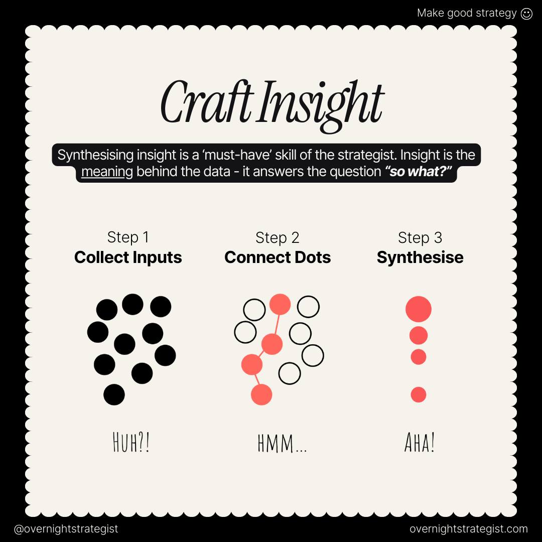
The Three Pillars of Insight Crafting
The model outlined in the “Craft Insight” graphic provides a powerful, iterative framework:
Collect Inputs: The “HUH?!” Phase – Gathering the Raw Materials
Connect the Dots: The “HMM…” Phase – Finding Patterns and Relationships
Synthesise Insight: The “AHA!” Phase – Forging Meaning and Action
Step 1: Collect Inputs – The Strategic Harvest of “HUH?!”
Before any synthesis can occur, you need raw material. In the physical world, a carpenter needs wood; in the digital world, a strategist needs data and information. The goal here is not to “boil the ocean” but to strategically gather diverse, high-quality inputs that will fuel your analysis.
Necessary Inputs & Tools
A common failure is relying on a single data source. True insight emerges from the triangulation of multiple sources. We categorize them into Quantitative (the ‘what’) and Qualitative (the ‘why’).
Quantitative Inputs (The Science):
Analytics Data: Tools like Google Analytics, Adobe Analytics, or Mixpanel provide a macro-level view of user behavior. Metrics like bounce rate, session duration, and conversion funnels are crucial.
Reference: Google Analytics Solutions
Product Usage Telemetry: For software and apps, this is the detailed log of user interactions. What features are used most? Where do users drop off in a workflow? Tools like Pendo or Amplitude excel here.
Reference: Amplitude: Product Analytics
Performance Metrics: As an IT Architect, I include system performance data from tools like Datadog or New Relic. A slow-loading page in the checkout process isn’t just a tech issue; it’s a profound user experience insight.
Reference: Datadog: Application Performance Monitoring
Survey Data (Structured): Quantitative surveys (e.g., NPS, CSAT) from tools like SurveyMonkey or Typeform provide statistically significant sentiment data.
Qualitative Inputs (The Art):
User Interviews: One-on-one conversations are unparalleled for uncovering deep needs, frustrations, and mental models. The goal is to listen for the story behind the stat.
Usability Testing: Observing real users (or potential users) interact with your product or a prototype is a goldmine. Tools like UserTesting.com or Lookback facilitate remote testing.
Reference: Nielsen Norman Group: Usability Testing
Support Tickets & Customer Feedback: This is a direct line to the user’s pain points. Analyzing tickets for common themes is a form of passive user research.
Contextual Inquiry: Going to where the user works or lives to observe them in their natural environment. For enterprise software, this is non-negotiable.
Sales & Customer Success Conversations: These teams are on the front lines and possess a wealth of anecdotal but critical information about customer needs and objections.
Expected Output of Step 1:
A curated, multi-faceted repository of information. This isn’t just a data dump; it’s an organized collection of quantitative metrics, qualitative notes, audio/video clips, and system logs, ready for the next stage.
Step 2: Connect the Dots – The Analytical Incubation of “HMM…”
This is where the magic begins. With your inputs gathered, the task shifts from collection to sense-making. The “HMM…” phase is a state of active curiosity and analysis, where you look for patterns, relationships, and, just as importantly, contradictions.
Frameworks and Best Practices
The human brain is a pattern-recognition engine, but it needs structure to avoid cognitive biases.
Affinity Diagramming: This is a quintessential UX method. Write individual observations, data points, and user quotes on sticky notes (or using a digital tool like Miro or Mural). As a team, silently sort them into emergent groups. The groups themselves, and their labels, reveal the patterns.
Customer Journey Mapping: Plot out all the touchpoints a user has with your product or service over time. Layer on the quantitative data (where are the drop-offs?) and the qualitative feedback (where is the frustration?). This creates a holistic view of the experience, revealing pain points and moments of delight.
The “Five Whys” Technique: Originally from Toyota’s production system, this is powerful for root cause analysis. When you see a problem in the data, ask “why?” repeatedly. The fifth answer is often a fundamental human or systemic insight.
Reference: MIT Sloan: The “Five Whys” for Startups
Data Correlation: This is where the IT Architect’s mindset shines. Can you correlate a front-end user behavior with a back-end system event? For example, does a specific API latency spike correlate with a drop in user engagement? Tools like Tableau or Power BI are invaluable for visualizing these relationships across disparate data sets.
Look for Conflicts: Don’t shy away from contradictions. If your analytics say a feature is widely used, but user interviews reveal universal hatred for it, you have a critical insight. Perhaps users are forced to use it to complete a task. This conflict is a signpost pointing to a deeper truth.
Best Practice: Let the Answer Reveal Itself
The biggest mistake in this phase is to force the data to fit a pre-conceived hypothesis. Approach it with a beginner’s mind. As the Zen proverb says, “Empty your cup.” The patterns must emerge from the data, not be imposed upon it.
Expected Output of Step 2:
A set of key observations, patterns, and emergent themes. You’ll have identified recurring pain points, unmet user needs, behavioral triggers, and systemic bottlenecks. You’re moving from hundreds of data points to a handful of core themes.
Step 3: Synthesise Insight – The Strategic Clarification of “AHA!”
This is the moment of transformation. Synthesis is the process of transforming your analysis—the connected dots—into a concise, actionable, and profound insight. It’s about answering the ultimate strategic question: “So what?”
An insight is not a observation (“Users abandon their shopping cart”). It is not a data point (“The cart abandonment rate is 70%”). An insight is a statement of underlying truth that explains the observation and points toward a potential solution.
The Anatomy of a Well-Crafted Insight
A powerful insight often follows a simple structure:
[User/Stakeholder] needs to [deep need], because [startling realization/truth], but [constraint/barrier].
Let’s build one from our e-commerce example:
Observation: High cart abandonment rate at the shipping information page.
Data: 70% drop-off; user interviews reveal frustration with “unexpected costs.”
Weak “Insight”: “Users don’t like high shipping costs.” (This is just a rephrased observation.)
Well-Crafted Insight: “Budget-conscious shoppers need to feel confident they are getting the best total price because their purchasing decision is based on a strict mental budget allocated for both product and fees, but the lack of upfront, all-inclusive pricing until the final checkout step creates anxiety and breaks their trust, leading them to abandon the purchase.”
Do you see the difference? The crafted insight provides context (budget-conscious shoppers), motivation (mental budget, trust), and causality (lack of upfront pricing causes anxiety). It is immediately clear what the strategic implication is: implement a shipping cost calculator earlier in the journey.
Tools and Frameworks for Synthesis
“How Might We…” (HMW) Questions: Framing your insight as an HMW question turns a problem into an opportunity. Based on the insight above: “How might we present the total cost, including shipping, to the user as soon as they express interest in a product?” This becomes a brilliant brief for your design and development teams.
Reference: IDEO: The “How Might We” Method
Point of View (POV) Statements: Similar to the structure above, a PV statement defines your user, their need, and your insight. It’s a tool used heavily in Design Thinking to align teams before brainstorming.
Reference: d.school: Define Tool
Jobs-to-Be-Done (JTBD) Framework: This framework posits that users “hire” products to get a job done. An insight framed through JTBD focuses on the progress a user is trying to make in a particular circumstance. “When a shopper is comparing final prices, they ‘hire’ a transparent checkout process to help them stick to their budget without unpleasant surprises.”
Expected Output of Step 3:
A set of clear, actionable insight statements. These are the foundational pillars of your strategy. They are the “AHA!” moments, neatly packaged and ready to be communicated.
From Insight to Narrative: The Final Bridge
Insights bridge analysis and storytelling. A dashboard full of data is forgettable; a story about a frustrated shopper trying to stick to a budget is memorable. Only after crafting clear insights should we weave them into a compelling narrative for stakeholders.
Your strategy presentation should not be a data dump. It should be a story arc:
Act I: The Hero’s World: Here’s our user and the world they live in.
Act II: The Conflict (The Insight): But here is the fundamental challenge they face (present your core insight).
Act III: The Resolution (The Strategy): And here is how our product/service/technology will help them overcome that challenge and triumph.
Conclusion: The Strategist as Artisan
Crafting insight is not a linear, one-time event. It’s a continuous, iterative cycle. As you build and test solutions based on your insights, you generate new data, leading to new “HUH?!” moments, and the cycle begins anew.
Remember: quality insights will lead to quality strategy. They are the compass that ensures every design decision, every line of code, and every architectural choice is moving in a direction that serves a genuine human or business need. In a world awash with data, the ability to distill it into meaning—to craft insight—is not just a ‘nice-to-have’ skill. It is, as the graphic simply states, a ‘must-have.’ It is the very craft at the heart of creating technology that is not only powerful but also purposeful.
Image belongs to: Overnight Strategist.