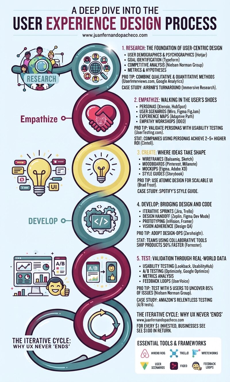
An infographic titled "A Deep Dive into the User Experience Design Process," presented as a stylized, continuous helix structure with five distinct, glowing nodes against a light blue background. From top to bottom, the nodes are: Research (#558c8c teal): Icons of users and a magnifying glass. Text includes "1. RESEARCH: THE FOUNDATION OF USER-CENTRIC DESIGN" and mentions Hotjar, Typeform, competitive analysis, and success metrics. Pro tip: "COMBINE QUALITATIVE & QUANTITATIVE METHODS (UserInterviews.com)." Empathize (#82204a magenta): Icons of two hands forming a heart with a wireframe face. Text includes "2. EMPATHIZE: WALKING IN THE USER’S SHOES" and mentions personas, user scenarios, experience maps (Adaptive Path), and empathy workshops (IDEO). Pro tip: "VALIDATE PERSONAS." Create (#e8db7d yellow): An icon of a glowing lightbulb with UI elements. Text includes "3. CREATE: WHERE IDEAS TAKE SHAPE" and mentions wireframes (Balsamiq), moodboards, mockups (Figma), and style guides (Storybook). Pro tip: "USE ATOMIC DESIGN (Brad Frost)." Develop (#558c8c teal): Icons of cogs and code brackets. Text includes "4. DEVELOP: BRIDGING DESIGN AND CODE" and mentions iterative sprints (Jira), design handoffs (Zeplin), prototyping, and design QA. Pro tip: "ADOPT DESIGN-OPS." Test (#82204a magenta): Icons of data charts, A/B testing, and a happy user. Text includes "5. TEST: VALIDATION THROUGH REAL-WORLD DATA" and mentions usability testing (Lookback), A/B testing (Optimizely), metrics analysis, and feedback loops. Pro tip: "TEST WITH 5 USERS (Nielsen Norman Group)." The helix loops back at the bottom to a final section: "THE ITERATIVE CYCLE: WHY UX NEVER ‘ENDS’" with an arrow circle, the ROI statistic (Forrester), and a list of "ESSENTIAL TOOLS & FRAMEWORKS" (Hotjar, SurveyMonkey, Google Analytics, Miro, UserTesting.com, Xtensio, Figma, Sketch, Adobe XD, Storybook, Zeplin, Jira, Framer, UsabilityHub, Optimizely, FullStory, HEART, Double Diamond, JTBD). The URL www.juanfernandopacheco.com is visible at the top and bottom.

Neglecting UX risks obsolescence. Brands like Apple and Tesla dominate by embedding user-centricity in their DNA. Start small: interview 5 users today. Map one customer journey. Test one button. The process compounds—each iteration deepens empathy, refines solutions, and ultimately, builds products humans love.

A comprehensive, vertical infographic titled "UX Research Methods" detailing qualitative and quantitative methods, categorized by behavioral ("what people do") and attitudinal ("what people say"). The design uses a green, blue, and yellow color palette and features a central matrix connected to detailed panels for each method, including Usability Testing, A/B Testing, Interviews, and Analytics, concluding with case studies from Spotify, Amazon, and Google, and a reference to juanfernandopacheco.com.

UX research is not a one-size-fits-all process. By blending behavioral and attitudinal methods, designers can create holistic, user-driven solutions. Start small—try a five-second test or a quick survey—and scale as you gain confidence. Remember, the best designs are rooted in empathy and evidence.
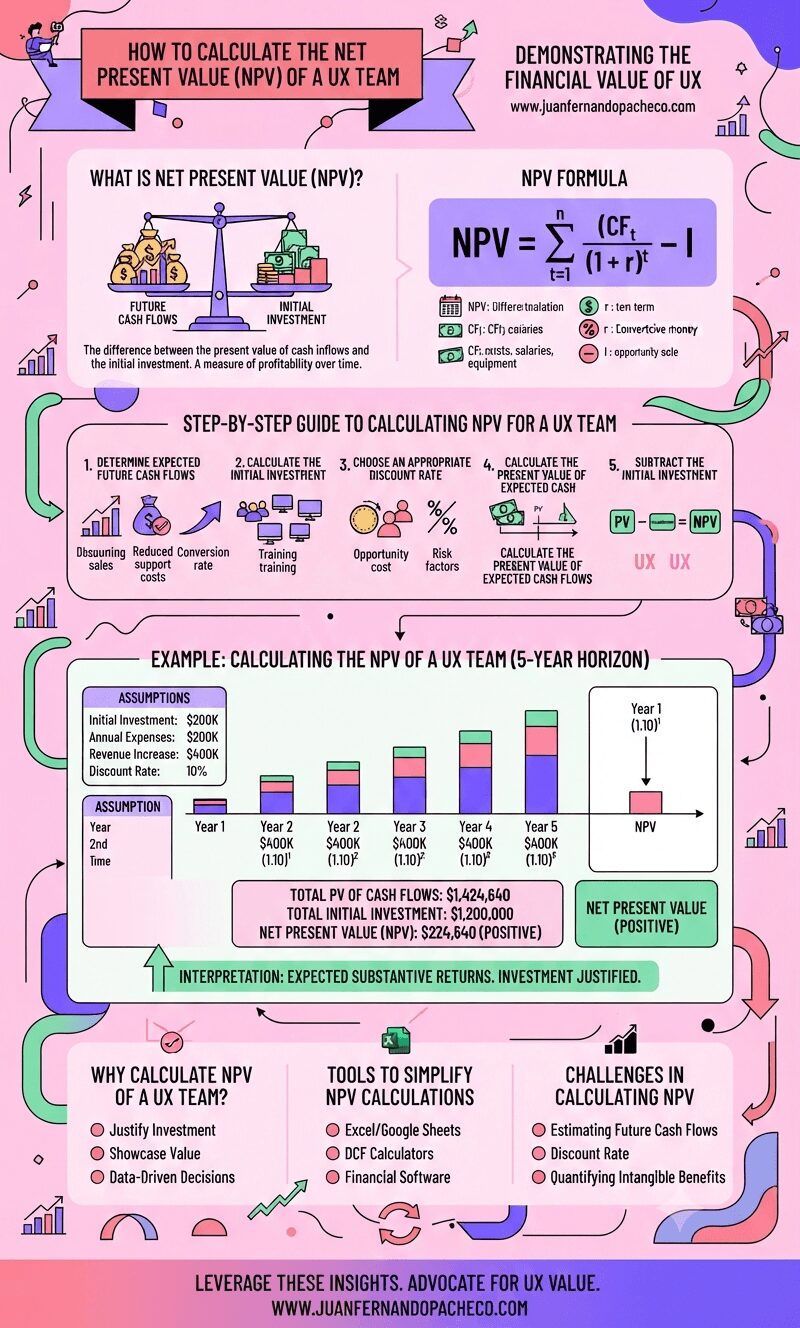
An infographic with a pink background and vibrant purple and teal accents, titled "How to Calculate the Net Present Value (NPV) of a UX Team." It features sections defining NPV, the mathematical formula, a step-by-step calculation guide, a practical 5-year example with a bar chart, and lists for rationale, tools, and challenges. The footer includes the URL www.juanfernandopacheco.com.

Calculating the Net Present Value (NPV) of a UX team is a powerful way to demonstrate their financial impact. By considering expected future cash flows, initial investments, and the time value of money, organizations can make informed decisions about investing in UX resources. As UX continues to play a pivotal role in business success, quantifying its value through NPV ensures that its importance is recognized in strategic planning.
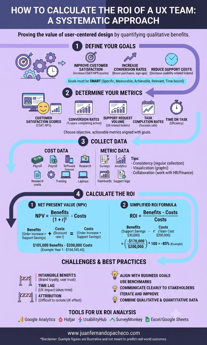
An infographic titled "How to Calculate the ROI of a UX Team: A Systematic Approach" against a light purple background. It outlines a four-step process: 1. Define Your Goals (SMART goals), 2. Determine Your Metrics (NPS, Conversion Rates, etc.), 3. Collect Data (Cost Data and Metric Data), and 4. Calculate the ROI (using NPV and simplified ROI formulas with examples). The graphic also includes sections for Challenges, Best Practices, and Tools, ending with the URL www.juanfernandopacheco.com.

Understanding the return on investment (ROI) of a UX team is critical for organizations aiming to justify and optimize their investment in user-centered design practices.
While calculating ROI in a UX context can be challenging because quantifying qualitative benefits is difficult, a systematic approach can reveal the value a UX team provides to an organization.
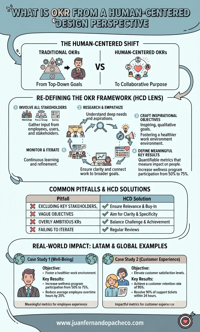
An infographic titled "What is OKR from a Human-Centered Design Perspective" illustrates a six-step framework for setting goals with empathy and collaboration. It compares traditional top-down goal setting with human-centered approaches, lists common pitfalls and solutions, and provides real-world examples for employee well-being and customer experience. The design uses a color palette of teal, cream, mauve, and grey. The footer includes the website www.juanfernandopacheco.com.

OKRs, or “Objectives and Key Results,” are a widely used framework for setting, tracking, and achieving goals within organizations.
Originally developed at Intel in the 1970s and later popularized by John Doerr in Measure What Matters, OKRs have become a cornerstone of goal management for companies like Google, LinkedIn, and Twitter.