How Ant Design Powers Enterprise UX at Scale
In the high-stakes world of enterprise software, complexity is the norm. Products juggle intricate workflows, vast datasets, and diverse user roles, all while navigating the relentless currents of changing business requirements and parallel development streams.
For designers and developers at Ant Financial (now part of Ant Group), this landscape was all too familiar. Facing the challenges of maintaining consistency, speed, and quality across a sprawling ecosystem of internal and external products, they embarked on a mission.
The result? Ant Design – not just another UI library, but a comprehensive, values-driven design system that has reshaped how enterprises approach user experience. Let’s dive deep into what makes Ant Design a cornerstone of modern enterprise application development.
The Enterprise Crucible: Where Ant Design Was Forged
The provided description perfectly encapsulates the genesis of Ant Design:
“Ant Financial has a large number of enterprise-level products. With complex scenarios, designers and developers often need to respond fast due to frequent changes in product demands and concurrent R & D workflow. Many similar contents exist in the process.”
Imagine the scene:
Complexity Overload: Dozens (or hundreds) of products, each with unique but often overlapping functionalities and user flows.
The Speed Imperative: Market pressures and internal needs demand rapid iteration and deployment.
Redundancy Reigns: Without coordination, every team reinvents the wheel – designing similar buttons, forms, data tables, and navigation patterns from scratch.
Inconsistency Creeps In: Slightly different implementations lead to a fractured user experience, confusing users and increasing training costs.
Resource Drain: Valuable designer and developer time is consumed by repetitive tasks instead of solving novel user problems or enhancing core value.
The solution lay in abstraction and systematization:
“Through abstraction, we could obtain some stable and highly reusable components and pages.”
This is the fundamental promise of any design system: identify common patterns, codify them into reusable assets (components, guidelines, patterns), and empower teams to build faster and more consistently. But Ant Design went beyond mere utility.
The Rising Bar: Experience as a Competitive Advantage
The second driving force behind Ant Design was a strategic shift:
“On the other hand, with the trend of commercialization, more and more enterprise products begin to pursue better user experiences.”
Enterprise software is no longer just about brute-force functionality delivered through clunky interfaces. Users, accustomed to polished consumer applications, demand intuitive, efficient, and even enjoyable experiences at work. Poor UX translates directly to lost productivity, user frustration, and increased support burden. Ant Group recognized that superior UX was becoming a key differentiator, even (or especially) for complex B2B tools.
The Pillars of Ant Design: Four Core Values
To meet the dual challenges of operational efficiency and elevated user experience, the Ant User-Experience Design Team didn’t just build a component library; they built a philosophy. Ant Design is explicitly grounded in four core design values:
Natural (自然):
What it means: Interactions should feel intuitive, flowing seamlessly with user expectations and mental models. It leverages familiarity and avoids unnecessary complexity or cognitive strain.
In Practice: Clear visual hierarchy, predictable component behavior, sensible defaults, leveraging established interaction patterns (where appropriate), and a focus on reducing friction. Think of a form that guides the user effortlessly or a data table where filtering and sorting feel instinctive.
Certain (确定性):
What it means: Users should never feel lost or surprised. The interface provides clear feedback, predictable outcomes, and a sense of control. Consistency is paramount.
In Practice: Comprehensive design guidelines covering everything from spacing and typography to error states and loading behaviors. Strict component APIs ensure developers implement interactions correctly. Users know what will happen when they click a button, submit a form, or navigate somewhere. Reliability builds trust.
Meaningful (意义感):
What it means: The design should serve a clear purpose, enhancing user efficiency and understanding. It should empower users to accomplish their goals effectively and with a sense of accomplishment. Aesthetics serve functionality.
In Practice: Thoughtful data visualization that reveals insights, clear and concise microcopy, workflows optimized for efficiency, visual cues that highlight important information or actions, and feedback that explains why something happened. It’s about making the complex feel manageable and purposeful.
Growing (生长性):
What it means: The system is not static. It must evolve gracefully to accommodate new requirements, technologies, and user needs without breaking existing experiences. It supports both incremental improvement and larger-scale innovation.
In Practice: A well-defined versioning strategy, clear contribution guidelines, a modular architecture allowing components to be updated independently, and a design language flexible enough to adapt to diverse product contexts while retaining core identity. The system itself is a product that iterates and improves.
These values aren’t just slogans; they permeate every aspect of Ant Design, from the pixel-perfect specs to the underlying React component code.
Anatomy of the Ant Design System: More Than Just Components
While the comprehensive React component library is its most visible output, Ant Design is a multi-faceted ecosystem:
Design Principles & Guidelines: The foundation. Detailed documentation covering layout (Grid, Space), color palettes (with semantic meanings and accessibility considerations), typography hierarchy, iconography usage, motion principles, and global style variables. This ensures visual and interaction harmony.
Pattern Libraries: Solutions for common complex scenarios beyond individual components – data entry flows, dashboard layouts, complex list management, settings pages, onboarding sequences. These provide best-practice blueprints.
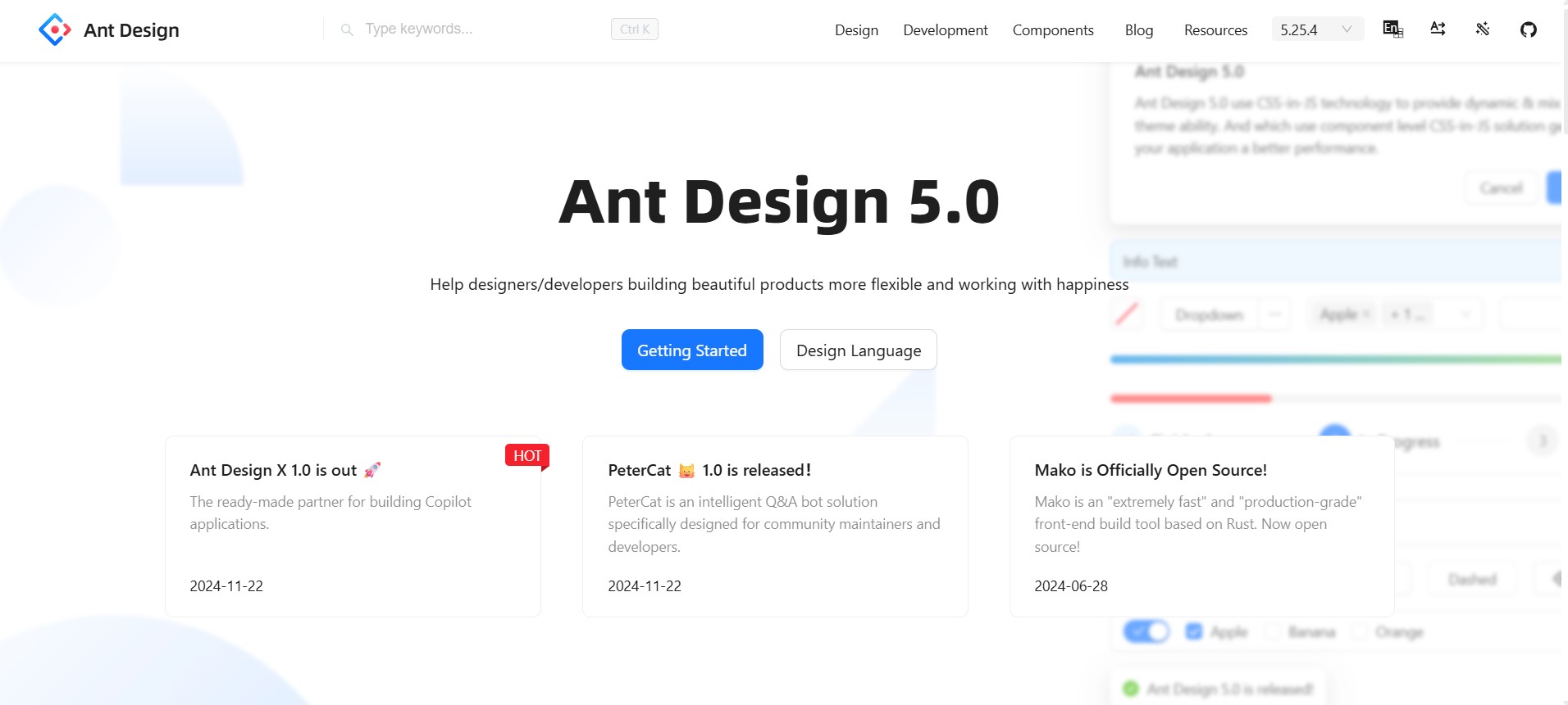
React Component Library (antd): The flagship offering. A vast collection of meticulously crafted, production-ready React components. From basic Buttons, Inputs, and Dropdowns to advanced Data Tables, Charts, Modals, Forms (with robust validation), Navigation schemes, and Layout systems. Each component is:
Highly Reusable: Encapsulates complex logic and styling.
Customizable: Extensive theming support via CSS variables or LESS.
Accessible: Built with WCAG standards in mind.
Internationalized (i18n): Supports multiple languages out-of-the-box.
Well-Documented: Comprehensive API docs with live editable examples.
Ant Design Pro: An enterprise-level front-end application solution. Think of it as a powerful starter kit or framework built on top of the core Ant Design components. It provides:
Pre-built templates for common pages (dashboards, lists, forms, detail views).
Integrated best practices for routing, state management (often with Dva or Redux), data mocking, authentication, and permissions.
A build toolchain optimized for performance.
Dramatically accelerates the creation of complex, consistent admin dashboards and internal tools.
Design Resources: Figma libraries, Sketch kits, and Axure RP components allow designers to work seamlessly within the system and hand off specs that developers can implement accurately using the React components.
Theme Customization: Robust theming capabilities allow organizations to adapt the core Ant Design look and feel to their specific brand identity while maintaining all the underlying functionality and consistency guarantees. This is crucial for commercialization and product differentiation.
Vibrant Community & Ecosystem: Massive open-source community contributing plugins, extensions, additional components, and themes. Extensive documentation, active GitHub discussions, and Stack Overflow presence.
The Tangible Impact: Why Enterprises Choose Ant Design
Implementing Ant Design delivers concrete benefits that directly address the challenges it was born from:
Unprecedented Consistency: Across products and teams, users encounter familiar patterns and behaviors. This reduces cognitive load, minimizes errors, and shortens training time. Brand perception becomes unified and professional.
Accelerated Development: Developers spend less time building basic UI infrastructure and wrestling with inconsistent implementations. Reusing battle-tested components drastically cuts coding time and QA cycles. “Time to Market” shrinks significantly.
Reduced Design & Development Costs: Eliminates the massive waste of duplicative design work and custom component development. Resources shift from reinventing the wheel to solving unique user problems and innovating.
Enhanced Developer-Designer Collaboration: A shared language (the components and guidelines) bridges the gap. Designers design within the system’s constraints and possibilities; developers implement using known components. Handoffs become smoother, and friction decreases.
Focus on Higher-Value UX: Freed from repetitive tasks and baseline consistency struggles, designers can concentrate on user research, complex interaction design, information architecture, and truly enhancing the core user journey. Developers focus on business logic and performance.
Scalability & Maintainability: New features and products can be built faster by leveraging existing patterns. Updates to the core library (e.g., accessibility fixes, new variants) can propagate across applications more easily. Technical debt related to UI fragmentation is minimized.
Built-in Best Practices: Accessibility, performance considerations, responsive design, and internationalization are baked into the components and guidelines, raising the baseline quality of all products using the system.
Strong Foundation for Commercial Products: Theming and customization allow internal tools to evolve into polished, branded commercial offerings with a fraction of the usual UI rework.
Beyond Ant: Adoption and Influence
While born within Ant Group (powering Alipay, Ant Fortune, and countless internal tools), Ant Design’s impact extends far beyond its origins. Its combination of enterprise-grade robustness, comprehensive component coverage, React-first approach, and clear design philosophy has made it a top choice globally for:
Large corporations building internal admin systems and dashboards.
SaaS companies developing complex B2B applications.
Startups needing a professional, scalable UI foundation quickly.
Government and financial institutions requiring secure, reliable, and accessible interfaces.
Its popularity is a testament to how effectively it solves the universal pain points of enterprise-scale front-end development.
Considerations and Challenges
No system is perfect, and Ant Design presents some considerations:
Learning Curve: The vastness of the component library and the conventions of the design system require initial investment from both designers and developers.
Bundle Size: Including the entire library can lead to large JavaScript bundles. Careful tree-shaking and selective importing are essential for performance-critical applications. Newer strategies like dynamic imports help.
Design “Ant” Aesthetic: While customizable, the default aesthetic is distinctive. Heavy customization is needed if a product aims for a radically different visual language, which can negate some consistency benefits.
Complexity within Components: Some advanced components (like the Table or Form) have extensive APIs and configuration options, which can be overwhelming initially but provide immense power.
The Future: Continuous Growth
True to its “Growing” value, Ant Design is constantly evolving. Recent trends and focus areas include:
Enhanced Performance: Ongoing efforts to optimize component rendering and bundle sizes.
CSS-in-JS Evolution: Exploring modern styling solutions for better theming and runtime flexibility.
Micro-Frontend Support: Adapting patterns to work seamlessly within distributed front-end architectures.
Deeper Accessibility: Continuous improvements to meet stricter accessibility standards.
Design Tokens: Refining the theming system with a stronger focus on design tokens for more systematic customization.
Expanded Resources: More templates, patterns, and educational content for the community.
Conclusion: More Than a Toolkit – A Strategic Asset
Ant Design is far more than a collection of React components. It represents a mature, battle-tested approach to taming the inherent complexity of enterprise software development. By anchoring itself in strong design values – Natural, Certain, Meaningful, and Growing – it provides a holistic solution that boosts efficiency, enforces consistency, and elevates the user experience.
For organizations drowning in redundant UI work, struggling with inconsistency, or striving to deliver commercial-grade experiences in their enterprise tools, Ant Design offers a proven path forward. It empowers teams to shift their focus from the mechanics of interface building to the true goal: creating meaningful, efficient, and valuable experiences for users navigating the complex digital landscapes of the modern enterprise. In the demanding world of enterprise UX, Ant Design isn’t just an option; for many, it’s become the essential infrastructure for building at scale.