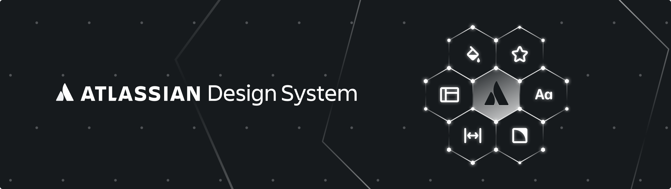
The Atlassian Design System: Engineering Harmony at Scale
The Symphony of Collaboration: More Than Just UI Components
In the chaotic orchestra of enterprise software development—where designers, developers, and product managers often play dissonant notes—the Atlassian Design System (ADS) emerges as the conductor unifying every instrument.
Born from the need to tame inconsistency across products like Jira, Confluence, and Trello, ADS isn’t merely a component library. It’s a living philosophy that transforms disjointed workflows into harmonious user experiences.
By integrating foundations, components, and standards, ADS enables teams to build with clarity while scaling creativity across 18+ products and millions of users.
The Genesis: From Chaos to Cohesion
In 2012, Atlassian faced a crisis common to rapidly scaling tech companies:
45 different dropdown menus across products
Design tools unable to support cross-product collaboration
Engineers rebuilding identical components for separate teams
This fragmentation sparked the creation of the Atlassian Design Guidelines (ADG)—the precursor to ADS. What began as a side project hosted on “a Mac Pro under a desk” evolved into a mission-critical system through relentless iteration. Early versions prioritized “doing things that don’t scale”—like static HTML files—to prove value before engineering perfection. The breakthrough came when a designer transformed ADG into a Living Style Guide during a hackathon, tethering design to code in real-time.
Pillars of the System: Where Philosophy Meets Practice
1. Foundations: The Atomic Building Blocks
ADS foundations are design tokens—reusable variables controlling visual attributes like color, spacing, and typography. These tokens enable systemic consistency:
Color: Contextual palettes with light/dark modes, enforcing WCAG AA contrast ratios for accessibility
Typography: The Maison Neue typeface balances personality (rounded forms) with pragmatism (readability at small scales)
Spacing: A strict 4px grid system creates rhythmic vertical/horizontal alignment
Motion: Functional animations categorized as Candid (human-like), Contextual (action-oriented), or Witty (delightful)
Table: ADS Foundation Tokens
| Token Type | Role | Scale Example |
|---|---|---|
| Color | Theming, accessibility | Primary brand, error states |
| Spacing | Layout consistency | 4px, 8px, 16px increments |
| Elevation | Hierarchical depth | 1px (cards) to 24px (modals) |
| Typography | Readability & brand voice | Heading, body, code styles |
2. Components: Reusable Interaction Patterns
With over 200 modular components, ADS solves complex UX challenges while preventing redundant work:
Smart Contextual Components: The
Benefits Modalexplains feature value without disrupting workflows, whileOnboarding Spotlightguides users through new interfaces.Primitives for Customization: Low-level building blocks like
Pressable(custom buttons) andAnchor(custom links) allow innovation without breaking standards.Atomic Design Methodology: Components follow Brad Frost’s hierarchy—from atoms (buttons) to organisms (navigation systems)—enabling GO-FOOD to repurpose GO-RIDE patterns in weeks.
3. Accessibility: “Leave No User Behind”
ADS bakes inclusivity into its DNA:
Semantic HTML for screen reader compatibility
Non-color cues (icons, strokes) for color-blind users
High-contrast defaults meeting WCAG 2.1 AA standards
The Engine Room: How ADS Fuels Cross-Functional Teams
👩💻 For Designers
Figma Libraries: Token-backed components synced via the Atlassian Design Tokens Plugin
Usage Guidelines: Not just how to use a component, but when (e.g., “Primary vs. Secondary buttons”)
👨💻 For Developers
React-Based Components: Code components via
Atlaskitwith built-in responsivenessTooling Ecosystem: ESLint/Storybook plugins enforce UI standards during development
🤝 The Collaboration Flywheel
ADS thrives on a two-way contribution model:
Centralized Stewardship: A dedicated team (designers + engineers) researches and consolidates patterns.
Product Champions: Rotating ambassadors from teams like Jira or Trello contribute components back to ADS.
As Matt Bond, ADS pioneer, notes: “A design system is a tool for empowerment, not a weapon to control design”.
Evolution in Action: Adapting to a Changing World
Unlike static style guides, ADS evolves through:
Bi-Weekly Sprints: Shipping updates like the 2025 Typography Refresh (bolder fonts) or Button/Link Revamp (improved accessibility)
Data-Driven Iteration: Monitoring NPS scores and opt-in rates for new patterns
Backend Consistency: Unifying services like
@mentionsbeyond frontend visuals
Lessons for Enterprise Teams: Building Your Own ADS
Start Scrappy: Begin with static mocks or basic HTML—perfection can wait.
Document Relentlessly: Atlassian uses Confluence templates to catalog components and writing guidelines.
Embed Engineers Early: Atlassian onboarded 500 engineers via workshops, turning them into system advocates.
Avoid “Redesign Everything” Traps: Fix foundational tokens before overhauling UIs.
Conclusion: The Silent Force Multiplier
The Atlassian Design System transcends aesthetics—it’s a strategic accelerant. By transforming redundancy into reuse, friction into flow, and isolation into collaboration, ADS proves that design systems aren’t constraints. They’re liberators of creativity. As teams worldwide grapple with scaling digital products, ADS offers a blueprint: Clarity through tokens, innovation through components, and harmony through shared purpose.
Ready to orchestrate your product suite? Explore foundations, components, and tools at atlassian.design.