A Professional’s Guide to Leveraging Urban Night Colors
Color in UI and graphic design is a powerful communicative tool, capable of influencing mood, guiding user attention, and establishing strong brand identities.
While natural landscapes offer a vast array of harmonious palettes, the vibrant, dramatic hues found in urban environments at night also present a rich source of inspiration. By observing and extracting the striking contrasts and luminous accents from nighttime cityscapes, designers can infuse their work with a sense of excitement, sophistication, and modernity that resonates with a broad audience.
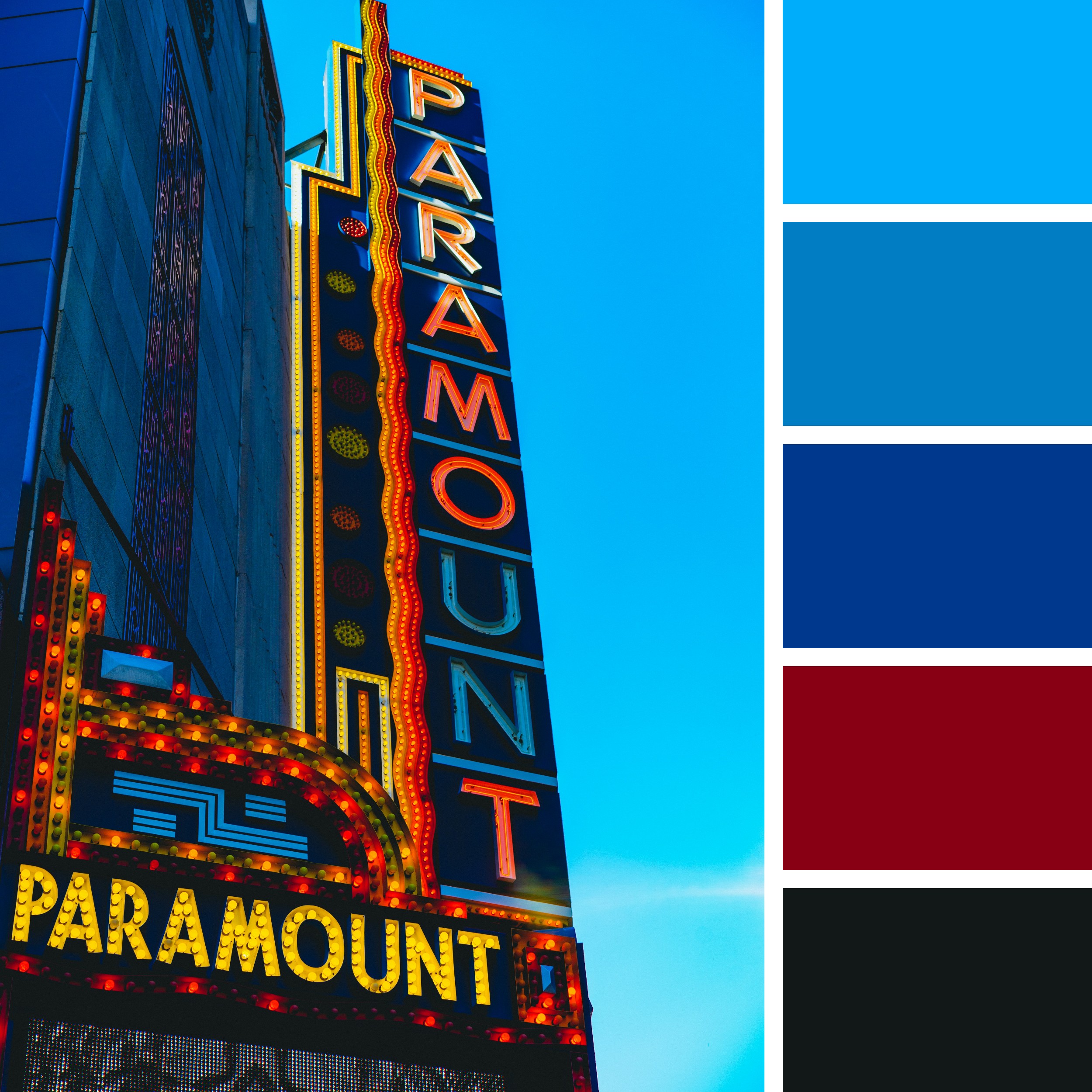
Consider the captivating scene of a towering urban sign, bathed in the electric glow of its own illumination against a deep twilight sky. The interplay of brilliant neon lights and the enveloping darkness creates a visual spectacle of high contrast and intense color saturation. This kind of dynamic urban observation, when approached with a designer’s discerning eye, can yield a robust and versatile color palette perfectly suited for applications demanding energy, drama, and a contemporary aesthetic.
The provided image captures precisely this type of compelling urban night scene. A grand vertical sign, emblazoned with bright yellow and red lights, stands prominently against a deep blue sky that transitions to near black. The architectural lines of the building are subtly illuminated by the sign’s glow, adding depth and structure. This visual richness is meticulously distilled into a curated color palette at the bottom of the image, offering a tangible starting point for practical design exploration.
Deconstructing the Urban Night Palette’s Significance:
The accompanying palette comprises five distinct colors, each reflecting a key aspect within the depicted urban night scene:
#00ADFA (Vibrant Sky Blue): This bright, energetic blue evokes the luminous quality of the twilight sky just above the sign, or perhaps the glow of ambient city lights reflecting off surfaces. It conveys feelings of clarity, freshness, and modernity. In design, this color can be highly effective as a primary accent for calls to action, interactive elements, or to create a sense of digital purity and technological sophistication. Its brightness ensures high visibility and can infuse designs with a lively, dynamic feel.
#017DC3 (Deep Electric Blue): This richer, more saturated blue reflects the dominant cool tones of the building itself, or the deeper parts of the night sky, illuminated by urban light. It offers a sense of depth, stability, and sleek professionalism. Designers can effectively utilize this color for backgrounds, primary navigation, or as a dominant brand color when a sense of corporate reliability, technological advancement, or a calm yet authoritative presence is desired. It provides a strong, sophisticated foundation and excellent contrast for brighter elements.
#00388D (Dark Midnight Blue): This profound, almost inky blue represents the deepest shadows within the urban architecture, the vastness of the late-night sky, or the darkest recesses of the sign’s structure. It conveys feelings of depth, sophistication, and a sense of understated power. In design, this color is invaluable for providing a solid background, creating strong visual anchors, or for sophisticated typography. Its deep tone allows brighter colors to truly pop, creating dramatic contrast and elegance, suitable for premium or luxury brand contexts.
#880014 (Bold Marquee Red): This rich, intense red captures the vibrant, eye-catching glow of the marquee’s incandescent bulbs or neon elements. It evokes feelings of excitement, urgency, energy, and drama. In design, this color is highly effective for critical alerts, prominent calls to action, or as a powerful accent color to draw immediate attention. Its strong, saturated presence makes it excellent for signifying importance or for injecting a sense of excitement and entertainment, often associated with events, alerts, or striking brand elements.
#121818 (Near Black): This extreme dark tone represents the absolute blackness of the deepest shadows in the urban environment, the unlit voids, or the darkest parts of the building facade. It conveys ultimate contrast, formality, and serves as a powerful grounding element. In design, this color is best used for primary backgrounds to create dramatic impact, for critical text elements that demand absolute clarity (especially with light-colored text), or as a sophisticated frame for other vibrant colors. Its minimalist nature allows the luminous blues and red to shine with maximum intensity, establishing clear focal points and a sense of modern elegance.
Practical Applications of the Urban Night Palette in Design:
The inherent dynamism and rich contrasts within this urban night-inspired palette make it exceptionally versatile for various design applications where impact, sophistication, and a contemporary edge are desired:
User Interface Design:
Crafting Dynamic and Engaging Interfaces: For applications in entertainment, media streaming, event promotion, or high-tech industries, this palette can immediately establish a sleek, modern, and exciting user experience. The vibrant sky blue (#00ADFA) can highlight interactive elements or progress indicators, while the deep electric blue (#017DC3) provides a sophisticated and clean background for content. The bold marquee red (#880014) can be used for calls to action or “play” buttons, drawing immediate user attention. The dark midnight blue (#00388D) and near black (#121818) ensure strong visual hierarchy and readability for text and structural components, giving the interface a premium feel.
Building Brand Identities with Modernity and Edge: For brands seeking to convey innovation, luxury, or a cutting-edge presence, this palette visually communicates sophistication and strong character. The deep electric blue (#017DC3) can serve as a primary brand color, representing reliability and technological prowess. The vibrant sky blue (#00ADFA) adds a touch of fresh energy, while the bold marquee red (#880014) provides a striking accent, representing dynamism or excitement. The dark midnight blue (#00388D) and near black (#121818) offer elegant anchors for logos and typography, ensuring a strong, memorable presence.
Enhancing Visual Hierarchy and User Guidance in Complex Dashboards: The sharp contrast offered by this palette is excellent for defining clear visual hierarchy in data-rich dashboards or complex applications. Key metrics, alerts, or important notifications can be highlighted using the vibrant sky blue (#00ADFA) or bold marquee red (#880014), ensuring they stand out against the darker blue and black backgrounds. This strategic use of high contrast helps guide the user’s eye to the most critical information, leading to a more efficient and intuitive user experience.
Ensuring Accessibility in High-Contrast Designs: When implementing such a high-contrast palette, designers must rigorously test for accessibility to ensure readability for all users. Light text, such as white or a light gray, on the dark midnight blue (#00388D) or near black (#121818) will provide excellent contrast for body text and headlines. Conversely, very dark text would struggle on the vibrant sky blue (#00ADFA) or bold marquee red (#880014); these brighter colors are best reserved for large headings, icons, or specific interactive elements, or paired with white text for maximum legibility.
Graphic Design:
Crafting Dramatic and Memorable Marketing Materials: For posters, advertisements, event promotions, or digital campaigns in entertainment, nightlife, or luxury products, this palette can create undeniable visual impact. Imagery that resonates with the electric glow of a city at night, combined with text and graphic elements using these intense colors, can generate immediate excitement and draw significant attention. The bold marquee red (#880014) and vibrant sky blue (#00ADFA) are ideal for headlines and calls to action that demand engagement.
Developing Thematic Visuals for Editorial or Lifestyle Content: In editorial design for fashion magazines, cultural event guides, or urban lifestyle blogs, this palette provides a modern and sophisticated aesthetic. The deep blues can set a stylish background, while the vibrant red acts as a powerful accent for imagery or pull quotes, creating a sense of urban energy and contemporary style.
Designing Striking Print Collateral: For high-end print materials such as invitations, album covers, or premium product packaging, this palette offers a luxurious and impactful aesthetic. The deep electric blue (#017DC3) or dark midnight blue (#00388D) can be used for rich backgrounds, allowing the bold marquee red (#880014) and vibrant sky blue (#00ADFA) to pop as luminous accents for branding, typography, and key visual elements. This combination creates highly tactile and visually arresting designs that convey sophistication and modern appeal.
Creating Engaging Infographics and Data Visualizations for Tech or Urban Data: When presenting data related to urban trends, technological advancements, or performance metrics, this palette can visually underscore the dynamic and sophisticated nature of the information. The vibrant sky blue (#00ADFA) and bold marquee red (#880014) can be used to highlight key data points, outliers, or areas of focus, while the darker blues and near black provide a clean, authoritative ground for charts, graphs, and labels, making complex information immediately impactful and understandable within a modern context.
A final word
The inherent dynamism and dramatic allure of urban nightscapes provide a boundless source of inspiration for designers.
By understanding the emotional and visual impact of these intense hues and sharp contrasts, UI and graphic designers can create compelling, high-impact designs that command attention and effectively communicate their intended message.
The strategic application of this vibrant, high-contrast palette, grounded by sophisticated dark tones, enables designers to craft experiences that are not only visually striking but also deeply resonant, driving engagement and leaving a lasting impression of modern sophistication.