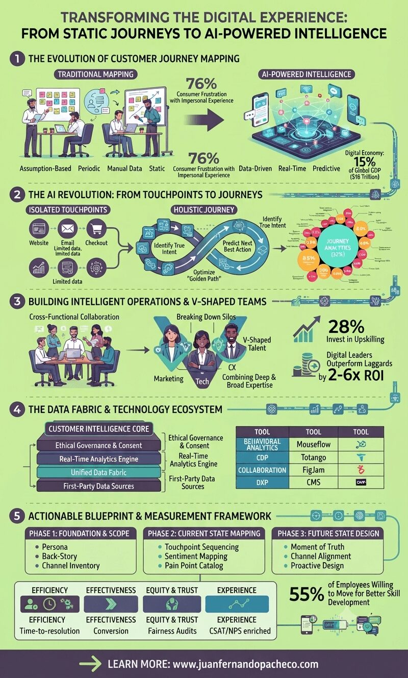
The future of customer journey mapping lies in creating dynamic, self-updating systems that not only reflect current customer behaviors but also predict future needs and preferences. This requires investment in both technology and talent—particularly in developing V-shaped employees who can bridge functional silos and translate data insights into human-centered experiences.
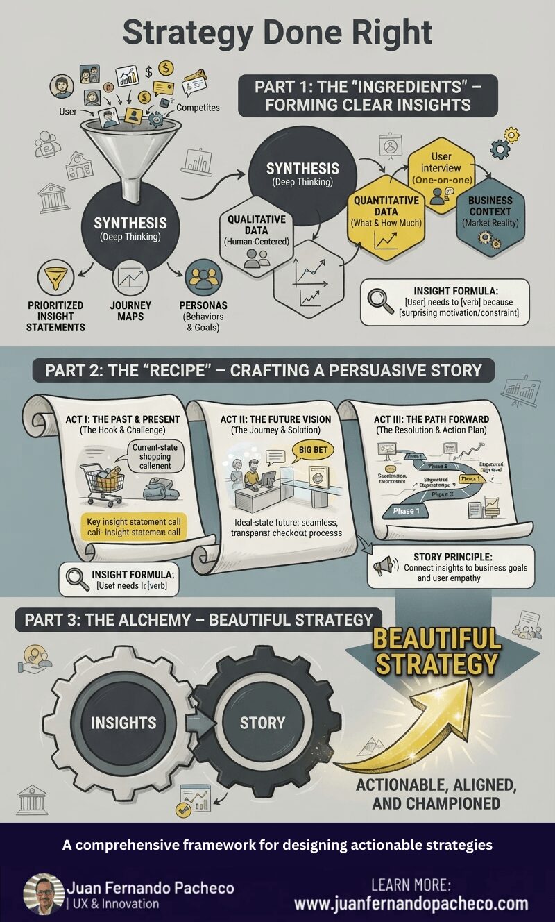
Strategy is the compelling story that explains why those steps are necessary and how they lead to victory. It is the bridge between the current reality and a desired future.
The framework in this post encapsulates this perfectly:
Beautiful Strategy emerges from the alchemy of Clear Insights and a Persuasive Story.
Think of insights as your raw “ingredients” and the story as your “strategy recipe.”
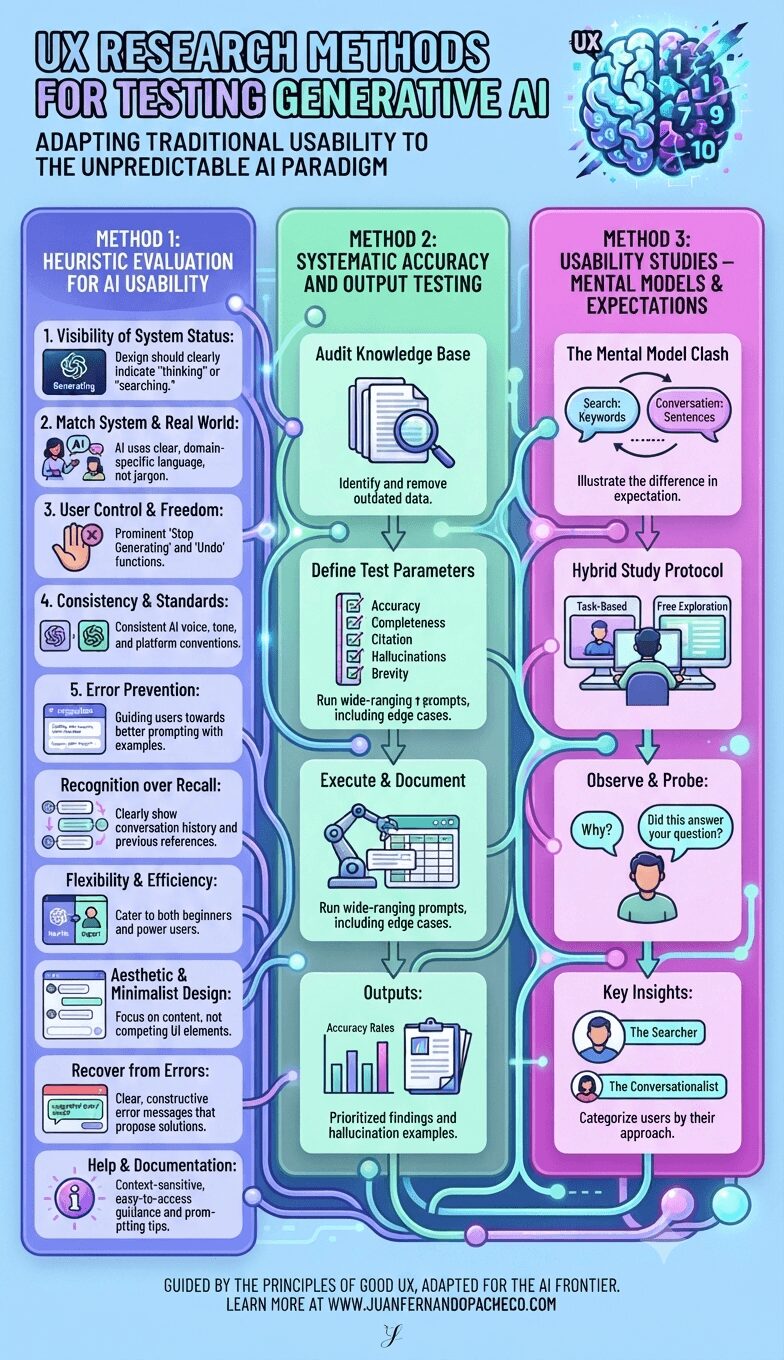
Testing generative AI requires us to expand our UX research toolkit. We can no longer rely solely on prototyping predictable flows. Instead, we must adopt a multi-pronged strategy that assesses not just the interface’s usability but also the quality of its output and its alignment with deeply ingrained user mental models.
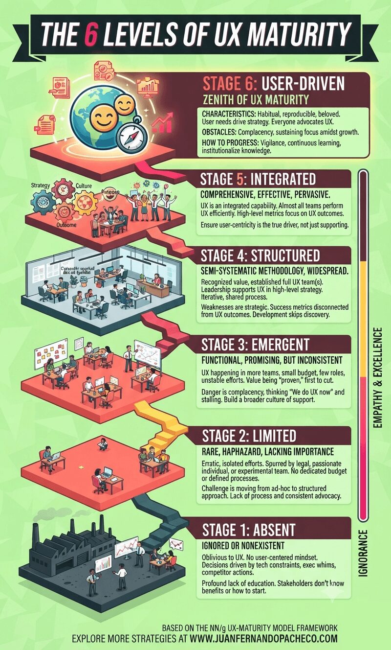
Understanding your organization’s UX maturity is not an exercise in vanity. It is a vital diagnostic tool that allows you to identify strengths to celebrate and weaknesses to address. It provides a realistic, shared language for improvement.
The path forward is incremental. You cannot leapfrog stages. The practices and cultural shifts of each stage create the necessary foundation for the next. Progressing even one stage can take years of dedicated effort. Don’t be discouraged. Start with an honest assessment, build a coalition of champions, celebrate small victories, and always, always tie your work back to both user value and business impact.
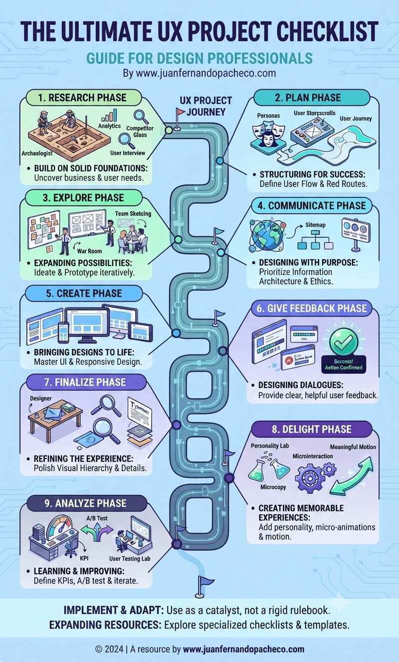
The UX Project Checklist represents more than just a list of tasks—it embodies a comprehensive approach to designing exceptional user experiences. As the field continues to evolve with new technologies, interaction patterns, and user expectations, this checklist should serve as a foundation rather than a final word.
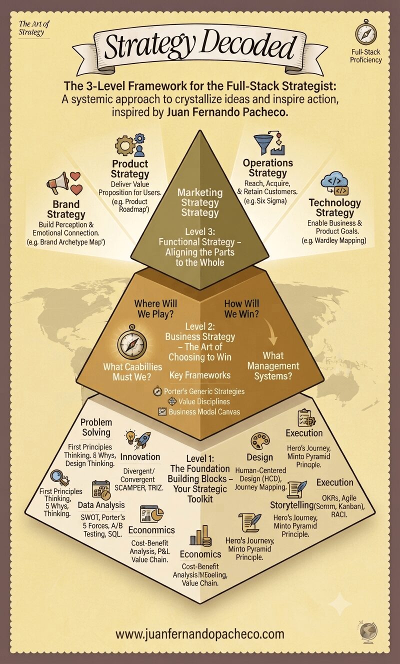
Becoming a full-stack strategist is a journey.
Start by auditing your proficiency in the seven building blocks. Where are you strong? Where do you need improvement?
Then, practice articulating the business strategy for your team or company—even if it’s not your official job.
Finally, constantly scrutinize your functional work (whether in design, tech, product, or marketing) and ask: “Does this truly ladder up to how we’ve chosen to win?”
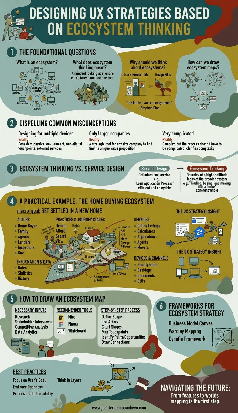
The future of UX design is not in crafting perfect, isolated interactions. It is in designing intelligent, adaptive, and respectful nodes within a vast and complex human ecosystem. It requires us to be not just designers, but strategists, systems thinkers, and diplomats who can navigate the relationships between services, businesses, and most importantly, people.
By adopting ecosystem thinking, we move from creating products that people use to crafting environments that people live in. We stop building features and start building worlds. The map is the first step. It’s time to start charting.
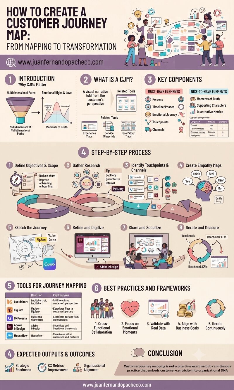
Customer journey mapping is not a one-time exercise but a continuous practice that embeds customer-centricity into organizational DNA.
By visualizing the intersection of human emotions and business processes, UX professionals can drive transformative change—turning fragmented interactions into cohesive, respectful experiences that build long-term loyalty.
As CX expectations escalate, the brands that thrive will be those who listen, adapt, and design journeys that resonate deeply with the people they serve.
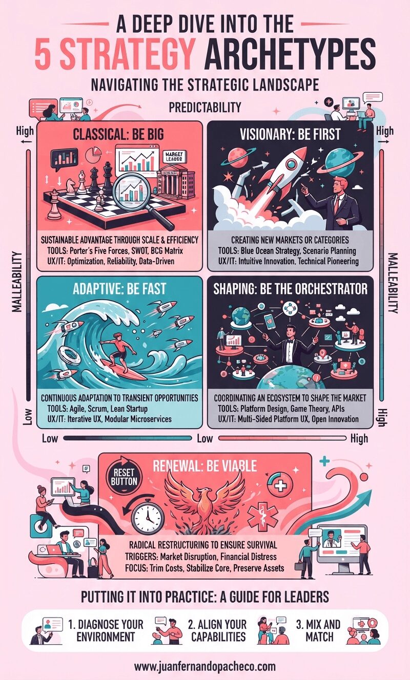
The greatest risk in strategy is complacency—the unconscious application of a default approach. The framework of the five archetypes empowers us to move from a reactive stance to a proactive one. It provides a language to debate not just what we are doing, but why we are doing it and how it matches the world we operate in.
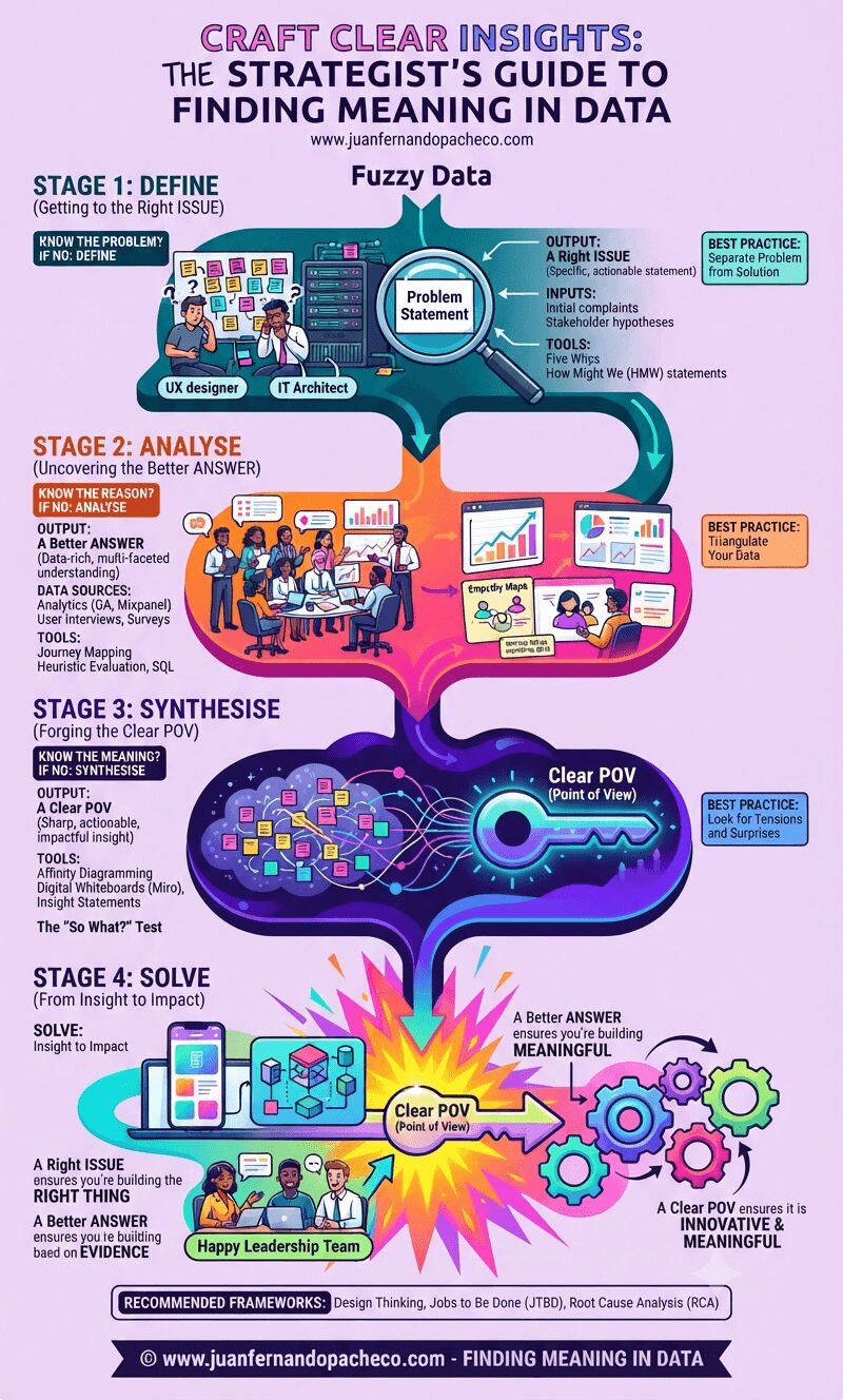
In a world saturated with data, the ability to craft clear insights is a superpower. It is the bridge between raw information and human understanding, between execution and strategy. It is what separates a feature factory from a truly impactful product team.