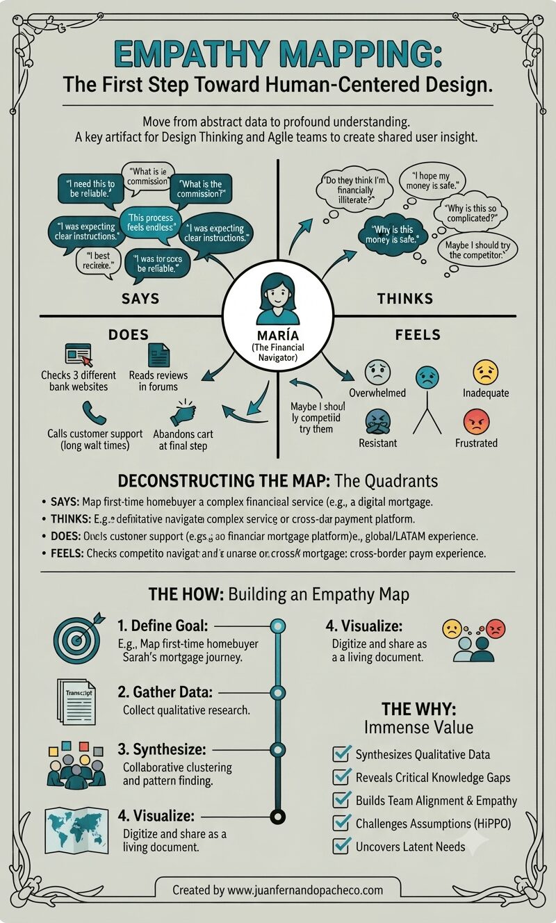
A vertically-oriented infographic titled "EMPATHY MAPPING: The First Step Toward Human-Centered Design," set against a light sage-green background with a decorative border. The center features a complete empathy map for a persona named "MARÍA (The Financial Navigator)," with radiating arrows connecting her icon to four detailed quadrants: "SAYS" (with quotes like "I need this to be reliable," "What is the commission?"), "THINKS" (internal thoughts like "Do they think I'm financially illiterate?"), "DOES" (actions like "Checks 3 different bank websites"), and "FEELS" (emotions with emojis like "Overwhelmed," "Inadequate"). Below the map, sections deconstruct the quadrants and outline "THE HOW: Building an Empathy Map" (Define, Gather, Synthesize, Visualize steps) and "THE WHY: Immense Value" (a checklist of benefits). The bottom includes the attribution: "Created by www.juanfernandopacheco.com."

An empathy map is more than just a diagram on a wall. It is a practice, a mindset, and a commitment to seeing the world through someone else’s eyes. It transforms the abstract “user” into a human with hopes, frustrations, and a complex inner world.

By systematically capturing what our users Say, Think, Do, and Feel, we move beyond building mere features.
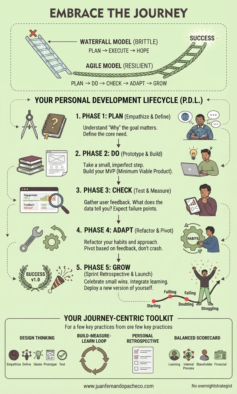
Infographic titled "Embrace the Journey" contrasting a "Waterfall Model (Brittle)"—shown as a straight, fragile glass ladder—with an "Agile Model (Resilient)"—shown as a flexible, woven rope ladder. Below, a five-phase "Personal Development Lifecycle (P.D.L.)" is outlined with illustrations and text: 1. Plan (Empathize & Define), 2. Do (Prototype & Build), 3. Check (Test & Measure), 4. Adapt (Refactor & Pivot), 5. Grow (Sprint Retrospective & Launch), culminating in "Success v1.0." The bottom section, "Your Journey-Centric Toolkit," details Design Thinking, Build-Measure-Learn Loop, Personal Retrospective, and Balanced Scorecard. The background is a light cream color, and the footer contains the URL "www.juanfernandopacheco.com."

In technology, a product is never truly “finished.” It is continuously improved upon in a live environment based on user interaction and changing conditions. Your life and goals are the same.

The wall decal that inspired this article isn’t a picture of failure; it’s an accurate map of the Agile development cycle for a human being. Starting, Learning, Practicing, Doubting, Failing, Feeling Lost, Struggling—these are not signs that you are off course. They are the necessary phases of a well-architected, resilient, and meaningful life.

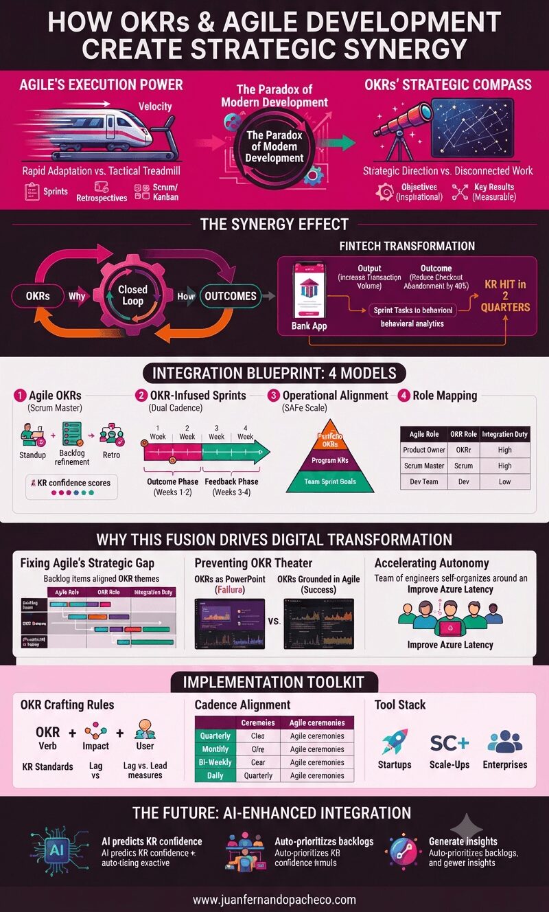
A vertical infographic titled "How OKRs and Agile Development Create Strategic Synergy" on a dark background. It details the fusion of Agile execution power and OKR strategic compass through a closed-loop cycle, leading to a fintech transformation. It presents four integration models: Agile OKRs, OKR-Infused Sprints, Operational Alignment (SAFe), and Role Mapping. It also covers why the fusion drives digital transformation, a toolkit for implementation (crafting rules, cadence, tool stacks), and the future of AI-enhanced integration.

Agile is the engine that propels your product forward; OKRs are the GPS ensuring you’re heading toward value. By embedding objectives into sprint rhythms, teams shift from “Did we ship?” to “Did it matter?” As John Doerr reminds us: “Measures matter more when they’re counterintuitive.”

Start your integration with one pilot team—measure their KR impact versus control groups. In 2025’s AI-driven chaos, this fusion isn’t just optimal; it’s existential.

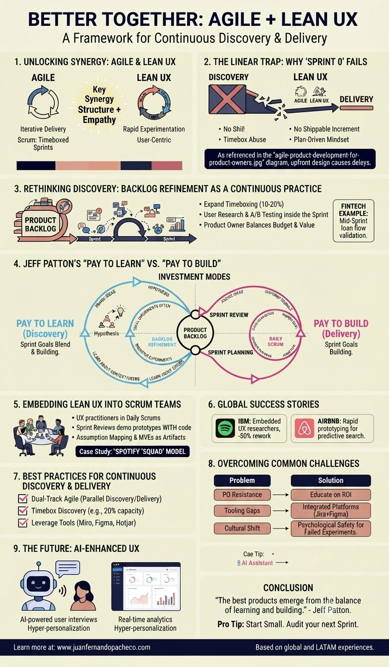
A detailed vertical infographic titled "Better Together: Agile + Lean UX: A Framework for Continuous Discovery & Delivery." The image is organized into nine numbered sections with illustrations, icons, and text, utilizing a color palette of cream, navy, pink, peach, and dark blue. It details how to integrate Lean UX principles like continuous discovery and "Pay to Learn" into Agile Scrum rituals, and includes case studies from Spotify, IBM, and Airbnb, as well as future trends like AI. The central diagram visually merges "Pay to Learn" and "Pay to Build" cycles.

Agile + Lean UX are not competing frameworks—they’re complementary forces. By embedding continuous discovery into Sprints, teams can deliver value faster while staying user-centric. As Jeff Patton says, “The best products emerge from the balance of learning and building.”

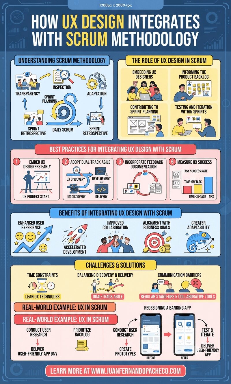
An infographic titled "How UX Design Integrates with Scrum Methodology," utilizing a color palette of blues, yellows, and reds on a dark blue background. The image is a comprehensive guide divided into sections: Understanding Scrum Methodology, The Role of UX Design in Scrum, Best Practices (including "Dual-Track Agile"), Benefits (Enhanced User Experience, Accelerated Development), Challenges & Solutions (Lean UX), a Real-World Example (Redesigning a Banking App), and a call-to-action URL.

Integrating UX design into Scrum is more than a best practice; it’s a necessity for delivering products that resonate with users. By embedding UX designers in teams, leveraging agile design methods, and prioritizing user feedback, organizations can achieve faster development cycles, improved collaboration, and superior user experiences.

As the demand for user-centric products grows, mastering the integration of UX design with Scrum will remain a critical skill for successful product teams.

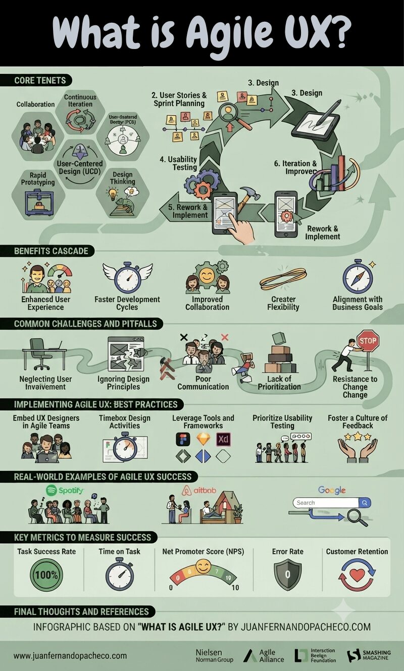
A detailed infographic titled "WHAT IS AGILE UX?" presented as a structured guide on a light green background. It covers six main sections: "CORE TENETS" (Collaboration, Continuous Iteration, User-Centered Design, Rapid Prototyping, Design Thinking, Design), the "AGILE UX PROCESS" (a 6-step circular flow from Planning to Iteration), "BENEFITS CASCADE" (User Experience, Development Cycles, Collaboration, Flexibility, Business Goals), "COMMON CHALLENGES AND PITFALLS" (Neglecting User Involvement, Ignoring Principles, Poor Communication, Lack of Prioritization, Resistance to Change), "IMPLEMENTING AGILE UX: BEST PRACTICES" (Embed Designers, Timebox Activities, Leverage Tools, Prioritize Testing, Foster Feedback), "REAL-WORLD EXAMPLES" (Spotify, Airbnb, Google), "KEY METRICS TO MEASURE SUCCESS" (Success Rate, Time on Task, NPS, Error Rate, Retention), and "FINAL THOUGHTS AND REFERENCES."

Agile UX is a user experience design methodology that integrates seamlessly with Agile software development principles.
It emphasizes collaboration, flexibility, and continuous iteration to create user-centric and high-quality products.

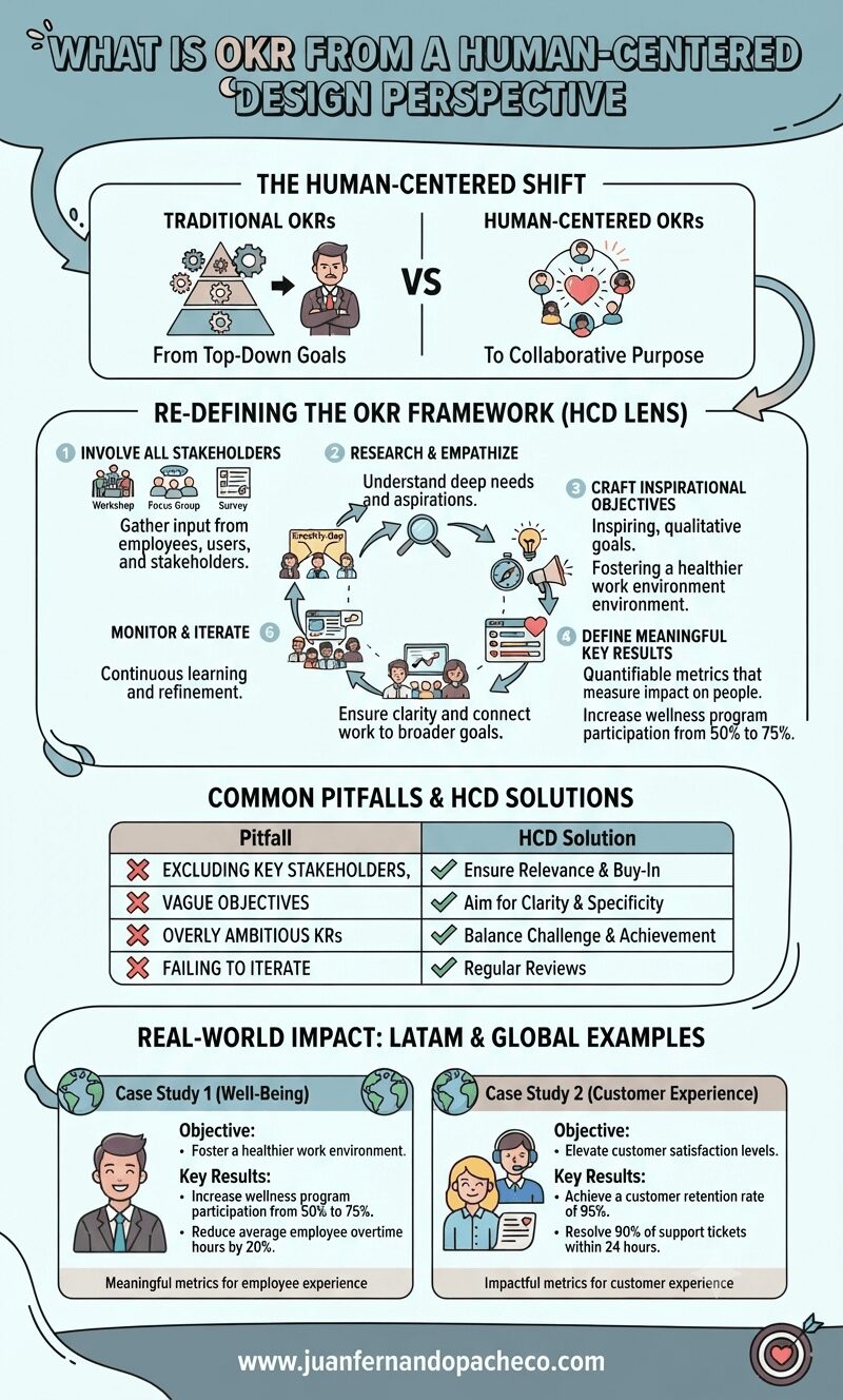
An infographic titled "What is OKR from a Human-Centered Design Perspective" illustrates a six-step framework for setting goals with empathy and collaboration. It compares traditional top-down goal setting with human-centered approaches, lists common pitfalls and solutions, and provides real-world examples for employee well-being and customer experience. The design uses a color palette of teal, cream, mauve, and grey. The footer includes the website www.juanfernandopacheco.com.

OKRs, or “Objectives and Key Results,” are a widely used framework for setting, tracking, and achieving goals within organizations.
Originally developed at Intel in the 1970s and later popularized by John Doerr in Measure What Matters, OKRs have become a cornerstone of goal management for companies like Google, LinkedIn, and Twitter.