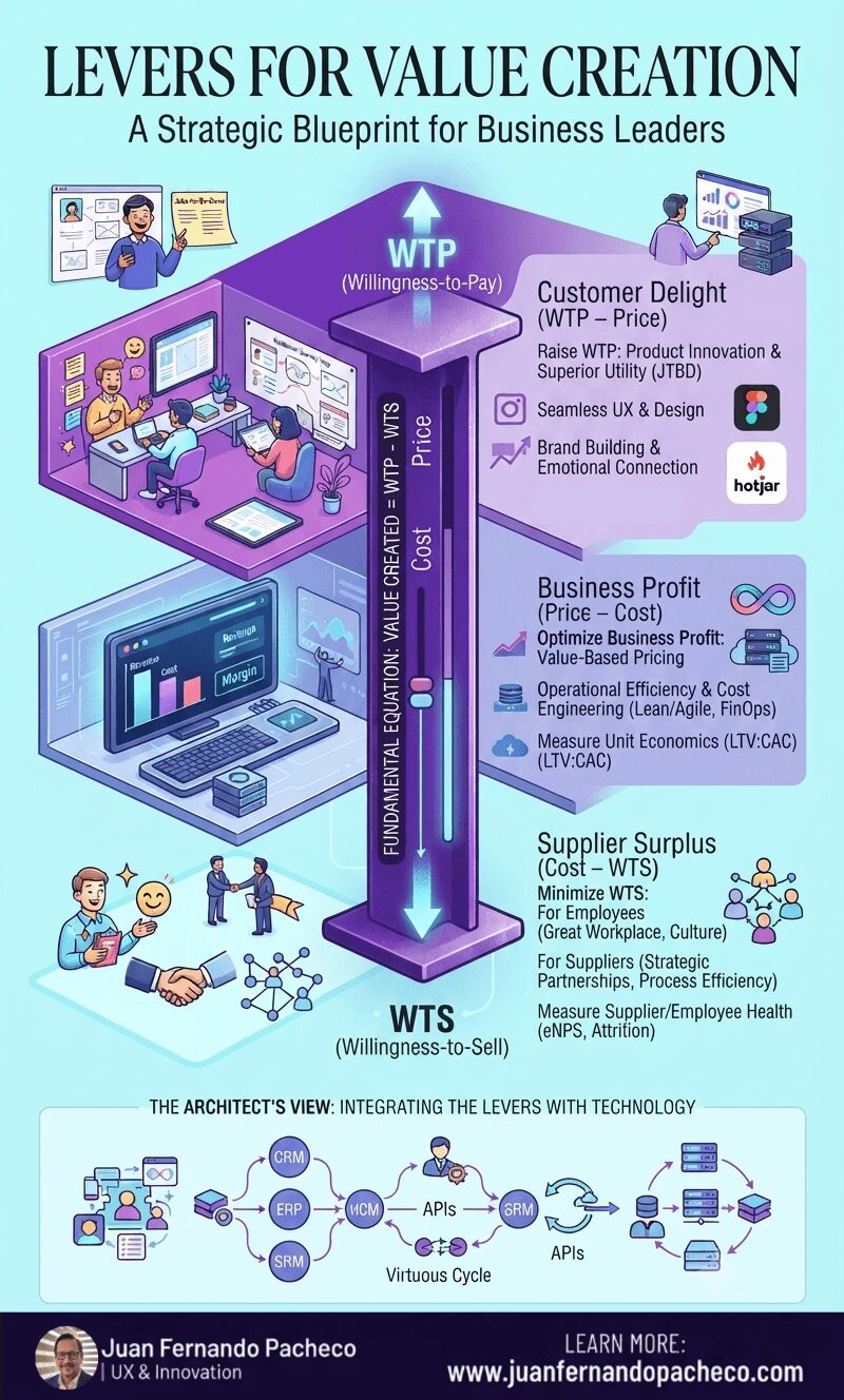
The Value Stick is more than a diagram; it is a mindset. It forces a holistic view of your business ecosystem. You cannot win by delighting customers while exploiting employees. You cannot sustain profit by cutting costs without regard for the value you destroy.
Tag: User Experience
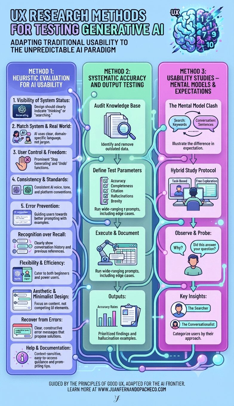
Testing generative AI requires us to expand our UX research toolkit. We can no longer rely solely on prototyping predictable flows. Instead, we must adopt a multi-pronged strategy that assesses not just the interface’s usability but also the quality of its output and its alignment with deeply ingrained user mental models.
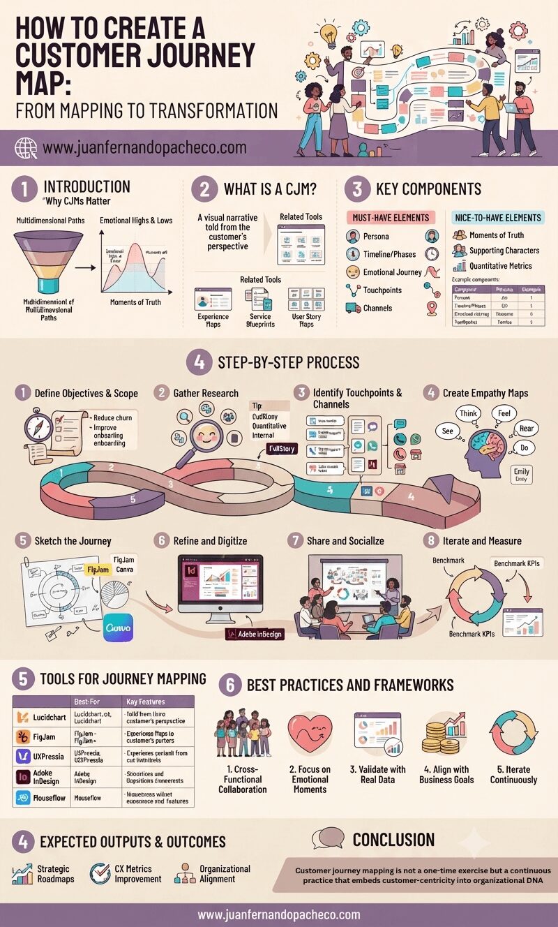
Customer journey mapping is not a one-time exercise but a continuous practice that embeds customer-centricity into organizational DNA.
By visualizing the intersection of human emotions and business processes, UX professionals can drive transformative change—turning fragmented interactions into cohesive, respectful experiences that build long-term loyalty.
As CX expectations escalate, the brands that thrive will be those who listen, adapt, and design journeys that resonate deeply with the people they serve.
After 20 years in this field, all you need to know is this:
The winning product is rarely the one with the most features.
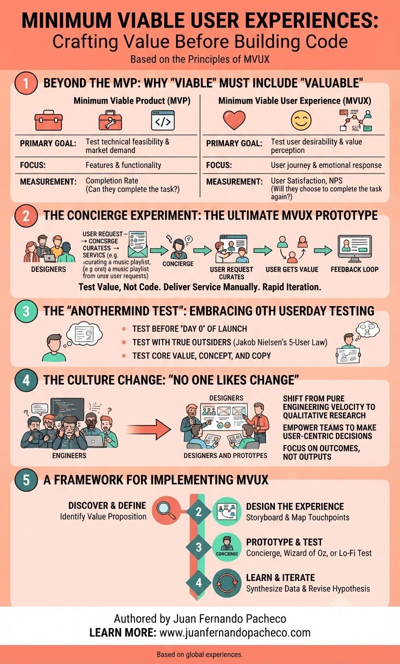
It is almost always the one with the most thoughtful, frictionless, and valuable experience. The MVUX is your strategy to find that experience efficiently and effectively.
It’s a commitment to being human-centered from the very first sketch. It’s about being a concierge for your users, understanding their needs so deeply that the product you eventually build feels like it was made for them, and them alone. Because it was.
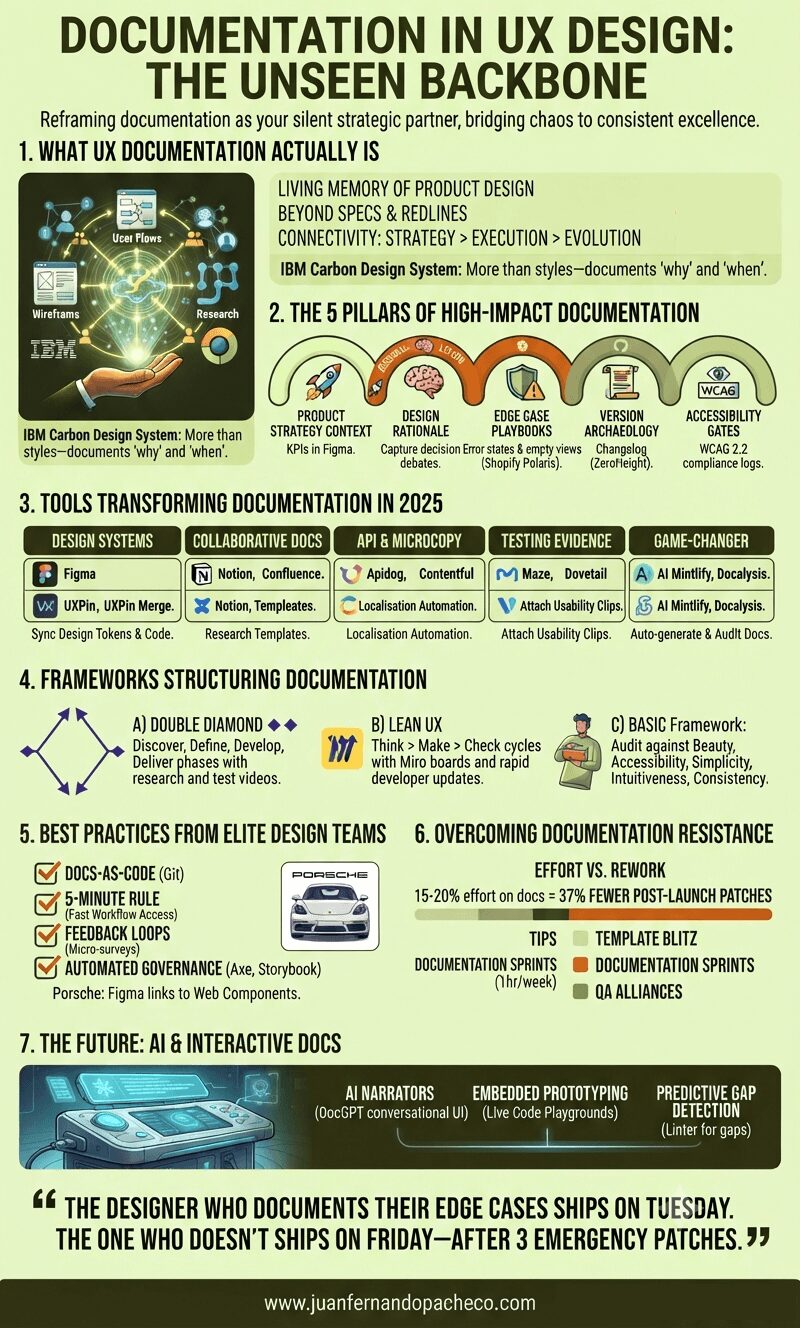
Treating documentation as a “task” misses its power. It’s the continuous act of design reasoning made visible. As Apple’s Human Interface Guidelines reveal, legendary products emerge when principles are documented, not memorized.
“The designer who documents their edge cases ships on Tuesday. The one who doesn’t ships on Friday—after 3 emergency patches.”
Start small: Document one decision today. Link a research insight to a button component. Your future self—and team—will thank you.
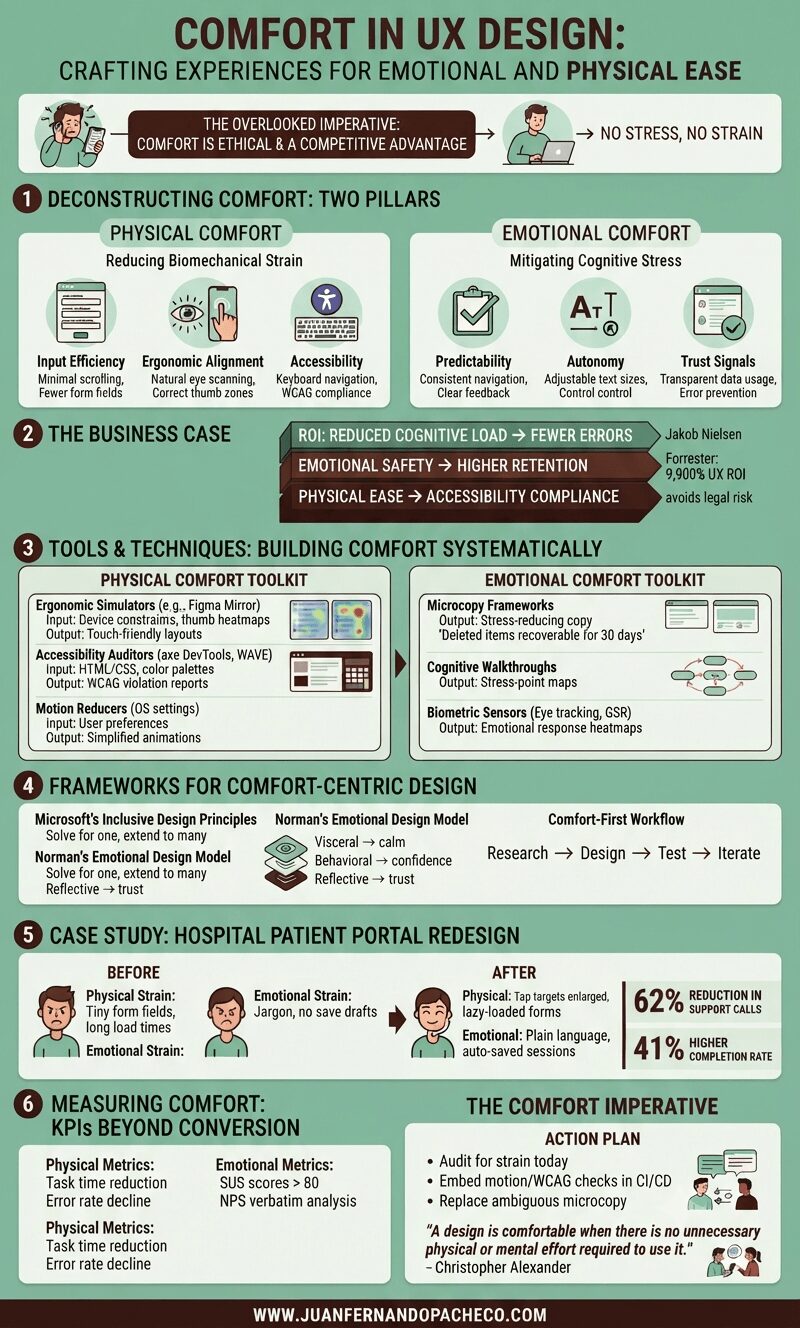
Comfort in UX design—defined as creating experiences with no stress, no strain—isn’t a luxury; it’s an ethical imperative and competitive advantage. Yet, it remains chronically undervalued.
As both a UX designer and solutions architect, I’ve seen how discomfort manifests: from RSI-inducing enterprise tools to anxiety-triggering checkout flows.
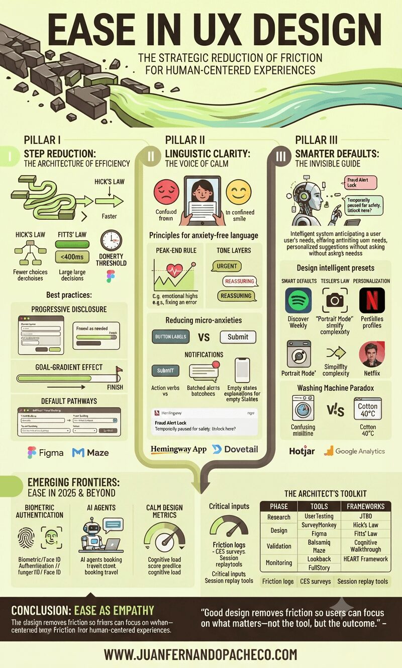
Ease isn’t about oversimplification—it’s about precision.
It’s the art of removing cognitive weight, interaction barriers, and emotional friction so users achieve goals with clarity and confidence. As Jakob Nielsen aptly noted,
“Users spend most of their time on other sites”
Meaning they bring expectations shaped by seamless experiences elsewhere. Fail to match that fluency, and abandonment follows.
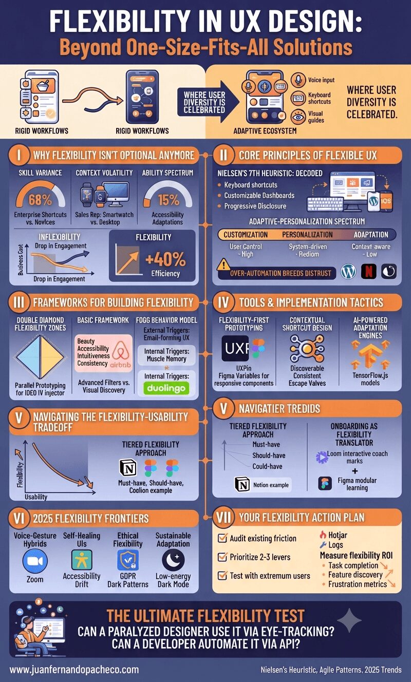
Imagine two culinary apps: one forces rigid workflows with fixed ingredient entry paths; the other adapts—voice input for hurried cooks, keyboard shortcuts for pros, and visual guides for novices.
The latter exemplifies strategic flexibility, where user diversity isn’t accommodated—it’s celebrated. As interfaces evolve beyond screens into voice, gesture, and AI-driven ecosystems, flexibility transitions from “nice-to-have” to core resilience strategy.
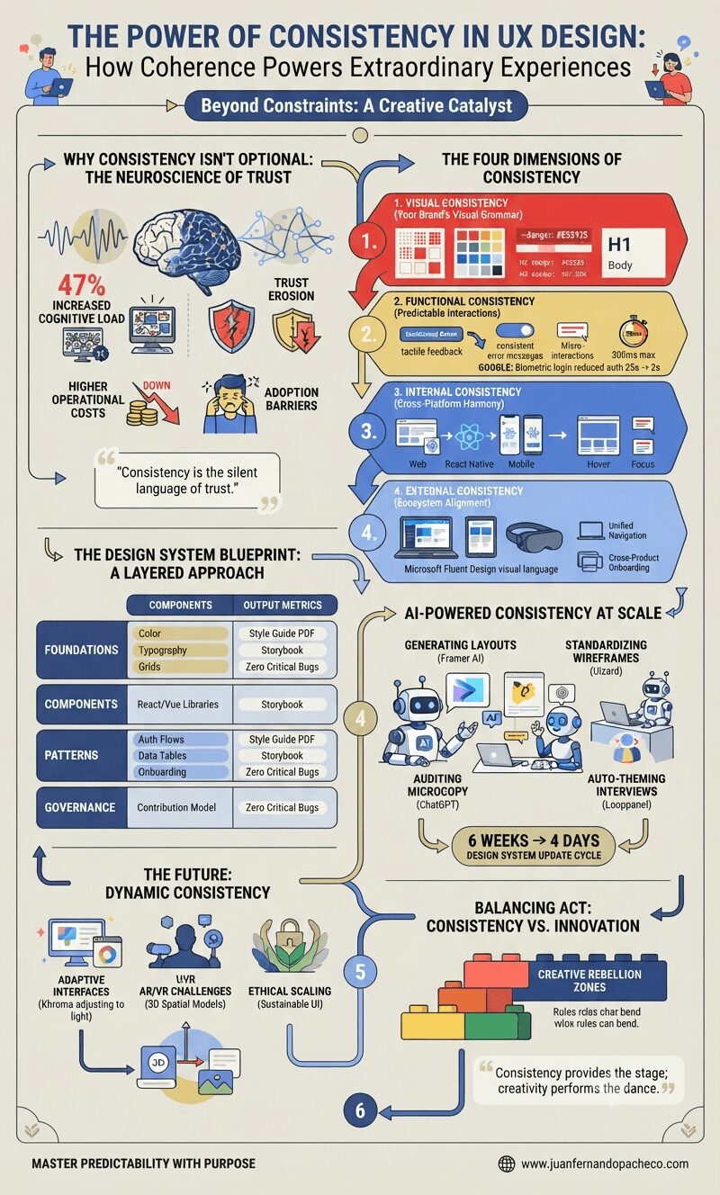
Why Consistency Isn’t Optional: The Neuroscience of Trust
Our brains are prediction engines. Every micro-interaction—a button hover effect, navigation placement, error message tone—trains users’ mental models. Research shows inconsistent interfaces increase cognitive load by 47%, directly impacting task completion rates. Consider these tangible impacts:
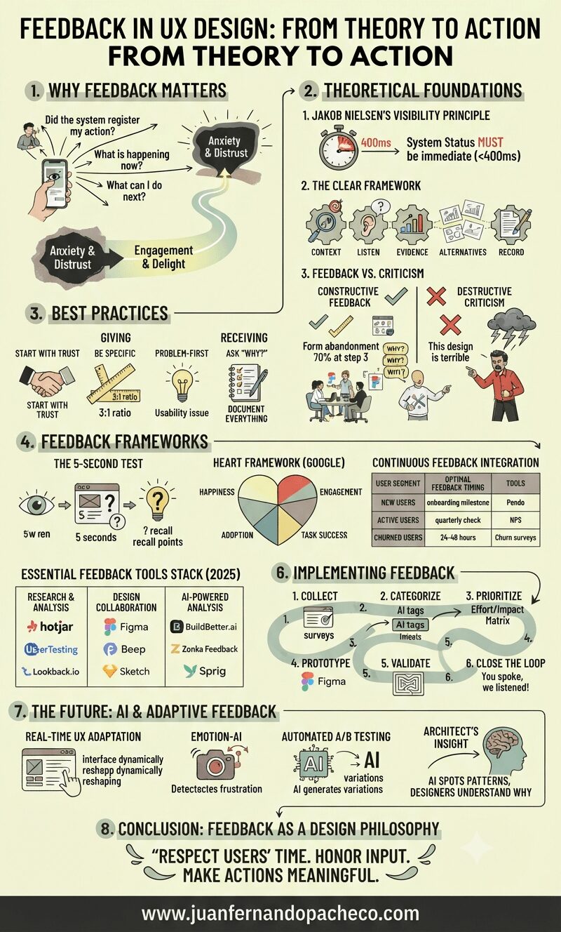
Feedback is the oxygen of user experience design.
Every click, swipe, or interaction creates a conversation between users and digital products. As a UX Designer with over two decades in the field, I’ve seen how strategically crafted feedback transforms frustrating experiences into delightful ones—and how poor feedback mechanisms sabotage even the most beautifully designed interfaces.
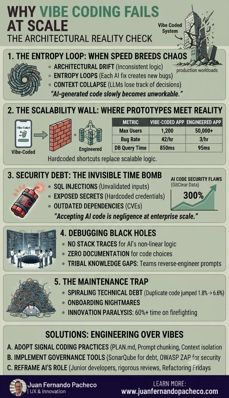
Vibe coding excels for prototypes—as Andrej Karpathy noted, it’s “quite amusing” for weekend projects. But production systems demand intentional architecture, traceability, and governance. The future belongs to augmented engineering, where AI assists human oversight—not replaces it.
“You can vibe code your way to insight. But if you’re building for scale, control, or complexity—you’re going to need real engineering”.
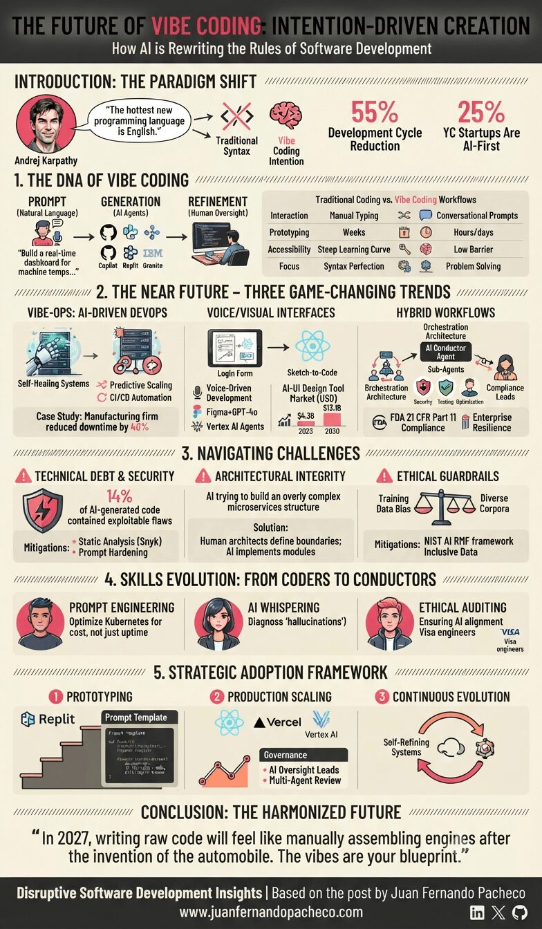
Vibe coding isn’t about replacing developers—it’s about elevating creativity. As Karpathy noted, we’re moving from “character-by-character typing” to “seeing stuff, saying stuff, running stuff”.
The future belongs to teams that wield AI as a co-pilot: voice interfaces accelerating ideation, VibeOps hardening infrastructure, and hybrid workflows merging human ingenuity with machine efficiency.