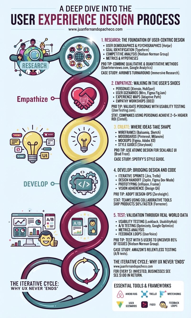
An infographic titled "A Deep Dive into the User Experience Design Process," presented as a stylized, continuous helix structure with five distinct, glowing nodes against a light blue background. From top to bottom, the nodes are: Research (#558c8c teal): Icons of users and a magnifying glass. Text includes "1. RESEARCH: THE FOUNDATION OF USER-CENTRIC DESIGN" and mentions Hotjar, Typeform, competitive analysis, and success metrics. Pro tip: "COMBINE QUALITATIVE & QUANTITATIVE METHODS (UserInterviews.com)." Empathize (#82204a magenta): Icons of two hands forming a heart with a wireframe face. Text includes "2. EMPATHIZE: WALKING IN THE USER’S SHOES" and mentions personas, user scenarios, experience maps (Adaptive Path), and empathy workshops (IDEO). Pro tip: "VALIDATE PERSONAS." Create (#e8db7d yellow): An icon of a glowing lightbulb with UI elements. Text includes "3. CREATE: WHERE IDEAS TAKE SHAPE" and mentions wireframes (Balsamiq), moodboards, mockups (Figma), and style guides (Storybook). Pro tip: "USE ATOMIC DESIGN (Brad Frost)." Develop (#558c8c teal): Icons of cogs and code brackets. Text includes "4. DEVELOP: BRIDGING DESIGN AND CODE" and mentions iterative sprints (Jira), design handoffs (Zeplin), prototyping, and design QA. Pro tip: "ADOPT DESIGN-OPS." Test (#82204a magenta): Icons of data charts, A/B testing, and a happy user. Text includes "5. TEST: VALIDATION THROUGH REAL-WORLD DATA" and mentions usability testing (Lookback), A/B testing (Optimizely), metrics analysis, and feedback loops. Pro tip: "TEST WITH 5 USERS (Nielsen Norman Group)." The helix loops back at the bottom to a final section: "THE ITERATIVE CYCLE: WHY UX NEVER ‘ENDS’" with an arrow circle, the ROI statistic (Forrester), and a list of "ESSENTIAL TOOLS & FRAMEWORKS" (Hotjar, SurveyMonkey, Google Analytics, Miro, UserTesting.com, Xtensio, Figma, Sketch, Adobe XD, Storybook, Zeplin, Jira, Framer, UsabilityHub, Optimizely, FullStory, HEART, Double Diamond, JTBD). The URL www.juanfernandopacheco.com is visible at the top and bottom.

Neglecting UX risks obsolescence. Brands like Apple and Tesla dominate by embedding user-centricity in their DNA. Start small: interview 5 users today. Map one customer journey. Test one button. The process compounds—each iteration deepens empathy, refines solutions, and ultimately, builds products humans love.
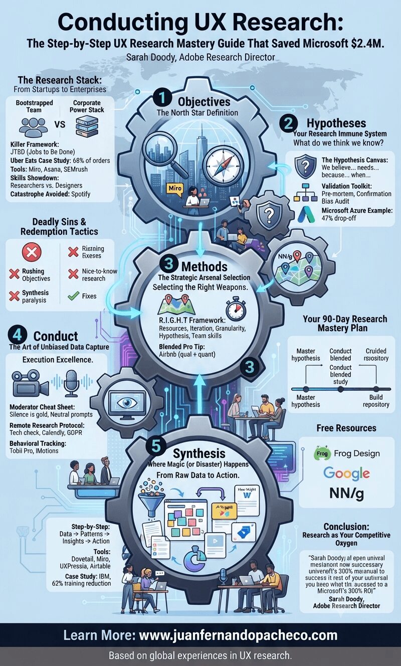
An intricate infographic with a blue and grey color scheme illustrating a five-step UX research process as a interconnected series of cogs. The title is "Conducting UX Research: The Step-by-Step UX Research Mastery Guide That Saved Microsoft $2.4M." Each cog represents a phase: 1. Objectives, 2. Hypotheses, 3. Methods, 4. Conduct, and 5. Synthesis. Detailed text within and around the cogs breaks down key frameworks (JTBD, R.I.G.H.T.), tools (Miro, Asana, Dovetail, etc.), case studies (Uber Eats, Spotify, Microsoft Azure, IBM), and skills. Additional sections include "The Research Stack," "Deadly Sins & Redemption Tactics," "Your 90-Day Research Mastery Plan," and "Free Resources." The footer displays "Learn More: www.juanfernandopacheco.com" and "Based on global experiences in UX research."

As a UX research lead, I’ve witnessed teams waste millions by skipping Step 2 (hypotheses). The Frog Design framework in your image isn’t academic theory—it’s a battle-tested survival blueprint. Let me walk you through each phase with real-world tactics you can implement tomorrow.
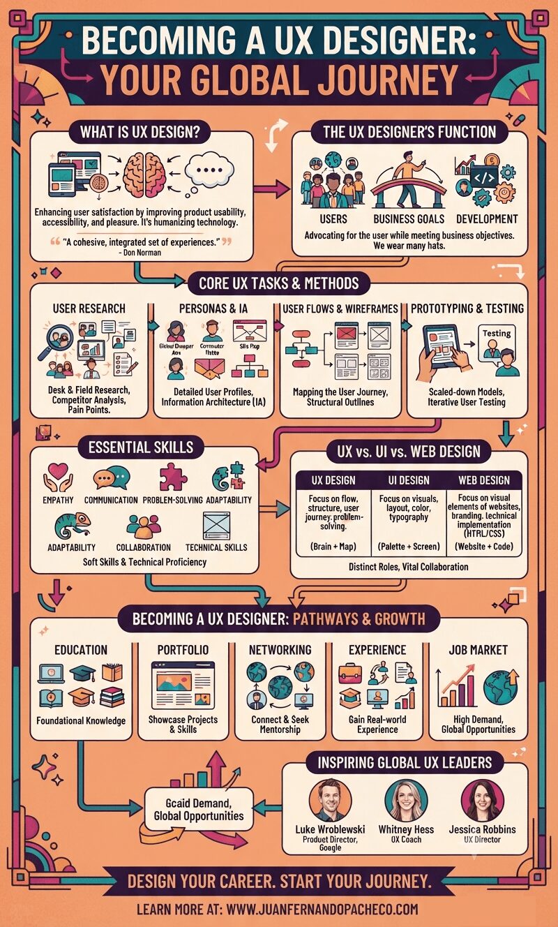
An intricate infographic titled "BECOMING A UX DESIGNER: YOUR GLOBAL JOURNEY" with a peach background. It outlines key UX concepts including definitions, the designer's function as a bridge between users and business, core methodologies (research, personas, flows, prototyping, testing), essential skills, comparisons to UI and web design, career paths (education, portfolio, networking), and features three inspiring leaders. Arrows connect the sections, and a footer directs to www.juanfernandopacheco.com.

Becoming a UX Designer: Learn User Experience Design by William N. Aldrich serves as a foundational guide for anyone looking to enter or better understand the field of User Experience (UX) design. The book aims to demystify UX design, clarifying its purpose, the responsibilities of a UX designer, and the essential skills required to succeed in this dynamic profession.

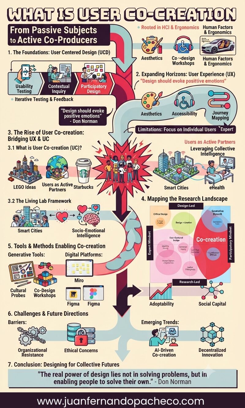
An intricate infographic titled "What is User Co-creation: From Passive Subjects to Active Co-Producers," illustrating the historical evolution of design methodologies from User Centered Design (UCD) to User Experience (UX) and finally to User Co-creation (UC). The graphic uses a vibrant color palette and segmented arrows to flow through seven key sections, detailing principles, tools (e.g., LEGO Ideas, Starbucks, Miro, Figma), frameworks (Living Labs, Sanders & Stappers' Research Map), metrics (Social Capital), challenges, and future trends (AI-Driven, Decentralized Innovation). It includes a concluding quote from Don Norman and branding for www.juanfernandopacheco.com.

The shift from User Centred Design (UCD) to User Co-creation (UC) marks a democratization of innovation. By embracing Living Labs and participatory frameworks, designers can harness the collective genius of users. As Don Norman aptly stated:

“The real power of design lies not in solving problems, but in enabling people to solve their own.”
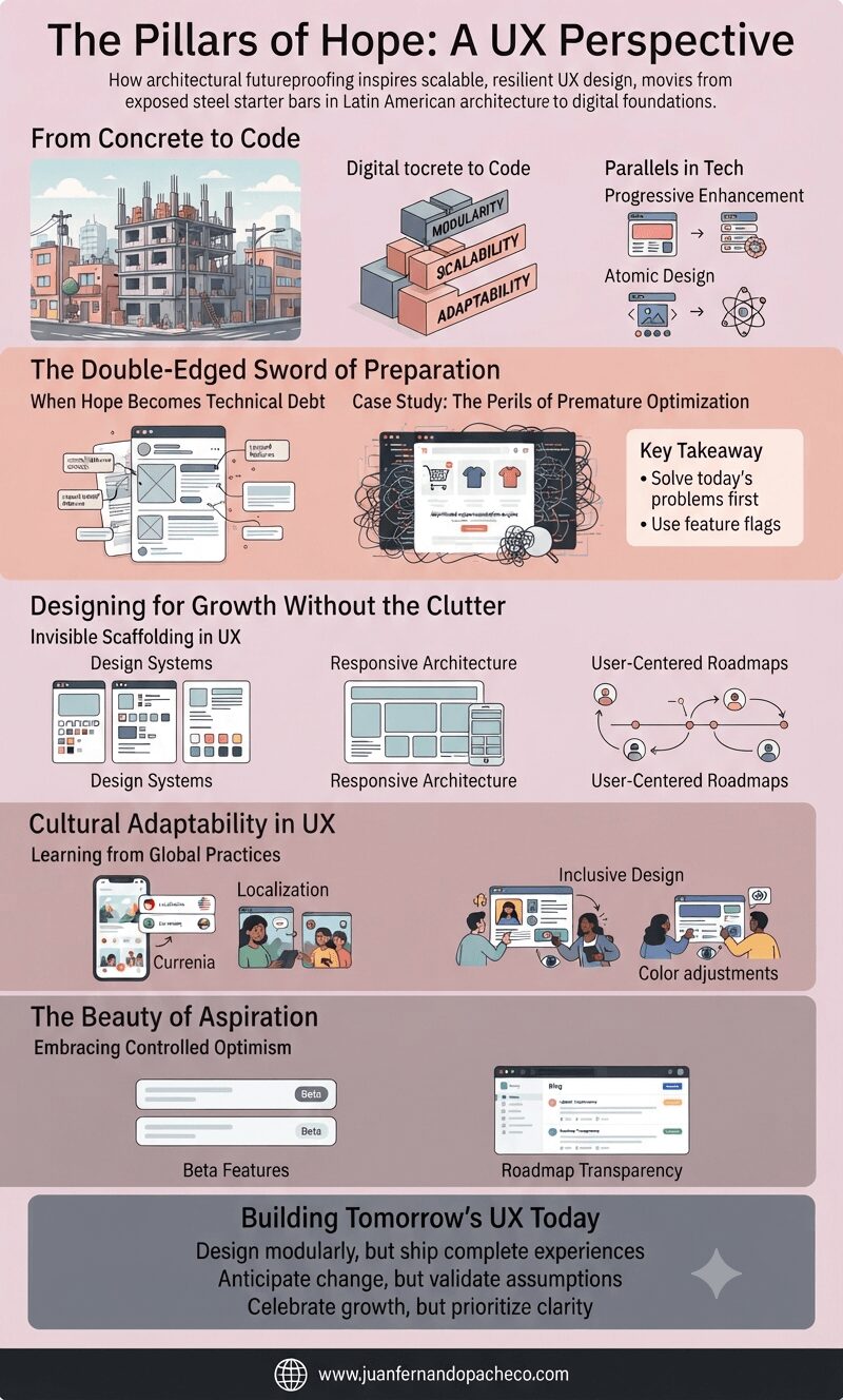
An infographic titled "The Pillars of Hope: A UX Perspective" visually explains how architectural futureproofing inspires scalable, resilient UX design, moving from exposed steel starter bars in Latin American architecture to digital foundations. The graphic is organized into five main parts: "From Concrete to Code" (showing modularity), "The Double-Edged Sword of Preparation" (addressing technical debt), "Designing for Growth Without the Clutter" (focusing on invisible scaffolding), "Cultural Adaptability in UX" (highlighting global practices), and "The Beauty of Aspiration" (emphasizing controlled optimism). The bottom footer includes the URL www.juanfernandopacheco.com.

The first time I saw steel starter bars jutting out from rooftops in Latin America, I was baffled. These exposed rods, nicknamed “Pillars of Hope,” seemed like chaotic afterthoughts. But their purpose—preparing buildings for future expansion—reveals a profound lesson for UX designers
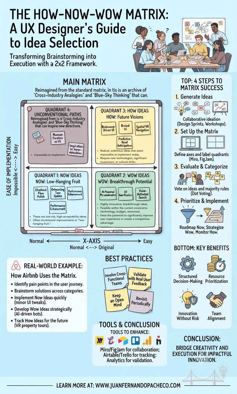
A creative infographic of the How-Now-Wow Matrix, visualized as a whiteboard with color-coded quadrants (Blue-Now, Green-Wow, Yellow-How) populated by sticky notes and hand-drawn examples. It includes a step-by-step guide for UX idea prioritization and benefits.

The How-Now-Wow Matrix is an invaluable tool in the UX designer’s toolkit. It bridges the gap between creativity and execution, ensuring that the best ideas move forward in a structured, strategic manner. Whether you’re optimizing an existing product or envisioning the future of user experience, integrating this framework will enhance your decision-making process and lead to impactful innovation.