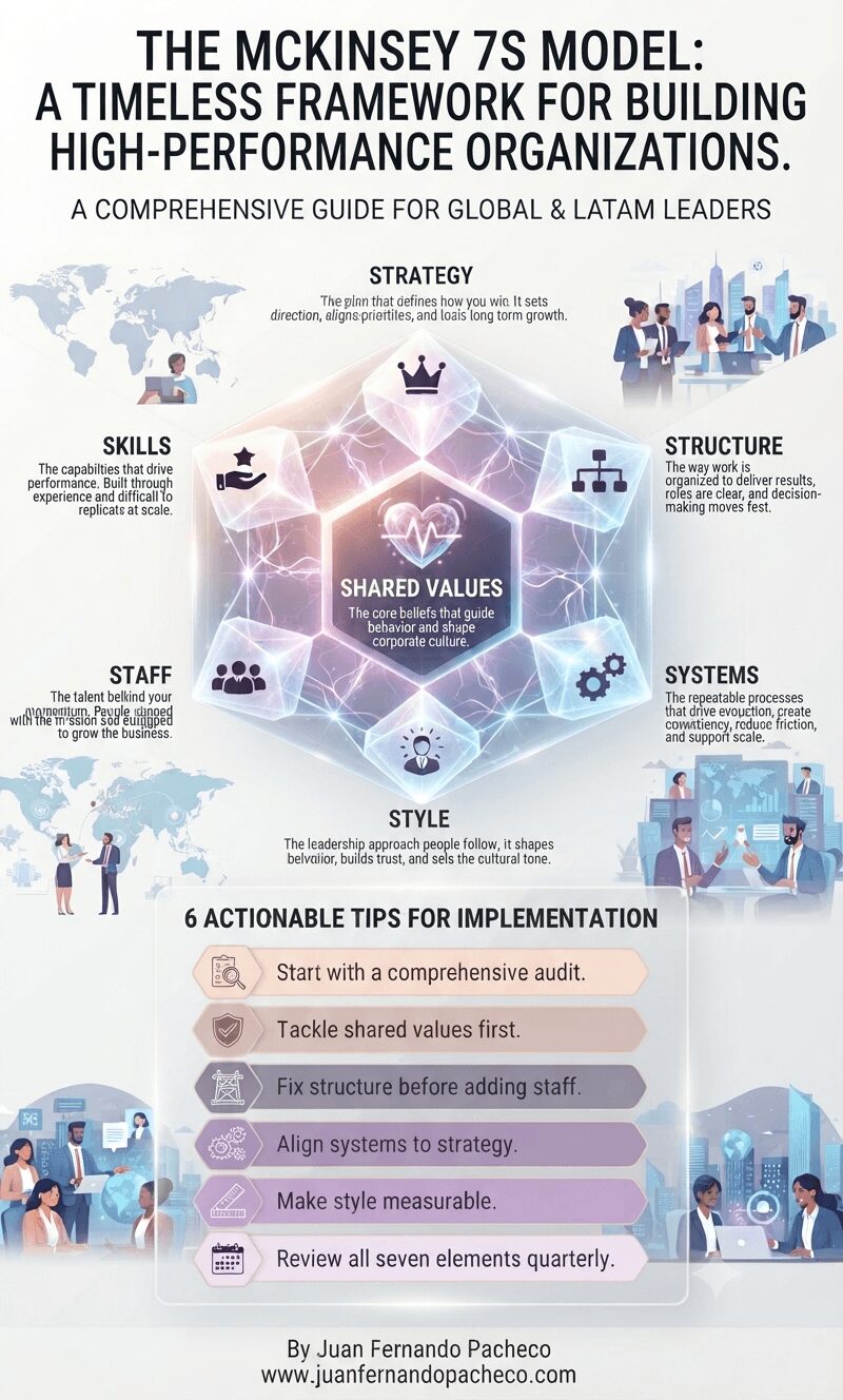
Discover how the McKinsey 7S Model can transform your organization’s effectiveness through strategic alignment of seven critical elements. Learn practical implementation tips from two decades of leading complex deals and scaling technology revenue across Latin American markets.
Tag: User Experience
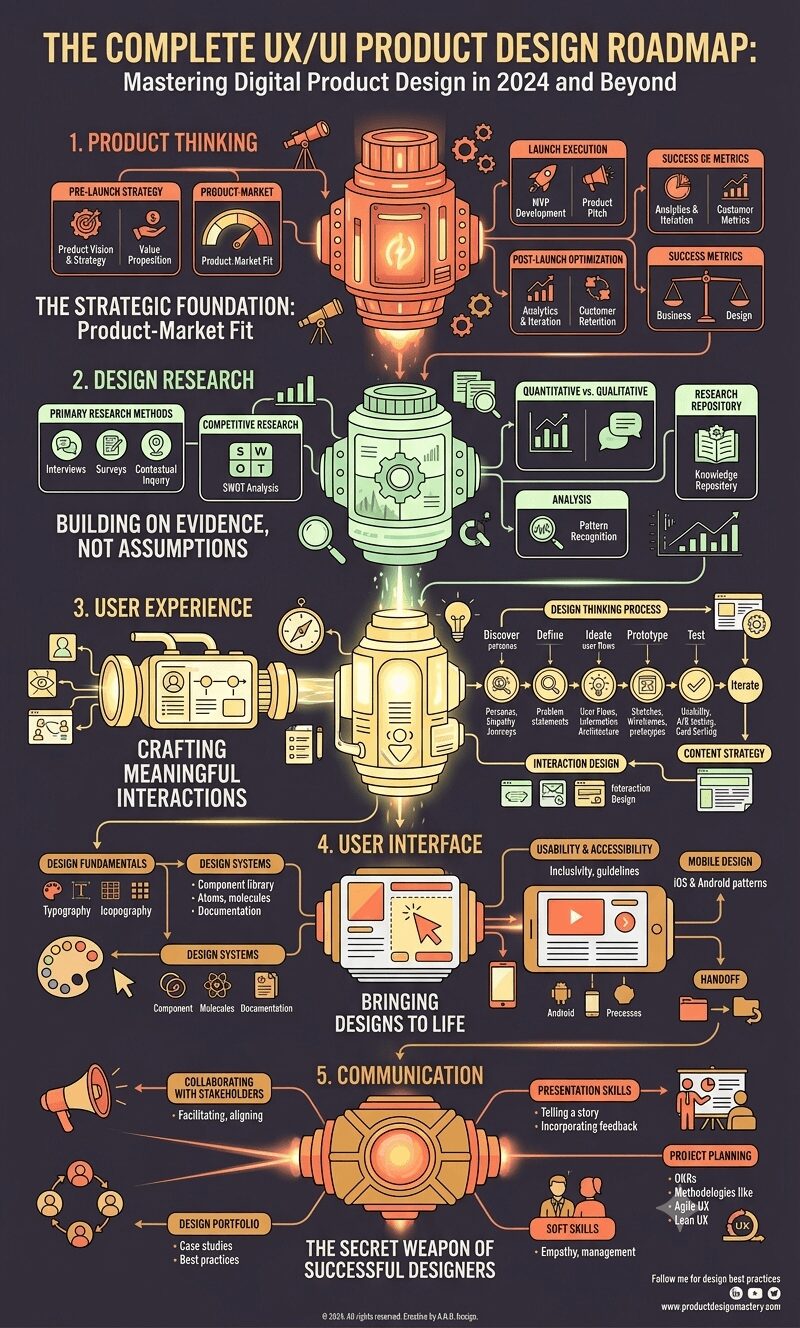
A comprehensive guide to mastering UX/UI product design through a structured roadmap covering product thinking, design research, user experience, user interface design, and essential communication skills for long-term career success.
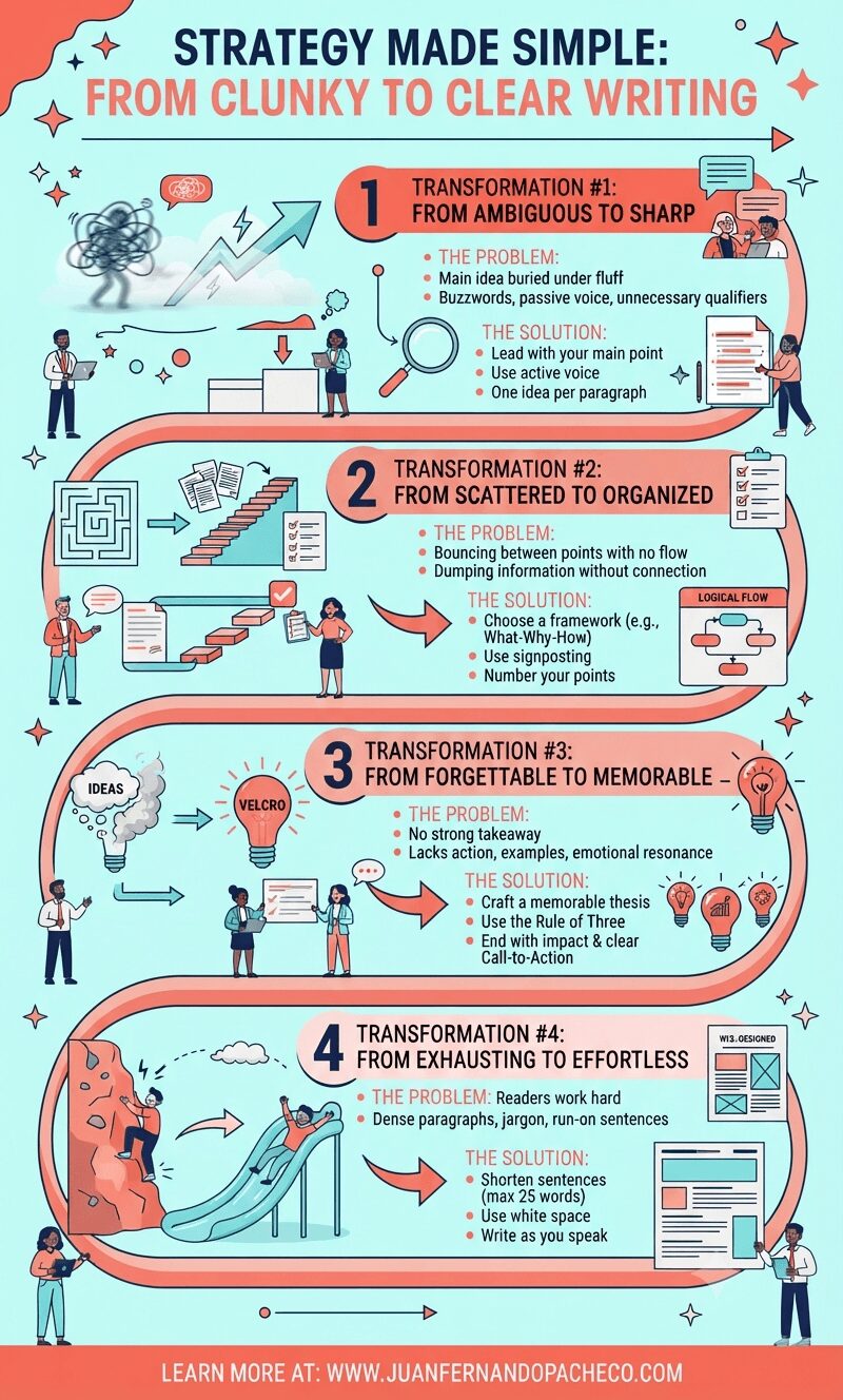
Transform your communication from confusing to compelling by mastering the four essential shifts that turn clunky writing into clear, actionable content. Learn proven strategies used by top UX designers and strategists to make your ideas impossible to ignore.
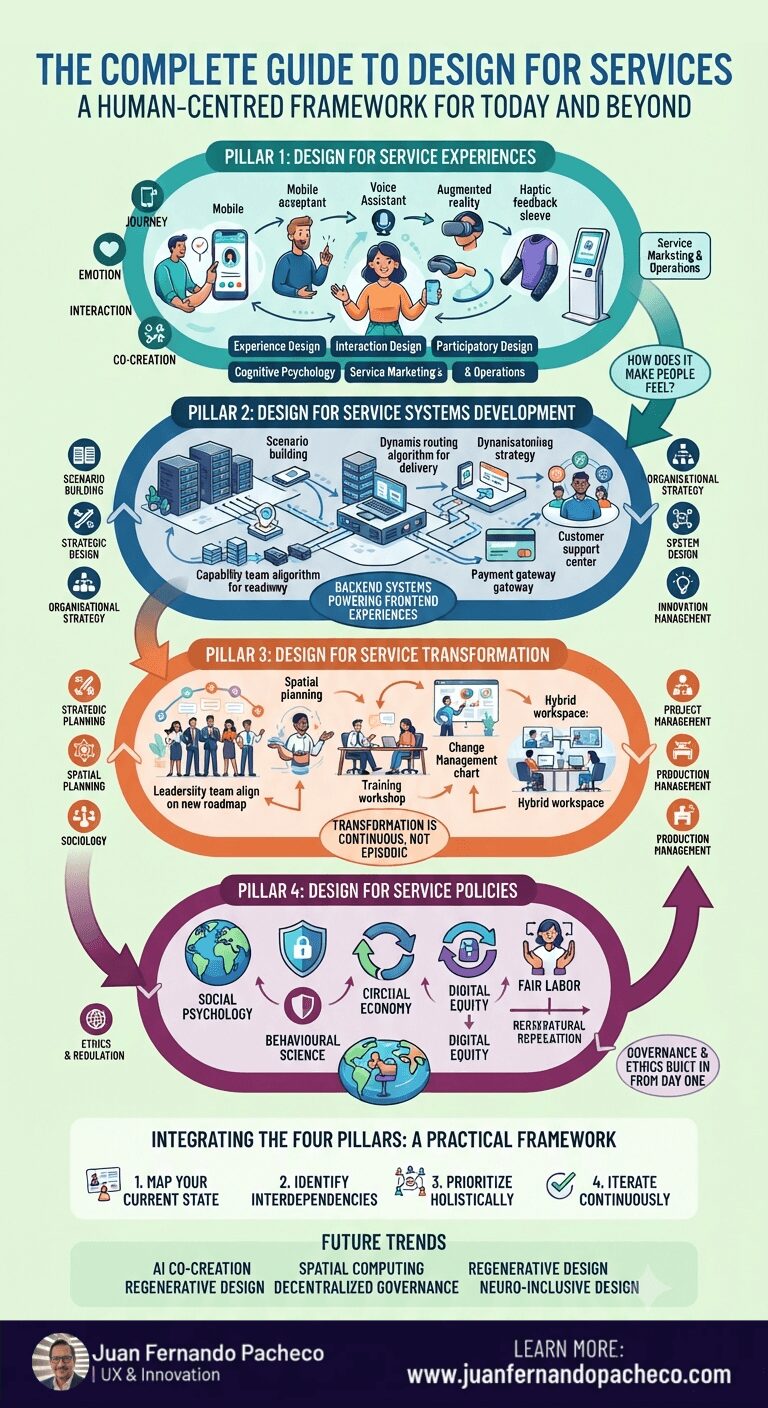
Circular diagram showing Design for Services framework with four quadrants: Design for Service Experiences, Design for Service Systems Development, Design for Service Transformation, and Design for Service Policies, surrounded by 27 interconnected disciplines and approaches for human-centred service design in today’s world
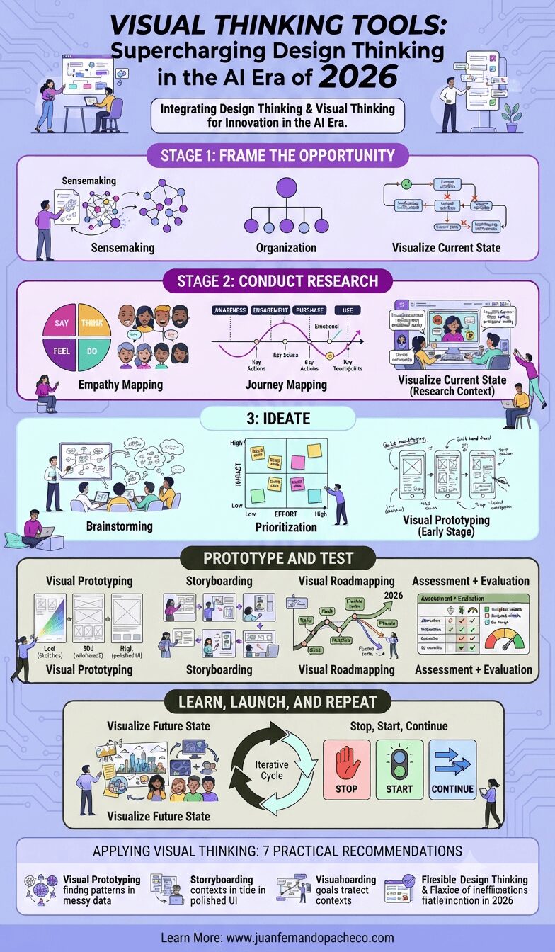
The design thinking methodology with visual thinking tools I’ve outlined here represents more than just a process—it’s a mindset shift toward collaborative, iterative, human-centered innovation. In 2026, where complexity is the norm and user expectations continue to rise, this approach isn’t optional; it’s essential.
Whether you’re a seasoned designer, a business leader driving digital transformation, or an entrepreneur launching your first product, these visual thinking tools can elevate your work. They’ll help you see problems more clearly, generate better solutions, and create experiences that truly resonate with users.
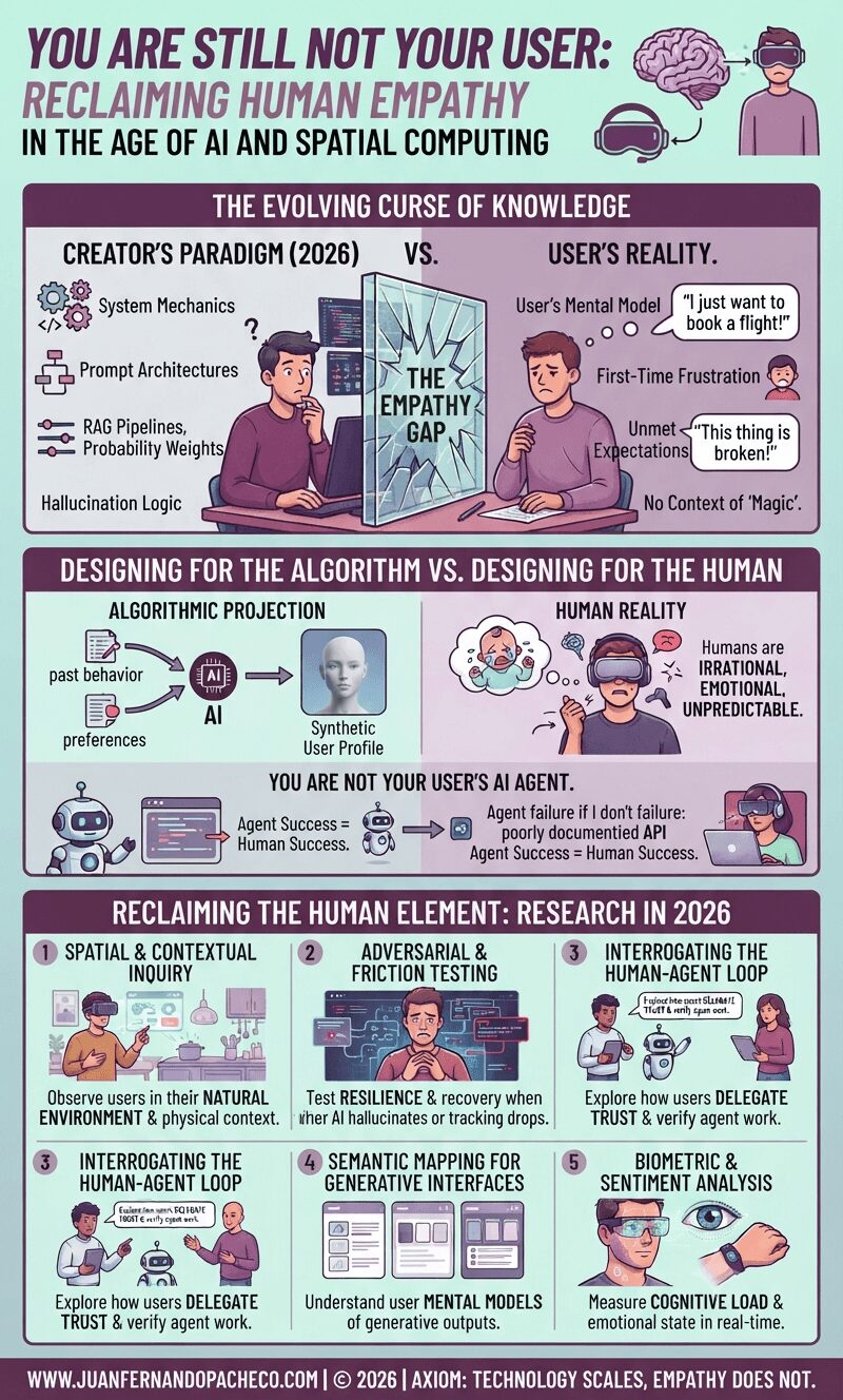
Fifteen years after the classic UX axiom was coined, the tools of our trade have evolved from static screens to generative interfaces and spatial computing. Yet, the fundamental rule remains: you are not your user. In 2026, as we navigate the complexities of AI agents and synthetic data, remembering this has never been more critical—or more challenging
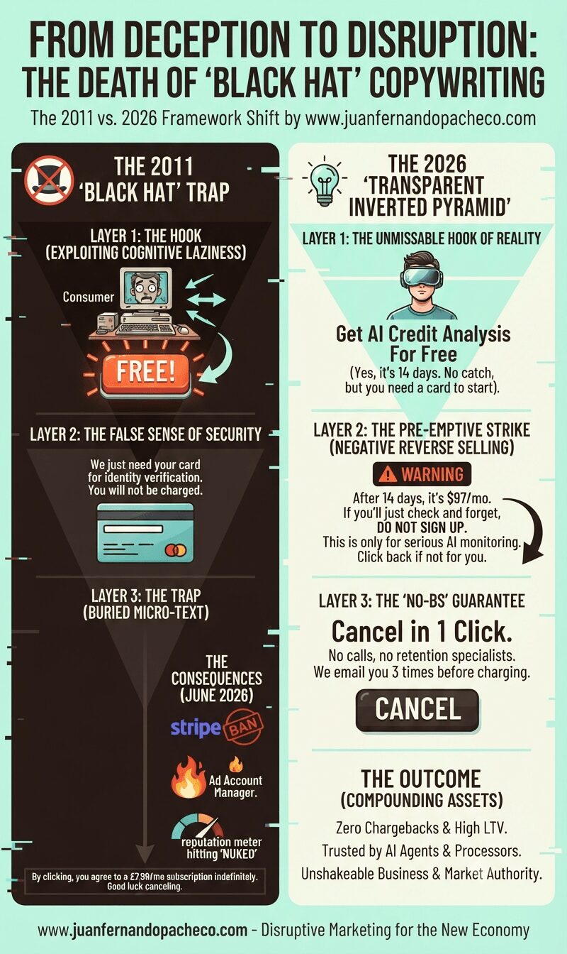
In 2011, black hat copywriting relied on hiding the catch in the fine print. In 2026, that trick will get your payment processors banned and your ads destroyed. Here is the new psychology of persuasion you need to master instead.
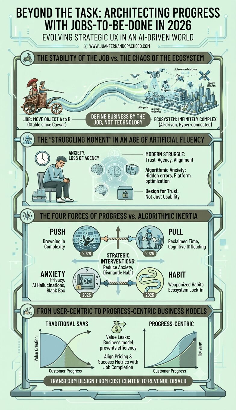
To truly master Strategic UX and Jobs-to-be-Done, we must look beyond the functional task and dive into the deep psychology of the user.
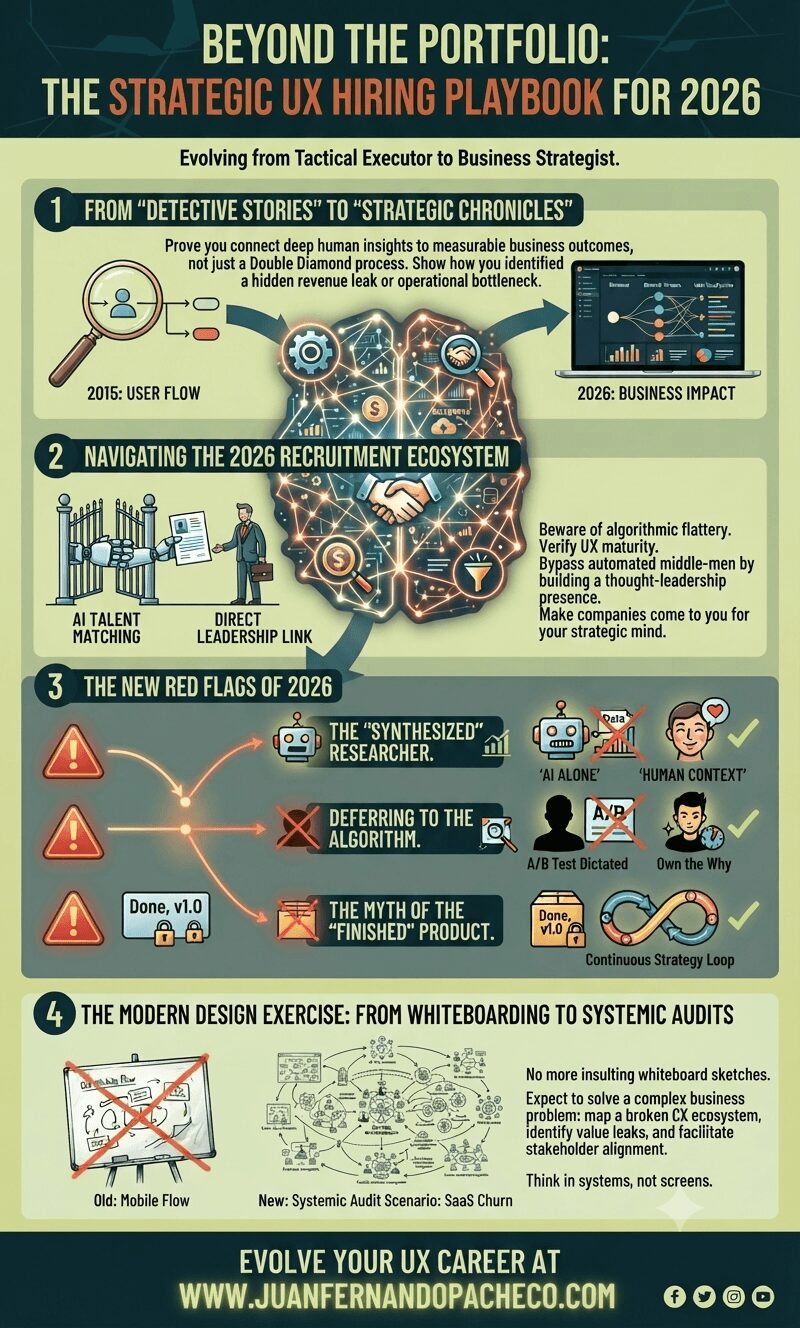
UX is about understanding humans, navigating complexity, and aligning those human needs with business viability.
In 2026, the bar for entry is higher because the tactical work is automated. But the ceiling for strategic impact is limitless.
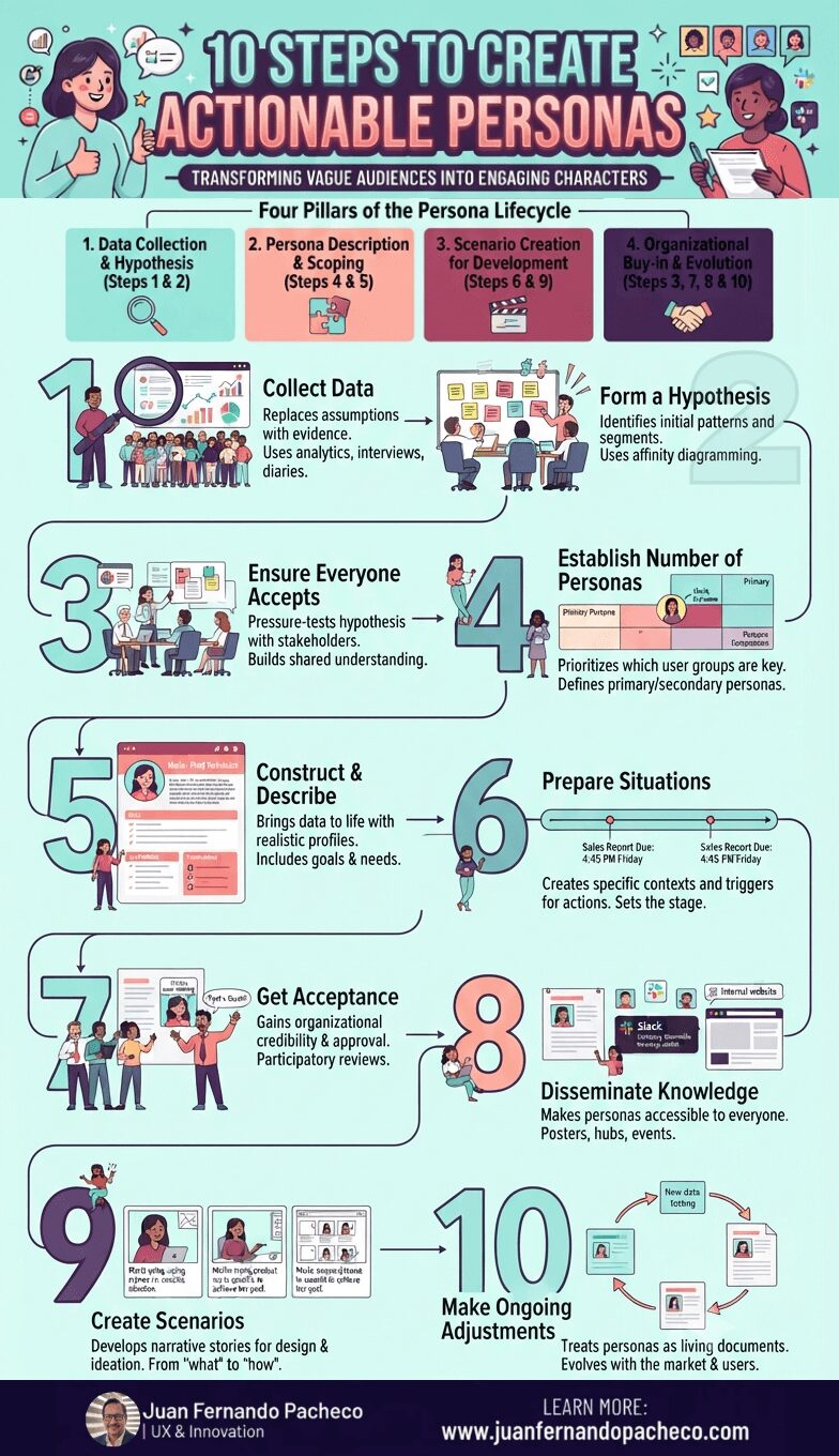
Creating engaging personas is not a one-week exercise to be filed away and forgotten. It is a strategic commitment to human-centered design. This 10-step process provides a robust framework, but its success hinges on a cultural shift within your organization—a shift from building for “the user” to designing for “Maria,” “John,” and “Akira.”