A Practical Color Strategy for Design Professionals
The natural world provides an enduring and universally appealing source of inspiration for visual design. Its inherent balance and harmonious color relationships offer a foundation upon which UI and graphic designers can build effective and aesthetically pleasing creations.
By carefully observing and extracting earth tones from natural landscapes, designers can imbue their work with a sense of authenticity, stability, and visual comfort that resonates with a wide audience.
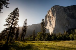
Consider a majestic vista dominated by towering rock formations, their surfaces sculpted by time and the elements. The interplay of sunlight and shadow across these monumental structures creates a subtle yet powerful gradient of tones, ranging from light, sun-drenched hues to deep, shadowed recesses.
This visual complexity, when analyzed through a designer’s eye, yields a rich and versatile color palette capable of informing a diverse range of design applications.
The provided image encapsulates such a scene. Soaring rock faces, exhibiting variations in texture and color due to weathering and mineral composition, rise above a landscape dotted with evergreen trees and patches of lighter vegetation.
The sky, a pale and clear expanse, provides a contrasting backdrop. This visual information is distilled into a curated color palette at the bottom of the image, offering a tangible set of hues for design exploration.
Understanding the Earth Tones Significance:
This earth tones palette comprises five distinct colors, each reflecting a key element within the depicted natural environment:
#A0A8B2 (Muted Blue-Gray): This soft, desaturated hue evokes the distant sky, the hazy atmosphere surrounding the rock formations, or the subtle blue undertones often found in weathered stone. It conveys a sense of calmness, vastness, and understated elegance. In design, this color can be effectively used for backgrounds, creating a sense of spaciousness and visual tranquility. It can also serve as a subtle accent color, adding a touch of sophistication without being overly dominant. Its muted nature makes it suitable for extended viewing in digital interfaces.
#CBC0B5 (Light Beige-Gray): This warm, neutral tone reflects the sunlit surfaces of the rock, the lighter patches of vegetation, or the overall ambient light of the scene. It offers a sense of warmth, neutrality, and natural simplicity. Designers can utilize this color as a primary background, providing a clean and unobtrusive canvas for content. It also works well for secondary elements, subtle textures, or as a lighter contrast to darker tones within the palette. Its versatility makes it adaptable to a wide range of design styles.
#292929 (Dark Charcoal Gray): This deep, almost black hue represents the deepest shadows within the rock formations, the dense foliage of the evergreen trees, or the stark contrast created by strong sunlight. It conveys a sense of strength, stability, and visual weight. In design, this color is invaluable for creating a strong visual hierarchy, defining text for optimal readability, or adding a touch of drama and sophistication as an accent. It should be used judiciously for large areas to avoid overwhelming the user, but it excels in providing contrast and grounding.
#4F5151 (Medium-Dark Gray): This mid-tone gray reflects the shadowed areas of the rock, the darker tones of the tree bark, or the transitional areas between light and shadow. It provides a sense of depth, neutrality, and visual balance. Designers can use this color for secondary text, subtle dividers, or as a background element that offers more visual interest than a pure white or light gray without being distracting. It helps to create visual layers and depth within a design.
#81785A (Olive-Brown): This earthy, desaturated tone represents the color of the tree bark, the undergrowth, or the subtle brown hues present in the rock formations due to mineral content. It evokes a sense of naturalism, grounding, and organic texture. In design, this color can be used for accent elements, subtle patterns, or to create a visual connection to nature-themed content. It offers a warmer alternative to pure grays and can add a touch of understated richness to a design.
Practical Applications in UI and Graphic Design:
The inherent harmony within this earth tones palette makes it highly adaptable for various design applications:
User Interface Design:
Creating Professional and Trustworthy Interfaces: For applications in fields like finance, law, or education, this palette can establish a sense of stability and reliability. The muted blue-gray (#A0A8B2) can serve as a calming background, while the dark charcoal gray (#292929) provides strong contrast for important text and navigation elements. The light beige-gray (#CBC0B5) can offer a neutral backdrop for content sections, and the medium-dark gray (#4F5151) can be used for secondary information or UI controls. The olive-brown (#81785A) can provide subtle accents, perhaps for icons or visual cues.
Designing Minimalist and Focused Experiences: The understated nature of this palette lends itself well to minimalist design aesthetics. A predominantly light beige-gray (#CBC0B5) background with dark charcoal gray (#292929) for primary text and key actions can create a clean and distraction-free interface. The muted blue-gray (#A0A8B2) can be used sparingly for subtle visual interest or secondary elements.
Developing Nature-Themed Applications: For applications related to outdoor activities, environmental conservation, or natural wellness, this palette offers a direct visual connection to the subject matter. The olive-brown (#81785A) can be used more prominently for backgrounds or thematic elements, while the lighter beige-gray (#CBC0B5) and muted blue-gray (#A0A8B2) evoke the sky and natural landscapes. The darker grays (#292929 and #4F5151) can provide necessary contrast and structure.
Ensuring Accessibility: When implementing this palette, designers must prioritize accessibility. Sufficient contrast between text and background colors is crucial for users with visual impairments. For example, white or very light text on the dark charcoal gray (#292929) will offer good readability. Similarly, dark text on the light beige-gray (#CBC0B5) should meet accessibility standards. Careful attention to color pairings and contrast ratios is essential.
Graphic Design:
Building Strong Brand Identities: A brand aiming to convey a sense of reliability, naturalism, or timelessness could find a suitable visual identity within this palette. The combination of the dark charcoal gray (#292929) and light beige-gray (#CBC0B5) offers a classic and sophisticated foundation, while the muted blue-gray (#A0A8B2) and olive-brown (#81785A) can add subtle character and visual interest to logos and branding materials.
Creating Effective Marketing Materials: Brochures, websites, and social media graphics can benefit from the inherent visual harmony of this palette. Images of natural landscapes similar to the inspiration image, paired with text and design elements utilizing these earth tones, can create a cohesive and appealing aesthetic. The medium-dark gray (#4F5151) can be used for body text, ensuring readability without being as stark as pure black.
Designing Print Collateral: For print materials like business cards, stationery, or brochures, this palette can convey a sense of professionalism and understated elegance. The light beige-gray (#CBC0B5) can serve as a sophisticated background, with the dark charcoal gray (#292929) used for key information and the muted blue-gray (#A0A8B2) or olive-brown (#81785A) providing subtle accents.
Developing Informational Graphics: When presenting data or information visually, this palette can offer a calm and neutral framework. The various shades of gray (#A0A8B2, #4F5151, #292929) can be used to differentiate data points or create visual hierarchy, while the light beige-gray (#CBC0B5) provides a clean background. The olive-brown (#81785A) can be used to highlight key information or add a touch of visual interest.
The Timeless Appeal of Earth Tones:

The enduring popularity of earth tones palettes in design stems from their inherent connection to the natural world and the positive associations they evoke.
These earth tones feel familiar, stable, and grounding, contributing to a sense of visual comfort and trust. By thoughtfully incorporating these hues, UI and graphic designers can create designs that feel both contemporary and timeless, appealing to a broad audience and conveying a sense of authenticity and reliability.
Observing and analyzing earth tones landscapes provides a continuous source of inspiration for designers seeking harmonious and effective color palettes. The subtle variations and nuanced relationships found in nature offer a wealth of possibilities for creating visually compelling and emotionally resonant designs.
The provided palette, inspired by a majestic rock landscape, serves as a valuable example of how earth tones can be effectively utilized to create professional, accessible, and aesthetically pleasing visual experiences across a wide range of design disciplines.
The key is in understanding the individual characteristics of each color and how they can be combined to achieve specific visual and communicative goals.


