A Guide to Using Nature’s Canvas Colors in UI and Graphic Design
In the realm of UI and graphic design, color is more than just an aesthetic choice; it’s a powerful tool that can evoke emotions, guide user behavior, and enhance the overall user experience. While synthetic color palettes have their place, there’s a unique appeal to drawing inspiration from the natural world.
Nature’s canvas, honed over millennia of evolution, possesses an inherent harmony and resonance that can elevate design to new heights.
This article explores how designers can harness the power of natural colors, using a specific palette derived from a lush forest scene as a case study. By understanding the significance of each hue and its interplay, we can create designs that are not only visually appealing but also emotionally engaging and user-friendly.
Deconstructing Nature’s Color Palette:
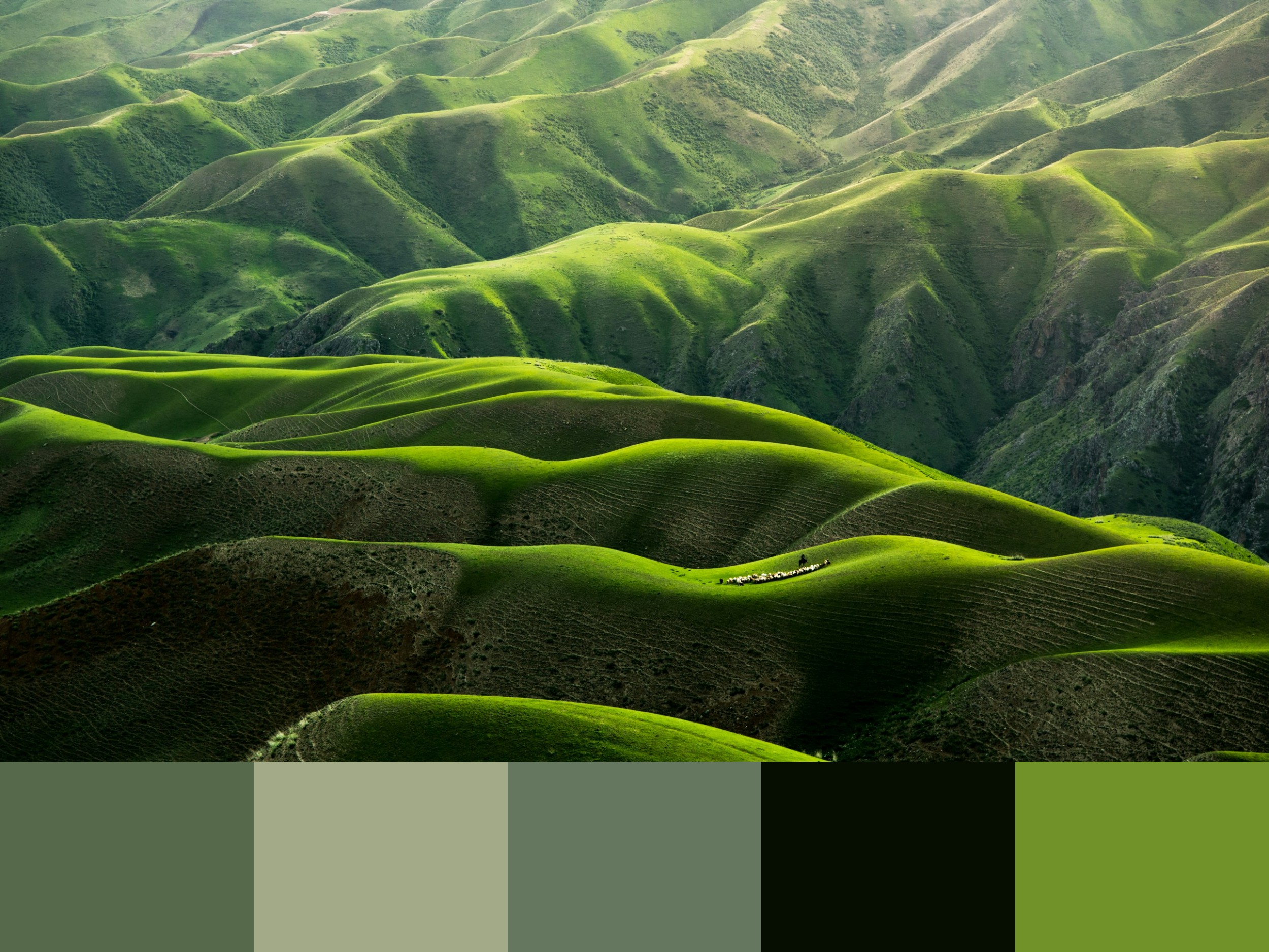
The image presents a vibrant forest scene, teeming with life and saturated with color. The interplay of sunlight filtering through the leaves, the varying shades of green foliage, and the rich earth tones creates a visually captivating palette. This palette can be broken down into five distinct colors:
#566A4B (Forest Green): This deep, rich green represents the heart of the forest, the dense canopy of leaves, and the lush undergrowth. It evokes a sense of vitality, growth, and connection to nature. In design, this color can be used as a grounding element, a background color, or to accentuate key elements. Its association with nature can be particularly beneficial for designs related to environmental themes, health, or organic products.
#A3AA88 (Olive Green): A lighter, more subdued green, this color reflects the dappled sunlight filtering through the leaves, creating a sense of warmth and tranquility. It conveys a sense of harmony and balance, inviting a sense of calm and relaxation. In design, this color can be used as a secondary accent, a subtle background, or to create visual hierarchy. Its association with peace and serenity can be particularly useful for designs related to wellness, meditation, or mindfulness.
#65785F (Moss Green): This muted green represents the mosses, ferns, and other groundcover, adding depth and texture to the forest floor. It conveys a sense of groundedness, stability, and organic beauty. In design, this color can be used as a subtle accent, a background texture, or to create visual depth and interest. Its association with nature and the earth can be particularly beneficial for designs related to sustainability, agriculture, or natural products.
#050E01 (Deep Forest Green): This deep, almost black green represents the darkest shadows within the forest, creating a sense of mystery and depth. It conveys a sense of stability, strength, and groundedness. In design, this color can be used as a strong accent, a text background, or to create visual hierarchy. Its association with darkness and mystery can be particularly useful for designs related to adventure, exploration, or the unknown.
#719229 (Bright Green): This vibrant green represents the highlights on leaves, the sunlight reflecting off the forest floor, and the overall energy of the forest. It conveys a sense of vibrancy, growth, and renewal. In design, this color can be used as a primary accent, a call to action, or to draw attention to specific elements. Its association with life and energy can be particularly useful for designs related to growth, health, or productivity.
Applying Nature’s Canvas in Design:
The beauty of using nature’s canvas lies in its inherent harmony and versatility. These colors, born from nature’s own palette, work together to create visually pleasing and emotionally resonant designs. Here are some practical applications for UI and graphic designers:
User Interface Design:
Creating Calming and Engaging Interfaces: For applications related to relaxation, meditation, or nature-based activities, this palette can create a serene and immersive experience. The forest green (#566A4B) can be used as a primary background, while the olive green (#A3AA88) can be used for secondary elements, creating a sense of depth and visual interest. The moss green (#65785F) can be used as a subtle texture or accent, and the bright green (#719229) can be used for calls to action or interactive elements.
Enhancing User Trust and Engagement: For websites or applications focused on sustainability, environmental awareness, or organic products, this palette can build trust and credibility. The forest green (#566A4B) and moss green (#65785F) can be used as primary colors, conveying a sense of authenticity and connection to nature. The olive green (#A3AA88) can be used for secondary elements, and the bright green (#719229) can be used for calls to action, encouraging user engagement.
Improving Readability and Accessibility: When using natural colors, designers must ensure that the contrast between text and background colors is sufficient for readability. For example, white or light text on the forest green (#566A4B) or deep forest green (#050E01) will provide good contrast. Similarly, dark text on the olive green (#A3AA88) or bright green (#719229) will ensure legibility. Careful consideration of color combinations and contrast ratios is essential for creating accessible designs.
Graphic Design:
Developing Brand Identities: A brand focused on environmental sustainability, organic products, or outdoor activities can leverage this palette to create a strong and memorable visual identity. The forest green (#566A4B) can be used as the primary brand color, while the olive green (#A3AA88) and moss green (#65785F) can be used for secondary elements, creating a cohesive and natural look.
Creating Engaging Marketing Materials: Brochures, websites, and social media graphics can benefit from the vibrant and inviting nature of this palette. Images of lush forests, paired with text and design elements using these colors, can create a visually appealing and engaging experience for the audience. The bright green (#719229) can be used for calls to action, encouraging user engagement.
Designing Print Collateral: For print materials like business cards, stationery, or brochures, this palette can convey a sense of professionalism and natural elegance. The forest green (#566A4B) can be used as a subtle background, while the olive green (#A3AA88) and moss green (#65785F) can be used for text and accents, creating a sophisticated and memorable look.
The Power of Nature’s Color:
By embracing the power of nature’s canvas, UI and graphic designers can create designs that are not only visually appealing but also emotionally resonant and user-friendly. The inherent harmony and versatility of these colors offer a wealth of possibilities for creating impactful and memorable designs. So, the next time you’re facing a design challenge, take a moment to look to nature for inspiration. You might be surprised at the beauty and effectiveness of the colors you find there.