The Road to Unity: How Gojek’s Asphalt Aloha Design System Transformed a Super App
In the bustling digital landscape of Southeast Asia, Gojek evolved from a ride-hailing service to a “super app” offering 17+ services—from food delivery to financial services.
But rapid growth brought chaos: inconsistent designs, redundant workflows, and 17 products scattered across hundreds of Sketch files and thousands of artboards.
The solution? Asphalt Aloha—a design language system that unified Gojek’s ecosystem while preserving its vibrant identity. This is the story of how a moonshot idea saved thousands of hours in development costs.
The Genesis: Scaling Without Sacrificing Consistency
By 2017, Gojek faced a design crisis. With services built in silos under tight deadlines, inconsistencies plagued the user experience:
Multiple brand colors in a single artboard
No grid structures or naming conventions
Fragmented components causing app crashes and usability issues
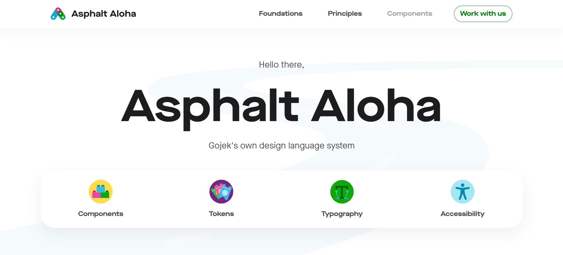
A dedicated team embarked on a journey to create Asphalt. Named after the Indonesian phrase “Salam Satu Aspal” (“The road that unites us all”), the system aimed to merge hundreds of unique components into a single, scalable language.
Pillars of Asphalt Aloha: Principles Over Presets
Asphalt wasn’t just a component library—it was a philosophy. Four core principles guided every decision:
Consistency
Designs were system-led, not screen-led
Outliers were eliminated to enforce uniformity
Usability
User needs prioritized over business goals
Interfaces optimized for efficiency, learnability, and safety
Accessibility
WCAG AA compliance for contrast ratios
Multi-sensory feedback (haptics, audio) for inclusivity
Aesthetics
Brand elevation through playful yet functional visuals
Maison Neue typeface for bold, legible communication
Foundations: The Tokens That Built an Ecosystem
Asphalt’s foundations are its atomic design tokens—reusable elements that scale across products and themes.
1. Color: Contextual Themes
Gojek’s services are color-coded for instant recognition:
| Theme | Use Case | Example Apps |
|---|---|---|
| Green | Consumer/Driver | GO-RIDE, GO-CAR |
| Pink | Entertainment | GO-TIX (event tickets) |
| Purple | Merchant Services | GO-MART, GO-FOOD |
Each theme supports light/dark modes and extends to fills, borders, and icons.
2. Typography: Personality Meets Pragmatism
Maison Neue was chosen for its blend of playfulness and readability. Its rounded forms and open counters ensure clarity at small scales while exuding brand character in headlines.
3. Spacing: The 4px Grid System
All spacing tokens are multiples of 4px
White space strategically groups related elements or highlights hierarchy
4. Elevation & Shadows
Shadows cast by components vary based on elevation height
A conceptual light source creates realistic depth
5. Motion: Functional Storytelling
Candid: Human-like animations
Contextual: Motion draws attention to critical actions
Witty: Playful micro-interactions that delight without distraction
The Component Engine: Atomic Design at Scale
Asphalt adopted Atomic Design methodology:
Master Components: Reusable, accessibility-audited elements
Workshop Components: Product-specific elements that graduate to “master” status
This approach slashed design-to-development time:
GO-MART’s UI was built rapidly using GO-FOOD components
GO-SEND’s redesign accelerated by repurposing GO-RIDE patterns
Accessibility: “Leave No Customer Behind”
Asphalt bakes inclusivity into every component:
Color & Contrast: Text/icons meet strict contrast minimums
Non-Color Cues: Icons and strokes convey information beyond color
Screen Reader Optimization: Semantic HTML and logical sequencing
Brand Magic: Icons, Illustrations, and Aloha’s Soul
The “Aloha” reflects Hawaiian meanings of “presence” and “joy”:
Iconography: Circular shapes inspired by Gojek’s logo
Illustrations: Three contextual sizes for onboarding, content, and icons
Impact & Lessons: From Growth to Global Expansion
Asphalt’s ROI transcends aesthetics:
Thousands of hours saved in front-end development
App crashes dramatically reduced through component stability
Key Takeaways from Gojek’s Journey:
Start Small, Scale Fast: Begin with a pilot service before expanding
Engineers Are Co-Creators: Involve devs early to bridge design-code gaps
Document Relentlessly: Continuous documentation as a core practice
Conclusion: More Than a System—An Ecosystem
Asphalt Aloha is a love letter to Gojek’s users—a bridge between drivers in Jakarta and merchants in Singapore. It proves that design systems aren’t constraints; they’re enablers of creativity and accelerators of innovation.
As Gojek expands across Southeast Asia, Asphalt ensures that every pixel whispers the same promise: “We’re with you on this road.”
Explore Asphalt Aloha: Dive into foundations, components, and principles at asphalt.gojek.io