The First Step Toward Human-Centered Design
In the intricate dance of creating technology that serves people, we often find ourselves lost in a sea of data, deadlines, and technical constraints. We talk about “users,” but this term can become an abstract, faceless crowd, a collection of data points rather than living, breathing humans with fears, motivations, and unspoken needs. As UX professionals and architects of digital experiences, our primary duty is to be the unwavering advocate for that human on the other side of the screen.
But how do we move from abstract “user” to profound understanding? How do we ensure that every member of a cross-functional team—from the developer to the CEO—shares the same core insight into the person they are building for?
The answer often begins not with a complex framework, but with a deceptively simple, powerful tool: the Empathy Map.
What is an Empathy Map? A Definition
An empathy map is a collaborative visualization tool used to articulate what we know about a specific type of user. It is a cornerstone artifact in the Design Thinking process and agile environments, serving to externalize user knowledge for two critical purposes:
To create a shared understanding of user needs across a multidisciplinary team.
To aid in informed, empathetic decision-making throughout the product development lifecycle.
Think of it as a one-page profile that captures the user’s internal and external landscape at a specific moment in time, such as while using your product or attempting to complete a key task. It was popularized by the design consultancy IDEO and is now a staple in the toolkit of UX teams worldwide, with organizations like the Nielsen Norman Group (NN/g) consistently advocating for its use to ground design in user reality [1].
Deconstructing the Empathy Map: The Four Quadrants
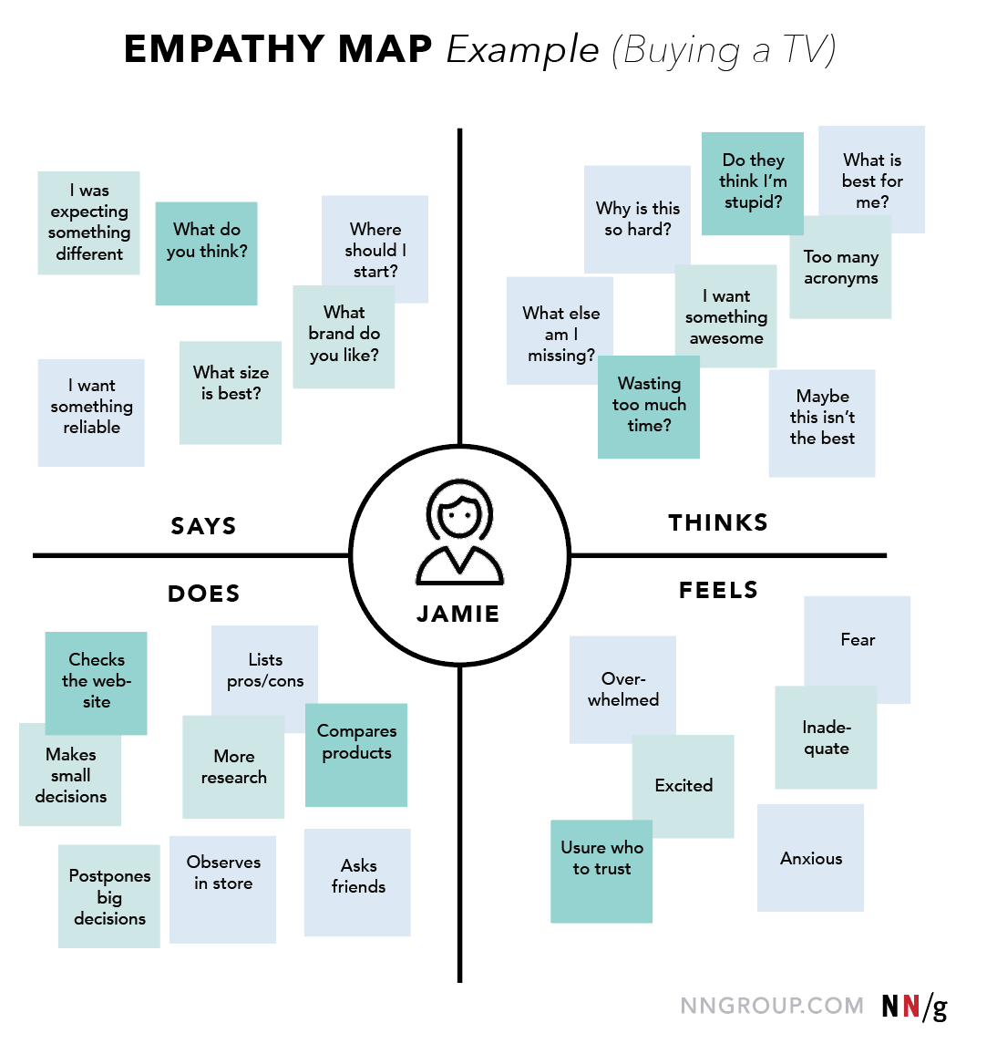
The most common format for an empathy map is divided into four quadrants: Says, Thinks, Does, and Feels. The user or persona is placed at the center, symbolizing that all these elements revolve around them.
Let’s break down each quadrant with precision.
1. Says
This quadrant contains what the user verbally expresses. The gold standard here is direct quotes gathered from user interviews, usability tests, or support logs. These are the statements made out loud, often rationalized and filtered through the user’s self-awareness.
Examples:
“I want something reliable.”
“I don’t understand what to do from here.”
“What brand do you like?” (As seen in the example image)
“I was expecting something different.”
2. Thinks
This quadrant delves into the user’s internal cognitive landscape. What is the user thinking but potentially not saying? This requires reading between the lines of your qualitative research. Ask: What occupies their thoughts? What are their primary concerns? What are they hesitant to share because of politeness, fear, or self-consciousness?
Examples:
“This is really annoying but I don’t want to be rude.”
“Do they think I’m stupid?” (A powerful insight from our example)
“Am I missing a better deal elsewhere?”
“Why is this so hard?”
3. Does
This quadrant captures observable actions and behaviors. What does the user physically do? How do they interact with the product or service? This is about tangible behavior, often revealed through observation in field studies or analytics.
Examples:
Refreshes the page multiple times.
Shops around to compare prices on three different websites.
Asks friends for recommendations. (Noted in the example)
Creates lists of pros and cons before purchasing.
4. Feels
This is the user’s emotional state, best represented as an adjective with a brief contextual sentence. What worries the user? What excites them? How do they feel about the experience? This quadrant is crucial because emotions are the primary drivers of decision-making and loyalty.
Examples:
Overwhelmed: By too many choices and technical acronyms.
Anxious: About making the wrong decision and wasting money.
Excited: About the prospect of having a new, high-quality product.
Inadequate: Feeling they lack the knowledge to make a smart choice.
The Power of Juxtaposition and Inconsistency
Our users are not simple, linear beings. The true magic of an empathy map emerges when we see contradictions across the quadrants. For instance:
A user might Say: “This looks great!” (to be polite) but Think: “This is completely wrong for me,” and Feel: Frustrated.
In our TV-buying example, Jamie Does “Compare products” (a positive, research-oriented action) but Feels “Overwhelmed” and “Inadequate.”
These tensions are not problems to be smoothed over; they are treasure maps leading to profound user insights. It is our job to investigate the root cause of this conflict. Why is the user overwhelmed? Is it information overload? A lack of clear, trusted guidance? Resolving this internal conflict for the user is where meaningful innovation begins.
Scope and Application: Individual vs. Aggregated Maps
Empathy maps are versatile and can be applied at different levels of granularity.
One-User Empathy Maps
These are based on a single user interview or a diary study entry. They are highly specific and raw, capturing the nuanced reality of one person’s experience. This is the ideal starting point, as it prevents the premature averaging of user data that can happen when creating personas.
Aggregated Empathy Maps
Once you have conducted several interviews, you can synthesize the data into an aggregated empathy map that represents a user segment. This involves grouping individual maps from users with similar behaviors and finding the common themes, pain points, and goals that run through the group.
Relationship to Personas: An aggregated empathy map is an excellent first step toward creating a data-driven persona. While a persona is a richer, narrative-driven archetype, an empathy map provides the structured, emotional raw material. In fact, an empathy map can be a more dynamic way to represent a persona than a static “business card” profile, as it can be easily updated with new research findings [2].
The “Why”: The Immense Value of Empathy Mapping
The process of creating an empathy map, and the resulting artifact, yields significant organizational benefits.
Synthesizes Qualitative Data: It forces the team to distill pages of interview transcripts, survey responses, and observational notes into a concise, structured format. It answers the question, “What did we actually learn?”
Reveals Knowledge Gaps: A sparse quadrant is a glaring red flag. If you have nothing to put in the “Thinks” or “Feels” quadrants, it signals a critical need for deeper qualitative research before any design decisions are made.
Builds Team Alignment and Empathy: The collaborative act of mapping creates a shared mental model. It gets everyone—engineering, marketing, product—on the same page about who the user is, fostering a shared sense of empathy and purpose.
Challenges Assumptions and Biases: The map acts as a “source of truth,” protecting the project from the HiPPO (Highest Paid Person’s Opinion) effect and unfounded assumptions by grounding discussions in actual user data.
Uncovers Latent Needs: By exploring the “Thinks” and “Feels” quadrants, we can identify needs the user themselves may not be able to articulate—the golden key to breakthrough innovation.
The “How”: A Step-by-Step Guide to Building an Empathy Map
As an architect of solutions, I value clear, actionable processes. Here is a robust framework for facilitating an empathy-mapping session.
Inputs and Prerequisites
Qualitative Research Data: This is the non-negotiable fuel for the map. Inputs include:
User interview transcripts or recordings
Diary study entries
Field study notes
Qualitative survey responses
A Cross-Functional Team: Include 3-6 people from various disciplines (design, development, product management, marketing).
Time: 60-90 minutes per user/interview.
Tools and Materials
Physical: A large whiteboard or wall, four different colors of sticky notes (one per quadrant), and markers.
Digital (for remote teams): Tools like Miro, Figma’s FigJam, or Mural are excellent for replicating the collaborative sticky-note experience virtually.
The Process
Define Scope and Goal (5 min):
Decide: Are we mapping a single user from a specific interview, or are we creating an aggregated map for a persona?
State the primary goal: “To align on the frustrations of our first-time homebuyer persona, Sarah, when getting a mortgage.”
Set Up the Workspace:
Draw the four quadrants (Says, Thinks, Does, Feels) on the board, with a circle in the center for the user’s name.
Individually Generate Notes (15-20 min):
Have everyone silently review the research data (e.g., read the interview transcript).
Each person writes down observations on sticky notes, one idea per note, and places them in the relevant quadrant. This ensures all voices are heard, not just the loudest.
Converge, Cluster, and Synthesize (30 min):
As a group, review the sticky notes on the board. Cluster similar notes within each quadrant.
Discuss the patterns. Why is this cluster here? What does this quote really mean? This discussion is where alignment and deep understanding are forged.
Name the clusters with themes (e.g., “Fear of Financial Commitment,” “Desire for Guidance”).
Polish, Plan, and Socialize (10 min):
Take a photo of the physical board or clean up the digital one.
Digitize the final map in a tool like PowerPoint, Miro, or a shared document. Include key metadata: User/Persona name, date, version, and any outstanding questions.
Share the output widely and plan to revisit it as new research emerges.
Best Practices and Pro-Tips
Timebox Rigorously: The activity can expand to fill available time. Keep it focused and energetic.
Embrace Ambiguity: Don’t get bogged down in debates about whether a note belongs in “Thinks” or “Feels.” The quadrants are a scaffold for understanding, not a rigid prison. Pick one and move on.
Make it a Living Document: An empathy map is a snapshot in time. Revisit and revise it after subsequent rounds of research.
Go Deeper with “The Five Whys”: When you encounter a strong emotion or contradiction, ask “why” repeatedly to get to the root cause.
Combine with Other Methods: Empathy maps are a fantastic starting point that feed directly into other UX tools like Journey Maps (to see how these thoughts and feelings change over time) and Service Blueprints (to connect the user’s experience to backend processes).
Advanced Applications and Framework Integration
Empathy maps are not an island. They integrate seamlessly into larger design and development frameworks.
In Design Thinking: They are a quintessential “Empathize” and “Define” phase tool.
In Agile & Scrum: Taped to the team’s wall, an empathy map keeps the “user voice” present during sprint planning and backlog refinement, ensuring user stories are grounded in real needs.
In Lean UX: They help form and test hypotheses. Our hypothesis might be: “We believe that by providing a ‘Compare’ tool and simplified guides, we will reduce the feeling of being overwhelmed for users like Jamie, resulting in higher conversion rates.”
Conclusion: From Empathy to Excellence
An empathy map is more than just a diagram on a wall. It is a practice, a mindset, and a commitment to seeing the world through someone else’s eyes. It transforms the abstract “user” into a human with hopes, frustrations, and a complex inner world.
By systematically capturing what our users Say, Think, Do, and Feel, we move beyond building mere features. We begin crafting experiences that resonate on a human level, that solve real problems, and that ultimately, stand the test of time. In the journey toward creating truly human-centered technology, the empathy map is not just the first step—it’s the most important one.
References and Further Reading
Nielsen Norman Group. “Empathy Mapping: The First Step in Design Thinking.” https://www.nngroup.com/articles/empathy-mapping/
Interaction Design Foundation. “How to Use Persona Empathy Mapping.” https://www.interaction-design.org/literature/article/how-to-use-persona-empathy-mapping
Gibbons, Sarah. “Journey Mapping 101.” Nielsen Norman Group. https://www.nngroup.com/articles/journey-mapping-101/
IDEO.org. “The Field Guide to Human-Centered Design.” https://www.designkit.org/resources/1
Gray, Dave. “Updated Empathy Map Canvas.” Gamestorming. https://gamestorming.com/empathy-map/