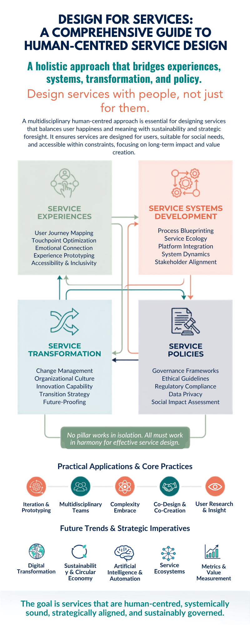
xplore the comprehensive framework of design for services through a human-centred lens. Learn how the four pillars of service design—experiences, systems development, transformation, and policies—integrate multiple disciplines to create meaningful, sustainable solutions that put people at the heart of innovation.
Tag: UX research
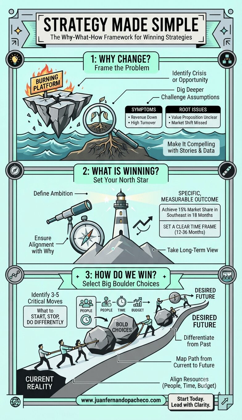
Strategy doesn’t have to be complicated. Start with why. Define what winning looks like. Make bold choices about how you’ll get there. Communicate with clarity. Execute with discipline.
That’s it. That’s the formula.
The question isn’t whether this framework works—it does. The question is whether you’ll have the courage to use it. To make the hard choices. To say no to the good so you can say yes to the great. To lead your organization from where it is to where it needs to be.
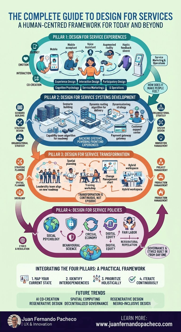
Circular diagram showing Design for Services framework with four quadrants: Design for Service Experiences, Design for Service Systems Development, Design for Service Transformation, and Design for Service Policies, surrounded by 27 interconnected disciplines and approaches for human-centred service design in today’s world
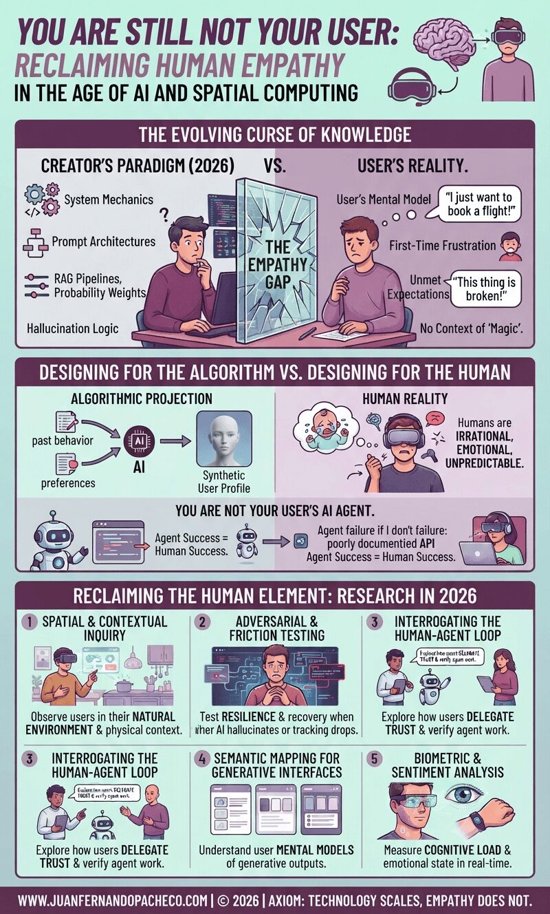
Fifteen years after the classic UX axiom was coined, the tools of our trade have evolved from static screens to generative interfaces and spatial computing. Yet, the fundamental rule remains: you are not your user. In 2026, as we navigate the complexities of AI agents and synthetic data, remembering this has never been more critical—or more challenging
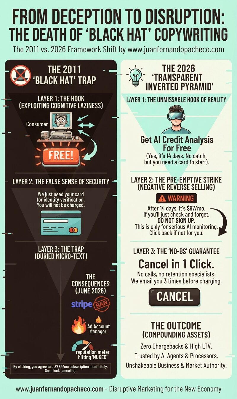
In 2011, black hat copywriting relied on hiding the catch in the fine print. In 2026, that trick will get your payment processors banned and your ads destroyed. Here is the new psychology of persuasion you need to master instead.
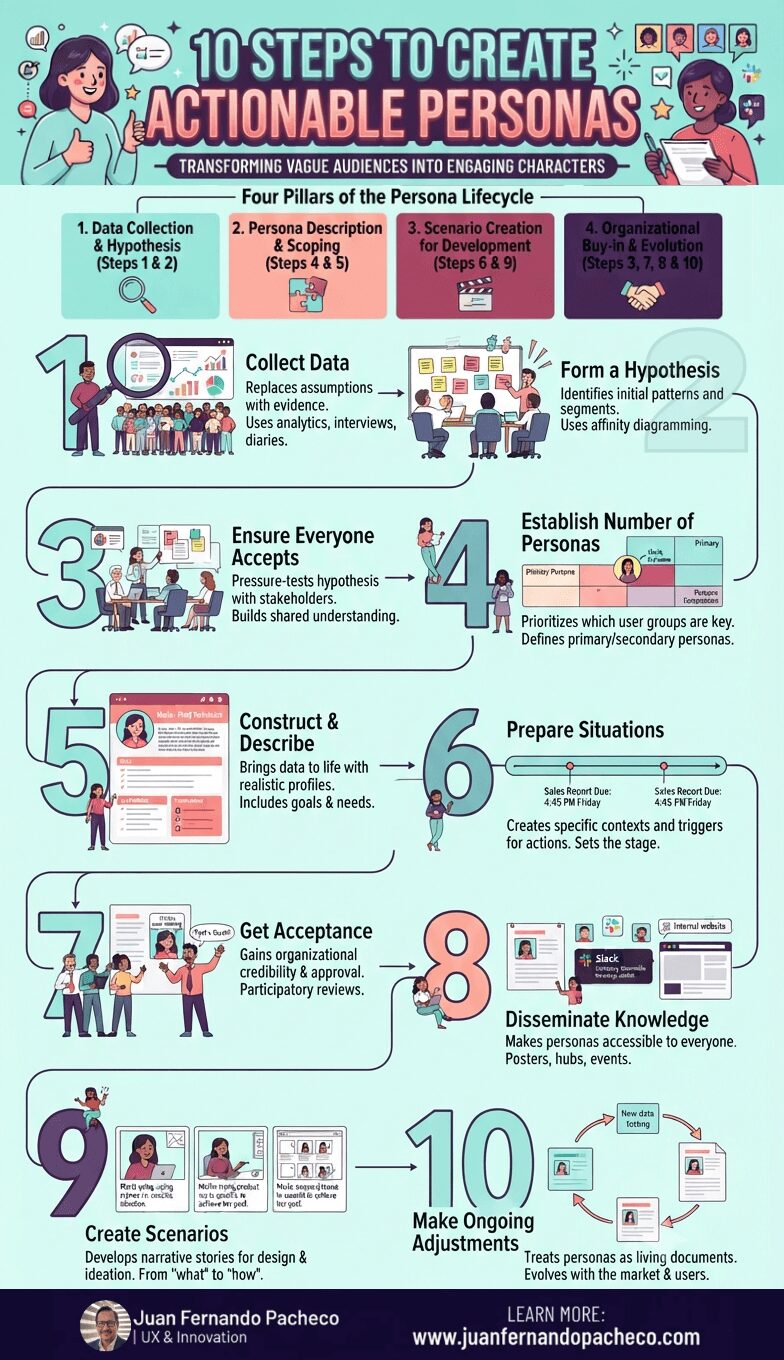
Creating engaging personas is not a one-week exercise to be filed away and forgotten. It is a strategic commitment to human-centered design. This 10-step process provides a robust framework, but its success hinges on a cultural shift within your organization—a shift from building for “the user” to designing for “Maria,” “John,” and “Akira.”
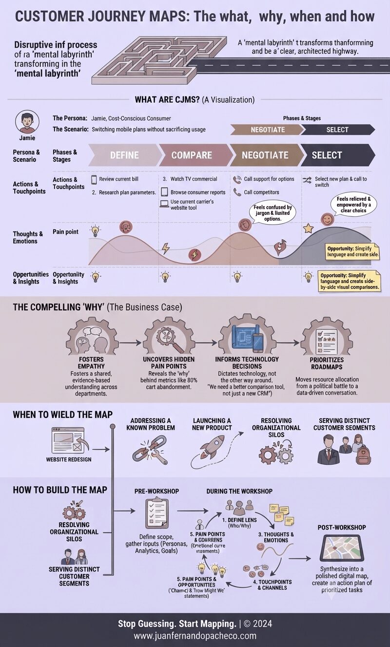
A Customer Journey Map is more than a diagram; it’s a strategic compass. It aligns your organization’s internal machinery with the external reality of your customer’s experience. It transforms abstract data into human stories, and those stories into a clear, actionable blueprint for improvement.
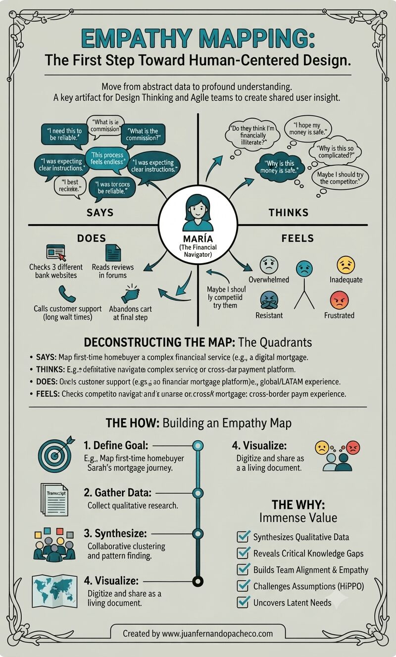
An empathy map is more than just a diagram on a wall. It is a practice, a mindset, and a commitment to seeing the world through someone else’s eyes. It transforms the abstract “user” into a human with hopes, frustrations, and a complex inner world.
By systematically capturing what our users Say, Think, Do, and Feel, we move beyond building mere features.
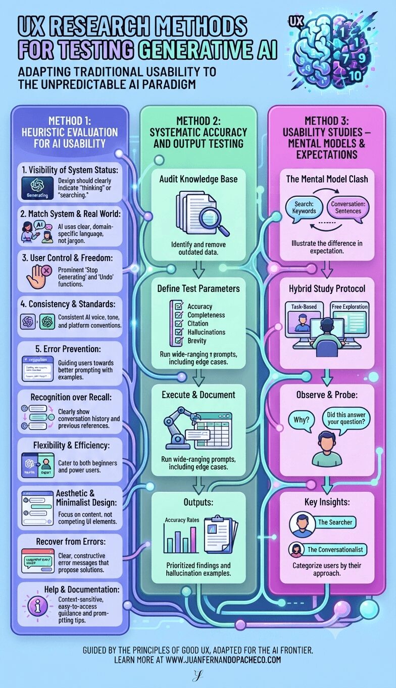
Testing generative AI requires us to expand our UX research toolkit. We can no longer rely solely on prototyping predictable flows. Instead, we must adopt a multi-pronged strategy that assesses not just the interface’s usability but also the quality of its output and its alignment with deeply ingrained user mental models.
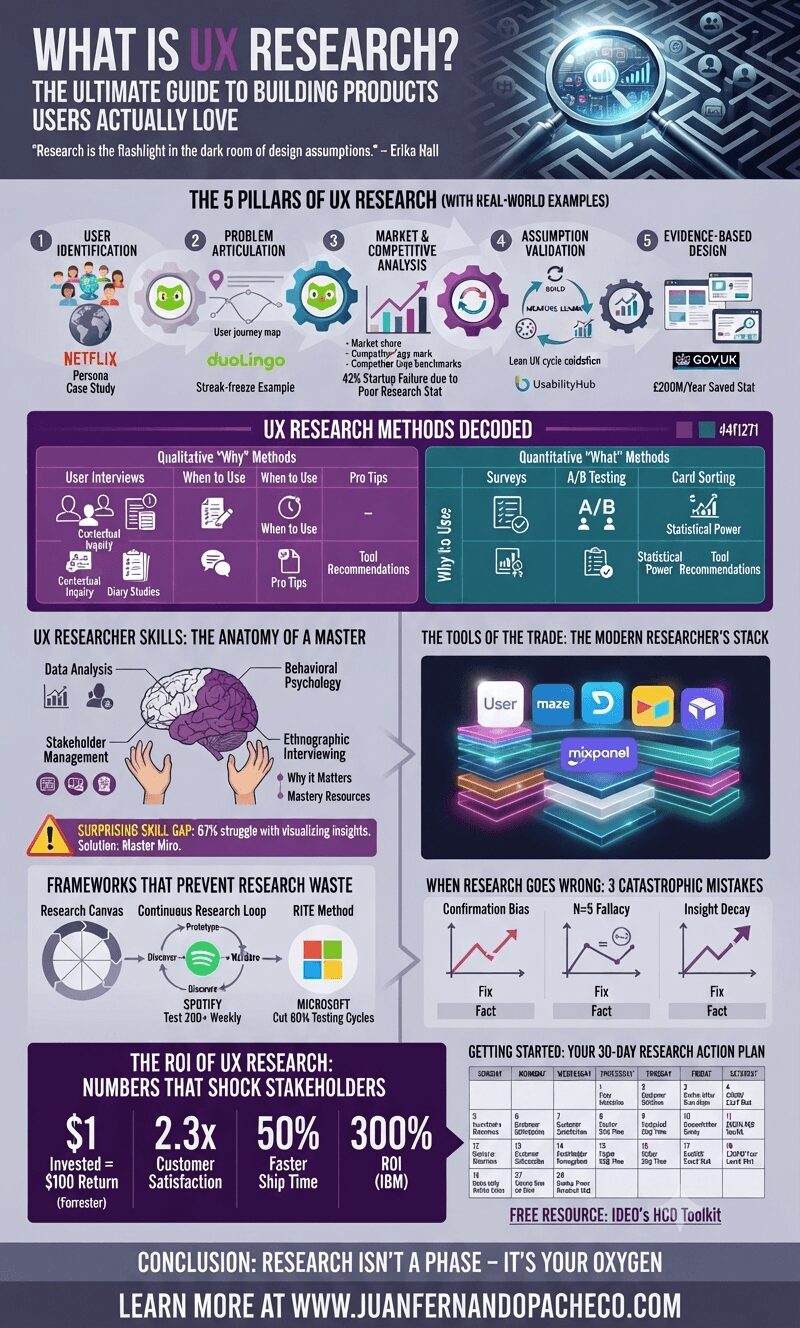
UX research transforms gut feelings into actionable intelligence. As Adobe’s VP of Design once told me: “Designers argue. Researchers prove.” In 2024, research isn’t optional – it’s the bedrock of product survival.