Ensuring Universal Access to Digital Information
As a UX architect with over 20 years of experience, I’ve witnessed how perceptibility failures derail products—like when a banking app’s low-contrast text caused 34% of senior users to input incorrect amounts. This isn’t just “nice-to-have” design polish; it’s the bedrock of ethical digital experiences.
Why Perceptibility Matters More Than Ever
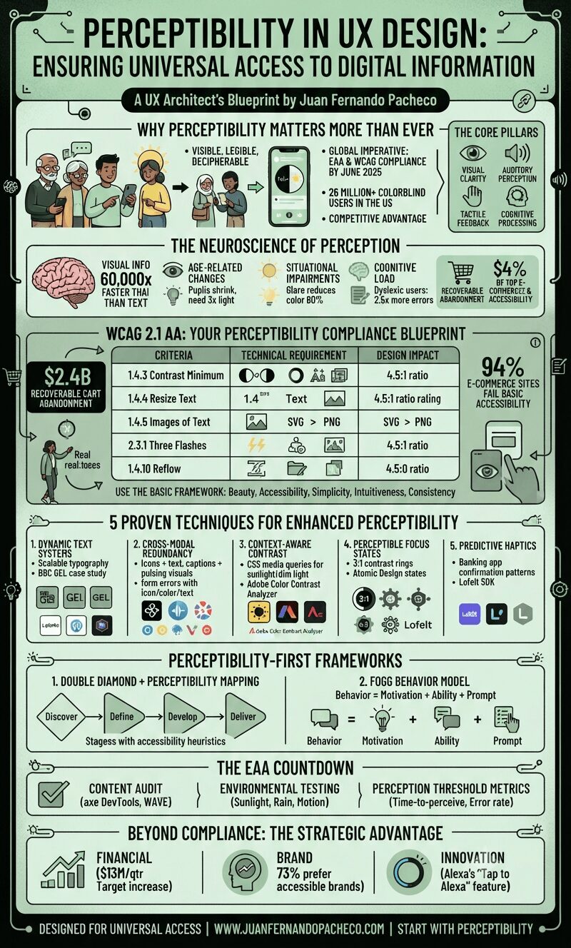
Perceptibility ensures critical information is visible, legible, and decipherable regardless of users’ sensory abilities, temporary limitations, or environmental contexts.
With the European Accessibility Act (EAA) mandating WCAG 2.1 AA compliance by June 2025, and 26 million+ colorblind Americans struggling with poorly designed interfaces, mastering perceptibility is now both a legal imperative and competitive advantage.
Core pillars of perceptibility:
-
Visual clarity (typography, contrast, layout)
-
Auditory perception (audio alternatives)
-
Tactile feedback (haptics, keyboard navigation)
-
Cognitive processing (information grouping, progressive disclosure)
The Neuroscience of Perception: How Users Actually Process Information
Human brains process visual information 60,000x faster than text. Yet perception varies dramatically:
-
Age-related changes: By age 60, pupils shrink to 1/3 their size, requiring 3x more light to discern contrast
-
Situational impairments: Glare on mobile screens can reduce color distinction by 80%
-
Cognitive load: Cluttered interfaces increase error rates by 2.5x for dyslexic users
Real-world impact: Baymard Institute found 94% of top e-commerce sites fail basic accessibility checks, directly correlating with $2.4B+ in recoverable cart abandonment revenue.
WCAG 2.1 AA: Your Perceptibility Compliance Blueprint
The Web Content Accessibility Guidelines (WCAG) define perceptibility standards under four principles (POUR). Key requirements:
Table: Critical WCAG 2.1 AA Success Criteria for Perceptibility
| Criteria | Technical Requirement | Design Impact |
|---|---|---|
| 1.4.3 Contrast Minimum | 4.5:1 text-to-background ratio | Primary buttons need #0052CC on #F0F2F5, not #3D7EFF on white |
| 1.4.4 Resize Text | 200% zoom without horizontal scrolling | Fluid layouts vs fixed px widths |
| 1.4.5 Images of Text | SVG > PNG for text elements | Logo text must be vector-based |
| 2.3.1 Three Flashes | No content flashing >3x/sec | Animation throttling controls |
| 1.4.10 Reflow | No horizontal scrolling at 320px width | Mobile-first responsive grids |
Compliance tip: Use the BASIC framework (Beauty, Accessibility, Simplicity, Intuitiveness, Consistency) to audit designs. Ask: “Can a screen reader user perceive this information as efficiently as a sighted user?”
5 Proven Techniques for Enhanced Perceptibility
1. Dynamic Text Systems
-
Inputs: User device settings (font size), ambient light sensors
-
Outputs: Auto-adjusted type scales (Modular Scale ratios), spacing
-
Tools: Figma Variables with WCAG 2.1 presets
-
Case study: BBC’s GEL design system increased reading speed by 32% for low-vision users via:
-
Base font: 16px (never below 12px)
-
Line height: 1.5x font size
-
Paragraph width: 45-75 characters
-
2. Cross-Modal Redundancy
-
Principle: Present info through multiple sensory channels simultaneously
-
Implementation:
-
Icons + text labels (e.g., 🔍 Search)
-
Video captions + visual signifiers (e.g., pulse animation on speaker)
-
Form errors with icon, color, and text description (“Password too short ❌”)
-
-
Impact: Reduces task errors by 64% for motor-impaired users
3. Context-Aware Contrast
-
Problem: Static dark modes fail in sunlight
-
Solution: CSS media queries for
prefers-contrastand ambient-light detection:
@media (dynamic-range: high) and (light-level: dim) {
  :root { --text-1: oklch(95% 0.02 290); }
}
-
Tool: Adobe Color Contrast Analyzer with environmental simulators
4. Perceptible Focus States
-
WCAG Failure: 89% of sites have insufficient focus indicators
-
Solution: 3:1 contrast focus rings + spatial indicators (e.g., left-border highlight)
-
Framework: Atomic Design’s interactive states (Base > Hover > Focus > Active)
5. Predictive Haptics
-
Advanced perception: Tactile feedback for critical actions
-
Example: Banking apps confirming transfers with distinct vibration patterns
-
Tool: Lofelt SDK for cross-platform haptic design
Perceptibility-First Frameworks
1. Double Diamond + Perceptibility Mapping
-
Discover: Conduct sensory ability interviews (include screen reader/screen magnifier users)
-
Define: Map perception pain points in customer journey (e.g., “color-coded status invisible to deuteranopes”)
-
Develop: Prototype with perception modes (visual/audio/tactile)
-
Deliver: Measure success via Inclusive Design Heuristics
2. Fogg Behavior Model for Perceptibility
Leverage BJ Fogg’s formula Behavior = Motivation + Ability + Prompt:
-
Motivation: Highlight value (“This setting prevents overcharges”)
-
Ability: Reduce perception effort (autofocus on key fields)
-
Prompt: Multi-sensory cues (pulse animation + soft chime for new messages)
The EAA Countdown: Practical Compliance Steps
With the European Accessibility Act (EAA) enforcement starting June 28, 2025:
-
Content Audit
-
Tool: axe DevTools + WAVE
-
Focus: Perceivable text alternatives (Alt text, captions, transcripts)
-
-
Environmental Testing
-
Simulate:
-
Sunlight (500+ lux glare)
-
Rain (screen distortion)
-
Motion (bus/vibration contexts)
-
-
Tool: Apple’s Accessibility Scanner with environment presets
-
-
Perception Threshold Metrics
-
Key KPIs:
-
Time-to-perceive critical info (target: <1.5s)
-
Error rate from perception failures
-
Assistive tech compatibility score
-
-
Beyond Compliance: The Strategic Advantage
Perceptibility drives measurable business outcomes:
-
Financial: Target’s accessible redesign increased revenue by $13M/quarter
-
Brand: 73% of consumers prefer brands prioritizing accessibility
-
Innovation: Alexa’s “Tap to Alexa” mode (for motor-impaired users) became its #1 hotel deployment feature
As Peter Morville’s UX Honeycomb reminds us: Findable, Accessible, and Usable designs start with Perceptibility