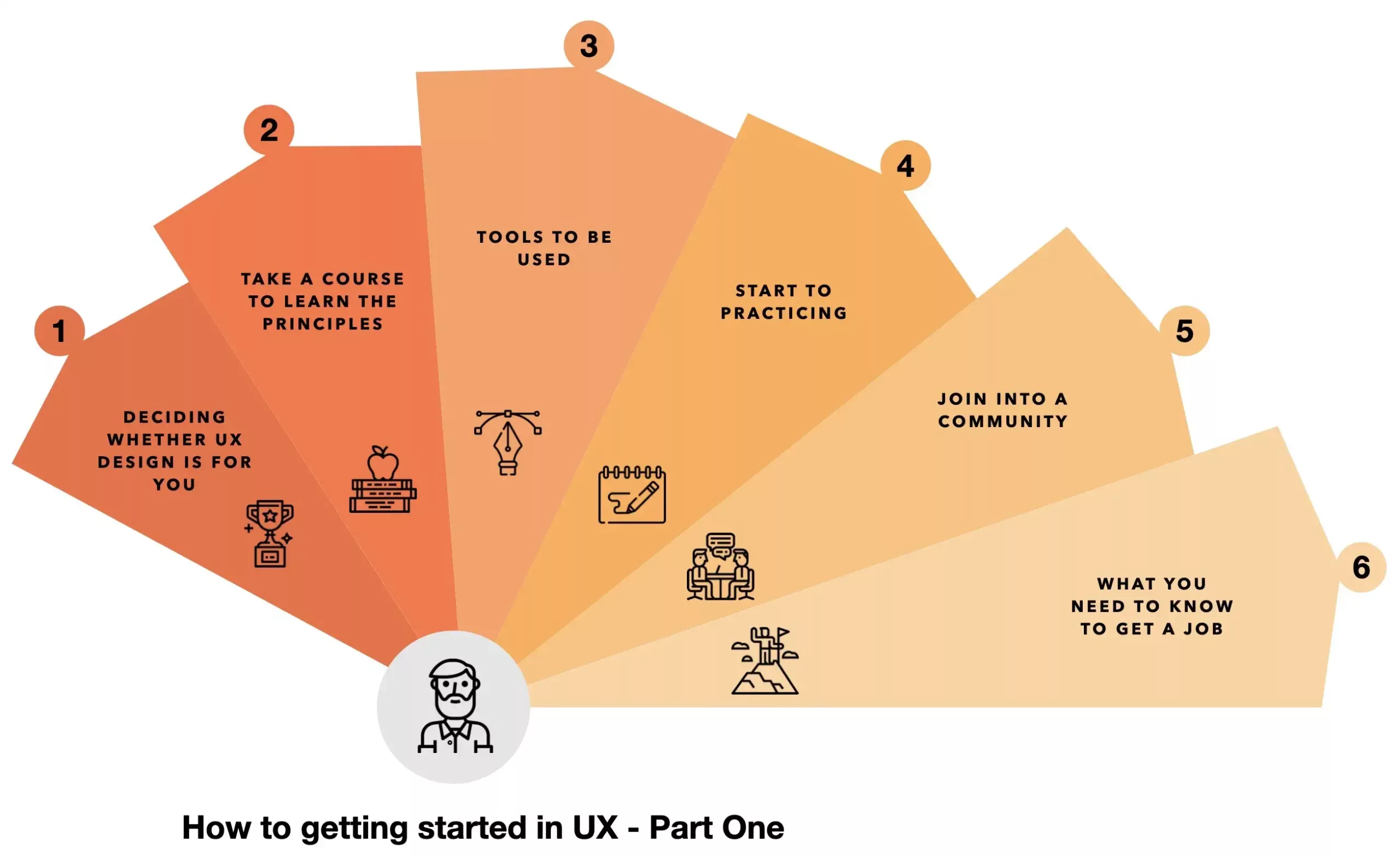
In this post, I’d like to share with you six simple steps toward how to get started in UX design.
In addition, I’m going to tell you the lessons I learned from it so you can avoid making the same mistakes.
Let’s get started.
Step one is deciding whether UX design is for you.
I’m assuming you already know about UX design, but you might not know if it’s the right fit for you. And you don’t know if you’ll enjoy this, alright?
However, I picked up a useful resource for you to be able to do that, so there’s a website called Career Foundry, and they offer UX design programs, but they also have this very nice and short emailed course it’s a 6-day course if you put in your name and your email you don’t have to pay anything, and they’ll send you a series of introduction email about UX design to help you decide whether this is the thing that you want to be doing as your job.
The other thing you can do to decide whether UX design is for you is to talk to someone who has a job that you want to be doing.
In this case, you go and find a UX designer, whether it’s a friend or a friend of a friend, and talk to them about what their job is like, what they enjoy about it, and when they don’t enjoy it.
That will give you a much more solid idea of what the day-to-day job is like, not just the highlights or what’s great about it, so it’s also a good idea to try.
Step two is to take a UX design course to learn the principles.
Now, this is important because a lot of people when want to learn about UX design.
Usually, they start watching random video tutorials and feel that they’re making progress.
But when you’re learning in such a scattershot way, you never have anything concrete that you can say that you’ve mastered, and that’s why you need to go through a structured curriculum.
I picked out two good courses for you to try, and I’m going to show them to you right here.
The first one:
Is the introduction to user experience design. This is a course by Coursera, and it’s free for you to take, and you only need to pay to get the certificate which is not necessary in my opinion.
This course has received a ton of good reviews, the syllabus is also excellent, and it’s not too long to take, it’s only five weeks long, and it gives you all the basics that you need if you don’t know a lot about UX design.
It has a good overview in the beginning and takes one hour, then it takes you through the steps that you need to know like, how you gather requirements for a design and then how you start thinking about alternatives to prototyping your final step is to evaluate your design so this is a good course to go through and is free.
The second one:
Is coming from Accenture, and it’s called digital skills user experience. This is also a good course, and I just put it as an alternative here because sometimes some people respond to some training better than others.
So you have a choice between these two, but I narrowed it down intentionally so that you don’t have to choose between multiple things and spend a lot of time choosing instead of learning and doing.
Just start with this course, the Coursera one, but if you don’t like it, move on to the next one, it’s not that important which one you choose as long as you go through it and finish it, and like I to said both of these courses are free.
Step three is related to the used tools.
I also picked out two tools for you, one is Figma, and it has a very generous free plan you can work on it using all the features for free, and has some collaboration features.
So, if you’re working with someone else, you’re able to work on the same file design at the same time, kind of like working in a Google Doc.
Another option is from Adobe, if you already have some Adobe apps, it’s called Adobe XD, and it also has a generous free plan that you can go through.
Figma is a browser-based tool, so no matter which computer you have, a Mac, PC, or a Linux system, it’ll work on everything same thing for Adobe XD these tools are both free, and they’re available no matter which is the computer you’re using.
Here’s a link to a quick tutorial for Figma. It’s a short tutorial that will show you all you need to get started. And with the principles that you’ll get with the training, you’ll be able to apply them while designing a mobile application or a website in Figma.
Step number four is to start practicing.
Now, this is the most important step which is, practice. Here’s where a lot of people stop. Most people are happy to do a kind of passive learning kickback and watch some videos or read some articles you feel good about yourself, but you’re not learning until you start practicing.
The easiest way to get started is to take something that’s already out there and redesign it or create a design that you like inside something like Figma.
Because when you take a good design previously created, and you draw out the design pixel-by-pixel again, you start to absorb the reason why these decisions were made, and at the same time, you’ll learn what’s a good layout, typography, spacing, etc.
All of these you’ll learn by copying a good design.
Another thing you can do is make an app that you think is not good enough. So, maybe you’re using an app for your bank it’s so bad you know that this app doesn’t like your friends.
So what you can do is take all the principles that you learned in the course which include gathering user requirements doing some user research, designing a new solution, and then testing it out with people to see their reactions.
And then, after you’ve done it, you should write about that and put it out there and get feedback on it. So that’s what practice means, it’s going through a whole cycle applying all the principles that you learned, and that’s real.
I can’t stress this enough this is the most important step, and this is the step that most people skip out on like they watch a few tutorials and then call themselves a designer.
It doesn’t work that way you have to put in the hard work, and you have to put up with the feeling that you know that you’re not good enough in the beginning, but you know in your mind what a good design looks like, and you want to get to that point, and that gap is always frustrating but you will get to it only by practicing.
A tip I can give to you when you’re practicing is.
If you’re designing for iOS or Android (which means you’re designing a mobile app), check out the human interface guidelines by Apple and Google, so you can start to design apps that appear natural and feel at home on these two platforms.
Again, if you’re designing something for an iPhone or an iPad you should check out the human interface guidelines.
Basically what it’s is a set of guidelines from Apple telling you what makes a good design on iOS, and all the pages in it are quite short, so it’s not a long book that you have to spend a ton of time reading, but it just shows you the principles of what makes good looking iOS app and just by sticking to these principles you can design something that’s not too flashy, but that feels right at home on iOS.
And, the same thing for Android. So, if you take a look at the Google resources, you’ll be able to see what a good layout looks like on Android, how much spacing you should leave when you’re designing something, and you don’t want the text to be right against the edge you should be leaving some margins and things like that.
So, both of these guides are extra excellent resources for you to get started designing something for iOS or Android and to have it look good from the start.
Step five is to join a community.
Now this one is important, especially if you’re someone who’s learning design on your own and you don’t know a lot of other designers.
Being a part of a community is helpful for you ton because it’s the kind of place where you get to ask questions you have to other people who are on the same level as you are that are learning, and you can meet them online.
You can start asking and answering questions and getting feedback on your design in the community, and it’ll keep you motivated because you won’t feel like you’re going through this journey alone.
So, I picked out one community that and it’s called designer hangout, this is an invite-only community, but it’s a free community.
In addition, there are paid communities, but I wanted to focus everything in this post on what’s free and your request and invite you to fill out a little information there, just to control the quality of who’s coming in.
And then you’ll be able to join a UX Design slack community where you get to chat with people and their QA’s there’s even a job board community a great way to get a job as you start talking to people in building relationships maybe someone will be working at a company, and you’ve already built a good relationship with that person they will think of you, and if they need someone to hire for a UX design job, for example, you’re a good choice.
Step six is learning what you need to know to get a job.
So this is only relevant if you want to go and get a job at a company instead of freelance somewhere, and my two tips for you to get a job are:
Browse job descriptions because that’s the best way for you to know what a company wants, because sometimes if you’re hanging out online and seeing what designers are talking about, you’ll think that’s what companies care about, but is not necessarily the same thing when someone is hiring they’re looking for a specific set of requirements, and you may have like three of them, and they need five or six of stuff that you haven’t learned about yet.
However, just browsing job descriptions is a way to know what you need to hit and start to work on your pitch, and you’ll present yourself as someone who knows all these topics and can do the job for them.
So, you can browse any job listing website, just search for junior UX designer and you could find something like this what you want to focus on is the requirements, the skills, the experience and this will give you a good idea of what you need to hit to be able to get a job at a company.
The list of requirements should be a list of goals for you. You should browse a few job descriptions and create a checklist of items that you need to have so that when you begin to apply, you already have these things that you know you need rather than finding out during a job interview.
So, there is a concept that you should know, and now you need to go and learn about it.
One thing that comes up a lot when you’re applying for your job, even from junior positions, is that you’ll see the company is asking for two or three years of experience for you to apply to that job.
Now the reason most companies put that limitation is just to intimidate people and begin to pre-filter candidates who aren’t confident enough to apply.
So, as long as you’re confident enough and able to present your skills and show what you’ve worked on, just go ahead and apply to these jobs any way.
What’s important in this step is to have something to show, so if you remember from step four of practicing, you must work on something and then post it online with a write-up.
This means don’t just show me some pretty pictures or pretty designs. Write an article saying exactly how you went through the whole design process:
- How do you do user research,
- How your design process like,
- Your thinking process,
- The drafts that you tried,
- The alternatives that you considered before you settled on a design, and then
- The final design that came out, and
- How you tested it,
- What the results were like,
- What did you learn from that, and
- Publish that as an article.
The biggest mistake that junior designers make is to work on some pretty screens, put them up on a website, and think that’s a good portfolio. It’s not a good portfolio because:
- First, you could have gotten those images from anywhere, and.
- Second, it doesn’t show the person looking at them that you know what you’re doing.
Maybe, you just happened to design something simple enough and look fine, but you didn’t show that you’re a good designer who knows how to think about design problems and design solutions all that a company wants when hiring someone is to answer the question can I trust that this person can do this job or not?
And if you have something documenting your thought process, any materials that I can just go and read and see:
- How much do you know about this topic?
- What’s your thinking process like?
- And that will help me decide whether I think you’re good enough for this job or not.
The last tip I have for you for getting a job is to employ a concept called the Canvas Strategy the idea behind is, to get a job at a company, in this case, you want to help that company do something and prove that you can be a helpful employee to them.
What I mean by Canvas Strategy is if you decide that there’s a company that you like and you want to work there.
So, you start following the people who work there on social media and start looking for an opportunity.
They’re not going to come out and say, hey we need someone to go and design something for us but what you might notice is that there’s a gap so for example:
- Maybe something on their website is not great,
- Or, something in their app is not the best that it can be.
So, what you can do in this case is go and do the work, research, and create a solution for a problem you’ve identified.
Then you can go and say, for example; Hey, I like your service, I like your website, but I knew this part was a little bit lacking, and I did some research on it:
- I’ve talked to some people,
- I asked them how this could be better, and
- I designed the solution for you.
I just want to give it to you, and I don’t expect anything in return.
So, this is you, just doing them a favor, something useful for the company and giving it away for free. And not expecting anything in return, and this is important, you shouldn’t feel entitled to anything they might just, say thank you, and that’s it, or in what like most people will be impressed enough to start a conversation with you.
After that, you can start talking about whether they have a design opportunity for you to apply for or that you know they can point you in the right direction to get a job, but it’s a great way to get a job somewhere.
Okay, so this rounds off the six steps that I wanted to share with you for how to go from a complete beginner to someone who can get a UX design job, but as you notice there are like six simple steps that simply don’t mean easy right?
You can continue with part two at How to get started in UX design – Part Two


