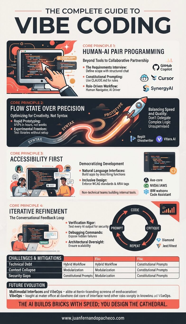
An infographic titled "THE COMPLETE GUIDE TO VIBE CODING," presenting a structured overview of AI-driven software development. The visual is divided into four main sections: "Human-AI Pair Programming," "Flow State Over Precision," "Accessibility First," and "Iterative Refinement." Each section uses diagrams, icons, and bullet points to explain core principles, practices, and lists relevant tools like GitHub Copilot and Replit. The bottom includes a challenges matrix and future predictions, with the quote, "THE AI BUILDS BRICKS WITH SPEED; YOU DESIGN THE CATHEDRAL." The background is light beige with accents of deep red and dark charcoal.

Coined by AI researcher Andrej Karpathy in 2025, vibe coding transcends traditional programming by treating natural language as the primary interface between human intent and machine execution.

For UX designers and architects like us, this represents more than a productivity boost—it’s a fundamental shift in how we translate vision into reality.
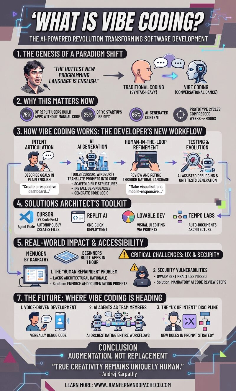
An infographic titled 'WHAT IS VIBE CODING?' detailing a paradigm shift where natural language replaces traditional code syntax. It illustrates the four-phase workflow (Intent Articulation, AI Generation, Human-in-the-Loop Refinement, Testing), highlights key statistics (e.g., 75% of Replit users build apps without manual code), lists essential tools (Cursor, Replit AI, Lovable.dev, Tempo Labs), and outlines future trends like voice-driven development and AI agents, concluding with the tagline 'Augmentation, Not Replacement.'

Coined in February 2025 by AI pioneer Andrej Karpathy (former Tesla AI director and OpenAI founding member), this methodology reimagines software creation as a conversational dance between human intention and AI execution.

Unlike traditional programming, vibe coding treats natural language as the primary interface: developers describe goals (e.g., “Build a REST API with JWT authentication”), and AI tools like GitHub Copilot generate executable code in real-time

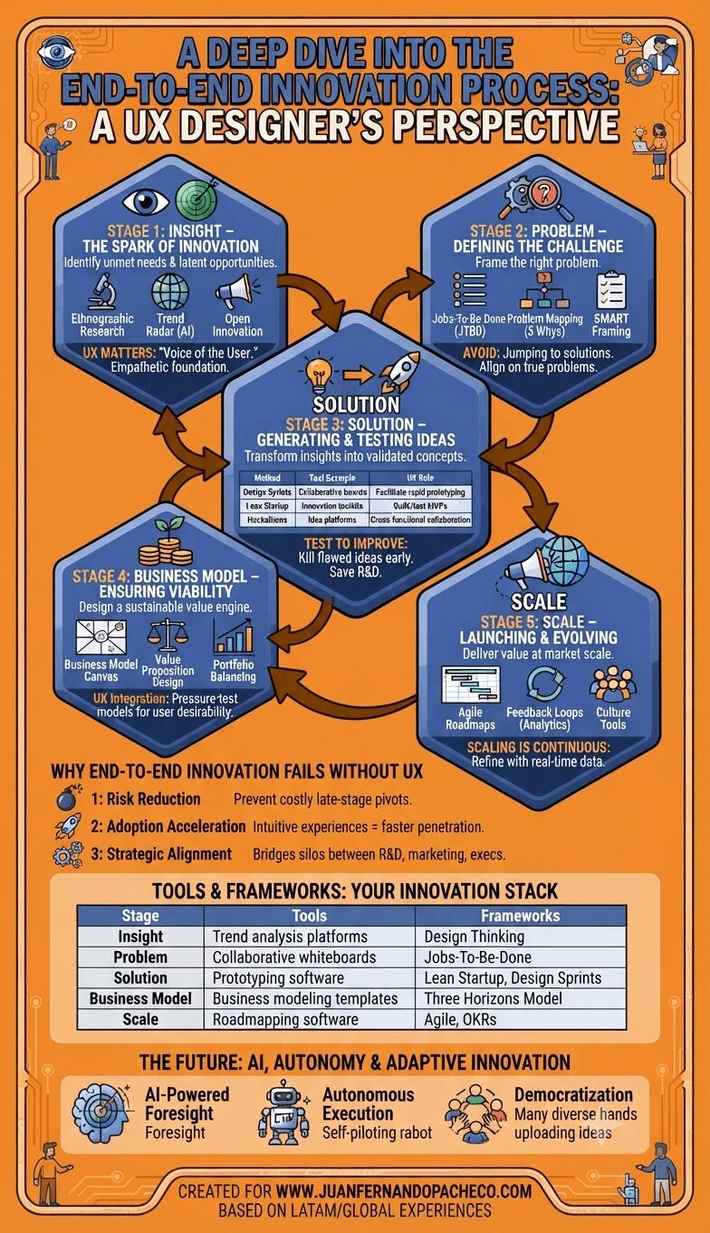
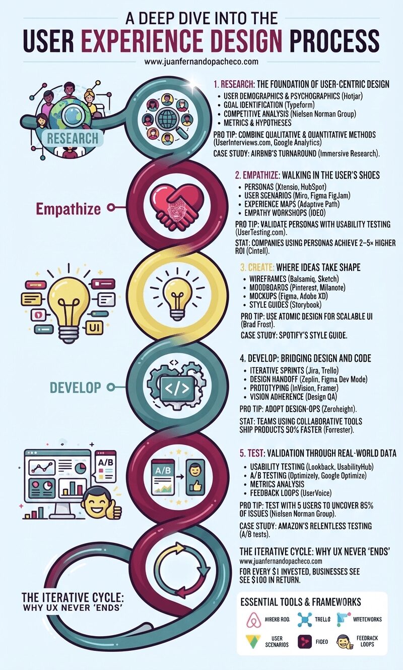
An infographic titled "A Deep Dive into the User Experience Design Process," presented as a stylized, continuous helix structure with five distinct, glowing nodes against a light blue background. From top to bottom, the nodes are: Research (#558c8c teal): Icons of users and a magnifying glass. Text includes "1. RESEARCH: THE FOUNDATION OF USER-CENTRIC DESIGN" and mentions Hotjar, Typeform, competitive analysis, and success metrics. Pro tip: "COMBINE QUALITATIVE & QUANTITATIVE METHODS (UserInterviews.com)." Empathize (#82204a magenta): Icons of two hands forming a heart with a wireframe face. Text includes "2. EMPATHIZE: WALKING IN THE USER’S SHOES" and mentions personas, user scenarios, experience maps (Adaptive Path), and empathy workshops (IDEO). Pro tip: "VALIDATE PERSONAS." Create (#e8db7d yellow): An icon of a glowing lightbulb with UI elements. Text includes "3. CREATE: WHERE IDEAS TAKE SHAPE" and mentions wireframes (Balsamiq), moodboards, mockups (Figma), and style guides (Storybook). Pro tip: "USE ATOMIC DESIGN (Brad Frost)." Develop (#558c8c teal): Icons of cogs and code brackets. Text includes "4. DEVELOP: BRIDGING DESIGN AND CODE" and mentions iterative sprints (Jira), design handoffs (Zeplin), prototyping, and design QA. Pro tip: "ADOPT DESIGN-OPS." Test (#82204a magenta): Icons of data charts, A/B testing, and a happy user. Text includes "5. TEST: VALIDATION THROUGH REAL-WORLD DATA" and mentions usability testing (Lookback), A/B testing (Optimizely), metrics analysis, and feedback loops. Pro tip: "TEST WITH 5 USERS (Nielsen Norman Group)." The helix loops back at the bottom to a final section: "THE ITERATIVE CYCLE: WHY UX NEVER ‘ENDS’" with an arrow circle, the ROI statistic (Forrester), and a list of "ESSENTIAL TOOLS & FRAMEWORKS" (Hotjar, SurveyMonkey, Google Analytics, Miro, UserTesting.com, Xtensio, Figma, Sketch, Adobe XD, Storybook, Zeplin, Jira, Framer, UsabilityHub, Optimizely, FullStory, HEART, Double Diamond, JTBD). The URL www.juanfernandopacheco.com is visible at the top and bottom.

Neglecting UX risks obsolescence. Brands like Apple and Tesla dominate by embedding user-centricity in their DNA. Start small: interview 5 users today. Map one customer journey. Test one button. The process compounds—each iteration deepens empathy, refines solutions, and ultimately, builds products humans love.

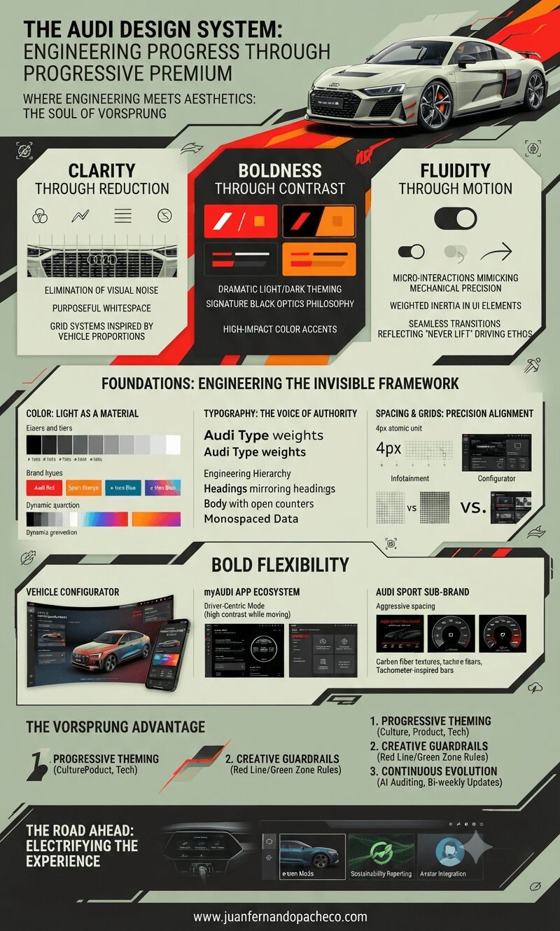
An intricate vertical infographic detailing "The Audi Design System," organized into sections including "The DNA of Progressive Premium" (Clarity, Boldness, Fluidity), "Foundations" (Color, Typography, Spacing), "Bold Flexibility" (Configurator, App, Sport), "The Vorsprung Advantage," and "The Road Ahead," featuring Audi vehicle renders, UI mockups, and a color palette of olive green, black, white, red, and orange.

The Audi Design System transcends pixels and code. It’s the digital embodiment of Ingolstadt’s engineering soul—a framework where every gradient curves like a roofline, every grid aligns like wheel spokes, and every interaction delivers the thunk of a perfectly weighted door. In a world of disposable digital experiences, Audi proves luxury isn’t just felt in leather seats—it’s engineered into every click, swipe, and scroll.

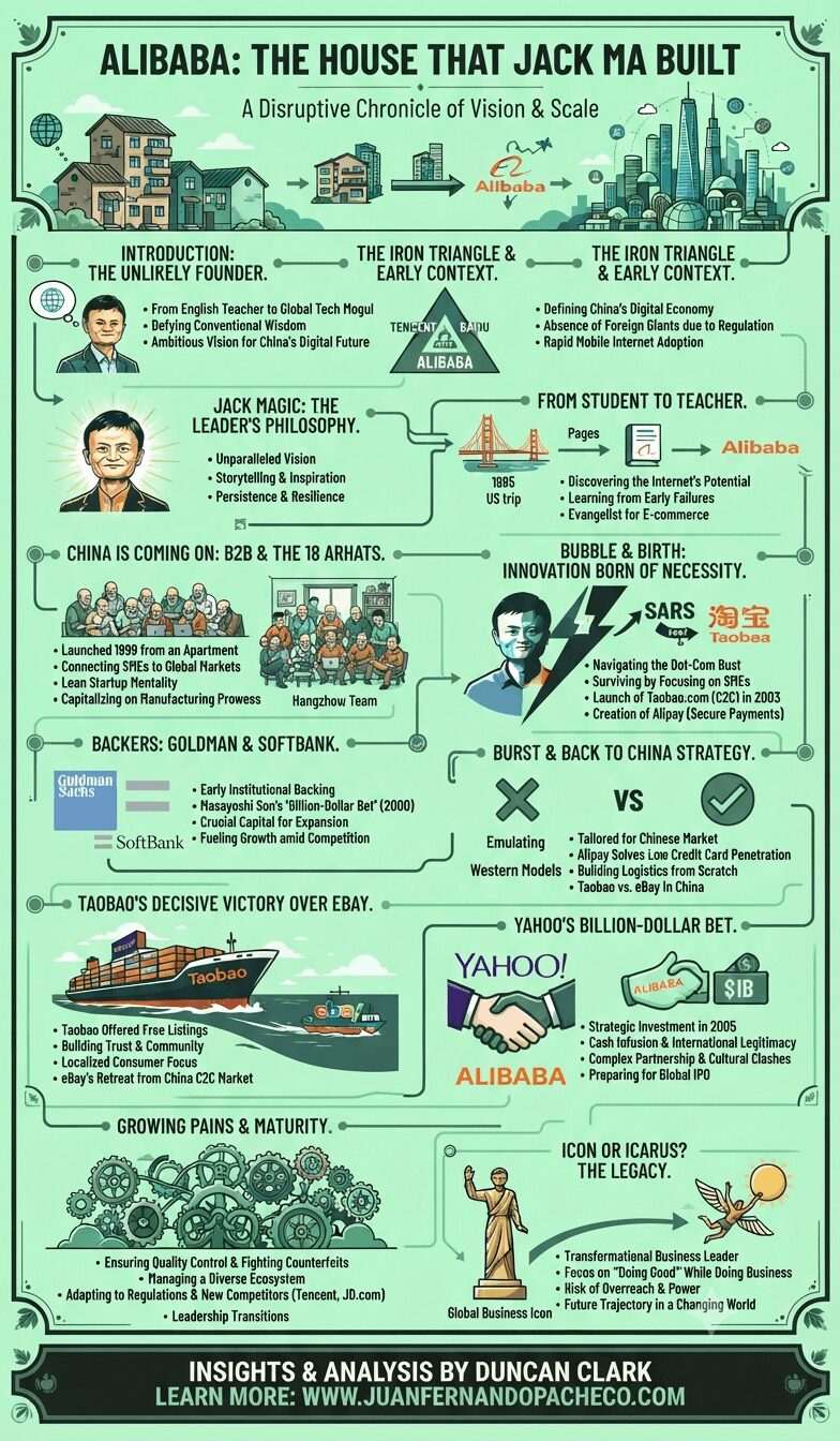
A vertical infographic titled "Alibaba: The House That Jack Ma Built," set against a light mint-green background with illustrations and text detailing the company's history, from Jack Ma's early life as a teacher to its global e-commerce dominance, including sections on Taobao, Alipay, the "Iron Triangle," and key investors like SoftBank and Yahoo, ending with a reflection on Ma's legacy.

In “Alibaba: The House That Jack Ma Built,” Duncan Clark delivers a compelling and meticulously researched narrative that goes beyond a mere corporate history. It is a story about vision, resilience, leadership, and the unique alchemy that allowed an audacious entrepreneur from a developing nation to build a global empire that redefined commerce and technology.