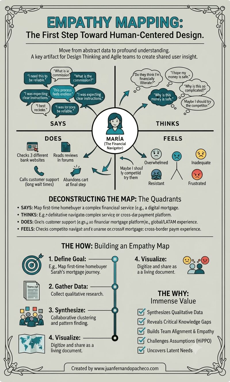
A vertically-oriented infographic titled "EMPATHY MAPPING: The First Step Toward Human-Centered Design," set against a light sage-green background with a decorative border. The center features a complete empathy map for a persona named "MARÍA (The Financial Navigator)," with radiating arrows connecting her icon to four detailed quadrants: "SAYS" (with quotes like "I need this to be reliable," "What is the commission?"), "THINKS" (internal thoughts like "Do they think I'm financially illiterate?"), "DOES" (actions like "Checks 3 different bank websites"), and "FEELS" (emotions with emojis like "Overwhelmed," "Inadequate"). Below the map, sections deconstruct the quadrants and outline "THE HOW: Building an Empathy Map" (Define, Gather, Synthesize, Visualize steps) and "THE WHY: Immense Value" (a checklist of benefits). The bottom includes the attribution: "Created by www.juanfernandopacheco.com."

An empathy map is more than just a diagram on a wall. It is a practice, a mindset, and a commitment to seeing the world through someone else’s eyes. It transforms the abstract “user” into a human with hopes, frustrations, and a complex inner world.

By systematically capturing what our users Say, Think, Do, and Feel, we move beyond building mere features.
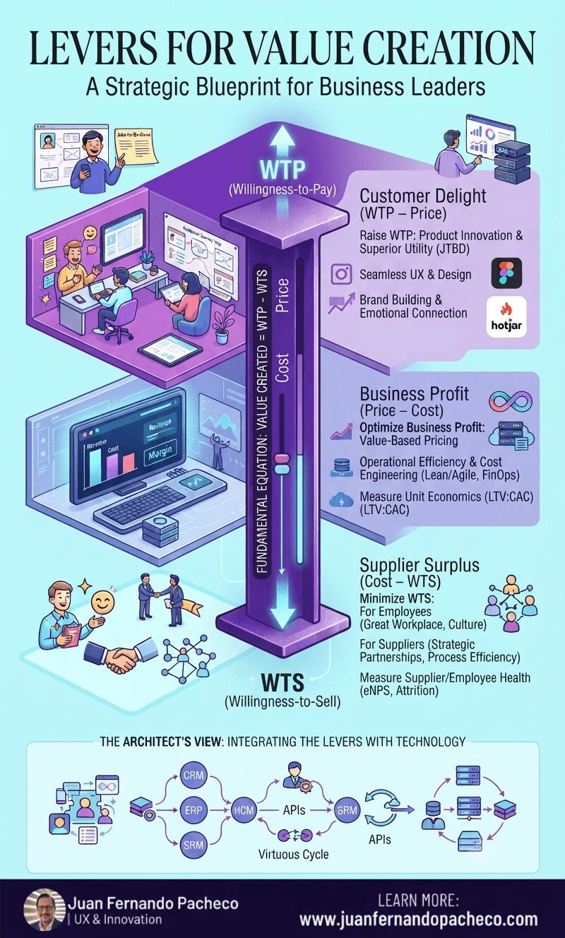
Infographic illustrating the "Levers for Value Creation" framework by Juan Fernando Pacheco, using a central "Value Stick" with WTP and WTS, surrounded by interconnected illustrated sections on Customer Delight, Business Profit, and Supplier Surplus, and an architectural view of technology integration.

The Value Stick is more than a diagram; it is a mindset. It forces a holistic view of your business ecosystem. You cannot win by delighting customers while exploiting employees. You cannot sustain profit by cutting costs without regard for the value you destroy.

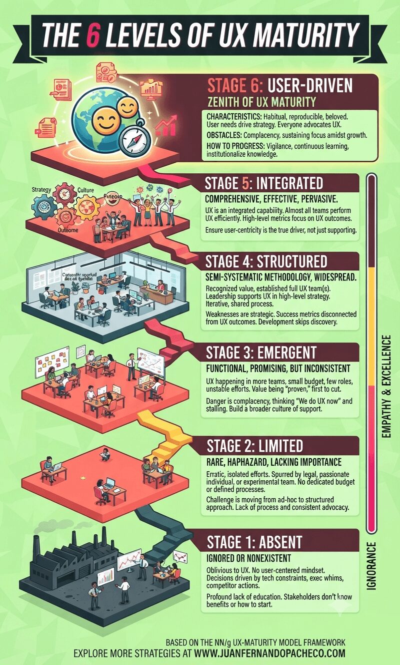
An infographic visualizes a six-stage staircase ascending from "Ignorance" to "Empathy & Excellence." Each level, from Stage 1: Absent to Stage 6: User-Driven, is detailed with an isometric illustration of an office environment, key characteristics, obstacles, and progress steps. The overall theme uses a bright, modern color palette of teals, yellows, and maroons against a lime-green background.

Understanding your organization’s UX maturity is not an exercise in vanity. It is a vital diagnostic tool that allows you to identify strengths to celebrate and weaknesses to address. It provides a realistic, shared language for improvement.

The path forward is incremental. You cannot leapfrog stages. The practices and cultural shifts of each stage create the necessary foundation for the next. Progressing even one stage can take years of dedicated effort. Don’t be discouraged. Start with an honest assessment, build a coalition of champions, celebrate small victories, and always, always tie your work back to both user value and business impact.

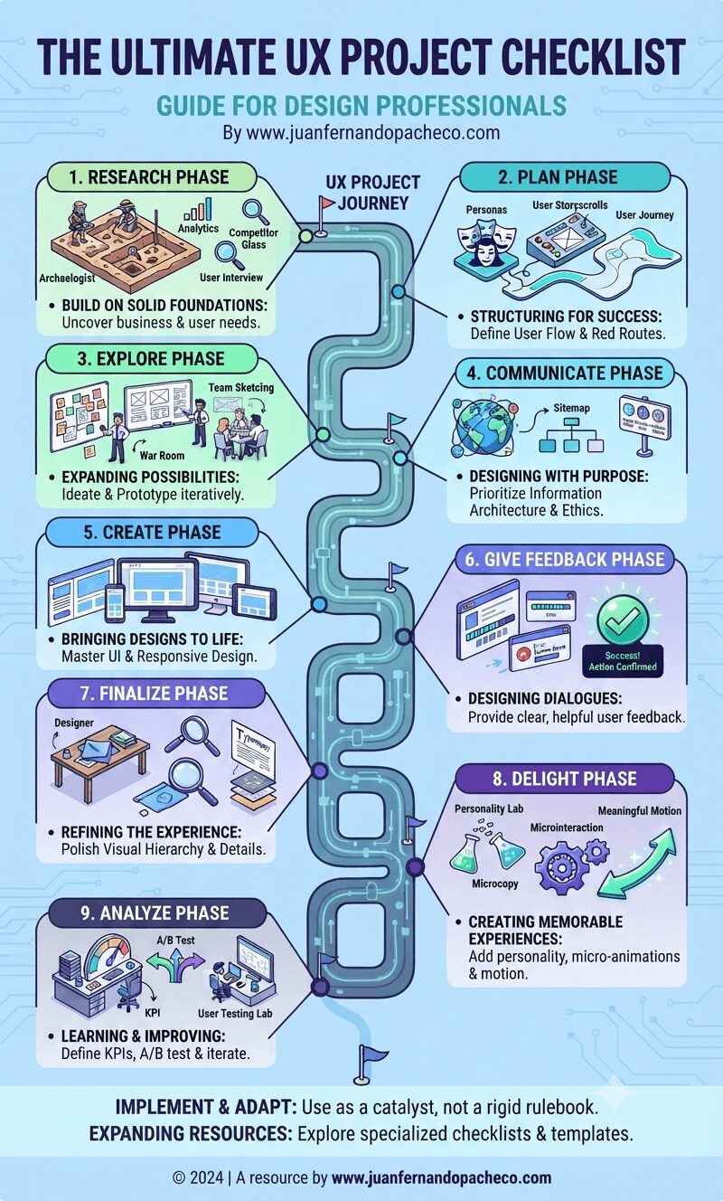
An infographic titled "The Ultimate UX Project Checklist" featuring a winding central milestone path connecting nine distinct UX phases—Research, Plan, Explore, Communicate, Create, Give Feedback, Finalize, Delight, and Analyze—against a light blue background, with brand reference www.juanfernandopacheco.com.

The UX Project Checklist represents more than just a list of tasks—it embodies a comprehensive approach to designing exceptional user experiences. As the field continues to evolve with new technologies, interaction patterns, and user expectations, this checklist should serve as a foundation rather than a final word.

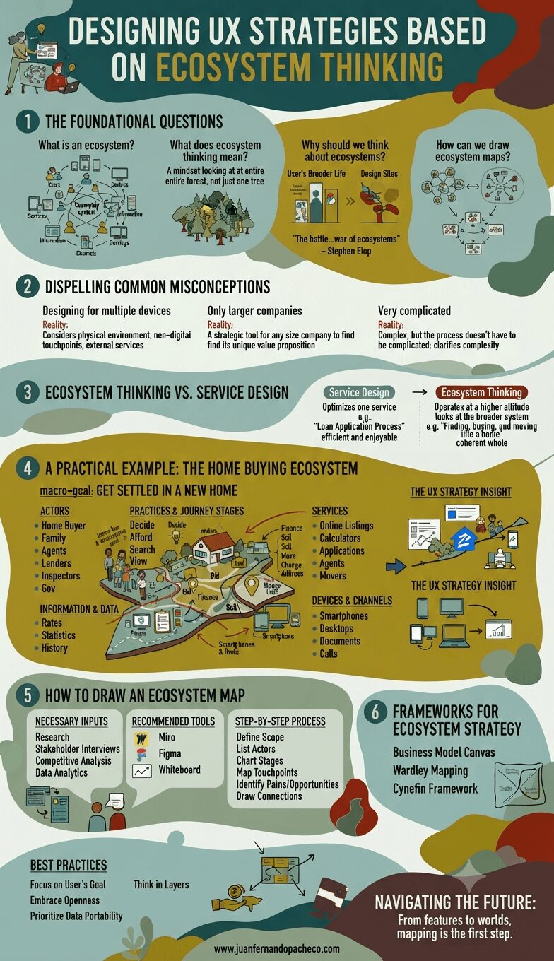
An educational infographic with a modern, illustrated aesthetic, structured into six sections with a teal and earth-tone color palette. It defines ecosystem thinking in UX design, dispels misconceptions, compares it to service design, provides a detailed home-buying example, outlines how to draw maps, lists strategic frameworks, and includes best practices and the website www.juanfernandopacheco.com.

The future of UX design is not in crafting perfect, isolated interactions. It is in designing intelligent, adaptive, and respectful nodes within a vast and complex human ecosystem. It requires us to be not just designers, but strategists, systems thinkers, and diplomats who can navigate the relationships between services, businesses, and most importantly, people.

By adopting ecosystem thinking, we move from creating products that people use to crafting environments that people live in. We stop building features and start building worlds. The map is the first step. It’s time to start charting.

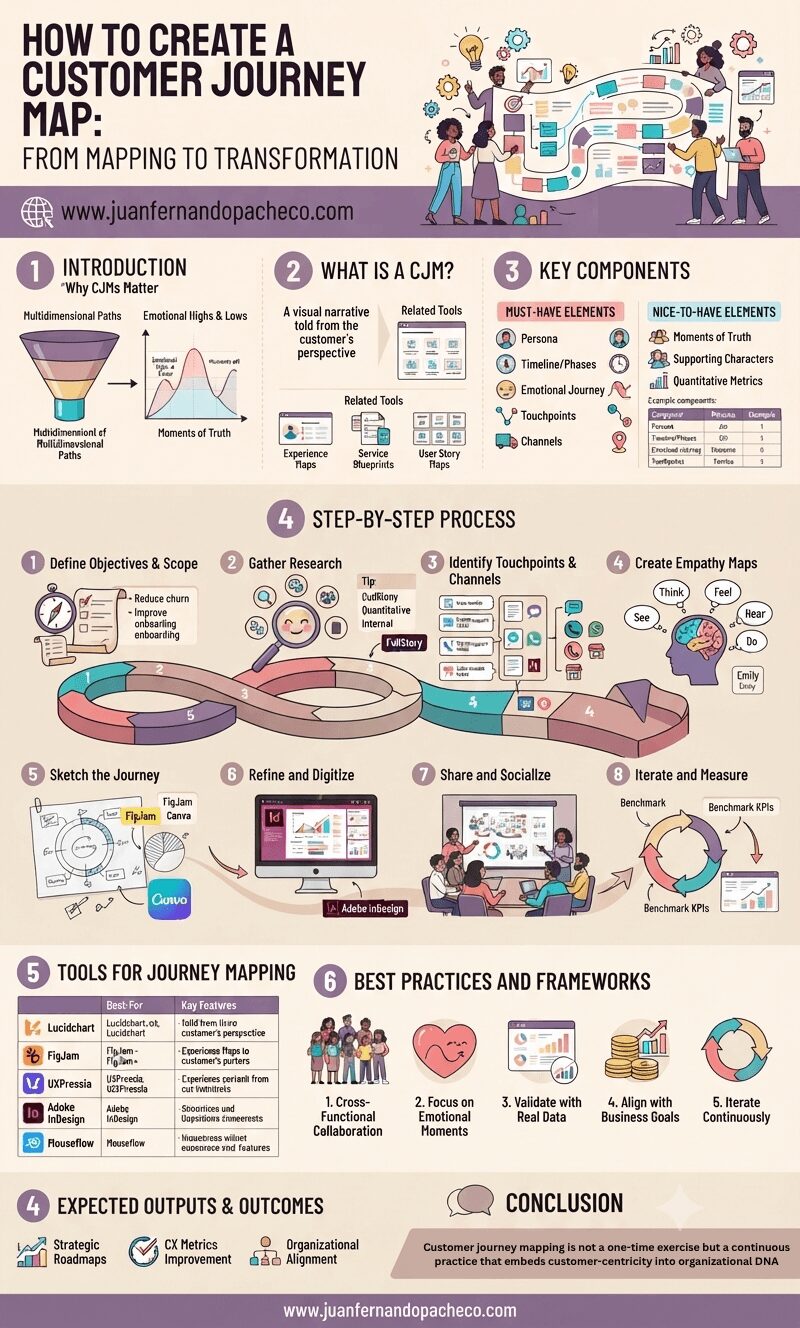
An intricate, vertically-oriented infographic detailing the eight-step process of creating a Customer Journey Map (CJM). The image includes sections on "Why CJMs Matter," "What Is a CJM," "Key Components," "Tools for Journey Mapping," and "Best Practices," using a color palette of lavenders, rose, and beige. It features illustrations of diverse CX teams, charts, a helical journey timeline, and the website www.juanfernandopacheco.com.

Customer journey mapping is not a one-time exercise but a continuous practice that embeds customer-centricity into organizational DNA.

By visualizing the intersection of human emotions and business processes, UX professionals can drive transformative change—turning fragmented interactions into cohesive, respectful experiences that build long-term loyalty.

As CX expectations escalate, the brands that thrive will be those who listen, adapt, and design journeys that resonate deeply with the people they serve.

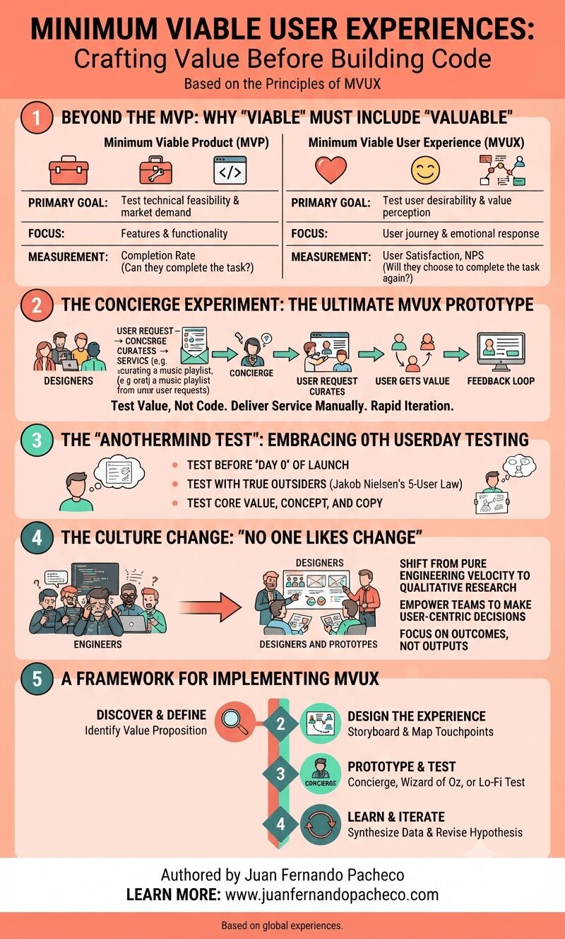
An infographic titled "MINIMUM VIABLE USER EXPERIENCES: Crafting Value Before Building Code," authored by Juan Fernando Pacheco. It presents a five-part framework for transitioning from MVP to MVUX. Section 1 compares MVP (focusing on features and technical feasibility) with MVUX (focusing on user journey and emotional response). Section 2 illustrates the "Concierge Experiment," showing a process of manual service delivery to test value before building code. Section 3 describes the "Anothermind Test" for 0th userday testing with outsiders. Section 4 explains the necessary "Culture Change," shifting from engineering velocity to user outcomes. Section 5 provides a four-step implementation framework: Discover, Design, Prototype, and Learn. The image uses a clean, professional design with icons and flowcharts.

After 20 years in this field, all you need to know is this:

The winning product is rarely the one with the most features.

It is almost always the one with the most thoughtful, frictionless, and valuable experience. The MVUX is your strategy to find that experience efficiently and effectively.

It’s a commitment to being human-centered from the very first sketch. It’s about being a concierge for your users, understanding their needs so deeply that the product you eventually build feels like it was made for them, and them alone. Because it was.

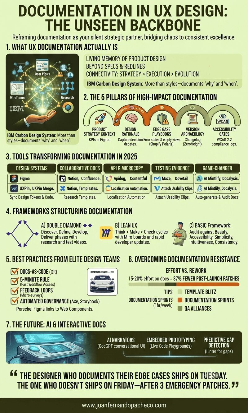
An infographic titled "Documentation in UX Design: The Unseen Backbone" is presented in a vertical format against a light-yellow background. It is structured into seven numbered sections that detail the components, pillars, tools, frameworks, best practices, overcoming resistance, and future of UX documentation, using a color palette of greens, orange, and white.

Treating documentation as a “task” misses its power. It’s the continuous act of design reasoning made visible. As Apple’s Human Interface Guidelines reveal, legendary products emerge when principles are documented, not memorized.

“The designer who documents their edge cases ships on Tuesday. The one who doesn’t ships on Friday—after 3 emergency patches.”

Start small: Document one decision today. Link a research insight to a button component. Your future self—and team—will thank you.

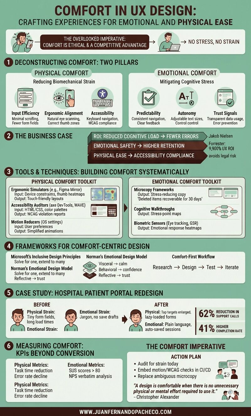
A detailed infographic titled "Comfort in UX Design" with a green background, broken into six main sections: Deconstructing Comfort, The Business Case, Tools & Techniques, Frameworks, a Case Study, and Measuring Comfort. It uses icons, charts, and text to explain how to design for physical and emotional ease, citing principles from Nielsen, Forrester, Microsoft, and Don Norman.

Comfort in UX design—defined as creating experiences with no stress, no strain—isn’t a luxury; it’s an ethical imperative and competitive advantage. Yet, it remains chronically undervalued.

As both a UX designer and solutions architect, I’ve seen how discomfort manifests: from RSI-inducing enterprise tools to anxiety-triggering checkout flows.