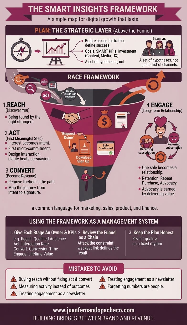
An infographic illustrating a five-stage digital marketing and sales framework, starting with 'PLAN' at the strategic layer, followed by the inverted funnel of the 'RACE FRAMEWORK' (Reach, Act, Convert, Engage), and concluding with a management system and common pitfalls. The color scheme uses deep purples and muted earth tones.

Tools, platforms, and algorithms will keep changing. The journey of a customer, to discover, interact, decide, and stay, is human, and therefore stable.

The smart insights framework endures because it is organized around that human journey and wrapped in the discipline of planning and measurement. Use it as your map, keep your KPIs honest, attack the constraint, and build engagement as seriously as you build acquisition.
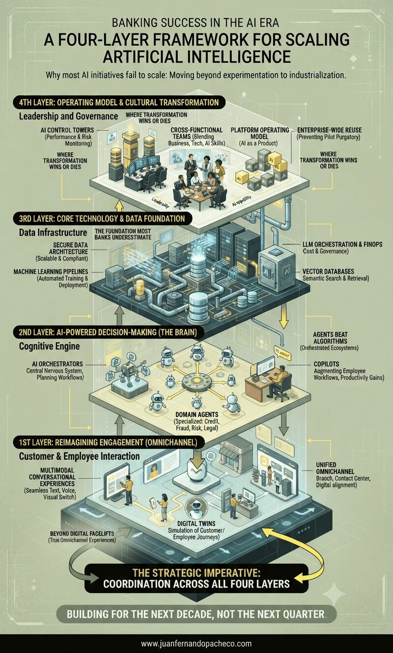
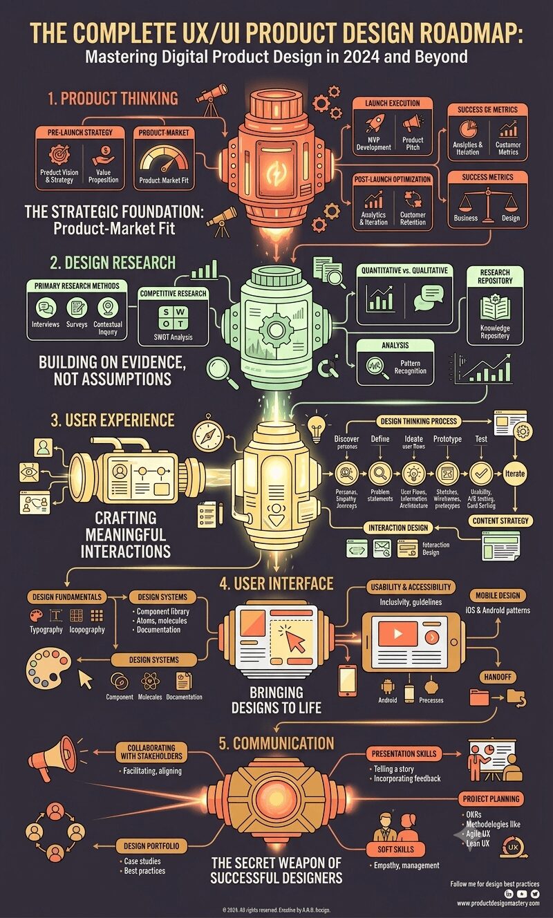
An illustrative, detailed infographic titled "Banking Success in the AI Era" presenting a four-layer framework for scaling artificial intelligence in financial institutions. The layers are stacked vertically as an architectural blueprint, with pipes and data streams flowing between them. From top to bottom: the 4th Layer: Operating Model & Cultural Transformation; 3rd Layer: Core Technology & Data Foundation; 2nd Layer: AI-Powered Decision-Making (The Brain); and 1st Layer: Reimagining Engagement (Omnichannel). Detailed components like AI control towers, cross-functional teams, vector databases, LLM orchestration, and AI agents are visualized within each layer. The overall tone is professional and high-tech, using a palette of muted greens, yellows, and charcoal, with a concluding imperative for "full-stack coordination" and a footer for "www.juanfernandopacheco.com."

As you evaluate your institution’s AI transformation journey, I encourage you to use this four-layer framework as a diagnostic tool. Where are you strong? Where are you weak? Are you investing proportionally across all layers, or over-indexing on visible engagement features while neglecting foundational infrastructure?

The banks that win won’t be those with the most impressive demos or the longest feature lists. They’ll be those that build coherent, integrated architectures capable of continuous evolution as technology and customer expectations change.

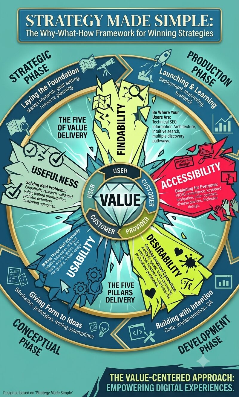
An infographic designed for the post "Strategy Made Simple: The Why-What-How Framework for Winning Strategies," presented in a vertical, 1,200 x 2,000 pixel format. The infographic utilizes a high-contrast color palette of teal, blue, yellow-green, red, and black, against a teal (#70C1B3) background. The central element is a large, fractured-style wheel labeled 'VALUE' at the very core, with text segments 'User, Customer, Provider' connecting to it. Radiating from this center are five angular, crystalline spokes representing the 'Five Pillars': Findability, Accessibility, Desirability, Usability, and Usefulness, each containing brief descriptive text. Surrounding this central wheel is a multi-layered, shattered ring with jagged edges, segmented into the 'Four Phases' of the framework, labeled in clockwise order: 'STRATEGIC PHASE: Laying the Foundation', 'CONCEPTUAL PHASE: Giving Form to Ideas', 'DEVELOPMENT PHASE: Building with Intention', and 'PRODUCTION PHASE: Launching & Learning'. Each segment includes 3-4 bullet points from the text description, linked by stylized energy lines. The overall style is modern and digital, with glowing effects, dynamic typography, and a powerful, almost explosive composition that visualizes interconnected strategy. The main post title, "STRATEGY MADE SIMPLE," is at the top in large, bold letters, and the framework title, "THE WHY-WHAT-HOW FRAMEWORK FOR WINNING STRATEGIES," is below it. The bottom of the image shows a call to action: "EMBRACE THE VALUE-CENTERED APPROACH. CREATE MEANINGFUL DIGITAL EXPERIENCES."

Discover a comprehensive approach to creating digital products that deliver real value by balancing findability, accessibility, desirability, usability, and usefulness. This timeless framework guides teams through strategic, conceptual, development, and production phases to build experiences that matter.

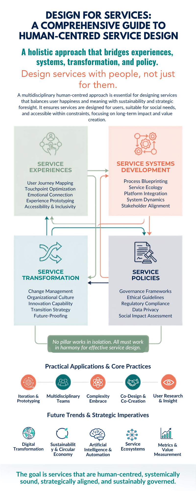
Infographic showing Design for Services framework with four interconnected pillars: Service Experiences (user journey mapping, touchpoint optimization, emotional connection, experience prototyping, accessibility & inclusivity), Service Systems Development (process blueprinting, service ecology, platform integration, system dynamics, stakeholder alignment), Service Transformation (change management, organizational culture, innovation capability, transition strategy, future-proofing), and Service Policies (governance frameworks, ethical guidelines, regulatory compliance, data privacy, social impact assessment). Below are five practical applications: iteration & prototyping, multidisciplinary teams, complexity embrace, co-design & co-creation, and user research & insight. Five future trends shown: digital transformation, sustainability & circular economy, artificial intelligence & automation, service ecosystems, and metrics & value measurement.

xplore the comprehensive framework of design for services through a human-centred lens. Learn how the four pillars of service design—experiences, systems development, transformation, and policies—integrate multiple disciplines to create meaningful, sustainable solutions that put people at the heart of innovation.

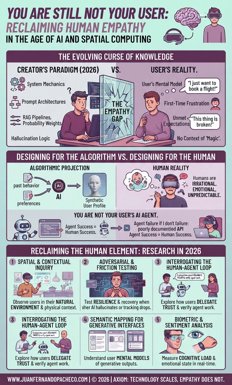
A vertical infographic titled "You Are Still Not Your User" against a light teal background, illustrating the growing gap between product creators and users in the age of AI and spatial computing. It is divided into sections showing the "Evolving Curse of Knowledge," the trap of "Synthetic Empathy," and a "2026 Research Toolkit" for reclaiming human understanding.

Fifteen years after the classic UX axiom was coined, the tools of our trade have evolved from static screens to generative interfaces and spatial computing. Yet, the fundamental rule remains: you are not your user. In 2026, as we navigate the complexities of AI agents and synthetic data, remembering this has never been more critical—or more challenging

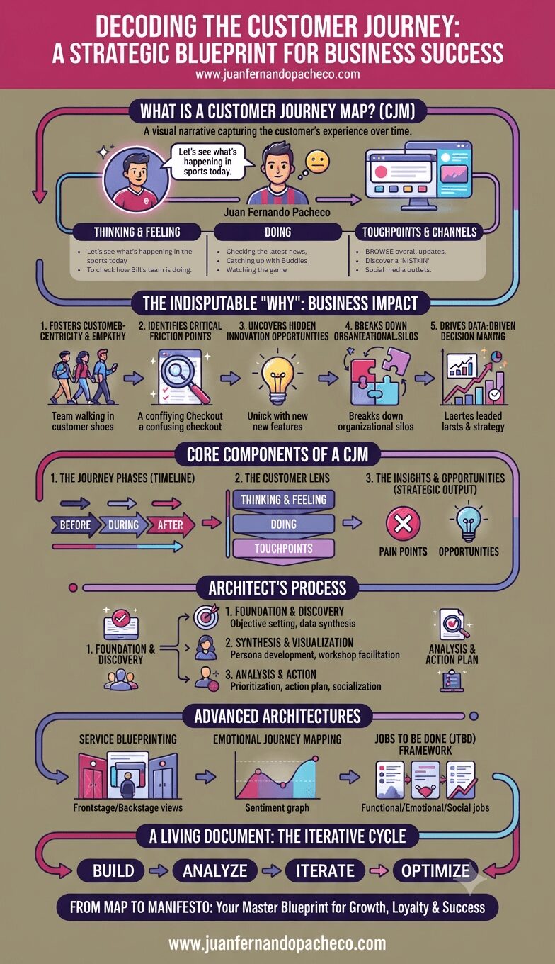
An infographic titled "Decoding the Customer Journey" that serves as a strategic blueprint for business success. The vertical graphic, set against a muted olive background, uses a color palette of pink, purple, and blue. It outlines the definition of a Customer Journey Map (CJM), its business impact, core components (phases, lens, insights), the architectural process (foundation, synthesis, action), advanced frameworks (blueprinting, emotional mapping, JTBD), and the iterative cycle of review. The URL www.juanfernandopacheco.com is included at the top and bottom.

Decoding the customer journey is the first, most critical step in building a truly customer-centric organization. The map of Juan Fernando Pacheco is more than a diagram; it’s a manifesto. It declares that the company’s success is inextricably linked to his success in achieving his goals—be they finding community, proving his knowledge to his buddies, or simply enjoying the thrill of the game.