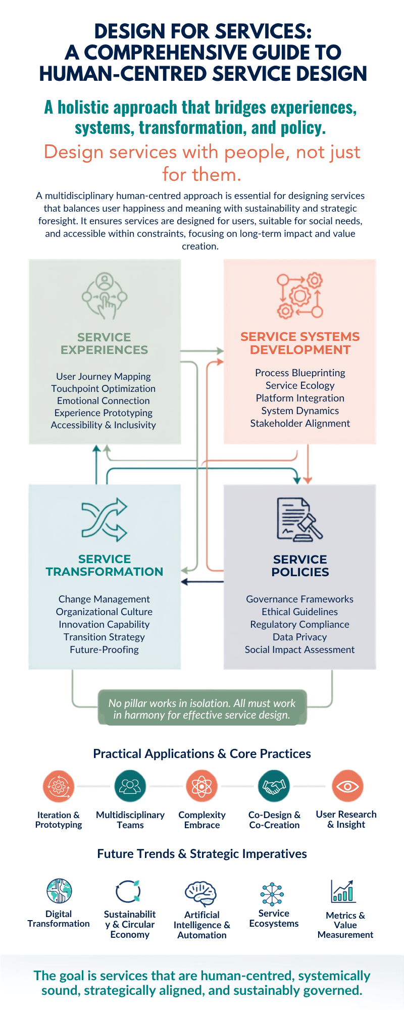
Infographic showing Design for Services framework with four interconnected pillars: Service Experiences (user journey mapping, touchpoint optimization, emotional connection, experience prototyping, accessibility & inclusivity), Service Systems Development (process blueprinting, service ecology, platform integration, system dynamics, stakeholder alignment), Service Transformation (change management, organizational culture, innovation capability, transition strategy, future-proofing), and Service Policies (governance frameworks, ethical guidelines, regulatory compliance, data privacy, social impact assessment). Below are five practical applications: iteration & prototyping, multidisciplinary teams, complexity embrace, co-design & co-creation, and user research & insight. Five future trends shown: digital transformation, sustainability & circular economy, artificial intelligence & automation, service ecosystems, and metrics & value measurement.

xplore the comprehensive framework of design for services through a human-centred lens. Learn how the four pillars of service design—experiences, systems development, transformation, and policies—integrate multiple disciplines to create meaningful, sustainable solutions that put people at the heart of innovation.

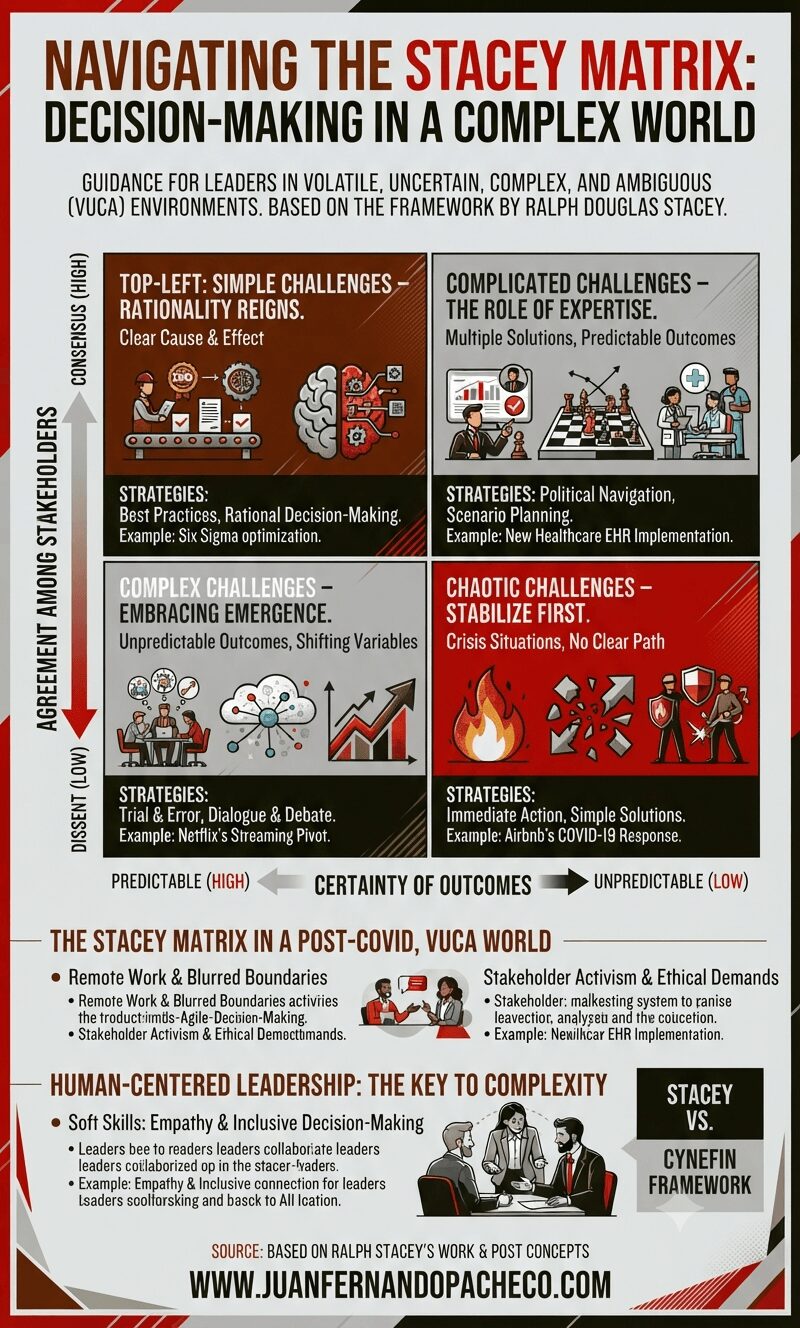
An infographic titled 'Navigating the Stacey Matrix: Decision-Making in a Complex World' set against a light grey background with a dark red, grey, and olive color scheme. It features a large matrix with two axes: 'Agreement Among Stakeholders' (vertical) and 'Certainty of Outcomes' (horizontal). The matrix is divided into four quadrants with icons, characteristics, strategies, and examples: Top-Left 'Simple Challenges' (rationality), Top-Right 'Complicated Challenges' (expertise), Bottom-Left 'Complex Challenges' (emergence), and Bottom-Right 'Chaotic Challenges' (stabilize first). Below the matrix are sections on 'The Stacey Matrix in a Post-COVID, VUCA World' and 'Human-Centered Leadership: The Key to Complexity' with small illustrations of people. The footer includes the URL 'WWW.JUANFERNANDOPACHECO.COM'.

The Stacey Matrix is not just a tool—it’s a mindset shift. In a world where 73% of leaders cite complexity as their top challenge (per Gartner), mastering this framework requires courage to embrace ambiguity and humility to learn from failure.
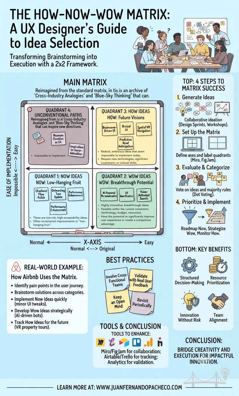
A creative infographic of the How-Now-Wow Matrix, visualized as a whiteboard with color-coded quadrants (Blue-Now, Green-Wow, Yellow-How) populated by sticky notes and hand-drawn examples. It includes a step-by-step guide for UX idea prioritization and benefits.

The How-Now-Wow Matrix is an invaluable tool in the UX designer’s toolkit. It bridges the gap between creativity and execution, ensuring that the best ideas move forward in a structured, strategic manner. Whether you’re optimizing an existing product or envisioning the future of user experience, integrating this framework will enhance your decision-making process and lead to impactful innovation.
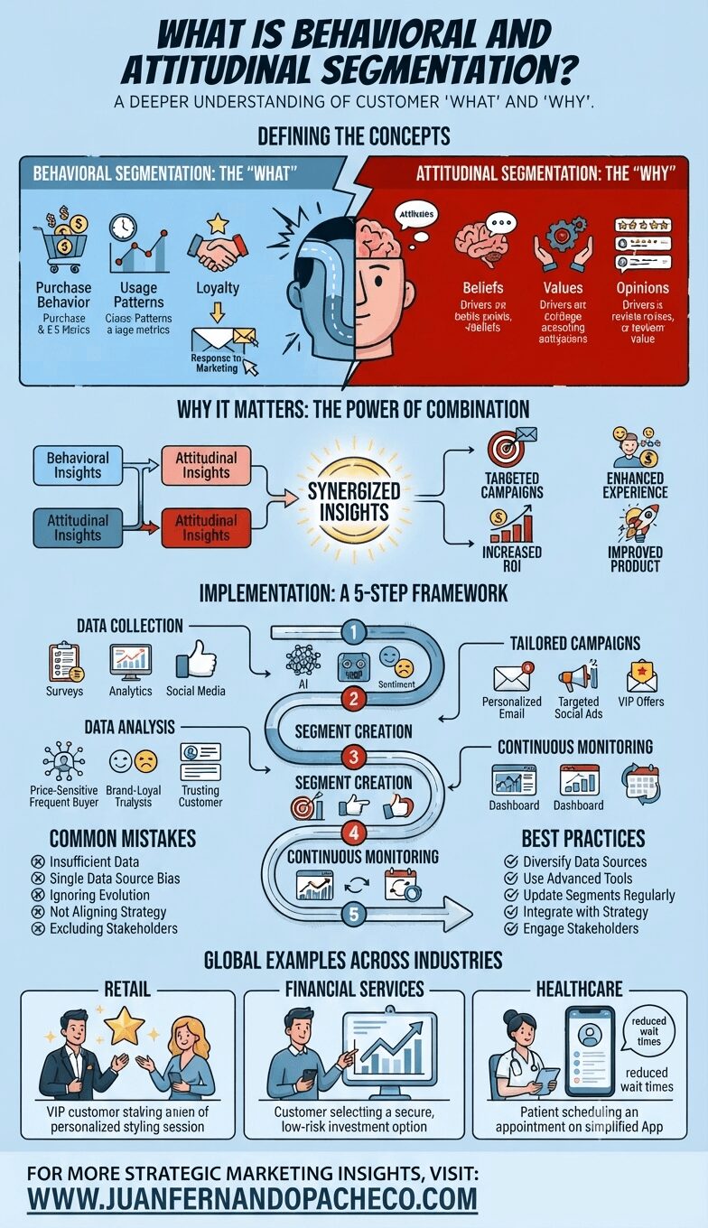
An infographic titled 'What is Behavioral and Attitudinal Segmentation?' illustrating a comprehensive marketing framework. It defines behavioral segmentation (the 'What') and attitudinal segmentation (the 'Why'), shows their combined power for 'Synergized Insights,' outlines a five-step implementation framework, details common mistakes and best practices, and provides global industry examples for retail, financial services, and healthcare. The infographic concludes with a call-to-action for WWW.JUANFERNANDOPACHECO.COM.

Behavioral and attitudinal segmentation is a powerful strategy for marketers aiming to connect with their audience on a deeper level. By understanding both what customers do and why they do it, businesses can craft personalized experiences that drive engagement and loyalty. By avoiding common pitfalls and following best practices, organizations can maximize the effectiveness of their segmentation efforts, ultimately leading to stronger customer relationships and improved ROI.
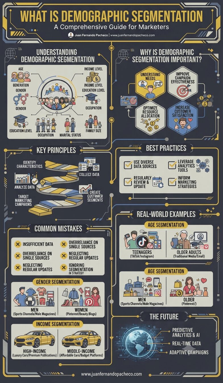
An infographic titled "What is Demographic Segmentation," designed with a dark background and yellow/blue accents. The chart visually explains the concept of dividing an audience based on shared characteristics like age, gender, and income. It covers key principles, importance, best practices, common mistakes, real-world examples (such as luxury vs. affordable cars and TikTok vs. traditional media), and future trends like AI analytics. The footer includes the URL www.juanfernandopacheco.com.

Demographic segmentation is a powerful tool for marketers aiming to understand their audience and craft effective campaigns. By following best practices and avoiding common pitfalls, businesses can achieve better results, foster customer loyalty, and gain a competitive edge. Start implementing demographic segmentation today and watch your marketing efforts soar!
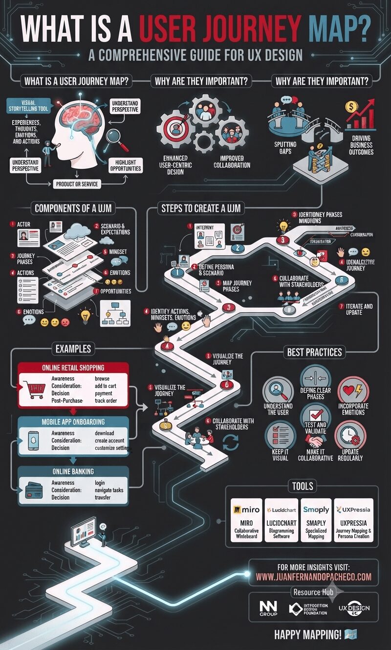
A detailed infographic titled "What is a User Journey Map?" set against a dark background with a glowing, circuit-like path. The infographic is structured in vertical sections, starting with the definition and importance of User Journey Maps. It then details the core components (Actor, Scenario, Phases, Actions, Mindset, Emotions, Opportunities, Visualization) and outlines a 7-step creation process. Following this, it provides three distinct examples (Online Retail Shopping, Mobile App Onboarding, Online Banking) and lists best practices and popular tools (Miro, Lucidchart, Smaply, UXPressia). The bottom section includes the URL "WWW.JUANFERNANDOPACHECO.COM" and resource logos.

A User Journey Map is an indispensable tool in UX design, enabling teams to create user-centric products and services. By capturing the user’s actions, emotions, and pain points, it provides valuable insights that drive innovation and improve overall user satisfaction.
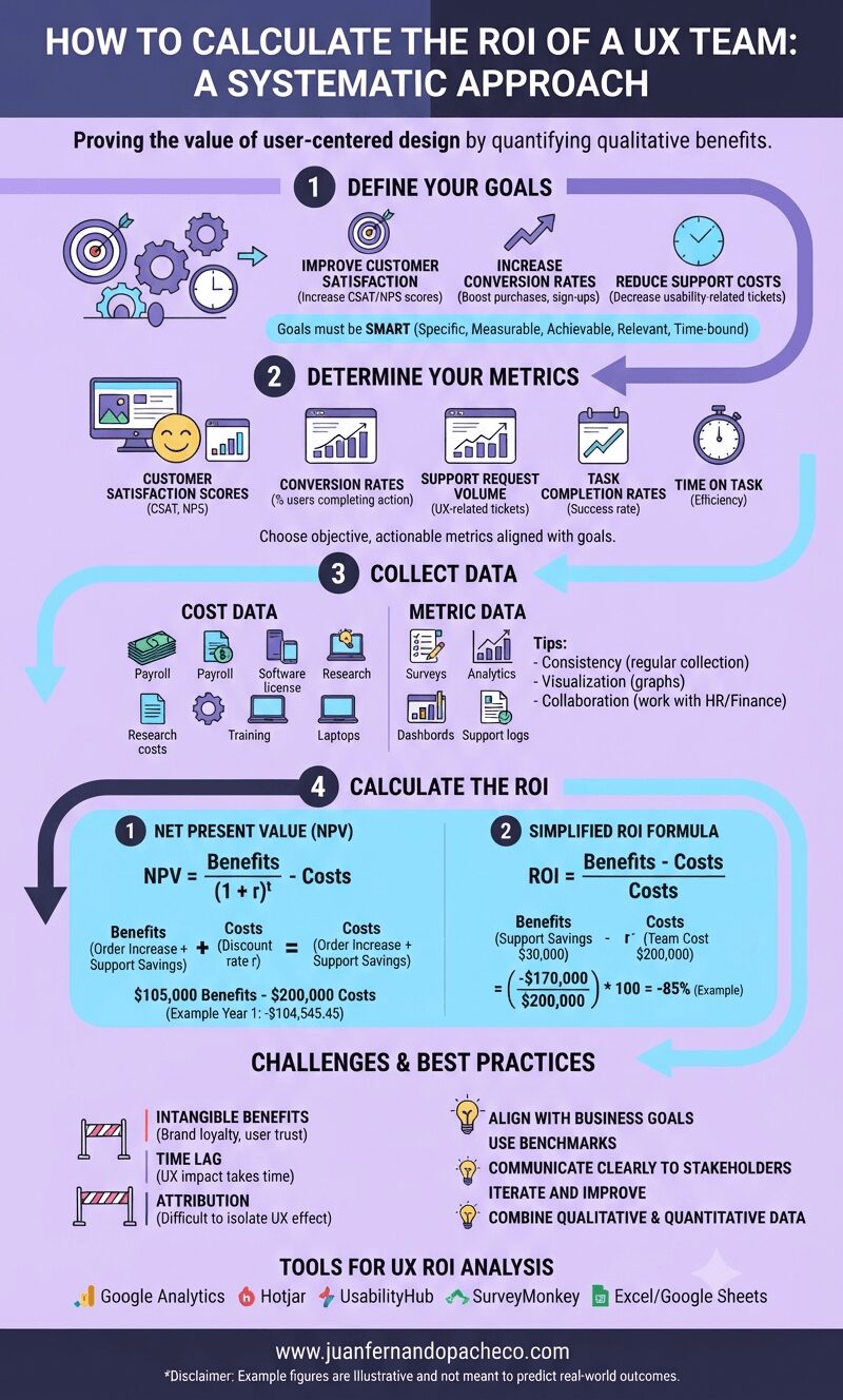
An infographic titled "How to Calculate the ROI of a UX Team: A Systematic Approach" against a light purple background. It outlines a four-step process: 1. Define Your Goals (SMART goals), 2. Determine Your Metrics (NPS, Conversion Rates, etc.), 3. Collect Data (Cost Data and Metric Data), and 4. Calculate the ROI (using NPV and simplified ROI formulas with examples). The graphic also includes sections for Challenges, Best Practices, and Tools, ending with the URL www.juanfernandopacheco.com.

Understanding the return on investment (ROI) of a UX team is critical for organizations aiming to justify and optimize their investment in user-centered design practices.
While calculating ROI in a UX context can be challenging because quantifying qualitative benefits is difficult, a systematic approach can reveal the value a UX team provides to an organization.