
Unlocking Design Excellence: Your Guide to DesignOps Ever wonder how some companies consistently deliver amazing
Tag: DesignOps
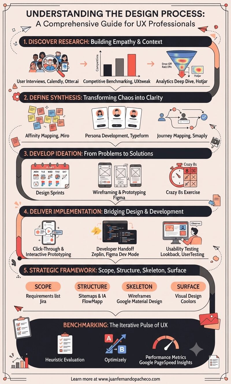
Mastering the design process requires balancing creativity with rigor.
By integrating tools like Figma for prototyping, Miro for synthesis, and Optimizely for testing, teams can deliver exceptional user experiences.
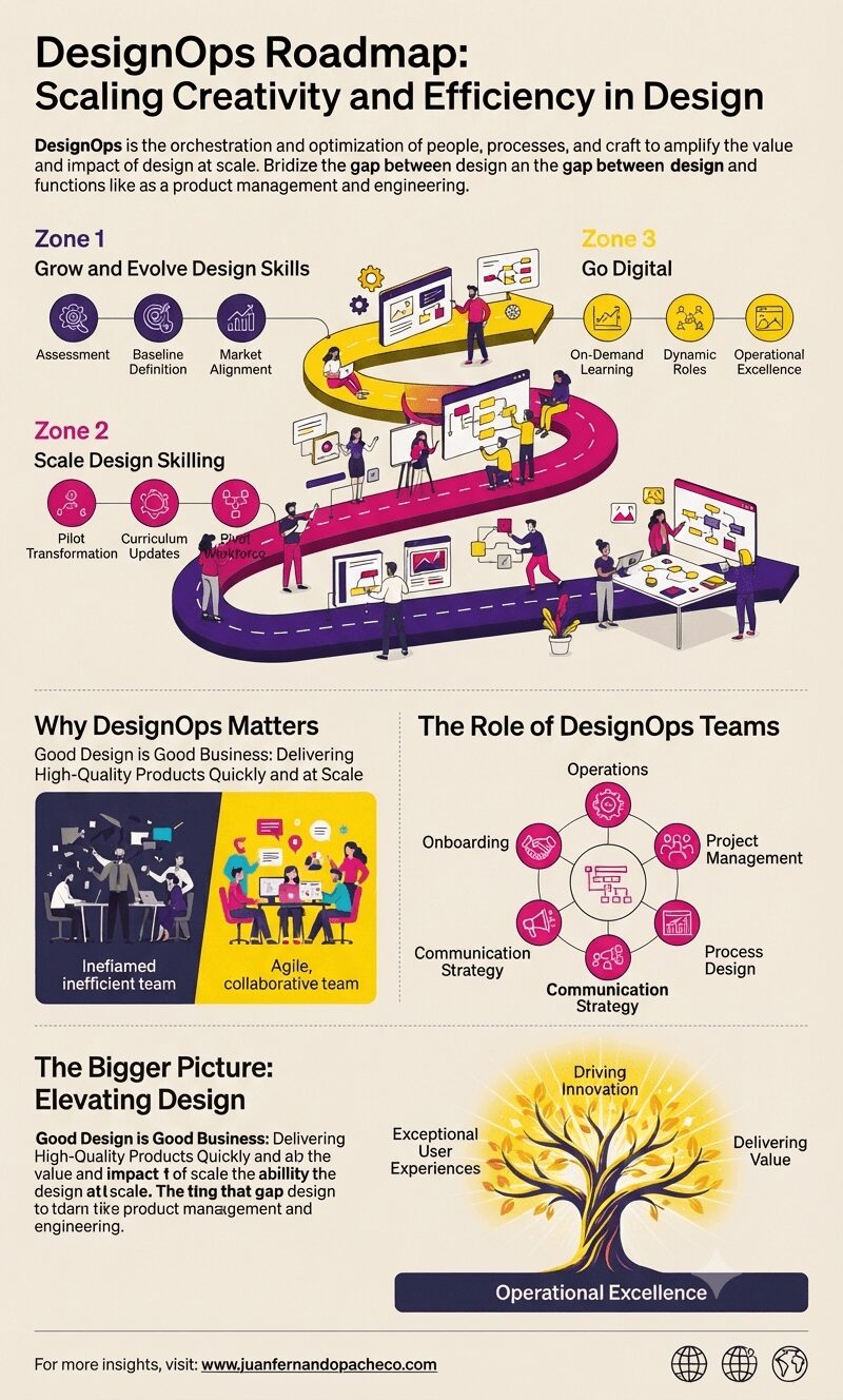
DesignOps is the orchestration and optimization of people, processes, and craft to amplify the value and impact of design at scale.
It focuses on streamlining design workflows, fostering collaboration, and enhancing the efficiency and effectiveness of design processes.
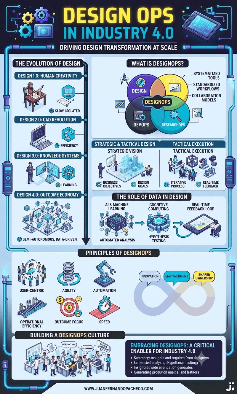
As organizations navigate the complexities of Industry 4.0, DesignOps emerges as a critical enabler of success. By operationalizing design, fostering collaboration, and leveraging data, companies can deliver innovative solutions at scale.
Embracing DesignOps is not just about optimizing processes; it’s about transforming how businesses think, design, and deliver value in a rapidly changing world.
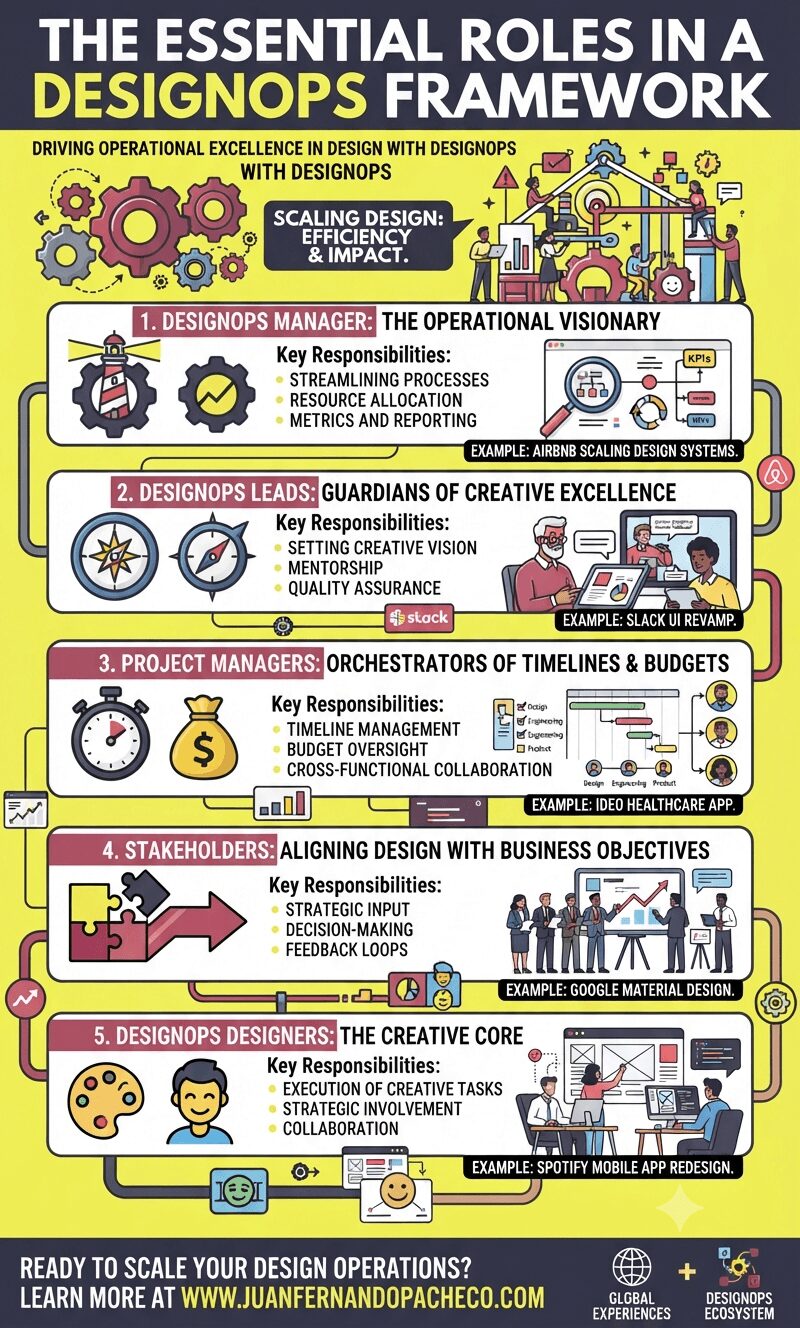
The rapid pace of digital transformation has propelled organizations to place greater emphasis on design as a strategic lever for innovation and customer satisfaction.
Yet, scaling design efforts across teams, tools, and workflows remains a formidable challenge. This is where DesignOps (Design Operations) emerges as a critical discipline, providing the scaffolding for designers to focus on what they do best: creating impactful experiences.
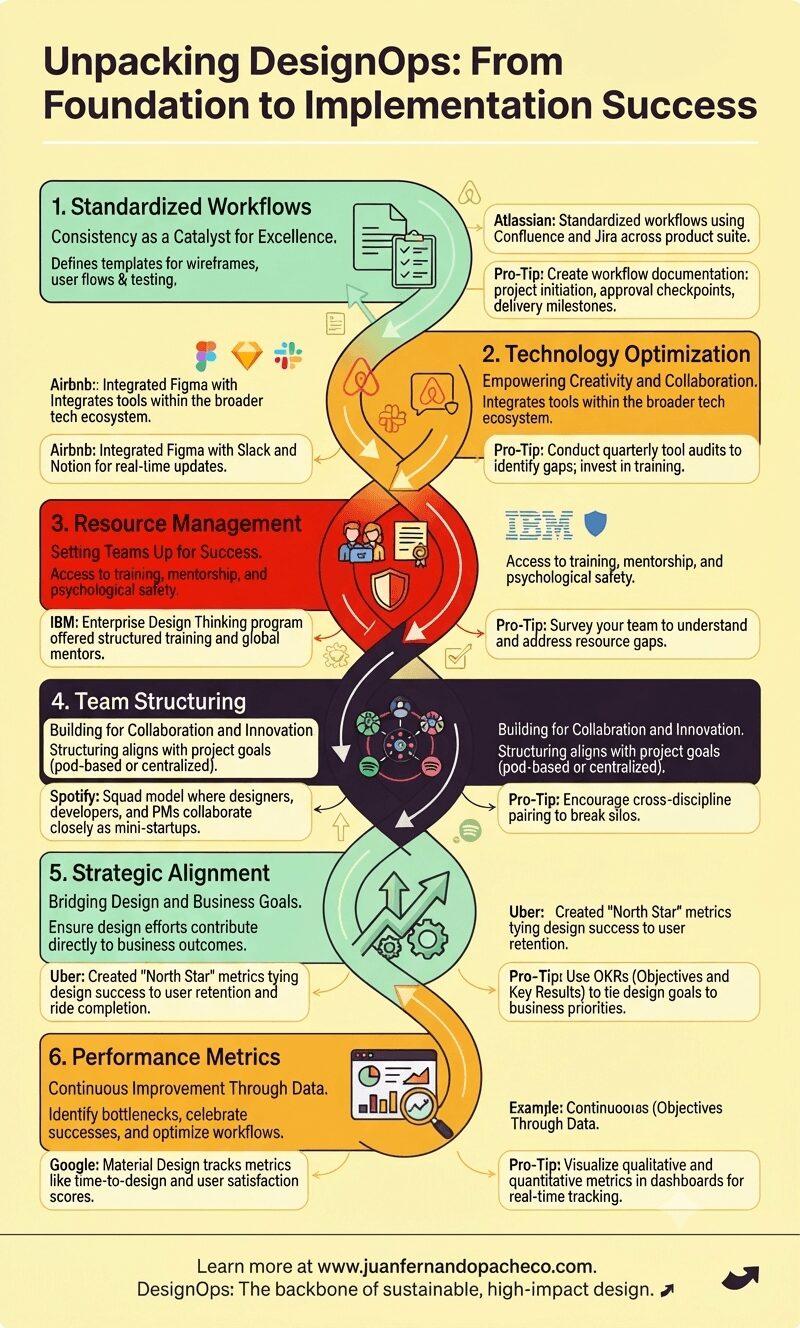
DesignOps isn’t just about scaling design; it’s about enabling designers to focus on what they do best: crafting exceptional user experiences.
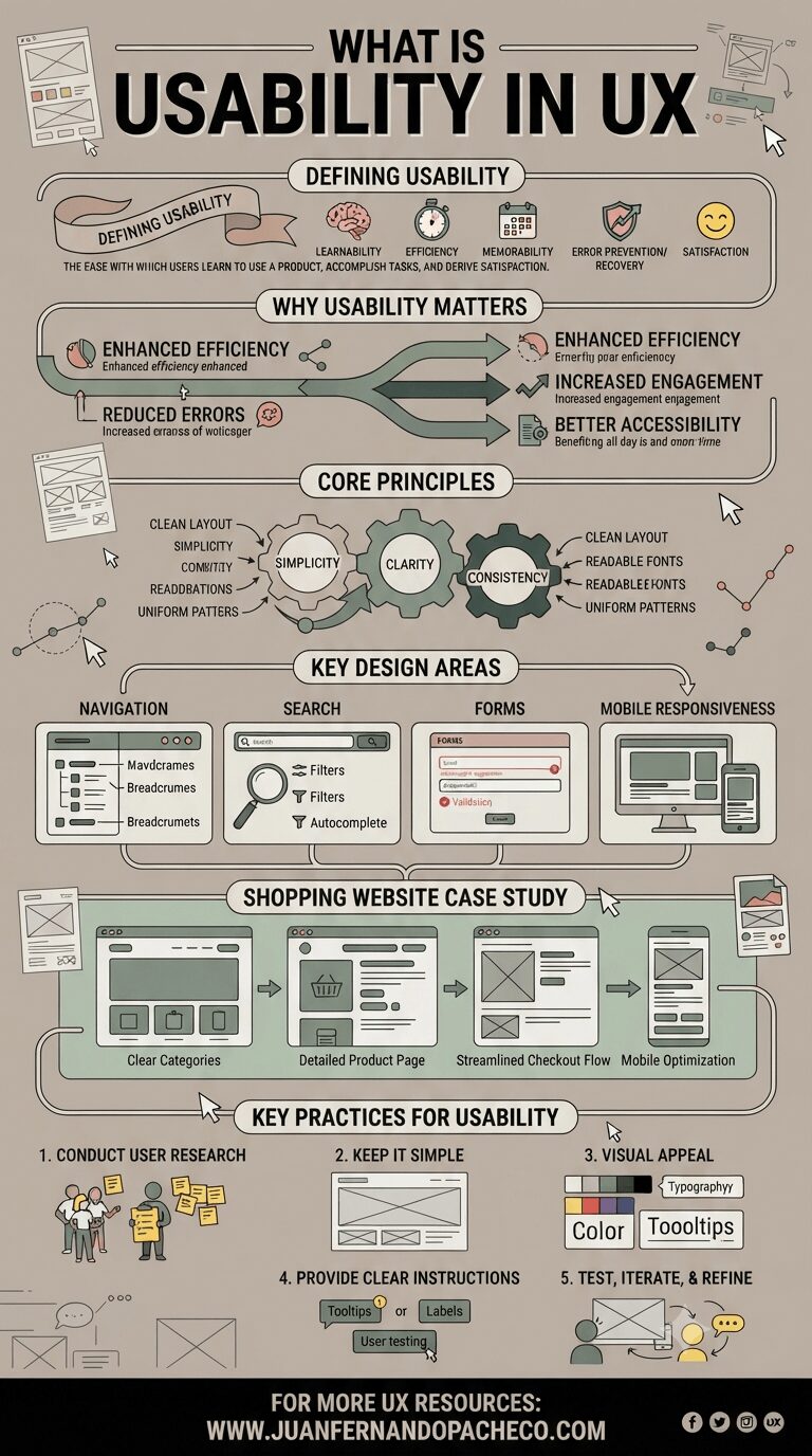
Usability is the backbone of exceptional UX design, ensuring products are intuitive, efficient, and satisfying to use.
By focusing on simplicity, clarity, and consistency, and addressing critical areas like navigation, forms, and mobile responsiveness, designers can craft experiences that delight users.
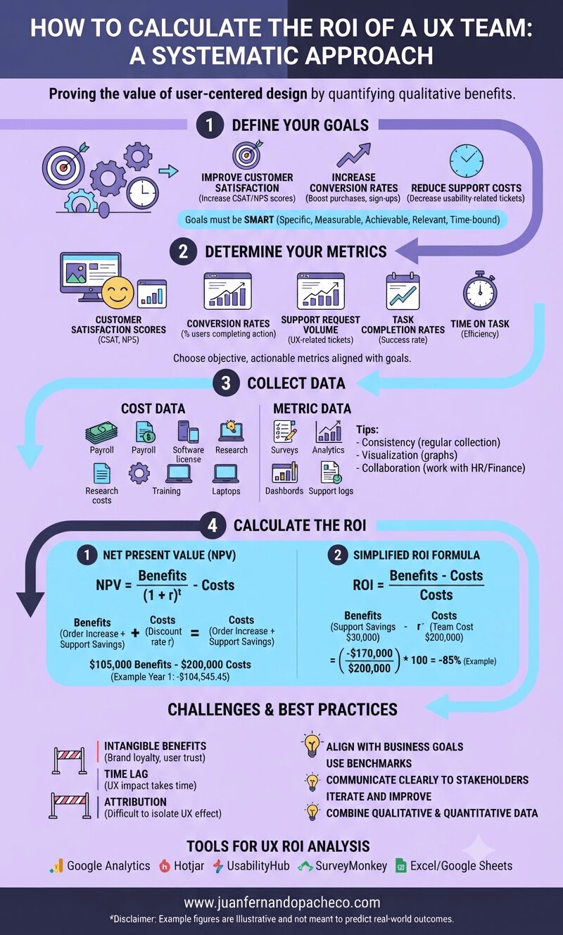
Understanding the return on investment (ROI) of a UX team is critical for organizations aiming to justify and optimize their investment in user-centered design practices.
While calculating ROI in a UX context can be challenging because quantifying qualitative benefits is difficult, a systematic approach can reveal the value a UX team provides to an organization.
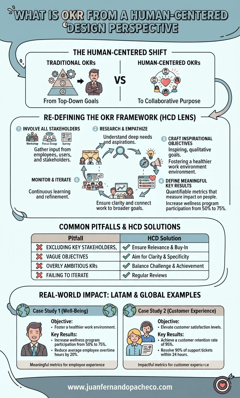
OKRs, or “Objectives and Key Results,” are a widely used framework for setting, tracking, and achieving goals within organizations.
Originally developed at Intel in the 1970s and later popularized by John Doerr in Measure What Matters, OKRs have become a cornerstone of goal management for companies like Google, LinkedIn, and Twitter.
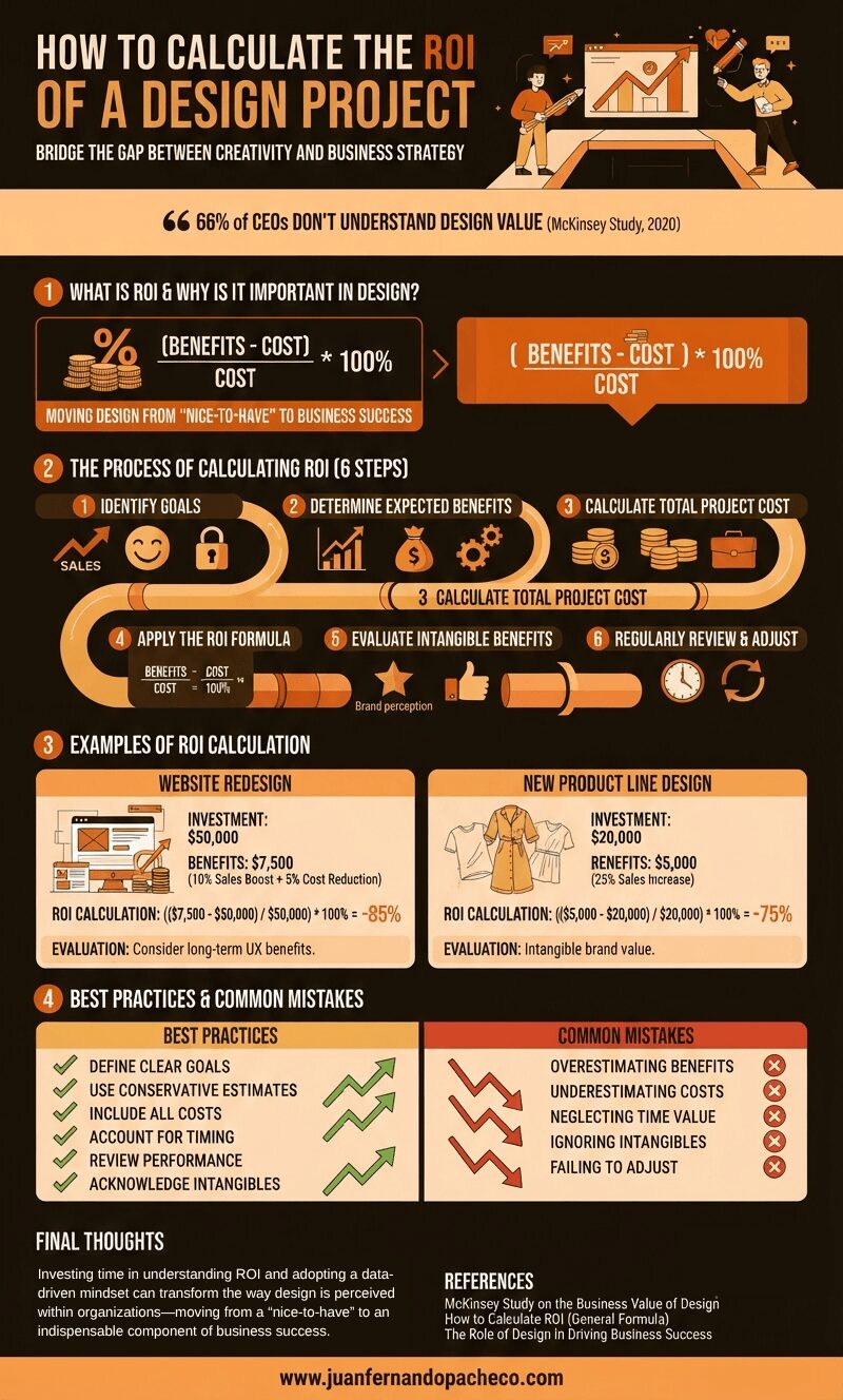
According to a McKinsey study from February 2020, nearly 66% of CEOs don’t understand what their senior designers are doing.
While design-driven companies are known to outperform competitors, the tangible benefits of design remain a mystery to many entrepreneurs.