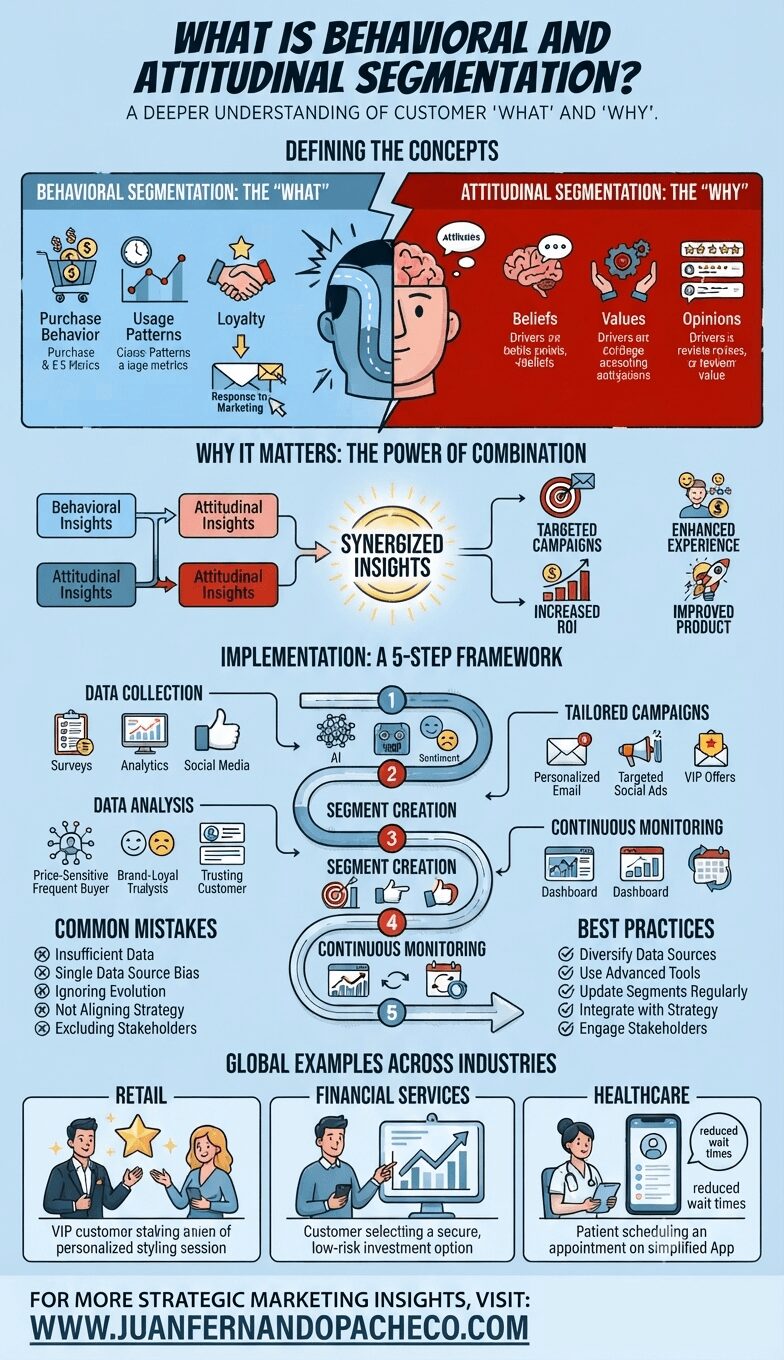
An infographic titled 'What is Behavioral and Attitudinal Segmentation?' illustrating a comprehensive marketing framework. It defines behavioral segmentation (the 'What') and attitudinal segmentation (the 'Why'), shows their combined power for 'Synergized Insights,' outlines a five-step implementation framework, details common mistakes and best practices, and provides global industry examples for retail, financial services, and healthcare. The infographic concludes with a call-to-action for WWW.JUANFERNANDOPACHECO.COM.

Behavioral and attitudinal segmentation is a powerful strategy for marketers aiming to connect with their audience on a deeper level. By understanding both what customers do and why they do it, businesses can craft personalized experiences that drive engagement and loyalty. By avoiding common pitfalls and following best practices, organizations can maximize the effectiveness of their segmentation efforts, ultimately leading to stronger customer relationships and improved ROI.

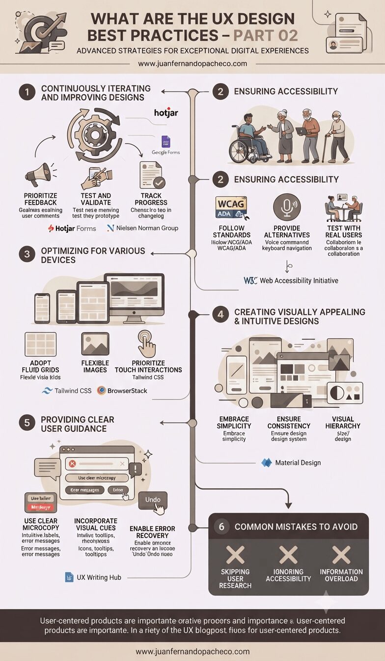
An infographic titled "WHAT ARE THE UX DESIGN BEST PRACTICES – PART 02" from www.juanfernandopacheco.com, presented in a vertical timeline format against a muted, professional background. It details six strategic steps: 1. Iterating based on feedback (with Hotjar and Nielsen Norman Group resources); 2. Ensuring accessibility (following WCAG/ADA standards and including a diverse group of users); 3. Optimizing for various devices (using fluid grids and tools like Tailwind CSS and BrowserStack); 4. Creating visually appealing designs (referencing Material Design and visual hierarchy); 5. Providing clear guidance (including microcopy and error recovery); and 6. Avoiding common mistakes (skipping research, ignoring accessibility, and information overload).

Adhering to UX design best practices ensures the creation of intuitive, inclusive, and visually compelling digital experiences. By embracing continuous iteration, prioritizing accessibility, optimizing for diverse devices, crafting intuitive designs, and providing clear guidance, designers can deliver products that delight users and drive engagement.
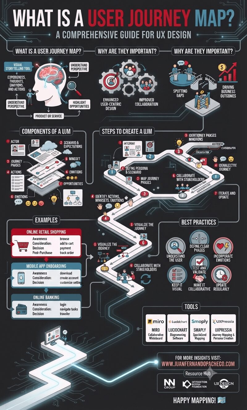
A detailed infographic titled "What is a User Journey Map?" set against a dark background with a glowing, circuit-like path. The infographic is structured in vertical sections, starting with the definition and importance of User Journey Maps. It then details the core components (Actor, Scenario, Phases, Actions, Mindset, Emotions, Opportunities, Visualization) and outlines a 7-step creation process. Following this, it provides three distinct examples (Online Retail Shopping, Mobile App Onboarding, Online Banking) and lists best practices and popular tools (Miro, Lucidchart, Smaply, UXPressia). The bottom section includes the URL "WWW.JUANFERNANDOPACHECO.COM" and resource logos.

A User Journey Map is an indispensable tool in UX design, enabling teams to create user-centric products and services. By capturing the user’s actions, emotions, and pain points, it provides valuable insights that drive innovation and improve overall user satisfaction.
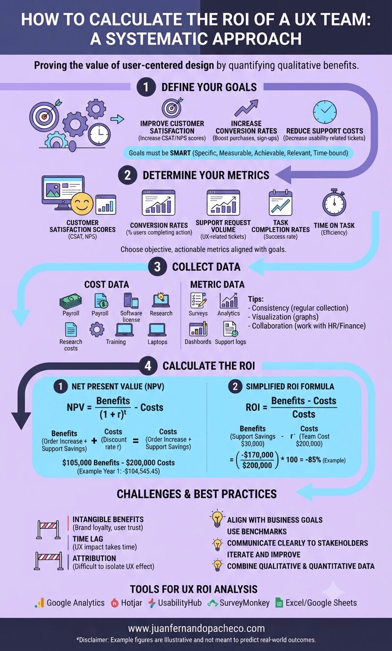
An infographic titled "How to Calculate the ROI of a UX Team: A Systematic Approach" against a light purple background. It outlines a four-step process: 1. Define Your Goals (SMART goals), 2. Determine Your Metrics (NPS, Conversion Rates, etc.), 3. Collect Data (Cost Data and Metric Data), and 4. Calculate the ROI (using NPV and simplified ROI formulas with examples). The graphic also includes sections for Challenges, Best Practices, and Tools, ending with the URL www.juanfernandopacheco.com.

Understanding the return on investment (ROI) of a UX team is critical for organizations aiming to justify and optimize their investment in user-centered design practices.
While calculating ROI in a UX context can be challenging because quantifying qualitative benefits is difficult, a systematic approach can reveal the value a UX team provides to an organization.
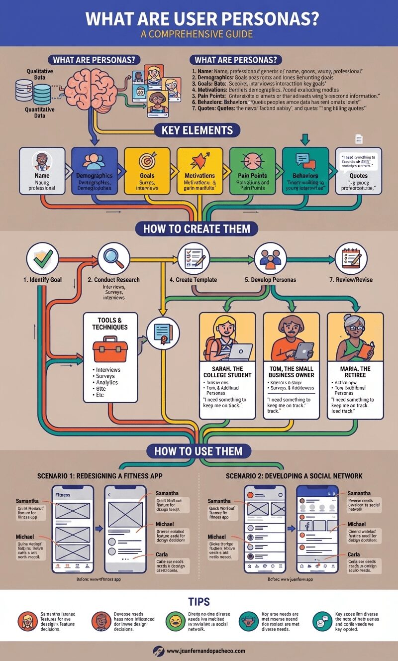
A detailed infographic titled "WHAT ARE USER PERSONAS? A COMPREHENSIVE GUIDE," set against a muted, earthy background. The image is a flowchart and structured text guide that explains user personas. It features sections for "What are Personas?" with a brain icon and data inputs, "Key Elements" with seven categorized steps, "How to Create Them" with a seven-step process, "Tools & Techniques," and "How to Use Them" with two detailed scenarios (Redesigning a Fitness App, Developing a Social Network). It concludes with "Tips." The infographic includes illustrative portraits of Sarah, Tom, and Maria, and app wireframe examples. The URL www.juanfernandopacheco.com is at the bottom.

In the world of user experience (UX) design, User Personas play a pivotal role. These fictional, yet representative, characters embody the different types of users for a product or service.

Crafted from extensive research and data, personas help designers and stakeholders understand the diverse needs, goals, and behaviors of their target audience. In this blog post, we’ll dive deep into the concept of user personas, how to create them, and their role in the design process.
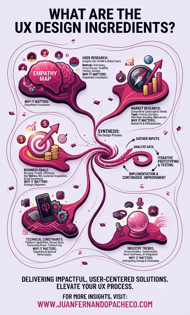
An illustrative infographic titled "WHAT ARE THE UX DESIGN INGREDIENTS?" displayed against a light purple background. It features five distinct, interconnected sections—User Research, Market Research, Business Goals, Technical Constraints, and Industry Trends—represented by 3D icons like a brain, compass, target, broken phone, and crystal ball. These sections flow into a central spiral labeled "Synthesis: The Design Process." Below the diagram, the text reads: "DELIVERING IMPACTFUL, USER-CENTERED SOLUTIONS. ELEVATE YOUR UX PROCESS." followed by the website "WWW.JUANFERNANDOPACHECO.COM".

UX design (user experience design) is a multifaceted field requiring the integration of diverse inputs to create user-centric solutions.

The term “UX design ingredients” refers to the core elements that inform and shape the design process. These ingredients provide the foundation for building products and services that meet both user needs and business goals.
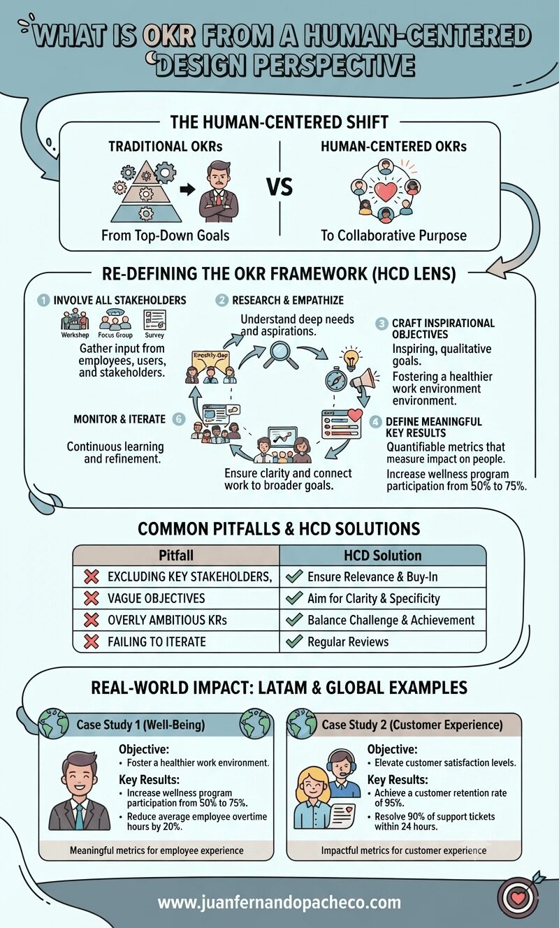
An infographic titled "What is OKR from a Human-Centered Design Perspective" illustrates a six-step framework for setting goals with empathy and collaboration. It compares traditional top-down goal setting with human-centered approaches, lists common pitfalls and solutions, and provides real-world examples for employee well-being and customer experience. The design uses a color palette of teal, cream, mauve, and grey. The footer includes the website www.juanfernandopacheco.com.

OKRs, or “Objectives and Key Results,” are a widely used framework for setting, tracking, and achieving goals within organizations.
Originally developed at Intel in the 1970s and later popularized by John Doerr in Measure What Matters, OKRs have become a cornerstone of goal management for companies like Google, LinkedIn, and Twitter.