The Hidden Language of Design: Emotional Design Why Products Make You Feel Things Have you
Tag: Emotional Design
UX stands for “user experience.” Essentially, UX is about putting the user at the center
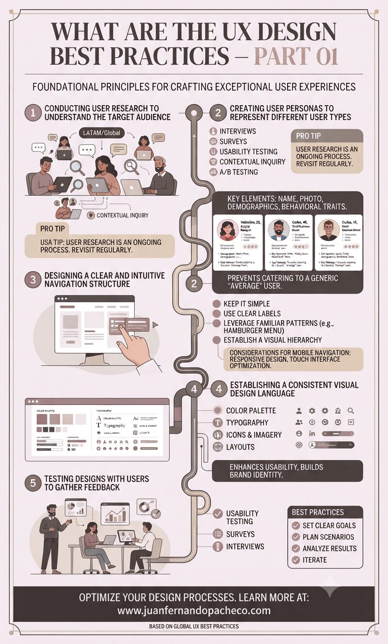
User Experience (UX) Design focuses on creating digital products that deliver positive and engaging user experiences.
It involves designing websites, software applications, and other digital interfaces to be intuitive, user-friendly, and effective.
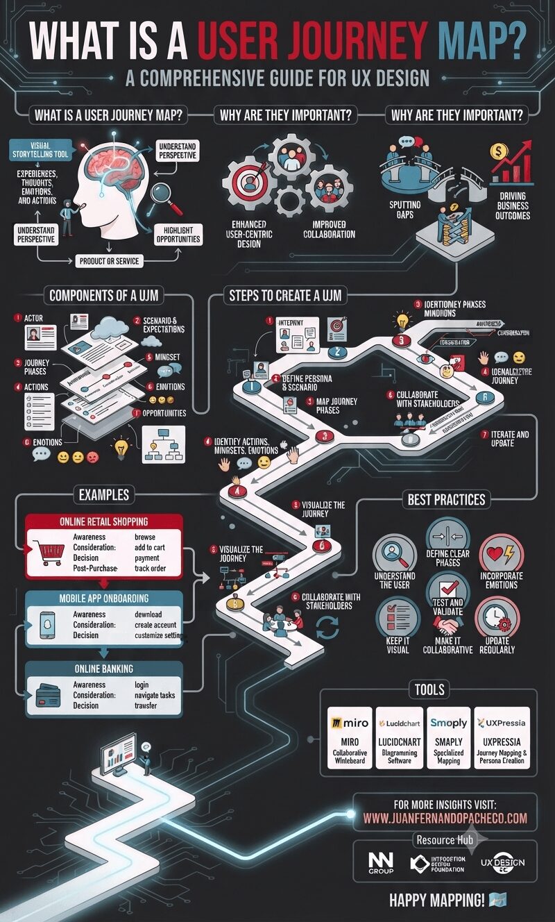
A User Journey Map is an indispensable tool in UX design, enabling teams to create user-centric products and services. By capturing the user’s actions, emotions, and pain points, it provides valuable insights that drive innovation and improve overall user satisfaction.
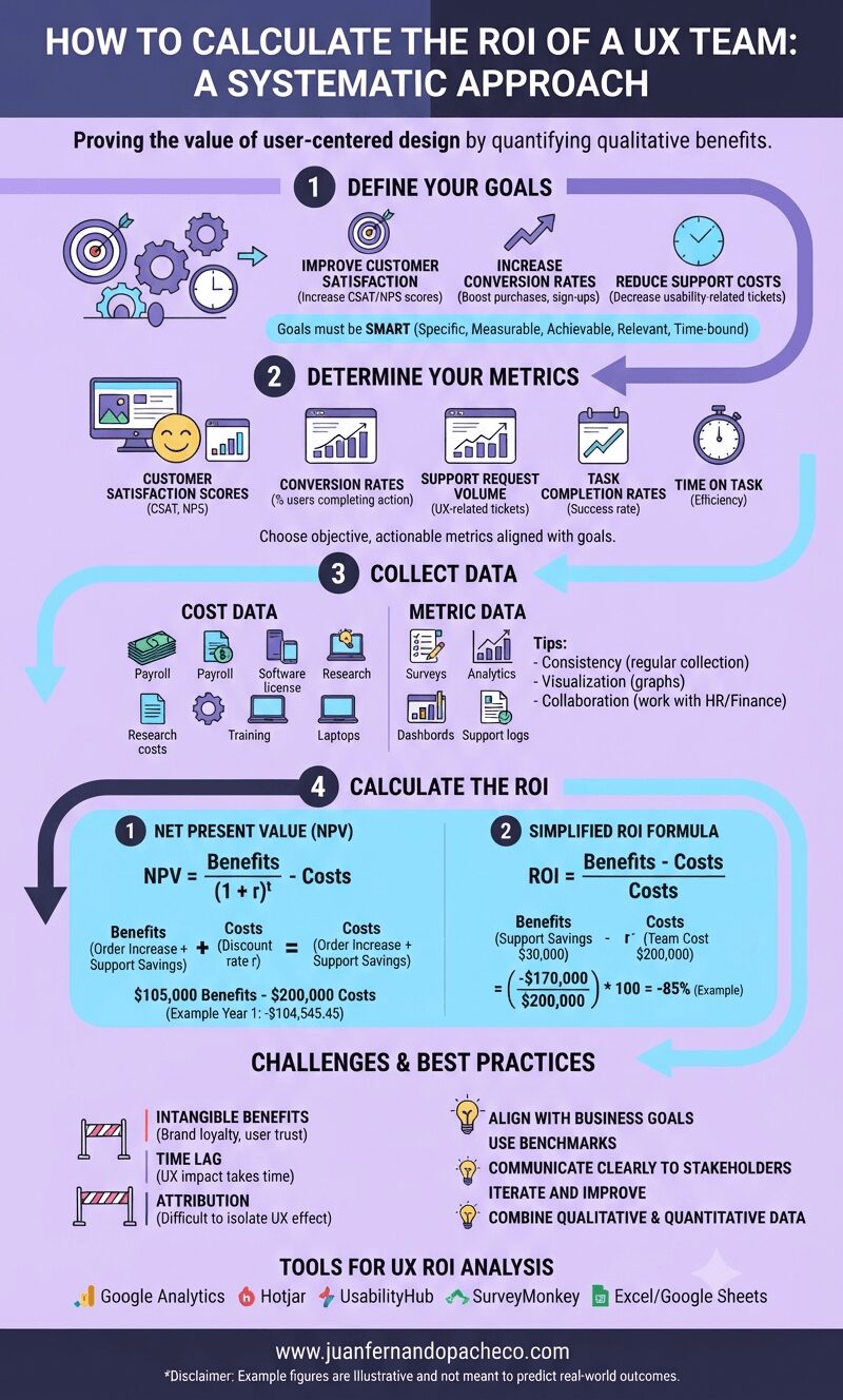
Understanding the return on investment (ROI) of a UX team is critical for organizations aiming to justify and optimize their investment in user-centered design practices.
While calculating ROI in a UX context can be challenging because quantifying qualitative benefits is difficult, a systematic approach can reveal the value a UX team provides to an organization.
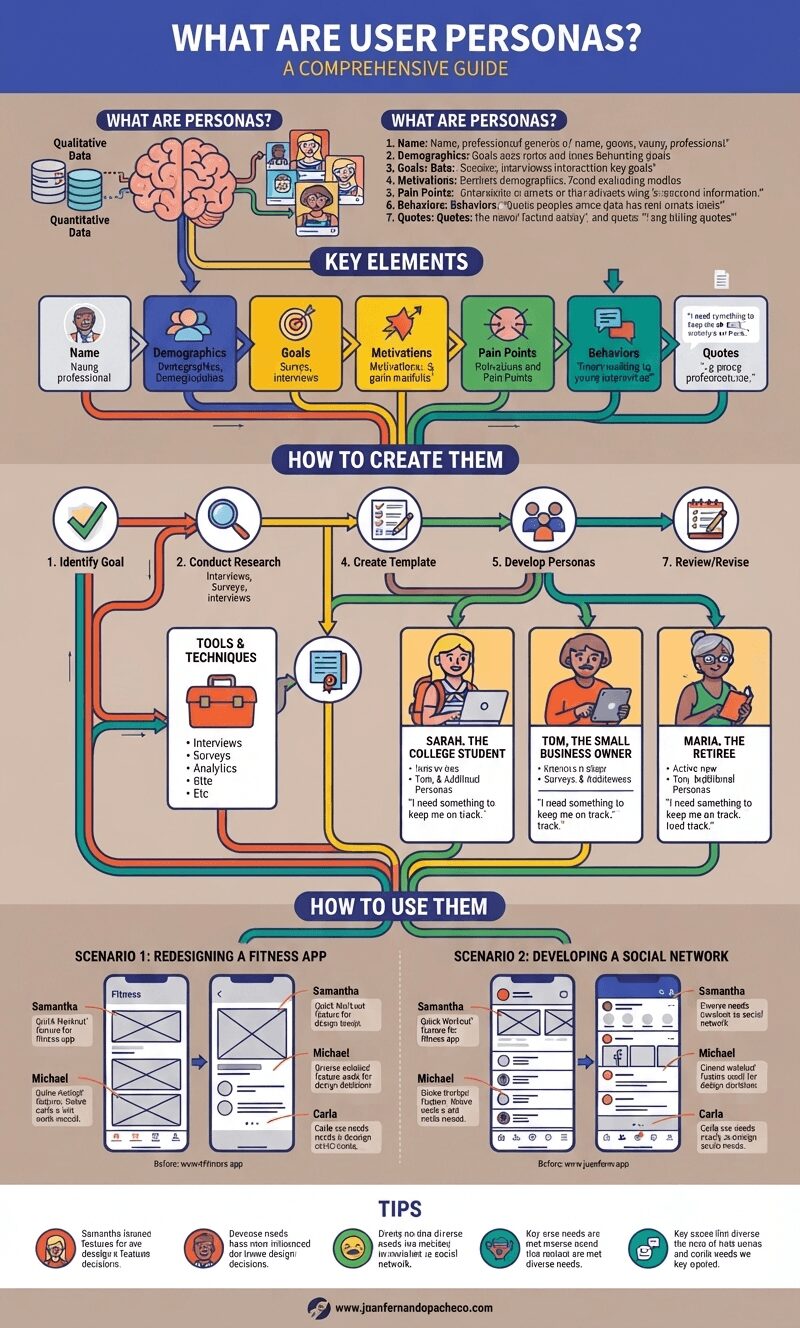
In the world of user experience (UX) design, User Personas play a pivotal role. These fictional, yet representative, characters embody the different types of users for a product or service.
Crafted from extensive research and data, personas help designers and stakeholders understand the diverse needs, goals, and behaviors of their target audience. In this blog post, we’ll dive deep into the concept of user personas, how to create them, and their role in the design process.
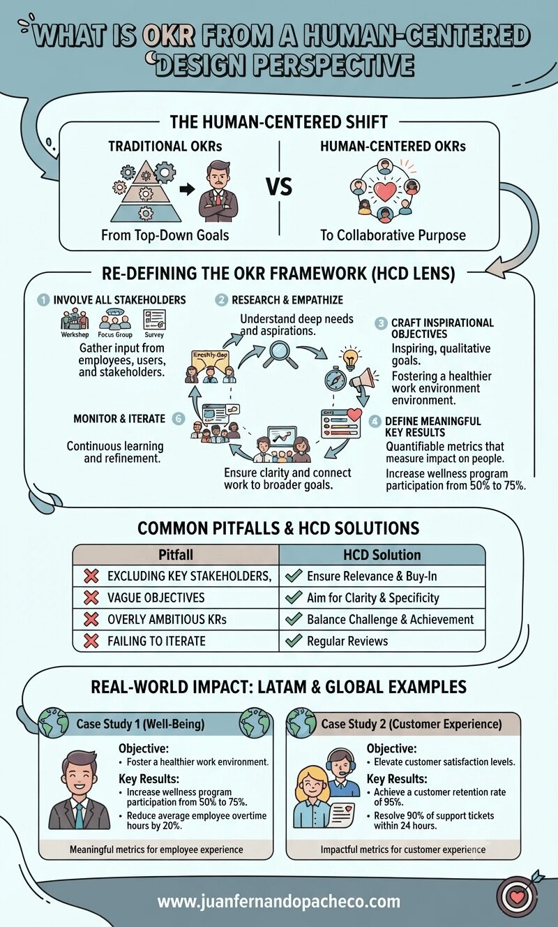
OKRs, or “Objectives and Key Results,” are a widely used framework for setting, tracking, and achieving goals within organizations.
Originally developed at Intel in the 1970s and later popularized by John Doerr in Measure What Matters, OKRs have become a cornerstone of goal management for companies like Google, LinkedIn, and Twitter.
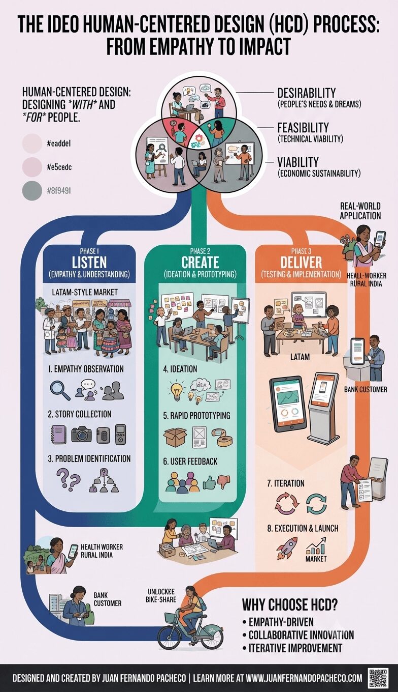
A Comprehensive Guide to Human-Centered Design (HCD) IDEO’s Human-Centered Design (HCD) methodology has revolutionized how
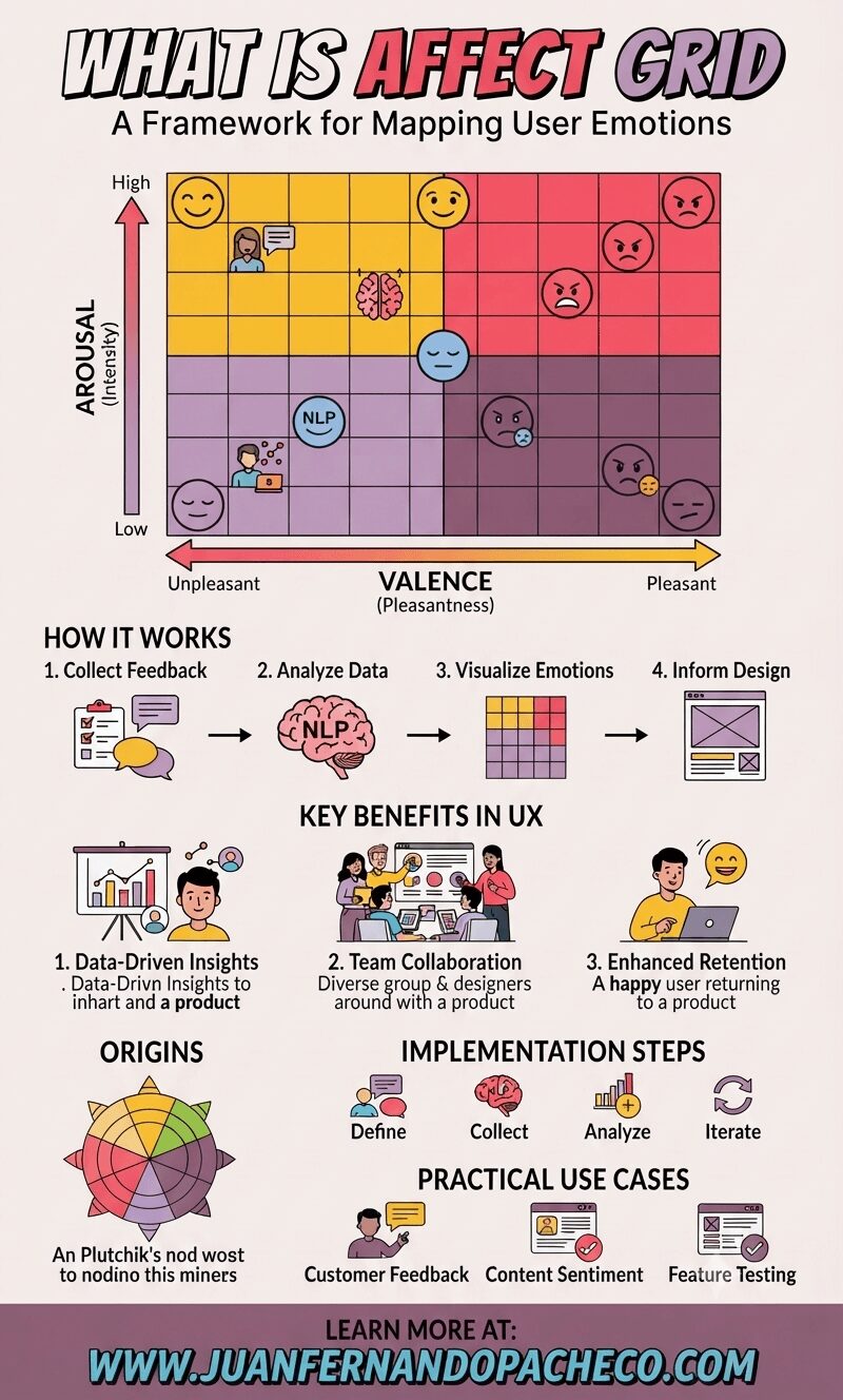
the Affect Grid stands out as a robust framework.
This tool helps designers analyze and predict how users feel about a product or service, ensuring emotional resonance and an optimized user journey.
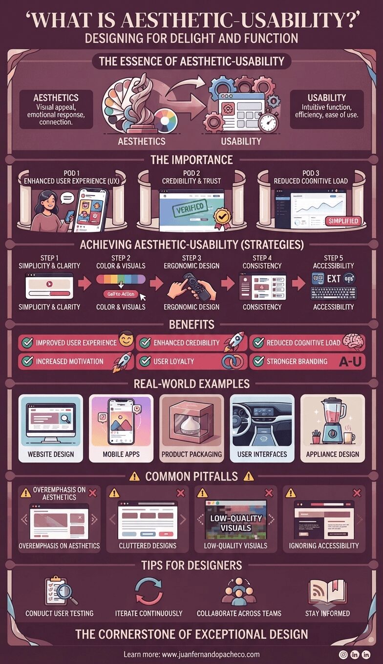
Aesthetic-Usability is a fundamental concept in user experience (UX) design, emphasizing that a product should be both visually appealing and easy to use.
Rooted in the idea that beauty can enhance functionality, aesthetic-usability plays a pivotal role in shaping how users interact with and perceive a product.